Insights for ArcGIS, a premium app available with ArcGIS Online and ArcGIS Enterprise, had lots of interest at our conference last week. The 2.3 update is now available and has plenty of great new features. If you are new to Insights, you can now check out the Insights for ArcGIS Playlist. This has many great hints, tips and exercises to get you started.
There are new colour ramps available for maps that are styled by Counts and Amounts, as well as for heat charts. Another great feature within Insights is that you can now do spatial joins using the location fields from 2 or more datasets by using the Create Relationships window.
Link Analysis
Link analysis allows you to establish relationships and view connections between related data elements. This is a great way to get a sense of associations between people, places, events and other entities. You can then see relationships in a Link (schematic view) or Flow Map (geographic view) shown below.
Link Analysis might help you answer questions like:
Health: Where did the first patient come from, who infected whom and how did the disease spread?
Police intelligence: Where do gang members live versus where they get arrested? Who is communicating through social media and how well are they connected?
Commercial: How is the sales force supporting customers? What locations does a store serve?
Manufacturing: What is the supply chain and where have the goods initially travelled from?
How would this look for the spread of the Ebola virus?
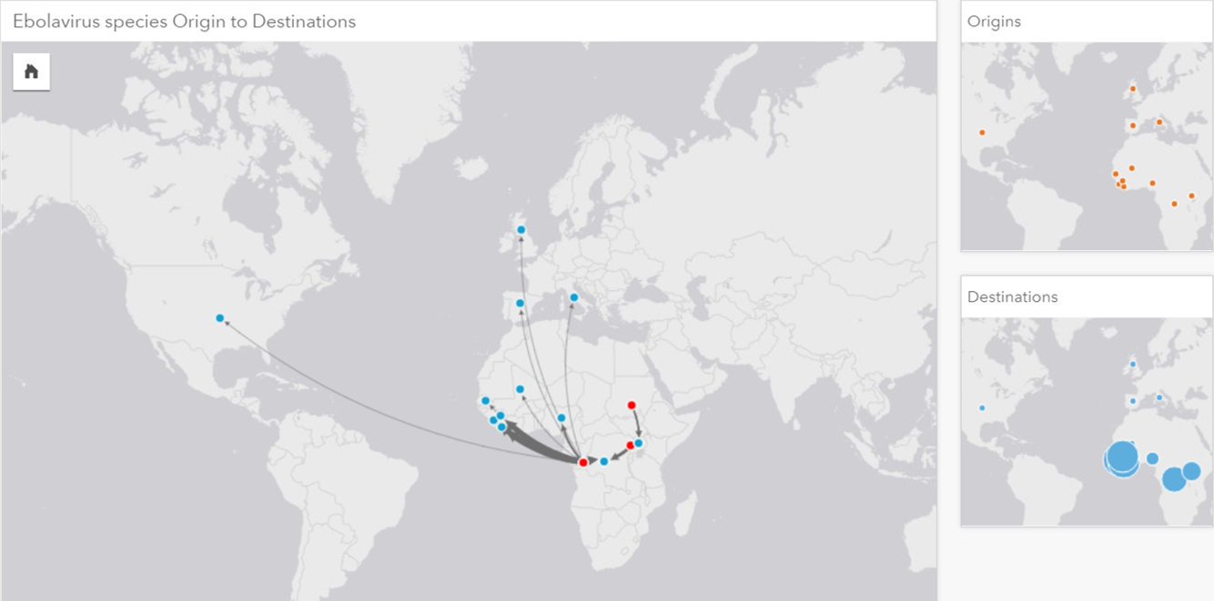 a link map showING the Geographic origins of The disease species (Red) and the outbreak locations (Blue).
The links to west Africa are quite clustered but the link chart gives a schematic view:
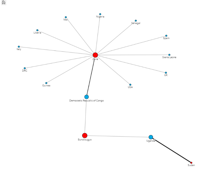 A Link Chart shows a schematic view of connected locations rather than a geographic view.
Regression analysis and scatter plots
My favourite new feature in Insights is the ability to do regression analysis and to make predictions. Insights also allows you to create a scatter plot matrix of variables as part of building the regression model – to help you quickly determine a good model for explaining a dependent variable.
One example is that you want to look at how deprivation in an area might change in the future, to plan for more resources, police staff and facilities. We can use regression analysis to understand factors that influence the Index of Multiple Deprivation (IMD) today. So what factors influence IMD?
Below, I’ve drag and dropped factors into a Scatter Plot Matrix to see what may influence IMD the most. The factors I chose were Less than level 2 qualifications, Employment deprivation and income deprivation.
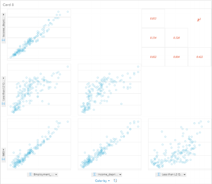 My chosen factors in a Scatter Plot Matrix. The R Squared values show that these factors have a high correlations with IMD.
Once you’ve created the regression model, you get your regression model statistics added to your dataset – as well as the estimated, residual and standardised residuals. Within the regression model, you get access to the Adjusted R-Squared and Durbin-Watson Test results.
Making Predictions
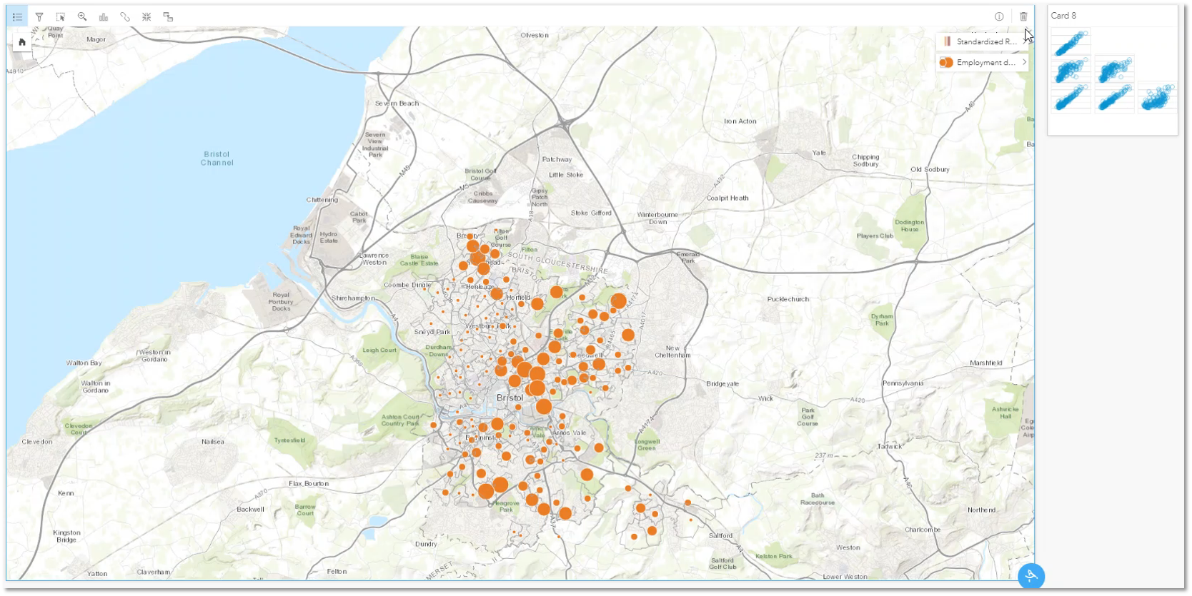
The most exciting part is how can I use the above analysis to work out what deprivation might look like in the future? To answer this, I added in predicted values for my factors and then ran the Predict Variable tool to see what would happen if each variable saw an increase of 10% by 2020. You can see what happened in this short video.
If you don’t yet have Insights for ArcGIS, why not try it free with ArcGIS Online.
I hope you enjoy using the new features within Insights 2.3!
![]()