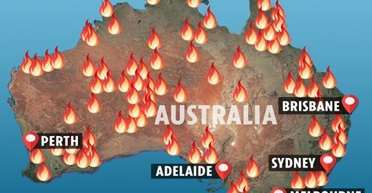
An example of the uncredited maps being shared on social media.
Over-sized fire symbols, misleading colours and poorly selected projections have all been front and centre in the recent spread of bushfire maps. Following yet another deadly bushfire event, a wide variety of maps have been created to reflect the damage caused in Australia. Unfortunately, many of these maps have faced criticism on social media and even in the news (BBC article), due to the misleading cartography. This is largely due to the data being misinterpreted and in the following blog I want to shift focus away from the visualisation and draw attention to the data itself.
One common theme amongst these maps was the data source, provided by science guru’s NASA. A well-respected organisation that provides reliable, historic data for fire detection’s across the globe, spanning all the way back to 2001. Naturally, I figured I’d jump into the cartography ring and see how many rounds I could last. My first point of call was to download 18 years (2001-2019) of data, spanning over 50 million points.
The Data
Each point on the map is captured using remote sensing, from the MODIS instrument on board the Terra/Aqua satellites which records the location of a detected fire. At this stage, my first observation was the confidence percentage assigned to each record, to establish how likely my point-on-map is actually a fire, rather than a reflection of a car roof or somebody shining a torch directly towards the satellite (kidding).
The second concern I had was that the MODIS spatial resolution is 1km, meaning that the data is limited to this scale and can never identify fires to a higher accuracy. This throws out any legitimacy on “number of fires” statistics, because MODIS can’t accurately detect a fire that spans 2 meters wide (for example).
Finally, MODIS is great, but unfortunately it doesn’t tell me if I’m looking at a large scale bushfire or a fire from a scouts campfire… more on this below.
The Results
If you’re still reading, you’ve done well to come this far without any maps to keep you gripped. Have a well-deserved hex bin styled map of all the detected fires across the globe during 2019.

Map by Esri UK using data from MODIS Collection 6 NRT (provided by Nasa).
The longer I worked on this map, the more I noticed the unexpected trends and patterns emerge. For example, why does the Middle East have a high number of recorded fires during 2019, when it’s not known for being a hotspot? Enter the ever-useful World Imagery basemap leading to the discovery that this data was not showing only natural fires, but all fires, human or natural.

Using Esri’s imagery basemap for an area in Iraq.