New decade, new map viewer. You may have already heard, but the Map Viewer is getting a makeover in the new year, with a new look and feel designed to make authoring your maps quicker and easier. Let’s run through some of our favourite new and updated features and how you can try it out yourself.
Rotate the map
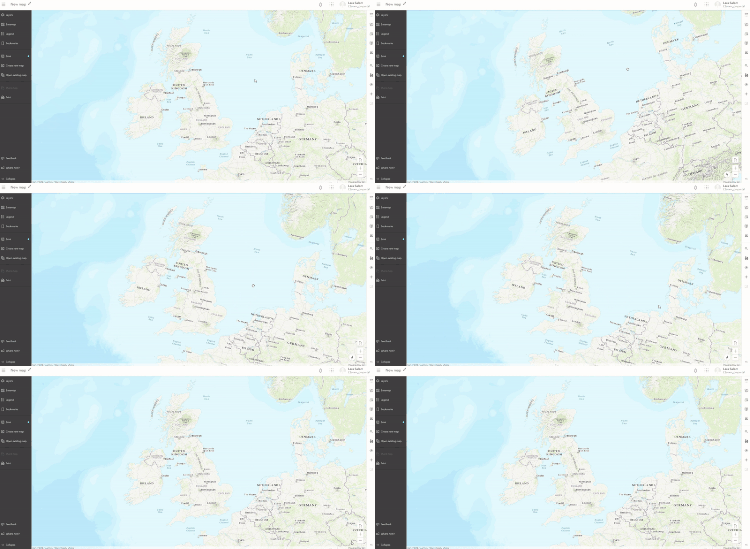
So simple, but very powerful. Right click and drag to rotate your map view and see your data from all angles.
Dot Density Maps
As we know, choropleth maps aren’t always the best representation of the underlying data. With the new Dot Density style option, see your data as individual points within their boundary. This style is great for data with a count or total field which represents the number of people, houses, or incidents within an area. For example, style census data to show one dot per person on your map and make your data that much more real.
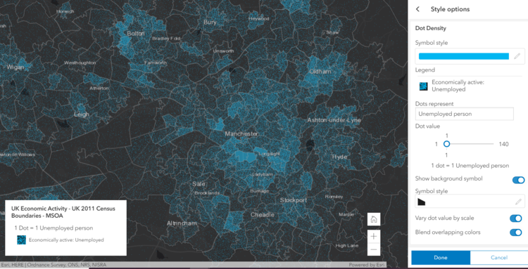
1 dot = 1 unemployed person (2011 UK Census Data, available in the Living Atlas)
1 dot = 1 unemployed person (2011 UK Census Data, available in the Living Atlas)
Colour ramps
The new Map Viewer has over 300 colour ramps for customising the look of your data. With sections for light and dark basemaps, bright and subdued colouring, and colourblind-friendly options, they are helpfully categorised to make it easier to find the one you need.
The colour ramps are also split by theme, designed to help you emphasise different aspects of your data. Here are two methods of presenting average house prices by GB local authority using different colour ramp themes.
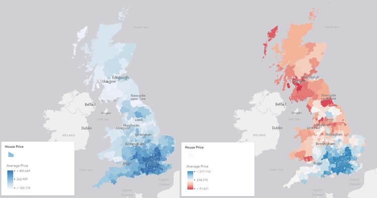
House prices in Great Britain in 2017 (available in the Living Atlas).
On the left is the High to Low theme. Use this theme when you want to highlight one part of the data. This map draws your attention to the concentration of high house prices in the South East with the darker, brighter blue.
On the right is the Above and Below theme. Use it to set a meaningful value as the centre point on the ramp and highlight areas which deviate strongly from this value. In this case, I set the national average house price of £234,370 as my meaningful value. The map now emphasises areas which are well below or well above the national average.
Pop-Ups
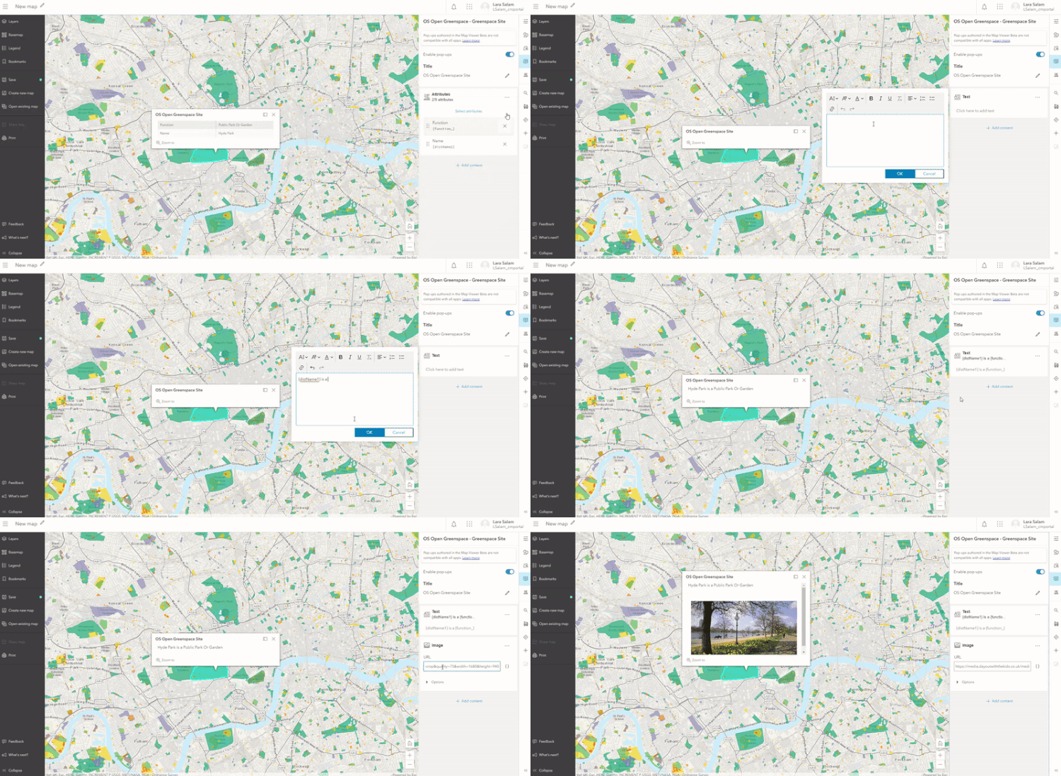
Pop-ups in the new Map Viewer give you more freedom to do things your way. Mix and match different content types, such as attribute lists, rich text and images, to create your perfect pop-up. Re-order them as you see fit by dragging and dropping them into place. Make sure to open a pop-up before you start editing and you’ll see the changes you make in real-time.
Still to come
While we love these new features, you may have noticed that a number of things are still missing from the Beta. Coming with the general release of the new Map Viewer in 2020 are clustering, tables, time animation, charts and the ability to switch between projections with your base maps. Check out the road map for more information.
How do I get access?
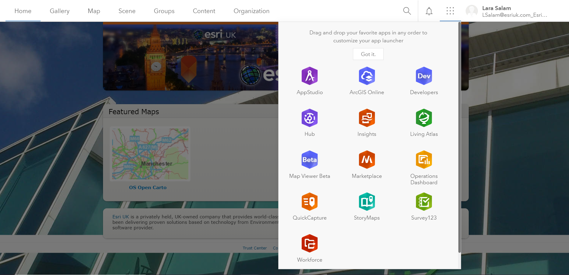
The new Map Viewer is available for everyone with an ArcGIS Online account. Head to your apps menu to find it.
For an existing web map the item details has a second Open in Map Viewer option for the beta.