What’s blossomed in the ArcGIS 2021 Q2 release of ArcGIS Pro? As a user it’s always good to see more performance improvements and there are enhancements to quite a few geoprocessing tools. But what about new functionality in Pro 2.8? I am particularly intrigued by one of them…
Data Engineering view
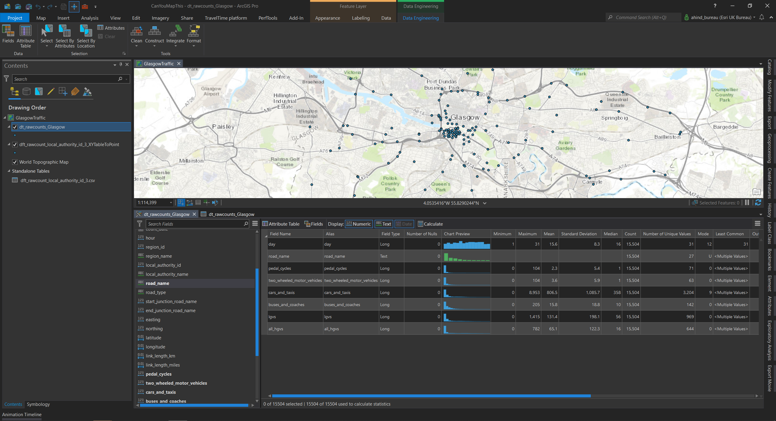
A what? The Data Engineering view is a new data-oriented view you can open for a layer. This is designed to allow you to quickly explore the data properties of the fields you are interested in. You start with a field list that also shows the data type. Then drag the fields of interest into the panel and remember to hit calculate. Hey presto! You get a comprehensive set of statistics for each field and a mini-chart to help understand the data distribution.
If you want to see a more detailed/bigger version of the chart, right-click and go direct to creating a chart item. As well as the classic stats in the screenshot above, scrolling right brings another set into view that includes: sum, range, quartiles and coefficient of variation.
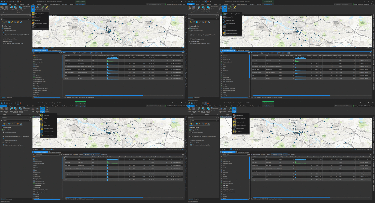
So that’s the data exploration bit, but what about the engineering? Some mapping projects start with data wrangling and the Data Engineering view includes a toolbar that has key commands and tools on it, along with activity menus for: Clean, Construct, Integrate and Format.
I can see this new approach being particularly useful with new datasets. Being able to explore and work with a layer’s data in this way could be really useful.
Command Search
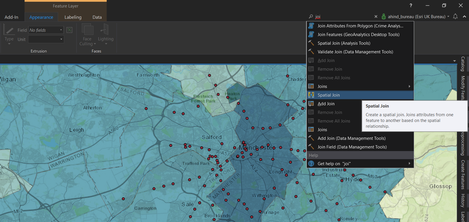
Tucked in top-right next to the login, you might not spot the new Command Search at first. With so many commands and tools in Pro it’s not always easy to remember where the less used ones are. For geoprocessing tools I use Find Tools on a regular basis, but I think I’ll now be using the new search since it covers both commands and tools. When you click in the box, or press Alt+Q, it displays recently used commands and some suggestions. Partial words work well to keep your search broad:
If a command or tool can be run, e.g. if there is a suitable layer selected, it will be highlighted and for all results the tool tip shows when you hover over it.
Accessibility improvement for PDF output
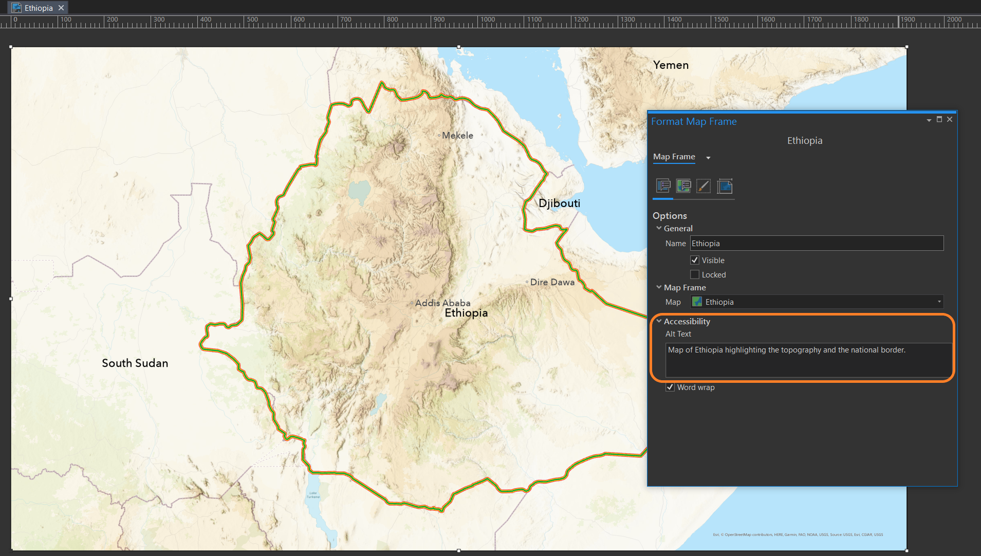
If you are exporting maps to PDF there is now the option to set up alternative text for layout elements. These are then picked up by screen-readers, making your PDF more accessible. Open the properties on your map frames, chart frames, and pictures to add the text:
When you export your layout as a PDF file, look for Accessibility and check the box to include your accessibility tags.
Remember, sometimes it’s the small updates that improve your workflows. There is now the option to have the polygon Selection colour applied as a fill or hatch, as well as the outline, to make it clearer what is/isn’t selected. Another of those small updates is a new banner message added to some tools to show if there is a faster alternative. It’s worth taking the time to check through the full set of changes on the What’s New page. You can see some of the new features in action in the video there.