One of the challenges I often face is trying to show how clusters of events (e.g. crime locations) have changed over time. ArcGIS through Spatial Analyst and/or Crime Analyst allows you to create great hot-spot maps for a period in time, but how do you create animated hot-spot maps? Here are a couple of methods I’ve come up with:
1. Using Animated Group layers
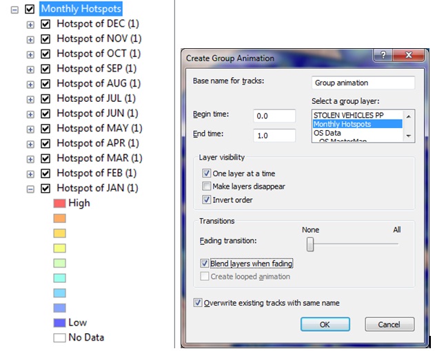
ArcMap allows users to create animations by cycling through a series of layers within one group layer one at a time either in the order they are listed or in reverse order. This is achieved by creating a hotspot for each of the time periods desired (in my example one per month) and grouping them together as a group layer.
Using the Animation toolbar, it is then possible to Create a Group Animation which will cycle through all the layers in the group one at a time. Fading transitions and blending can also be set to improve the visual effect of the animation.

NOTE: If you are animating semi-transparent layers over a background map which is also set to be semi-transparent you may experience a flashing effect. This can be resolved by setting the background layer to be completely opaque.
Additional Comments
There are many benefits to this approach of animating time data, but here are a couple I have noted:
A. It doesn’t matter what time periods we are using, so long as layers have been created. You can easily animate years, months, times, weeks etc. In just the same way.
B. You can use this method to animate through any number of layers which in turn may be grouped. For example, I have created a Group Layer which contains a sub group for each month comprising a hotspot and mean centre point location.
Relevant sections of help file: Creating Group Layer Animations
2. Using Mosaic Datasets and Time Awareness (ArcGIS 10 only)
One of the downsides to the first approach is that it doesn’t leverage the new Time-Awareness capability released at ArcGIS v 10. This makes it very easy to bring vector data with a time or date to life by playing back through time using the time slider tool. But how can you achieve the same result with raster data. I have created a number of demonstrations recently where I have created hot-spots for the same area but based on data for different time periods. Here’s how:
i. Create a raster for each time period – if your data is suitably formatted, this is a simple process to automate using an iterative model. (e.g. for each unique month, select all the data, create a hot-spot and export as a new raster using the month name as the file name).
ii. Create a new Mosaic Dataset (new at v10) and load all these rasters into it – again this could be part of the model.
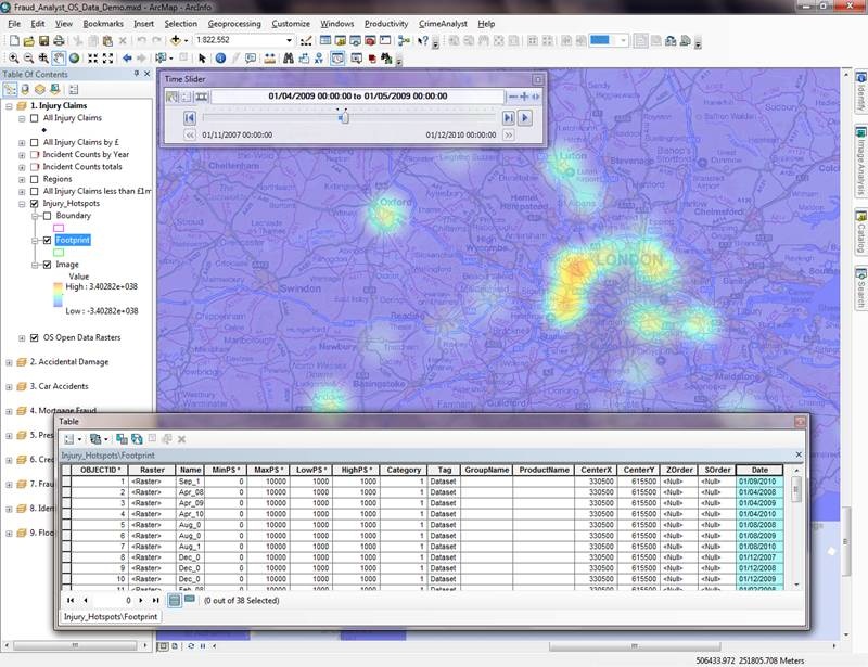
iii. When you look at the Mosaic Dataset, one part of it is the raster footprints. If you open the attribute table for the footprints, you will see that you have one record per raster that you’ve added.
iv. Now add an additional ‘date’ field to this table and populate with a date. For month based data, I set this to the 1st of that month.
v. Once this is set up, you can make the Mosaic dataset ‘Time Aware’ and use the Time Slider to animate

Additional Comments
There are many benefits to this approach of animating time data, but here are a couple I have noted:
A. Using this method, you can also publish as a time-aware service and play back through a web application, BUT this requires Image Server extension
B. By having all the rasters in the same layer, you only need to set the symbology once and you can then ensure the classification settings are consistent across all rasters. In other words, you will only get a ‘really’ hot spot for the month when the values were particularly high.
Relevant sections of help file: What is a Mosaic Dataset