Esri Maps for Office provides simple tools for looking at patterns within your data, especially high volume data, using clustering of points. A recent addition to the product now makes it even easier to create comparison maps using filtering and clustering.
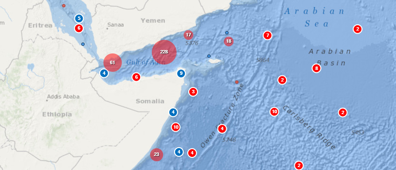
In the screenshot below I have created a map showing Piracy attacks off the coast of Somalia during the 1990s (in blue) compared with those occurring in the years 2000-2009 (in red).
Here’s how I created it:
1) I added my spreadsheet of incidents into Excel, formatted the data as a table and then used the auto filter tools in Excel to select all the incidents occurring during the 1990s.
2) I copied this worksheet to create a second table and then simply altered its name and the filter to include only incidents from the years 2000-2009.

3) I then used Esri Maps for Office to add these two tables to the map as separate layers and set up appropriate symbology – one in red, one in blue.
4) For each layer, I also chose to use the Clustering option, but for the layer symbolised in blue I then right-clicked on the layer in the Map Contents and chose Clustering Setting.
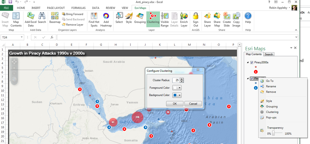
From here, you can choose the cluster colour allowing you to easily differentiate between the two layers.
The same technique could be used to compare high volume data of different type or for different time periods. It’s really easy, give it a go!