For those that have not come across Arcade before, it is a simple expression language that was introduced into the ArcGIS Platform at the end of 2016. Arcade enables you to write simple calculations or logical expressions that can control; symbology, labelling and how pop-ups are configured. You can create new fields on the fly, using a wide variety of inbuilt functions to publish and share your data across the ArcGIS Platform. And if you’re wondering about case sensitivity, Arcade is case insensitive – so you don’t have to worry about casing errors. Arcade is not here to replace Python as a scripting language. Its role is to make expressions portable across the ArcGIS Platform, from desktop to web. For more information, this blog is a good introduction to Arcade.
Arcade has been around for a while, so I want to focus on how it might be used in the real world, to enhance data and visualisations with little hassle. I’ll be using the example of deprivation in England (using the IMD data).
ArcGIS Pro
Before Arcade, if I wanted to understand deprivation change over time I would have to create a new field in the attribute table and use the Field Calculator to populate it. Now, in ArcGIS Pro, Arcade expressions can be used for symbology and labelling, without having to even touch your attribute table.
I have created a layer with deprivation ranks for 2010 and 2015 and want to look at which areas have improved and which have become more deprived.
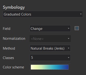
I can go to Symbology and calculate this on the fly. This can be done by clicking on the button to the right of Field:
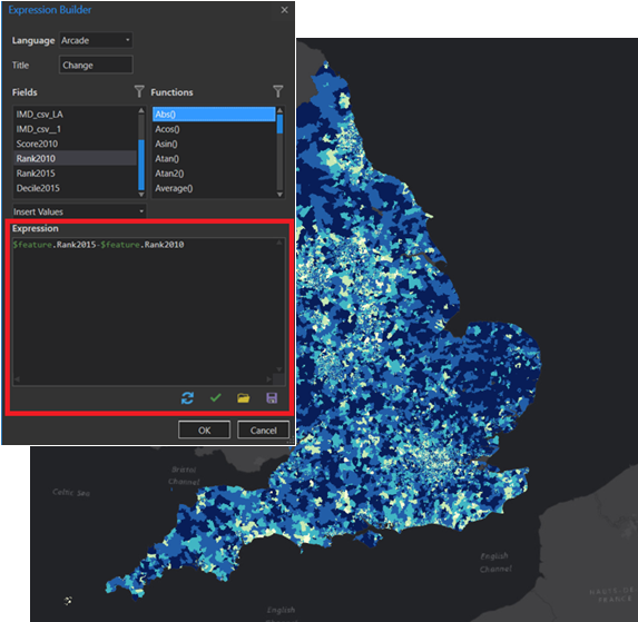
By selecting the 2015 rank and subtracting the 2010 rank, you can start to understand the changes. The darker the area, the more deprived the area has become in the past five years.
I can then publish this layer onto my ArcGIS Online Organisation, where my custom symbology will already be applied.
ArcGIS Online
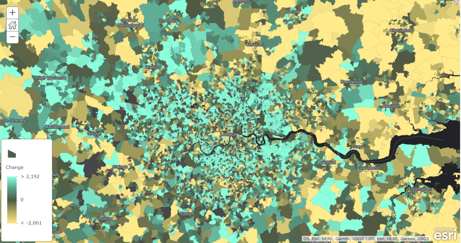
Although I understand the symbology of change over time (above), others may not. By changing the symbology in ArcGIS Online to Above and Below, you can now easily see areas that have become more deprived (<0), and those which have improved (>0).
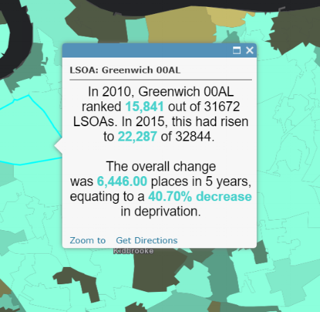
Arcade expressions can also be used to configure your pop-ups. This can reference the pop-up content’s text template, fields, and media charts. If you are feeling adventurous, you could also try creating pop-ups with conditional images. I have decided to keep mine fairly simple and just create a couple of expressions that use colour highlights to explain the change over time. Here are the Arcade expressions:
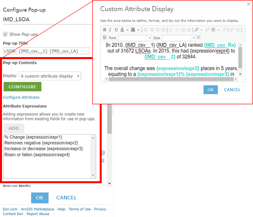
And here is the result:
The nice thing about Arcade expressions within ArcGIS Online is that any changes made to the symbology, labels or pop-ups, will automatically be included in any web maps or mobile apps that you create and share.
Hopefully this has given you an idea of what ArcGIS Arcade can do and has got you thinking about ways to utilise expressions across your organisation. If you need any more information, head over to the Arcade webpage here.
![]()