Dashboards are used to monitor people, services, assets and events – allowing decision makers to respond to data as it’s changing. Operations Dashboard for ArcGIS was redesigned last year and launched in the last update to ArcGIS Online. Last week it was released for ArcGIS Enterprise 10.6, so let’s take a look.
You can now author dashboards in your browser, ready to share with users in your ArcGIS organisation:
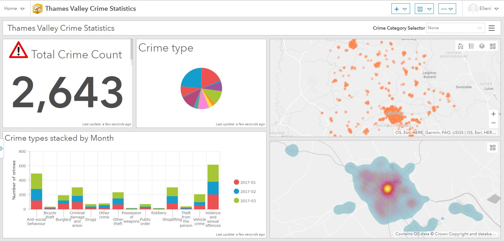
LiGHT THEME DASHBOARD
There is no longer the need to install a local application, just browse and manage your dashboards within your ArcGIS organisational content or from the dashboard home page.
Dashboard layout
Managing how your dashboard will look and function is one of the key design considerations of Operations Dashboard. Dashboard’s are comprised of elements that provide a summary of key data within a flexible panel structure. Drag and drop docking functionality allows panels that you create to have a custom layout. You can use this to dock a panel as a row, column or as a group, and resize it to your liking.
You can also customise your dashboards with colour themes, flexible layouts and HTML images.
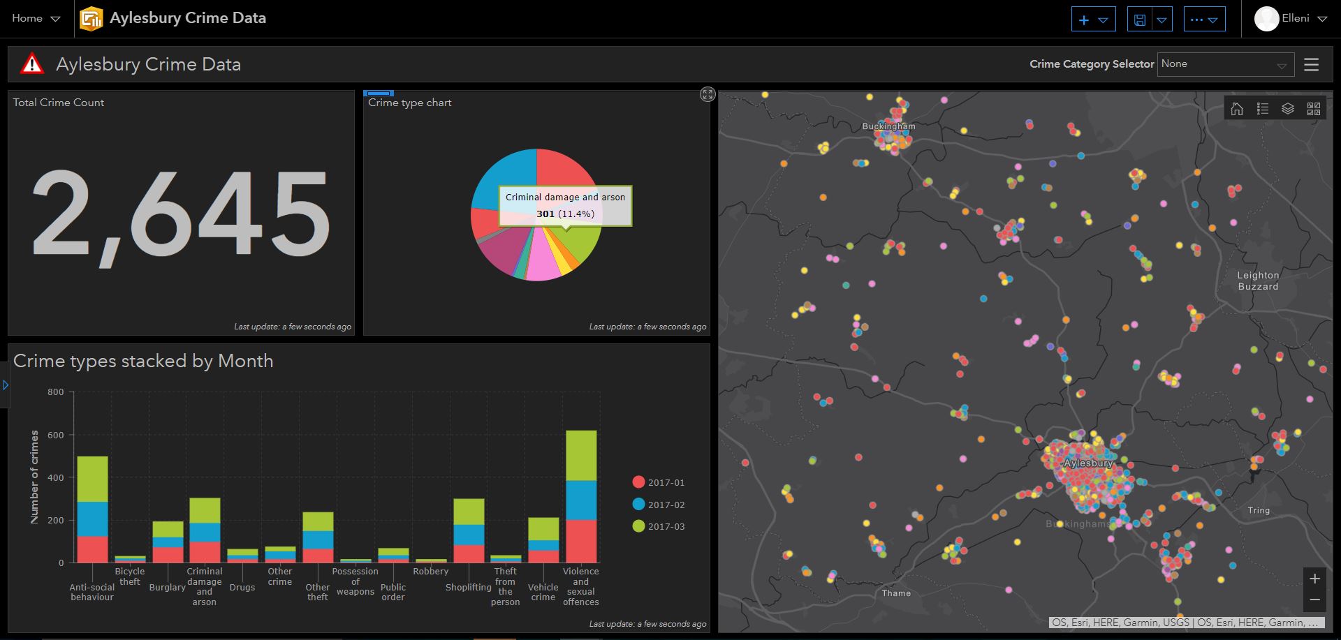
Dark theme dashboard
Grouping dashboard panels allows you to display secondary information such as charts and tables behind a main element, without compromising on that precious screen real estate. A user can then switch the grouped panel which is accessible via an interactive tab.
Grouped panels
You can specify whether you want to include a dashboard Header via the main add elements toolbar. By including this element, you can give your dashboard a title and customised logo. You can also decide to enable selector options and allow users to pick a category of data to display (once you have attached an action – see below).
In addition to the option for a header element, you can also choose to have a Left Panel. You can choose this to be a slide over panel or one that is pinned directly to the dashboard.
Map Options
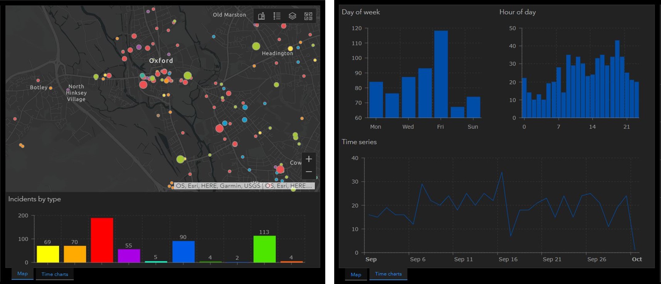
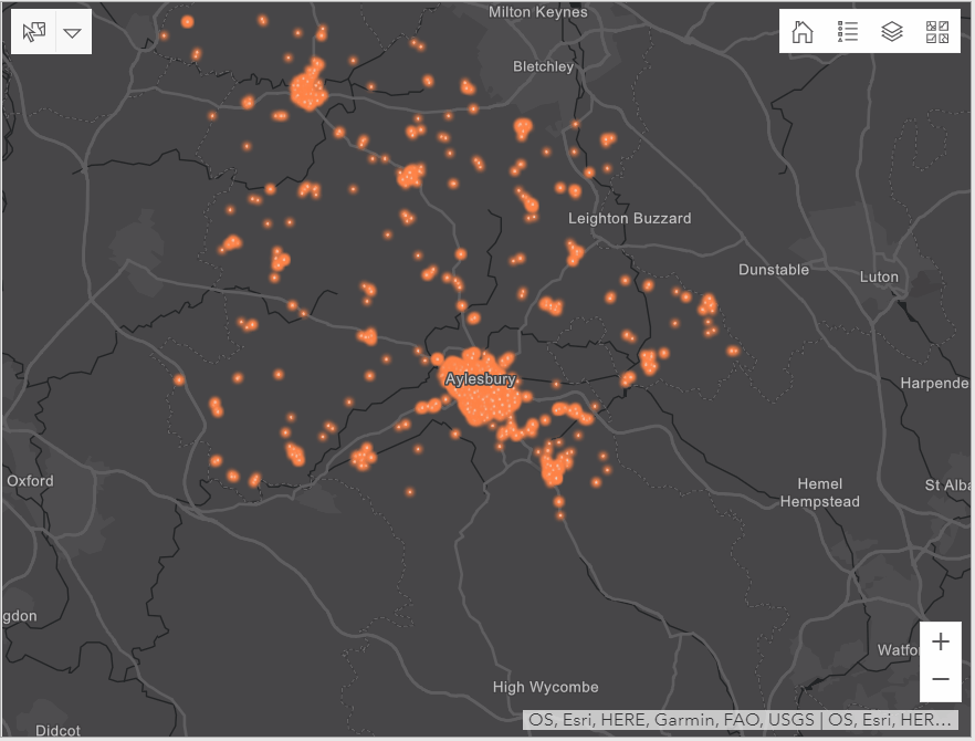
Operations Dashboard supports smart mapping (including the heat map renderer), vector basemaps, stream layers, labels, and custom pop-up content. When configuring your map, you can choose what map tools to give to the user – such as extent bookmarks, legends, layer visibility and basemaps. You can also define whether pop-ups will be visible within your map.
Charts
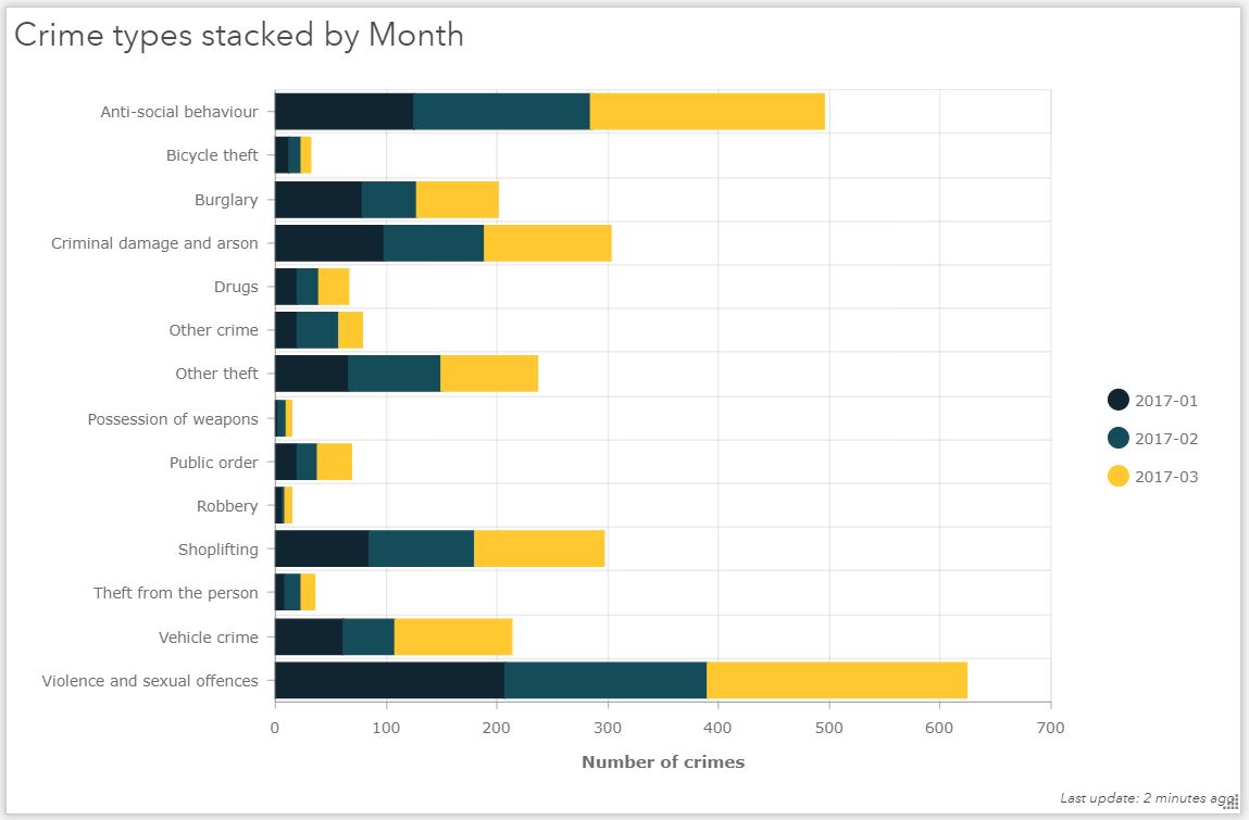
Serial chart elements give authors three styles to choose from; bar, line or smoothed line. You can also choose to stack data. Stacking data allows more information to be displayed in a single space, such a field types and date range, which can be stacked on their own, or stacked to 100%. Other configuration options include chart orientation, legend placement, axis titles, label placements and series colour. Matching series colours to the colours of your map data helps maintain dashboard design consistency.
Serial Chart
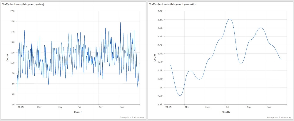
With chart elements that display data along an X and Y axis, you can parse date fields to display data at a coarser level of granularity. ‘Binning’ such data to a coarser level of detail produces serial charts that are much easier to interpret. For example, crime incident data that is captured every hour can be parsed to display by day of the week, or by the month of the year and so on.
Parse dates
Dashboard authors can control the style of date and number formatting. Within serial charts, dates on the category axis can be formatted to display as much, or as little, information about a date as the author deems necessary. Default number formats can also be overridden by the author. This configuration option allows number and date formats to conform to any international numeric format. For example, changing thousand separators from a decimal place to a comma, as is common practice in the UK.
Selectors
Interactive selectors allow a user to categorise and filter the data that’s displayed within the dashboard. Selectors can be added to your header or left panel, which trigger actions when a selection is made. You can choose whether to filter your data by category, number or date – by hovering your cursor over the panel corner.
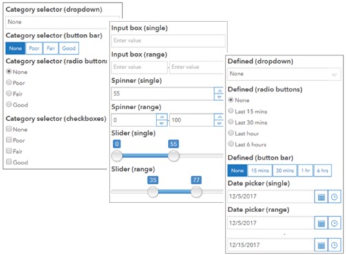
Category selectors obtain their values from features, static values and summary statistics within your data. They can be configured to display as dropdown lists, button bars or radio buttons.
Date selectors have several display options; pre-defined dropdown lists, button bars and radio buttons. You can also decide to include a date picker as a single value or ranged value.
Number selectors can be displayed as a spinner, slider or as an input box with single or ranged values.
Map Actions
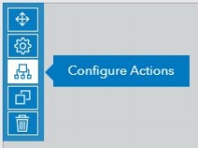
Configure actions
Map actions are a way of creating highly interactive dashboards, where your elements are linked together to allow them to communicate with each other. Like category selectors, dashboard actions can be found by hovering your cursor over your map’s top left corner. When you open up the configure actions pane, there are two ways in which you can link dashboard elements together through actions.
By selecting your web map as a source of the Map Actions, you have the option to filter any other elements within your dashboard – so as your map extent changes, your elements will change accordingly.
If you decide to set a feature layer as a source, a drawing tool will be added to your map where you can make a data selection through a point, rectangle, lasso, circle or line sketch. You can choose whether the map will zoom to, pan to or flash the selected data. You can also add a target element for filtering as you perform a selection.
It’s clear that Operations Dashboard has a huge amount of functionality – and nearly every bit of it is configurable. Map actions that make your dashboards interactive is definitely one of my personal highlights. You can learn more about Operations Dashboard in this free training seminar (you’ll need to login to access it), or use of the help pages to start making your own dashboards in ArcGIS Online.
![]()