Operations Dashboard is a configurable web app that is included with your ArcGIS Online subscription. Dashboards offer flexible and engaging views of your data to provide key insight for at-a-glance decision making. Following the initial launch inside ArcGIS Online in December 2017, Operations Dashboard was updated this month with some exciting new capabilities. This post captures my favourite features that have been introduced.
Selection on Charts
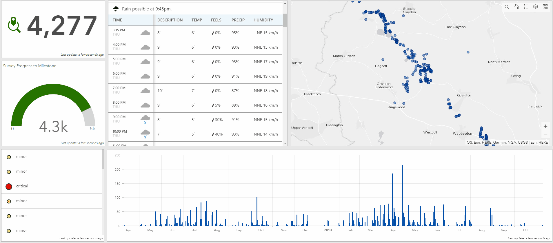
Dashboards are composed of elements such as maps, lists, gauges, indicators and charts that bring your data to life. Elements within your dashboard keep you informed when your data changes, but you can also configure elements to communicate with one another to improve interactivity through dashboard actions.
Alongside maps and selectors, charts can now be a source of actions – for both pie and serial charts. You can select a single data point, or multiple data points in your charts, and have their selection trigger actions in other elements like maps or lists.
Embedded Content Element
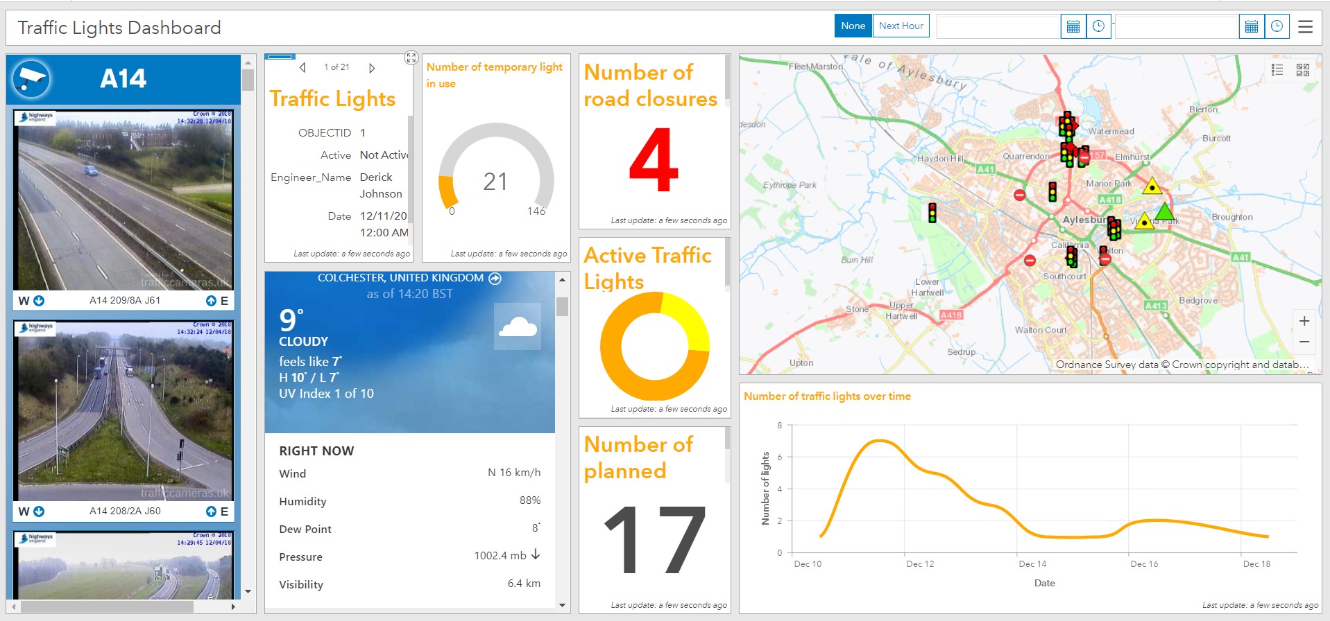
The new embedded content element makes it easy to embed documents, images and video into your Dashboard. Embedded content can be configured as static, in respect to the URL, in which case all you need to provide is the direct URL. So if you want to display weather information, a video from YouTube, or even an app or Survey form, simply enter the URL as a document to embed it.
You can also embed content by features. This means that each feature’s attribute information can be used to dynamically construct a URL at run time. This is a great way to display content from external web pages that are based upon a common key, shared in a feature attribute (like images from CCTV cameras for example). When embedding from features, the embedded content can be the target of an action such as selection on a map or list.
Here’s my dashboard with embedded CCTV pictures and a weather report:
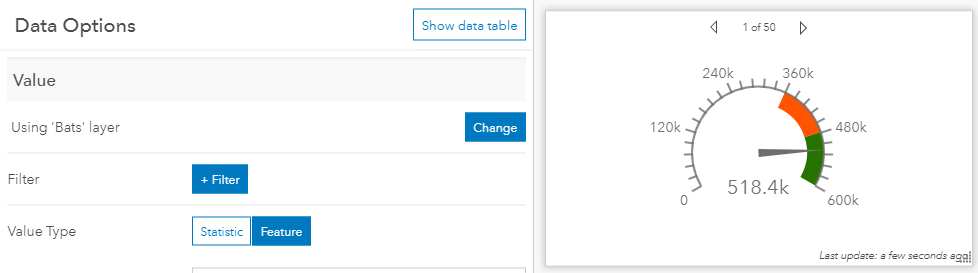
Feature-mode for Gauges and Indicators
Until now, you could only configure a gauge or indicator to use a statistic, such as an average or sum. With this release, you can now drive the value type, as well as the minimum and maximum values, directly from attributes of a feature.
Sharing Premium Content in Dashboards
ArcGIS comes with ready-to-use map layers that require an organisational subscription account to access. Some of the subscription content, premium content, will consume credits as well. You can include subscription content in your Dashboard, provide seamless access to it, and if needed, limit the number of requests it can receive to manage costs.
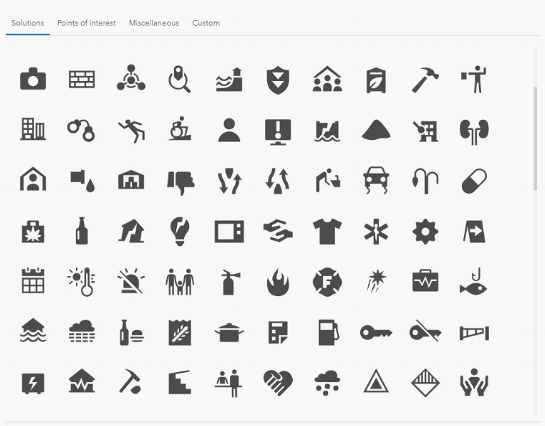
New SVG Icons
When adding an icon to your indicator or gauge, you will find Operations Dashboard has over 100 new icons in the collection. Of course, you can continue to add your own icons as well. You can also use an SVG icon as the logo within the header element as well!
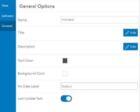
No Data Label
It is possible that your visualization may not have any data to display. Maybe it is driven by an empty layer awaiting data to be added from field apps like Collector, or the element is the destination of a selection within another element. If the element is void of any data, Dashboard will fill the empty space with a “No data” label. Now you can provide your own text that makes sense to your users and potentially gives direction on how to populate the element with data.
In addition to these new features, Actions are no longer a separate button from the rest of the configuration experience. They are now available in a unified configuration experience so that they are easier to find and manage. A full list of the new features introduced in April 2018 can be found here.
![]()