How many maps can you make using a single dataset and single theme of population based data? This is a question I posed at the recent Esri UK Annual Conference in London. For many, the ubiquitous choropleth (graduated colour) map might be the only real solution they’re aware of. It’s common. It’s well understood. It’s an obvious choice. But there are other choices available and while I can’t definitively answer the question I just posed, it’s worth thinking of the different options as part of the map-making process. I built a gallery of maps for the 2012 Presidential election and, I’ve just updated and expanded it to make a gallery of maps for the 2016 Presidential election data to showcase 30 (and growing) different techniques. In my 40 minute slot I rifled through as many of these 30 (plus a few extras!).
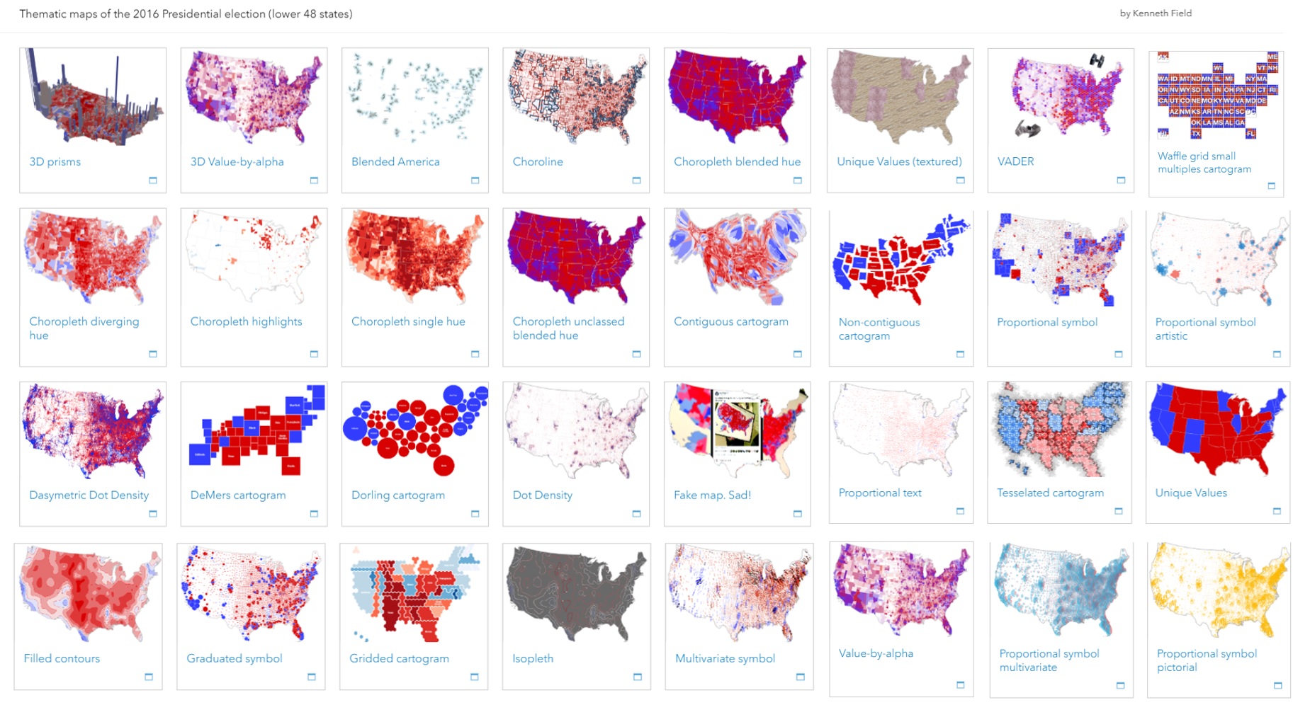
What’s the point? Isn’t the choropleth good enough? Well yes, the choropleth is a pretty good mapping technique when used correctly. But there are other maps available. By taking a single dataset it takes the focus away from the data to the map type itself. We can explore not only the fairly common thematic mapping techniques such as proportional symbol and dot density but, also, to showcase the wide range of alternative approaches that might enable you to tell a different story. These include the often derided cartogram, the much under-used isoline and all types in between. Put simply, fitting your data into a specific thematic mapping technique and expecting it to fulfil your needs is not necessarily going to work. Thinking about the story you want to tell alongside the benefits and drawbacks of different techniques will give you a way to make a better choice and to make a smarter map. Sure, you may end up making a positive choice to use a choropleth map, and that’s perfectly fine. But let’s at least explore alternatives so you can make that choice from a deeper understanding of the options available.
The presentation was a verbal version of the gallery itself. For each of the map types there’s a detailed information panel which goes into the pros and cons of the technique. It explains how a map reader will be decoding the way the information is presented and if we understand that process we can design the map to take advantage of its benefits and to hook key messages off it. It also helps to appreciate how the map can be misread and, again, some of the pitfalls of different techniques are highlighted. There’s context too, such as what you may need to do with your raw data to make the map work properly. Or, perhaps, there’s some very specific considerations for the colours or symbols you might use that can optimize the message or, at the very least, avoid ambiguity.
All of the maps have been created using ArcGIS Pro and published using ArcGIS Online. Some are out-of-the-box and use standard renderers. Others have involved some data processing to get to the final result. You may want to use a choropleth but if it doesn’t do what you want then just try out a different technique. There’s plenty of thematic map types to go around and the gallery provides you with a handy reference on the range and use of different types.
Kenneth Field
![]()
Kenneth Field talks and writes about cartography, teaches and occasionally makes maps, with Esri. He blogs (cartonerd.com), tweets (@kennethfield), is past Editor of The Cartographic Journal (2005–2014), and current Chair of the ICA Map Design Commission (mapdesign.icaci.org). He’s the author of the best-selling book CARTOGRAPHY and recently taught a MOOC to over 35,000 people interested in making better maps.