Web App Builder, Story Maps, Operations Dashboard, Survey123 the list goes on. At Esri, we provide many out-of-the-box applications, making it easier for you to understand your world.
These apps have a default look and feel, but we often hear from users who want to re-style their apps to align with their organisations brand. **Spoiler alert** – this is entirely possible, and, in most cases, is super easy.
Why should you care?
Organisations invest large amounts of money each year developing their brands and want this to permeate through to platforms and tools that are adopted within their business. Esri users are no different.
We want to make it easy for our customers to take Esri apps and design them so that they look and feel like their own.
Considerations when branding your apps UI
Colour
This is probably the single most important aspect when aligning your brand. Just think how strange if would be to see an EasyJet themed app using a bright green colour palette! Make sure you match the app’s colours with your approved corporate colours.
Fonts
Consider what your brand’s default fonts are – do you want these to be included in your ArcGIS apps? Several of our app builders support custom fonts.
Logo
All our app builders support adding custom logos. Don’t miss out on the opportunity to add yours too!
Tone of voice
We regularly overlook the importance of the tone of voice on a website or application, but it is just as important as logos and colours. Decide whether your app needs to have a friendly or formal tone.
Button and link styles
Call to actions are the places where we want our users to click and interact with us, so take the time to ensure that buttons and links feel familiar in style.
How to pull your brand into ArcGIS?
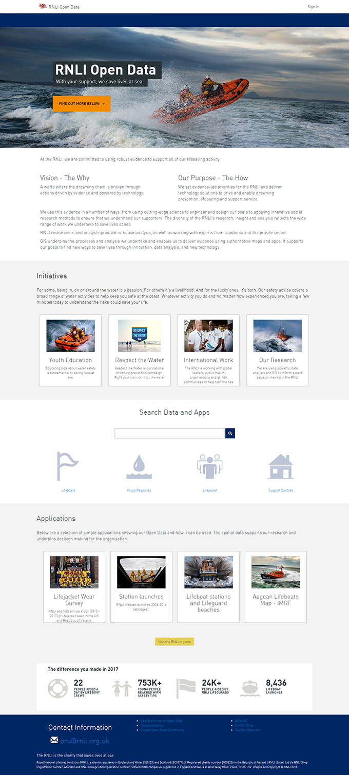
We recently showcased several RNLI branded out-of-the-box applications at the Esri UK Annual Conference . We will explore two of these apps and examine the steps we considered when branding their UI.
ArcGIS Hub allows you to quickly and easily create your own Open Data. It allows for a certain level of customisation on your Open Data site, through its Site Editor interface. The Theme Builder allows you to change the default colour values for the page background, buttons, text and links.

There is also the option to import custom web fonts into the application via the Customize Theme Fonts option. This allows organisations to use their own corporate fonts. In the RNLI’s case, we used their pre-approved Din font family.
A combination of these styling options and a custom font can ensure you get the correct look and feel for your Open Data site – keeping it very much ‘on brand’.
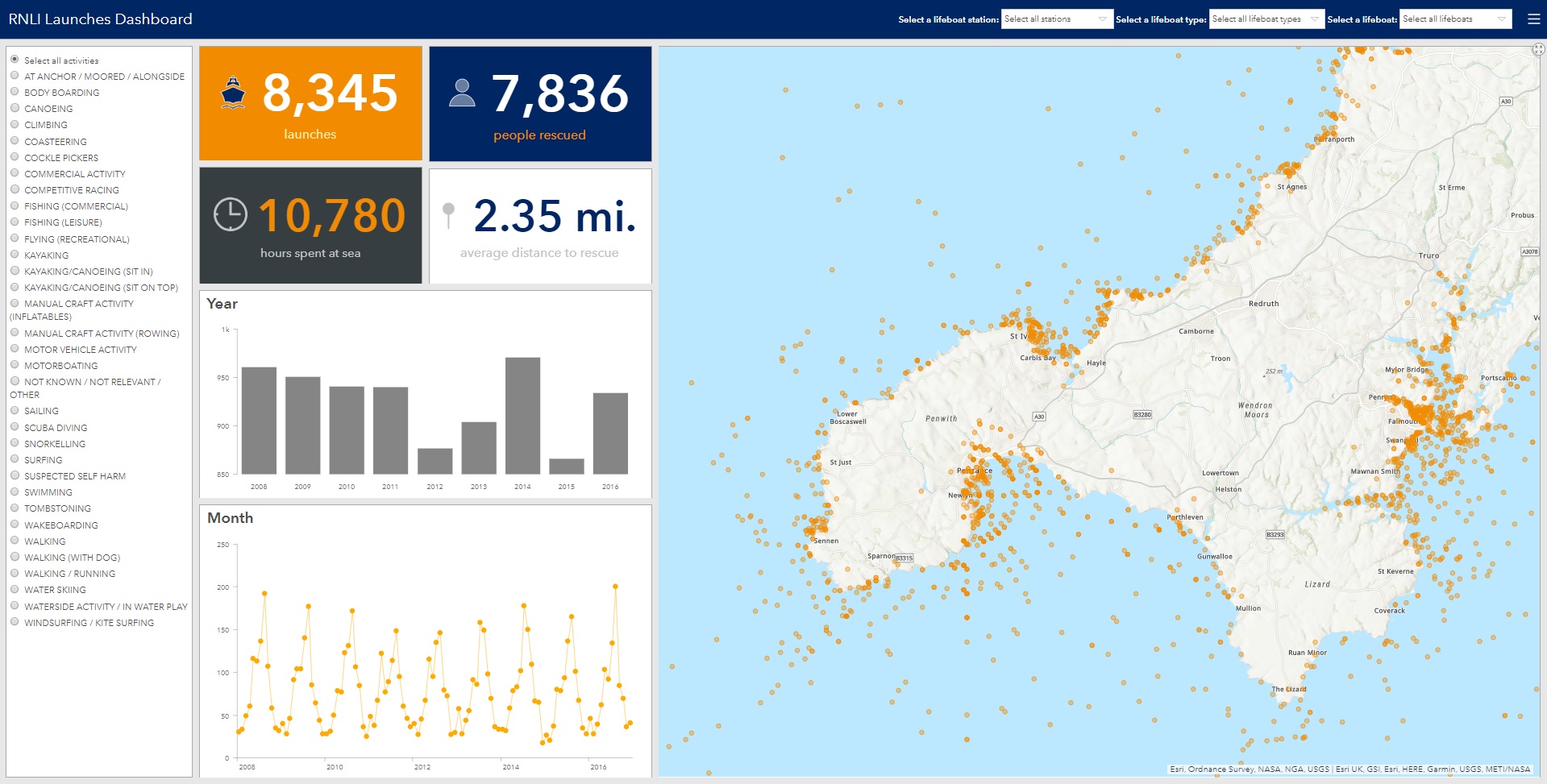
Operations Dashboard also provides flexibility in terms of styling and branding.
Individual widgets on the page allows you to choose from a plethora of predefined colours or specify your brand colour in the hex colour box. In the RNLI example, we adopted their corporate colours to give it the RNLI look and feel.

Combining this simple styling with ‘on brand’ cartography and well designed, scaled and coloured symbology we can easily create a very distinct and individual Operations Dashboard that fits brand guidelines. In this example, we have married the symbology on the map with the colours of the chart graphics to create a level of consistency.
Need help branding your apps?
I hope you have enjoyed reading this post and want to learn more!
If you would like to discuss branding your ArcGIS apps, feel free to contact our UX team via ux@esriuk.com.
Happy branding!
![]()