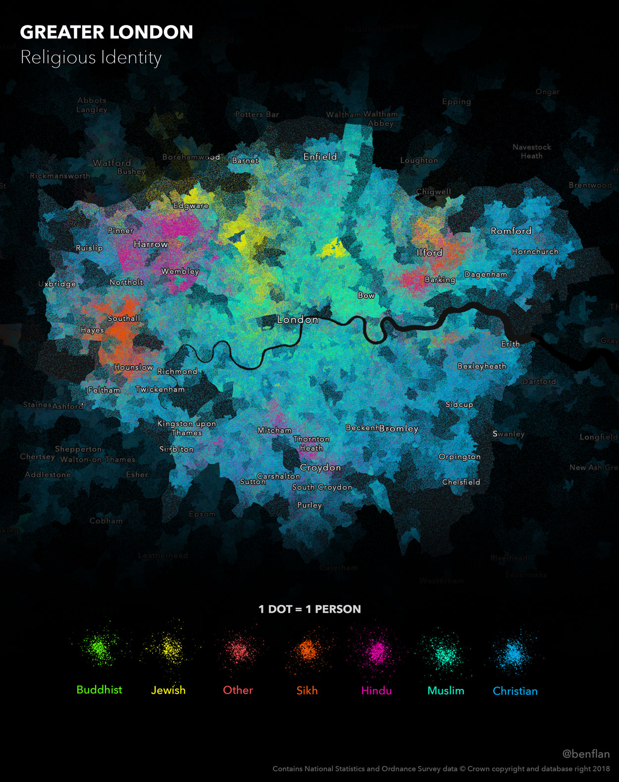
This is a dot density map which reveals religious identity across London. Each person is represented by a single dot – the colour depicting religious allegiance. So how did I create it?
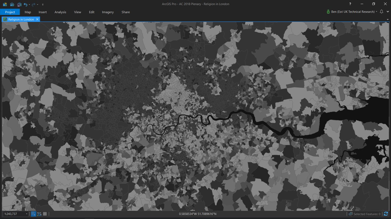
I started by adding the ‘Lower Layer Super Output Areas Boundaries’ layer from the Living Atlas into ArcGIS Pro. The data was published by the Office for National Statistics, the UK’s largest independent producer of official statistics. I enriched this layer with information from the 2011 Census to create a choropleth map of people who identify as religious – in England and Wales, that ‘s almost 38 million people. I normalised the data to provide rates (% of population who identity as religious) and created this map…
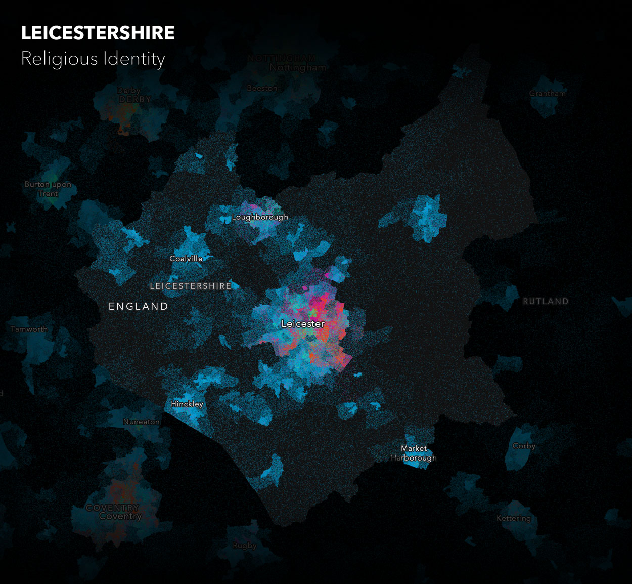
This is an effective map and shows where religion is more popular. However, there are plenty of other techniques available. At ArcGIS Pro 2.1, it became possible to create dot density maps. Dot Density’s are really effective at normalising by geographic area as we can effectively represent each human being in our data as a single dot. I decided to have a play with this method – take a look at my result below.
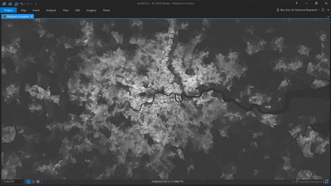
Cool right? Now areas with fewer people start to fade away, whereas areas with greater numbers of people become more prominent. These maps not only look interesting, but they help to make the data more tangible. I took this a step further by injecting colour to reveal religious allegiance.
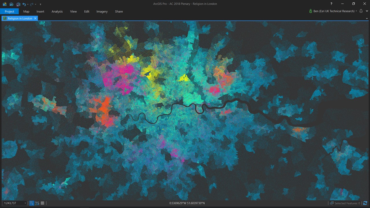
This is now a multivariate dot density map and helps to reveal patterns in the data that would have otherwise been hidden.
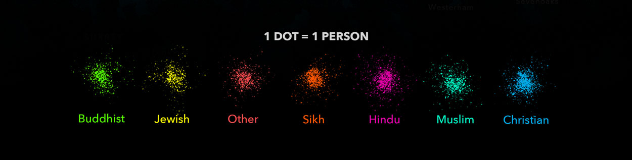
After creating the map, I needed a legend. I could have used the default legend, but why stop there? After studying the map for a while, it began to remind me of something I had seen before – powder paint!

So why not create a power paint inspired legend? I created seven random paint splatter images and added matching labels.
After adding labels and a mask to my map (a trick I often use to help focus the readers eye), the map was finished!
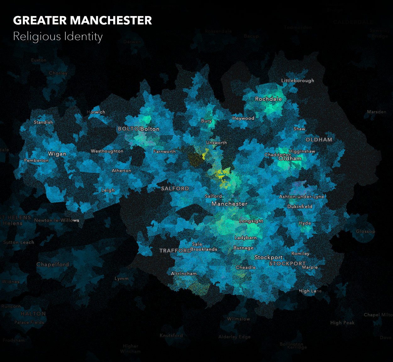
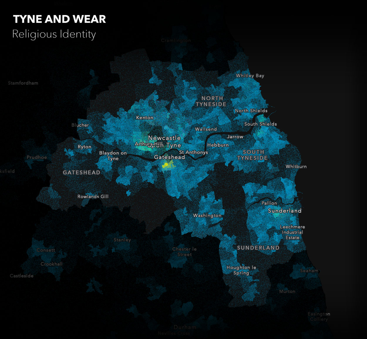
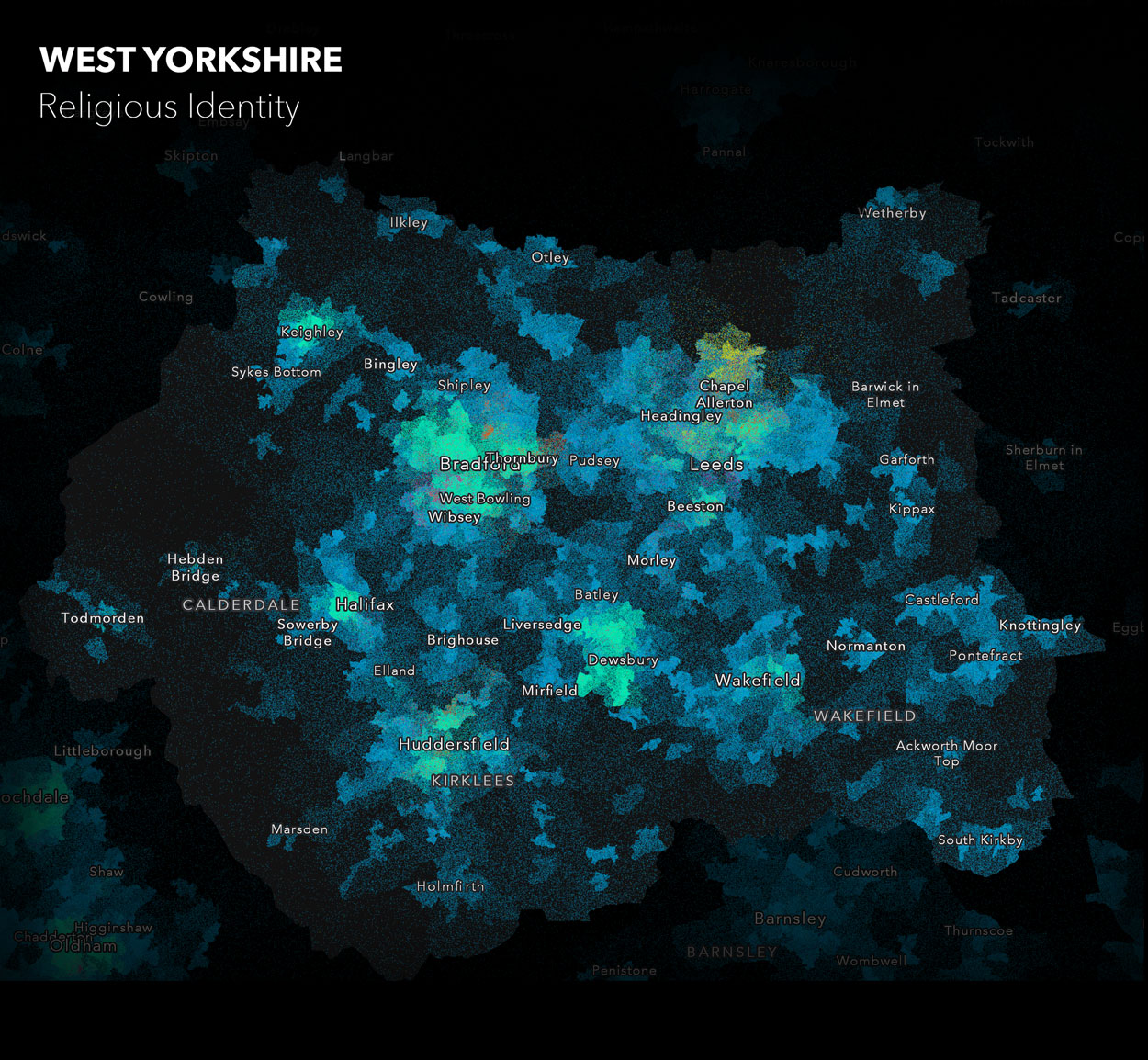
There are many other cities in England and Wales where we can use this effect to reveal religious identity. You can see a few of these examples below!
If you’ve enjoyed my walkthrough and would like to reach out, you can connect with me on twitter @benflan or feel free to drop me an email: bflanagan@esriuk.com.
![]()