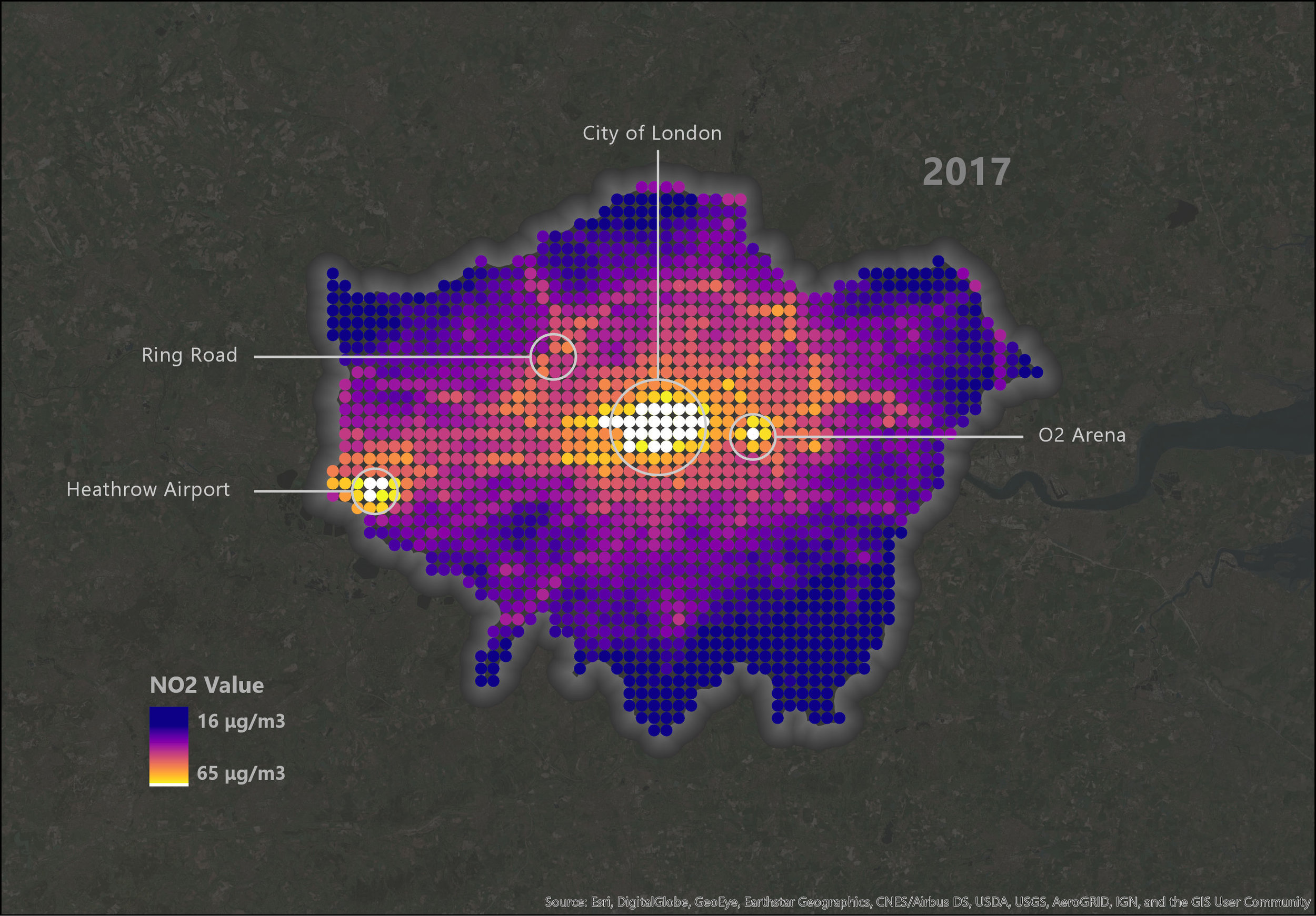
Over 8 million people live in Greater London, with roughly 11.9 million vehicles travelling their road’s in 2017. That’s a lot of vehicles emitting and a lot of people breathing. Vehicles are one of the main sources of toxic NO2 so, in the wake of the government’s new Clean Air Strategy, where do UK city’s need to clean-up their air? London seems like a good place to start.
How was this map built?
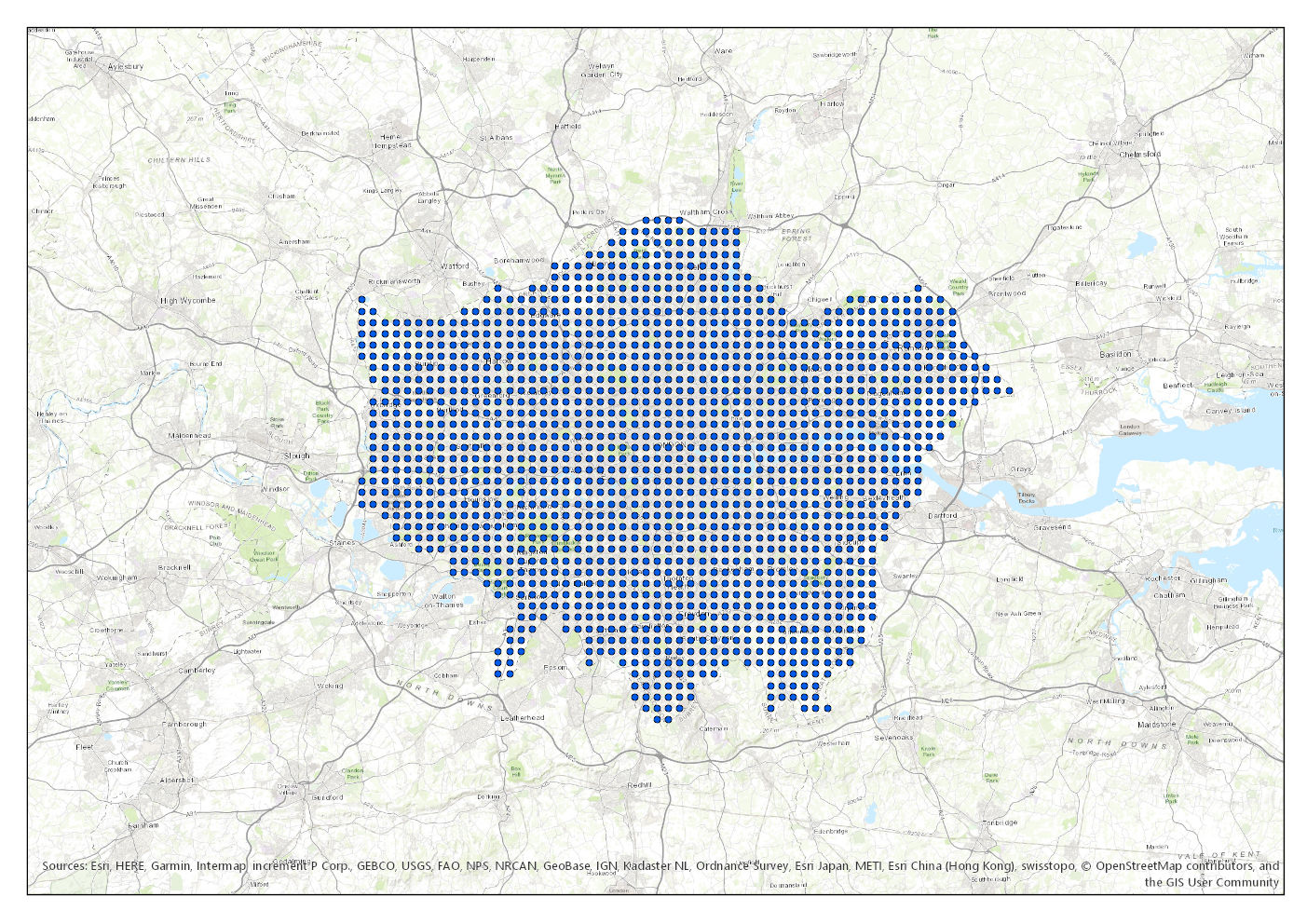
Here’s a map showing NO2 concentrations across Greater London in 2017. Loading in Defra’s NO2 air pollution data, the linear columns and rows of points were pretty satisfying. This made my job a whole lot easier.
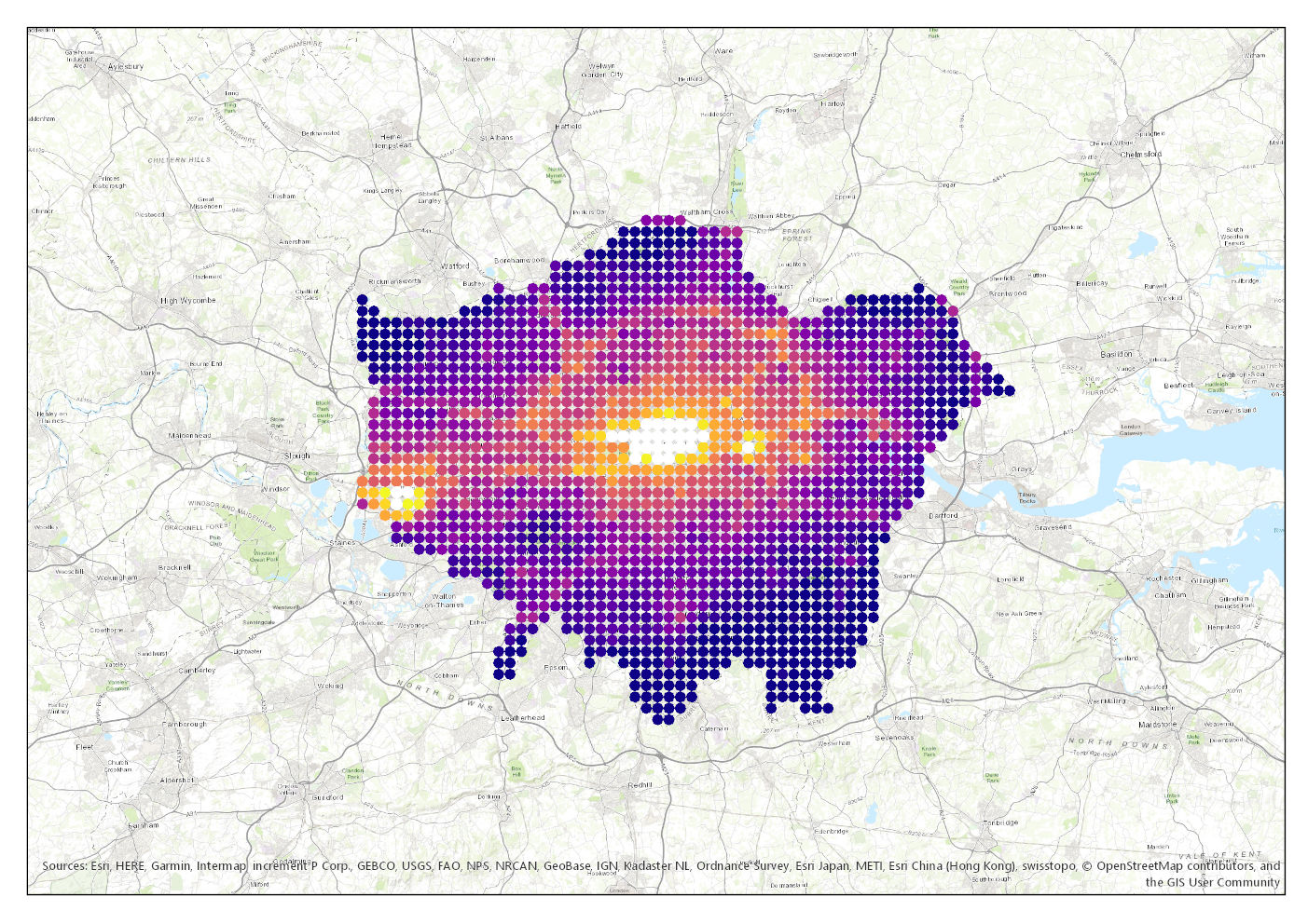
But the symbology wasn’t quite as appealing. It wasn’t telling me much about NO2 levels. Nothing like a good old colour ramp to sort that out, or even a new one; introducing the new plasma colour ramp. The hotspots were now looking nice and vibrant and you could begin to pick out London’s road network.
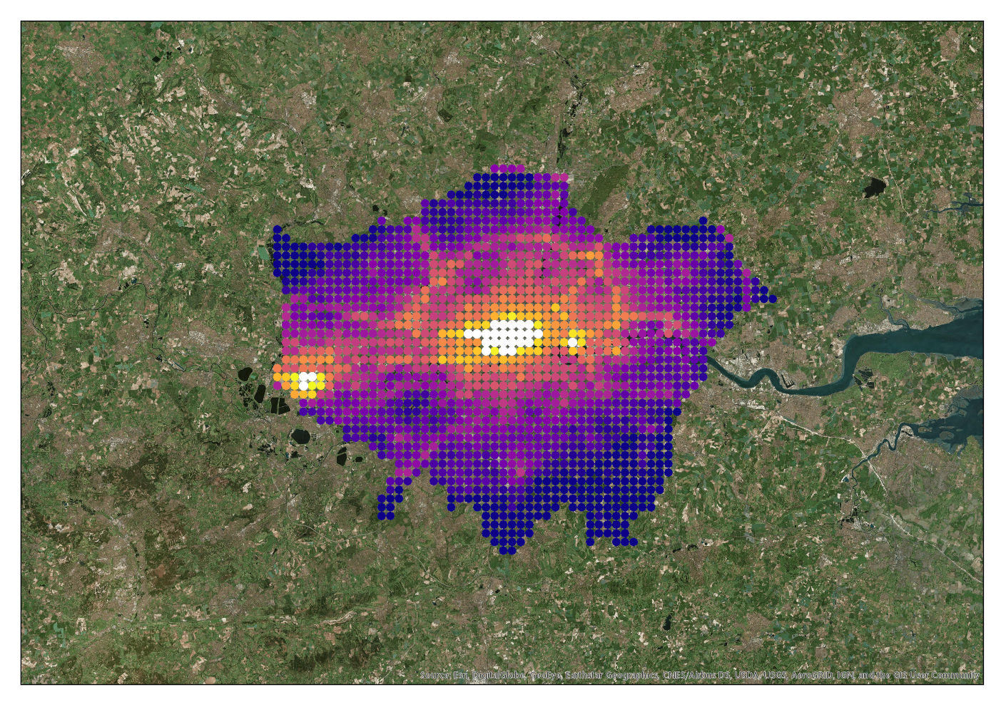
With a few tweaks to the point size and swapping the Topographic basemap to Esri’s World Imagery layer, the map began to come together. The devil is in the detail though.
Inspired by Esri’s cartographer, John Nelson, I wanted to make it very clear where the area of interest is. Why re-invent the wheel? Adopting his technique, I masked out the surrounding area, adding transparency for context. After adding a buffer around Greater London’s boundary, the hotspots really began to glow.
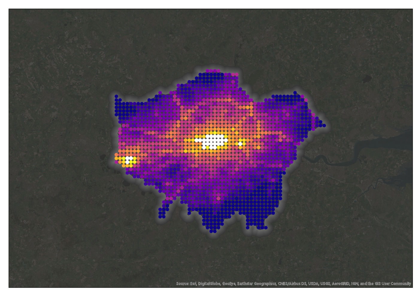
With a few labels to pinpoint the highest levels, we can now see that Heathrow airport, the City of London and the area around the O2 arena should all benefit from this new clean air strategy.
Where in your world do you need some cleaner air?
Happy mapping.
![]()