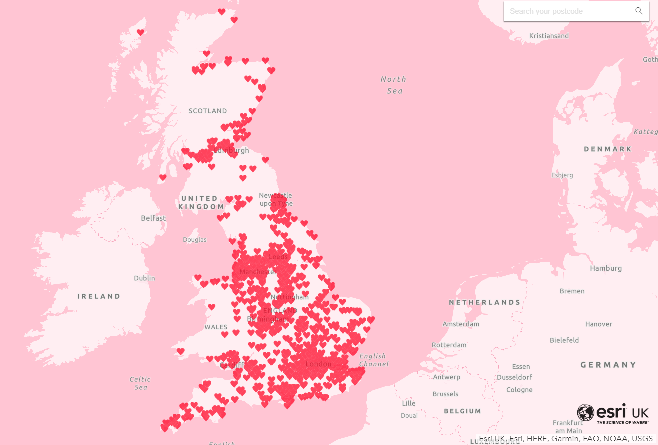
Valentine’s Day has come and gone for another year. To celebrate, you may have seen that we created a map showing the most romantic street names in Britain, styled up to be as pretty and pink as possible.
Love it or loathe it, read on to learn how to make your own colourful and animated web maps.
Basemap - Think Pink
Let’s start with the basemap. I knew I wanted a nice, bright pink to get everyone into the Valentine’s spirit. However, as I’m sure you’re aware, there is no default pink basemap to choose from the basemap gallery.
So, how did I do it?
The ArcGIS Vector Tile Style Editor is the answer. It allows you to customise any of the existing Esri vector basemaps. Simply select a basemap and you can edit the colours and labels to your heart’s content. I chose the Light Gray Canvas and got to work making my sickly-sweet basemap.
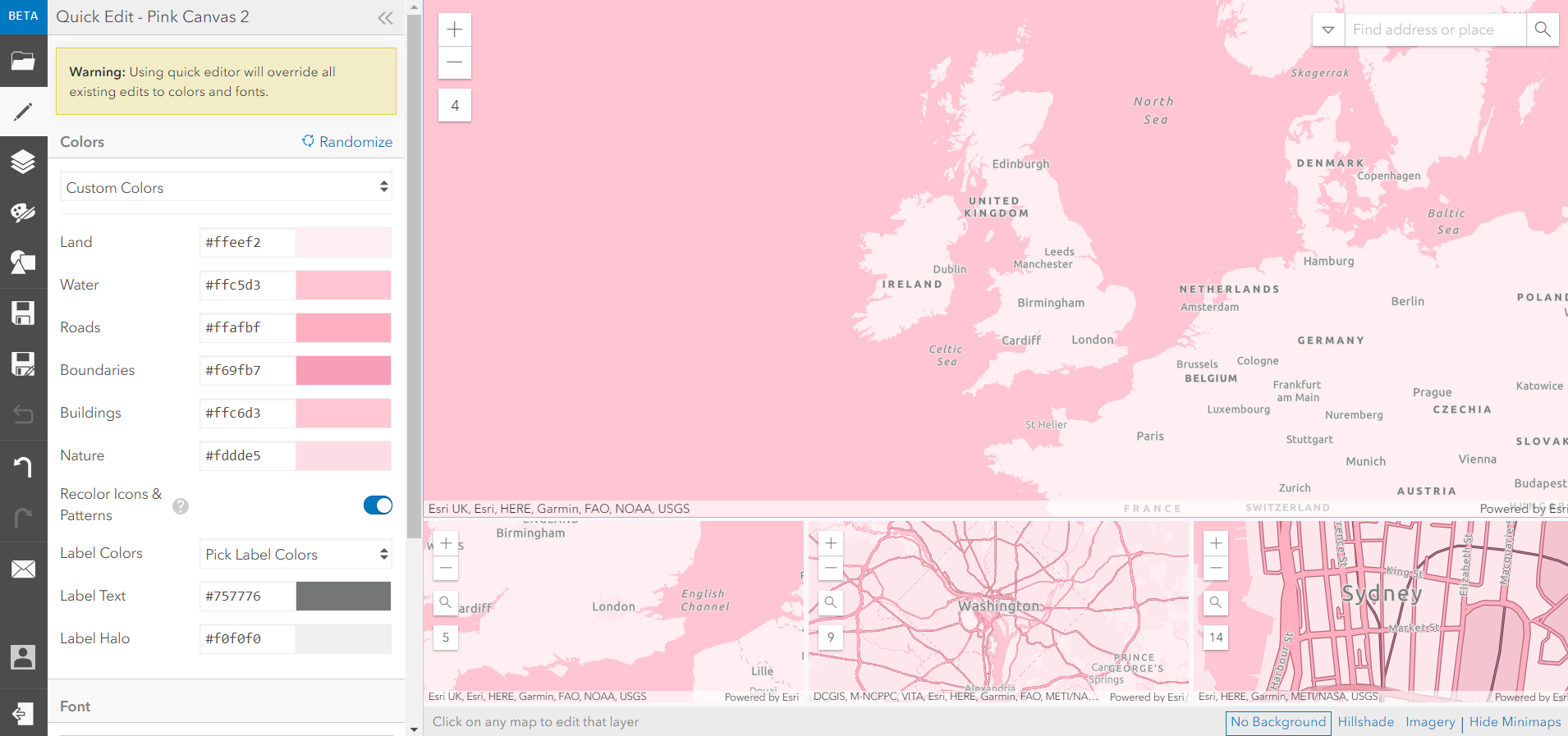
Pink is the new light gray.
When you’re finished, save the style and it will instantly appear in your ArcGIS Online account. Use it in web maps, web apps, or anything else you fancy.
Getting to the heart of animated points
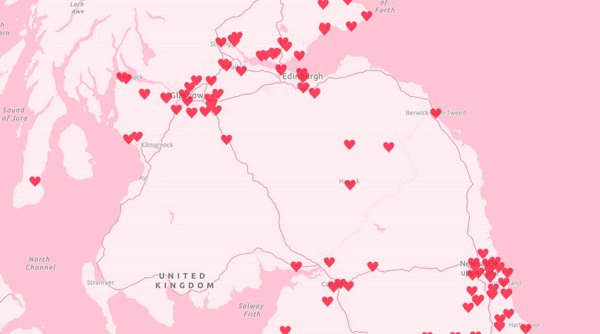
Now for the animated point symbols. Did you know that you can use a GIF to symbolise your points?
If you want to add a little life to your map, GIFs are a great way to do it. This blog article takes you step-by-step through adding your custom images as point symbols, but the most important bits are:
1. Find or create your GIF (be as bold as you want!)
2. Host your GIF online
3. Add it as your point symbol
And there you have it - beautiful animated point symbols.
Combine it all together and you have one tooth-achingly sweet Valentine’s map.
![]()