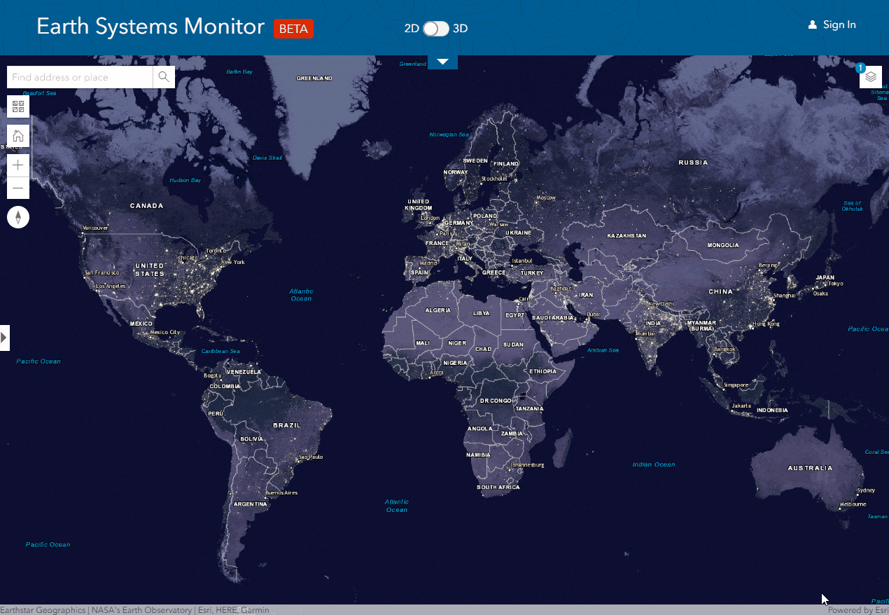
If you are interested in exploring a wide range of environmental, observational and socio-economic data, then the Earth Systems Monitor is the perfect app for you! This new Esri web application (currently in beta) allows you to discover the world around you using data from the Living Atlas of the World.
Through this blog, I hope to pique your interest into checking out the wide range of capabilities and datasets this app has to offer as well as encouraging an appreciation of the world around us. I can assure you, it’s well worth a look!
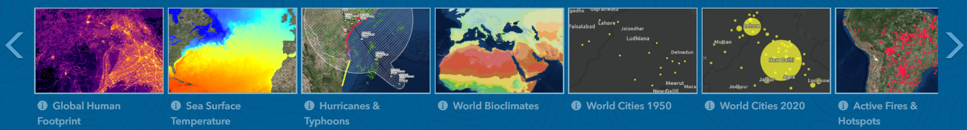
This app is jam-packed with various tools to help you explore the data. The Dataset Gallery can help you choose and combine over 29 different datasets.
By hovering your cursor over a particular dataset, you’ll see the options for adding data to the Map Viewer. The Eye symbol adds the data as the only visible layer whilst the Down Arrow adds all selected data as visible layers – these layers can then be modified using the Layer List. Be aware that some of the datasets require an ArcGIS Online named user account to access the data.
Once data is added to the map, the Content Panel at the left-hand side displays information about the selected dataset.
A favourite map feature of mine is the 2D/3D Toggle. This transforms the data from a 2D to 3D map, letting us examine and visualise the data in a whole new way. I’d recommend looking at the Air Routes dataset in the 3D view and see where some of the most congested airways are located.
Now let’s take a look at the data itself. From Shipping Routes to Landsat Imagery, Current Wind and Weather Conditions to Water Storage - there’s something here for everyone. Here’s some of my own favourites.
Earth at Night
This is undeniably one of the most aesthetically pleasing maps!
This dataset displays a global composite image of the Earth at night and beautifully illustrates the complex patterns of human activity and settlement worldwide. The brightest areas are more prevalent along coastlines where cities tend to flourish. Let’s focus in on South/South-East Asia – here, you can easily pinpoint all the major cities & observe the differences in urban development throughout a region e.g. North & South Korea or Eastern & Western China. By contrast, some of these regions appear sparsely populated and unlit.
This night-time light imagery has been used for a wide variety of applications such as short-term weather research and forecasting, monitoring energy efficiency and growth of urbanisation, tropical rainforest/coastal conservation and disaster aid response.
Armed Conflict Events
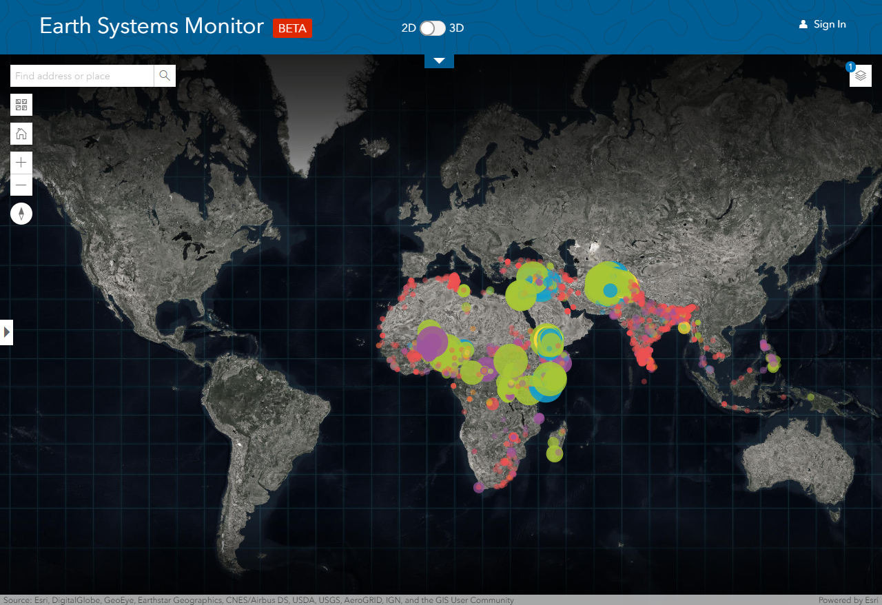
Whilst this dataset may not directly apply to the UK, it certainly caught my interest. I was shocked by the abundance of ongoing political violence, occurring mainly in Sub-Saharan Africa and the Middle East. This map does an effective job of highlighting attacks which have been overlooked, alongside those more highly reported incidents.
This weekly updated data is collected from the Armed Conflict Location & Event Data (ACLED) project and is based on news reports, civilian posts, human rights organisation publications and international organisation security updates. The dataset includes information on the type of violence and reported death toll (both displayed in the default symbology).
Sea Surface Temperature
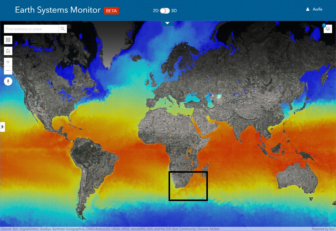
As an environmental scientist, it’s no surprise this was one of the most appealing datasets to me! Based on MODIS observations from NASA’s Aqua satellite, this dataset displays a daily updated, global map of the average sea surface temperature.
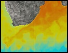
Agulhas Current off South Africa.