We’re all aware that you can use ArcGIS Pro to produce stunning visualisations in both 2 and 3 dimensions. But did you know that you can also tackle the 4th dimension?
For those of you who have tried to blot out as much of their school physics lessons as possible, the 4th dimension is time. If you work with time enabled data in ArcGIS Pro, you can create animated maps that show how your data varies over time as well as location. Time can be a fundamental aspect in understanding patterns in spatial data, and let’s be honest, an animated map can look really cool.
If you’re thinking this is beyond you, then think again. Read on to find out how to use the time slider and animation tools in ArcGIS Pro to easily create your very own videos showing change over time. In this example, we’ll be animating the movement of London Marathon runners over the past 5 years to show which nations have the speediest joggers.
What do I need?
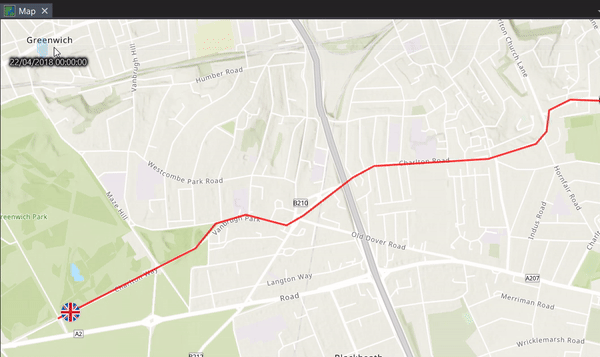
Let’s start by considering our data. After a bit of preliminary data processing, I have two essential elements which will be used to make the animation. Firstly, I have a polyline showing the route of the marathon in its entirety.
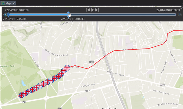
 Anyone else getting out of breath just looking at this?
Secondly, I have the average run times of the top 15 participating countries from 2014 to 2018.
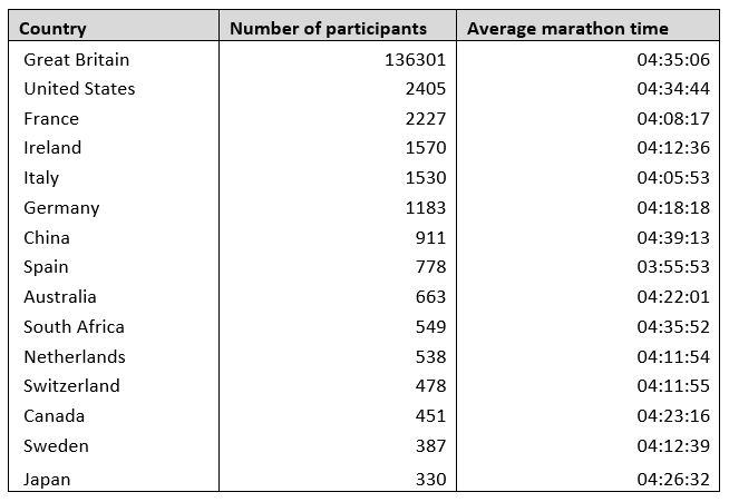 This is open data, by the way. You can find marathon results for up to 10 years back at this page .
Next, I need to tell ArcGIS Pro at what time each country was at each point along the marathon route. From this, it can then create a series of static frames which will form an animation of the countries running along the marathon route at different speeds.
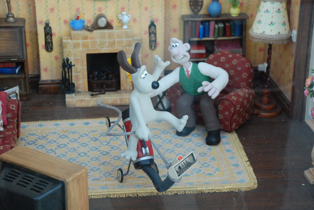
If you’re lost, think of traditional stop motion animation films such as Wallace and Gromit. Taking lots of still images that change ever so slightly results in a smooth, fluid animation when played back.
Data crunching
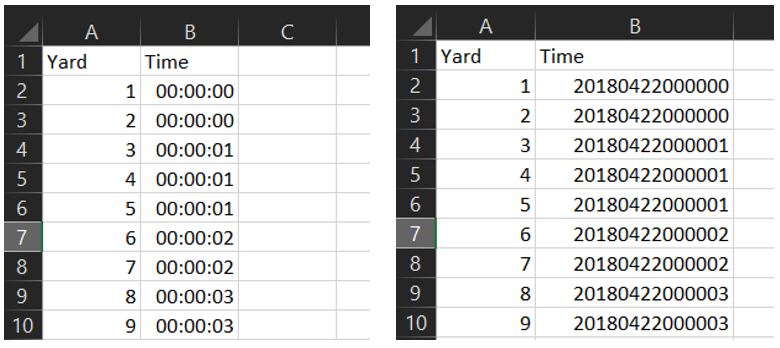
Now for the serious stuff. I first needed to break down my line into points so that the time values can be assigned along the route. This needs to be done for each country, resulting in 15 individual point layers. Choosing the number and spacing of points is a balance between a smoothly-finished animation and having a crazy number of points to work with. Feel free to experiment at this stage to figure out what you need. As a marathon is 26.2 miles, I decided to create a point at every yard as I wanted as smooth an animation as possible.
In Excel, I generated a table for each country using the final marathon times. The ultimate goal is a field that moves incrementally forward in time, corresponding directly to the increasing distance along the route. These tables were then joined to the point layers using the yard field.
A note about times in ArcGIS Pro:
It’s important to be careful when bringing your table of time data into ArcGIS Pro as it won’t accept just any format. Your time must include year, month, day, hour, minute and second data, even if it’s not pertinent to your animation. Trying to input just hh:mm:ss data will not work, so choose a random day for your times if necessary.
Additionally, not all time and date formats are accepted. Here’s a useful page showing you the supported time formats, so you don’t waste your time importing and joining all of your data together to realise it’s not going to work.
If it sounds like all this came from experience, I can assure you that it most definitely did.
Left: what not to do Right: You’re onto a winner
So, you’ve got your points evenly spaced along your route, with each point containing its own assigned time value. What next?
Sliding through time
You can now enable time for your layer. Right click the layer and go to the properties, then to the Time tab. Fill in the properties as follows:
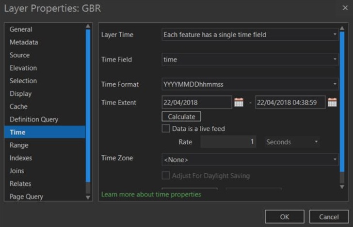
Don’t forget to press the calculate button to make sure all your data is included in the final result.
A time slider should now appear in your map window. Play around with it to see your data slide back and forth along the route.
But this isn’t really what we want. We want to see a single point moving along the line. Not to worry, you should have noticed that a contextual time tab has appears in the ribbon along the top of your screen. Navigate to the current time group and change the span to 0 seconds.
That’s better.
Lights, camera, animation:
The moment we’ve been waiting for, the animation. To create your animation, go to the view tab and press Add in the Animation group. This will give you access to the Animation tab at the top of the screen. In here, we can start creating our final product.
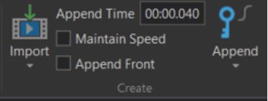
The key to a nice, smooth animation is to have enough frames per second that the movement in the video flows together without noticeable jumps. Remember Wallace and Gromit? For a 25 frames-per-second video, each frame needs to be shown for 0.04 seconds. Therefore, before you import your frames, set your Append Time to 00:00.040
Now to make the magic happen. In the same group, click Import > Time Slider Steps. This will create your animation, with one frame for each step in your time slider. You can now add image and text overlays to add context to your animation, or leave it as is. I decided to add an animated map time overlay to give an indication of the real-life results.
When you’re ready, export your animation to a video, get out the popcorn, and dim the lights.
It’s showtime.
![]()