Updated and republished in August 2024 to reflect changes to the ArcGIS user types.
Access to the imagery capabilities in ArcGIS Online has been expanded and they are now available for user types Creator and above (previously an ArcGIS Image for ArcGIS Online license was required). The blog was edited to reflect these changes.
Picture this – 4,000 active satellites orbiting the earth, sensors whirring (I know that they’re not making a sound because space is a vacuum but I’m taking artistic license). Some of these capture high resolution imagery, which provide organisations with a better understanding of their areas of interest. Closer to earth, planes, drones and even hot air balloons are doing the same. Beyond visualisation, imagery reveals a breadth of information about a region, such as vegetative health, elevation, soil moisture, building footprints… I could keep going. And when you bring this information into the cloud, its effectiveness goes a step further. With ArcGIS Online you can host and analyse your imagery, collaborate with colleagues, and curate maps to share with a wider audience. In this blog, we’ll be exploring these capabilities to investigate environmental conditions of a forest.

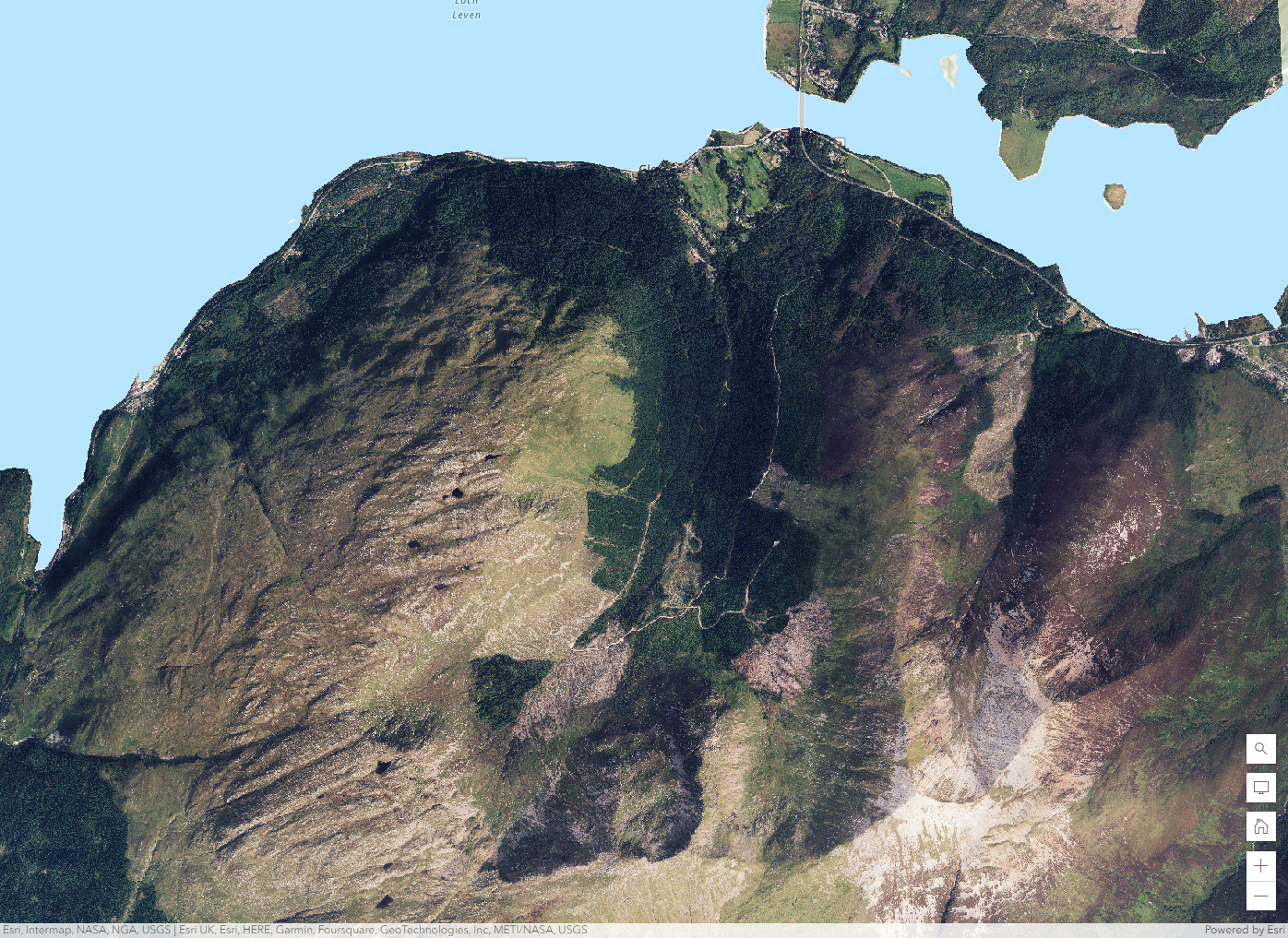
A fly over of our area of interest in ArcGIS Scene Viewer, using data from Bluesky and OS Terrain 5.
Imagery in ArcGIS
In ArcGIS Online, users with the Creator user type, or higher, can create hosted imagery layers. With the Professional and Professional Plus user types, users can also perform image analysis. The ArcGIS Online imagery capabilities form part of a larger suite of offerings, all of which help support your imagery workflows.
If you’d like to learn more about the imagery options that ArcGIS offers, check out this web page for an overview. If you’re still getting to grips with imagery itself, might I also suggest our storymap?
Step 1 – Finding data
First thing’s first, sourcing the data. This could be data you or your organisation owns, or imagery from a third-party provider. Esri UK collaborates with data partners to provide users with high resolution imagery for use across the ArcGIS system. In this blog, we’ll be using data from BlueSky Aerial Photography, harnessing their high resolution orthophotos (between 12.5 and 25 cm!) that are up to date and ready to analyse.
Step 2 – Bringing data into ArcGIS Online
Hosting data in ArcGIS Online is relatively straightforward; a drag and drop system with additional configuration options if needed. To load our imagery, we followed these steps.
When you’re uploading your data, it’s important to think about how you want to host it – tiled or dynamic? One main difference is the added control over input images available in dynamic imagery, which let you order how input images display and their overlap. However, this wasn’t a needed feature for our workflow so we opted for tiled. You can compare the different offerings in this functionality matrix.
Uploading your imagery data into ArcGIS Online.
Step 3 – Visualisation
After pulling in our imagery, we now have a stunning orthomosaic.
This true colour representation contextualises the forest against its surrounding terrain and a useful reference in maps where high resolution imagery is needed. Or, using ArcGIS Image’s other capabilities, we can better understand the landscape’s characteristics. Enter processing templates. These act like a filter, generating on-the-fly informational visuals with no credit costs. You can create your own raster function processing chains, or use ones shared by other members of your organisation to minimise duplication efforts.
The image below shows a processing template on NDVI, normalised difference vegetation index, which quantifies vegetation density.
Note: import organisational templates directly from Map Viewer (shown below), or search for them within your Content using the keyword “rft.”
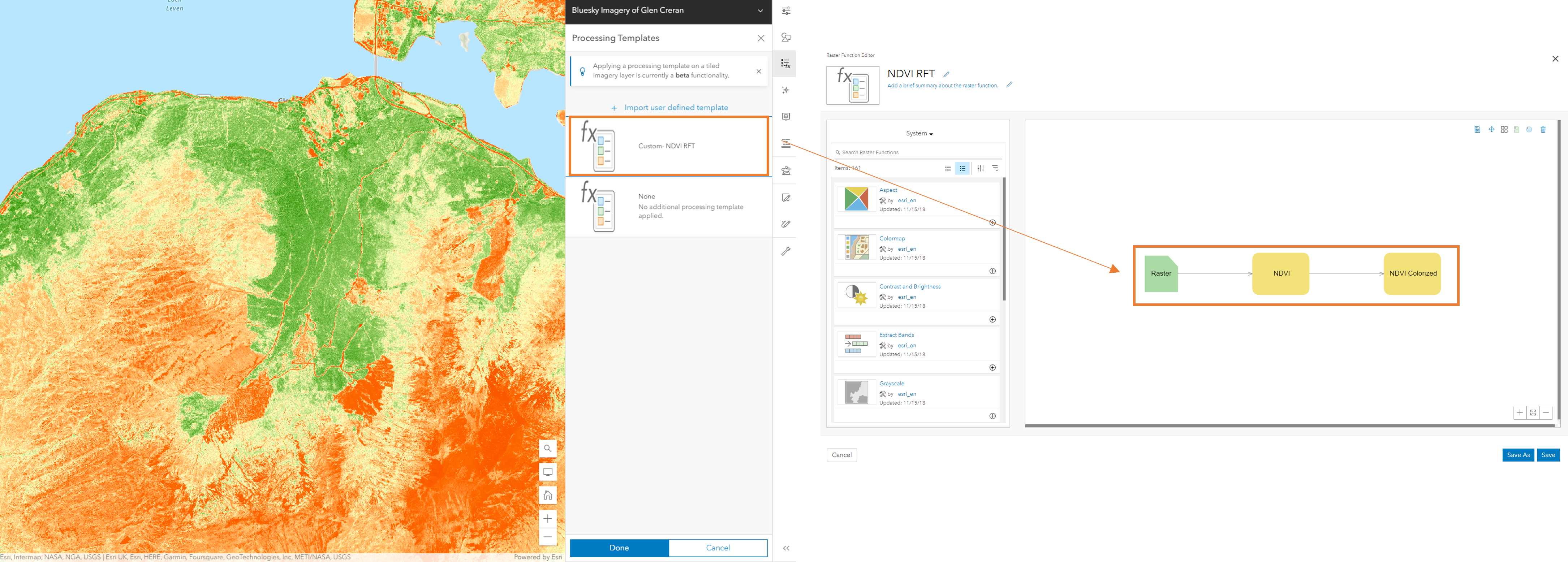
A custom processing template for NDVI, normalised difference vegetation index, made using the Raster Function Editor. NDVI helps quantify vegetation density, where areas of green denote higher densities while red indicates lower levels.
Step 4 – Analysis
We now have a better idea of the density distribution of healthy vegetation, but to continue investigations and share findings with others, we will need more than an instant rendering. As powerful as processing templates are (very), we need resulting layers. Analysis tools give us this in over 150 flavours. Some commonly used ones include Slope, NDVI and Watershed functions.
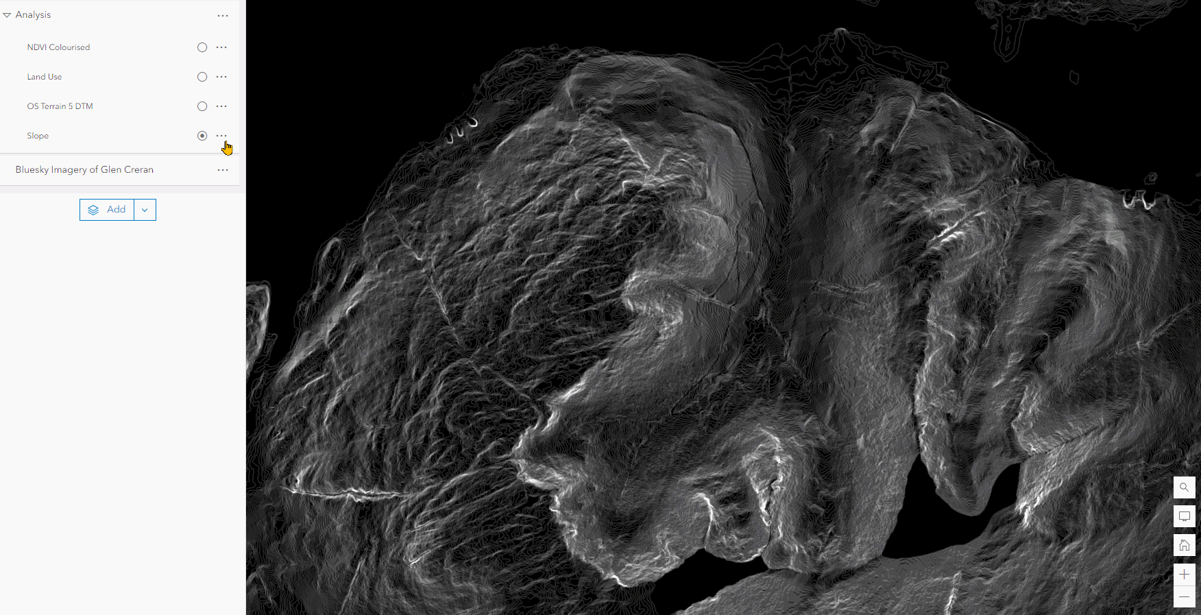
Outputs from the analysis tools including Slope, NDVI and Land use classification layers.
Note: analysis tools consume credits but you can monitor costs with the Estimate Credits button, and find more tips to limit credit costs here.
Step 5 – Sharing your findings
This step is twofold. We will want to share the data internally, which is easy to set up using Groups in ArcGIS Online. Add relevant team members into one group, share data via a URL, and then everyone included can interact with the data directly in their web browser or through their desktop via Portal. From a security perspective, ArcGIS Online gives you the control to manage who and how the data is engaged with.
Secondly, web apps provide the flexibility to cater to a variety of audiences both within and outside of an organisation. Design different apps to suite the needs of GIS experts and non-technical users alike, whether that be analysts, mobile workers, stakeholders or the general public. Besides the ArcGIS Image extension, all users need to get started with configuring the following web apps are a Creator user type for ArcGIS Online.
A few options for sharing
1) Capitalising on the ArcGIS Image extension, we can provide a data analysis team with imagery to study change detection. ArcGIS Instant Apps offers a way to engage key stakeholders in a focused application.
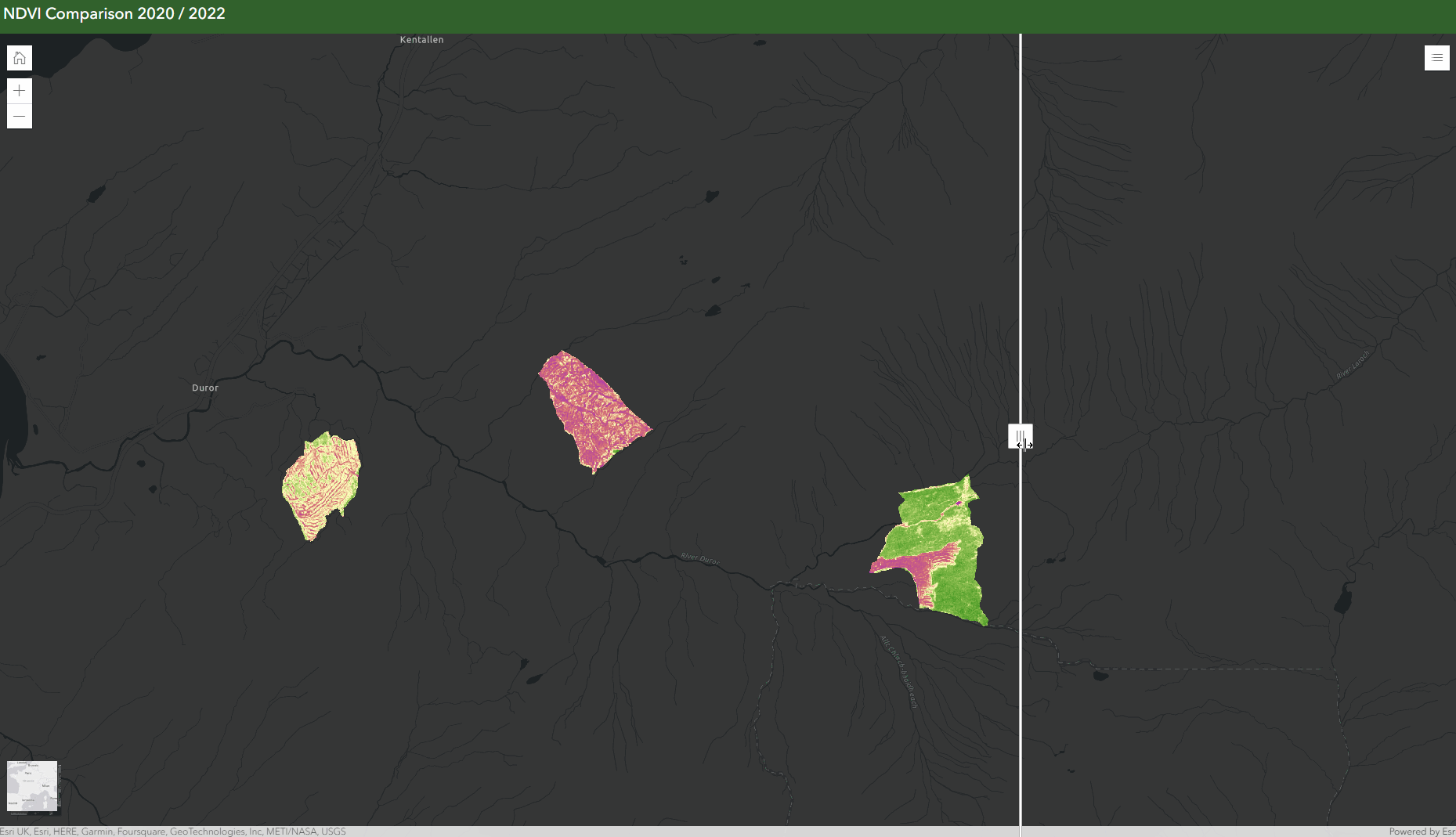
ArcGIS Instant Apps Slider template lets users compare the vegetative health of the woodland over the course of two years. Imagery makes it easy to see the forest regenerate after a fell.
Note: imagery can be an effective way to monitor change over time, as in the above case! Just keep in mind that to do this you’ll need data from multiple time periods. This tutorial can help you get started.
2) The extension could also be used to assist a field team, providing them with high resolution imagery for ground truthing operations.
3) Or perhaps imagery will support your narrative approach of sharing information. In ArcGIS StoryMaps, you can embed imagery for end users to interact with. Here’s one of my favourite examples.
While I’ve covered a few web app options available in ArcGIS Online, these are not the only ones! You can find more considerations for choosing an app builder here. The best bit? All these options enhance collaboration, letting users view and interact with a single source of truth.
The final step
I hope you’ve seen how imagery can become an integral part of the workflow. And this journey isn’t over yet. With plenty of resources available, the next step is to expand your possible uses of imagery to harness more capabilities of ArcGIS over time.
Here are a few to get started:
- Tutorials available for analysing imagery in ArcGIS Online
- Going further with deep learning
- Further readings and resources about working with imagery in ArcGIS Online