I’m sorry about that title, I couldn’t resist the hop-ortunity for a good beer pun.
Have you got a large dataset stored in a spreadsheet which contains lots of information, but don’t know where to begin with it? Maybe you can make out some useful figures just by looking through – but let’s be honest, scrolling through pages of rows and columns isn’t all that appealing and nor is it overly efficient. This is where ArcGIS Insights could be of help. It allows users to explore their data and perform advanced analytics through an intuitive interface which is integrated within the ArcGIS system.
The aim of this blog is to introduce you to some of the basic concepts of the app and how you can find out more about your data. So I decided I’d look at some data of my own to see if I could find some interesting trends. The data in question? My beer drinking habits over the past few years. Being a fan of craft beer and wanting to try out lots of new brews, the Untappd app has allowed me to log my drinks – giving them ratings and sharing with friends. All well and good but, having logged all this data over the past few years, I thought now would be a good time to see how all these check-ins shape up.
I gave myself five questions to try and answer by using Insights:
- Who are my favourite breweries?
- What are my favourite beer types?
- Where do my beers come from?
- When do I drink beer most often?
- Why am I rating some beers better than others?
Getting Started
Having downloaded the csv from Untappd, I was greeted by columns and rows of data which had lots of useful information, but I wasn’t going to learn much by simply looking through the spreadsheet.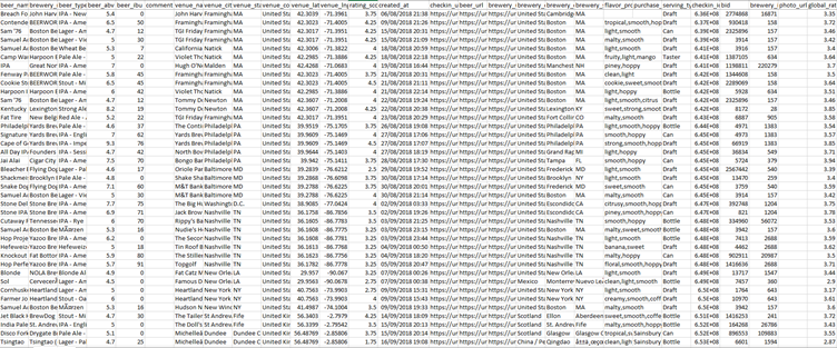
The solution was to close that and open the ArcGIS Insights app on my desktop, although I could have easily used the web app instead. You can find the desktop app here and it’s available for both Windows and macOS.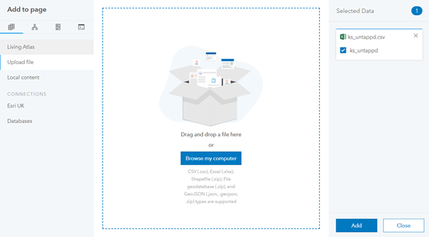
I created a new workbook and dragged the csv into the box, ensured it was selected in the right column and pressed the add button. Insights automatically adds all the columns from the csv as datasets and I’m ready to start analysing.
Who are my favourite breweries?
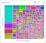
This is a simple one to begin with, who are my favourite breweries? To find this out, a graph of some sort is probably needed. I decided to use a treemap which creates a series of quadrilaterals with the largest representing those which have been checked in the most. This visualisation quickly shows all the breweries with BrewDog being the most popular.
What are my favourite beer types?
Just like breweries, this question was best answered by using a treemap. The data clearly shows a preference towards IPAs and Pale Ales with a few stouts and lagers thrown in. This is all informative, but the next step brings even more understanding to the data. By enabling cross filters for both treemaps, you can select a brewery or beer type to see how they relate. Selecting IPA for beer type filters the breweries: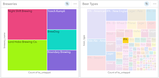
Where do my beers come from?
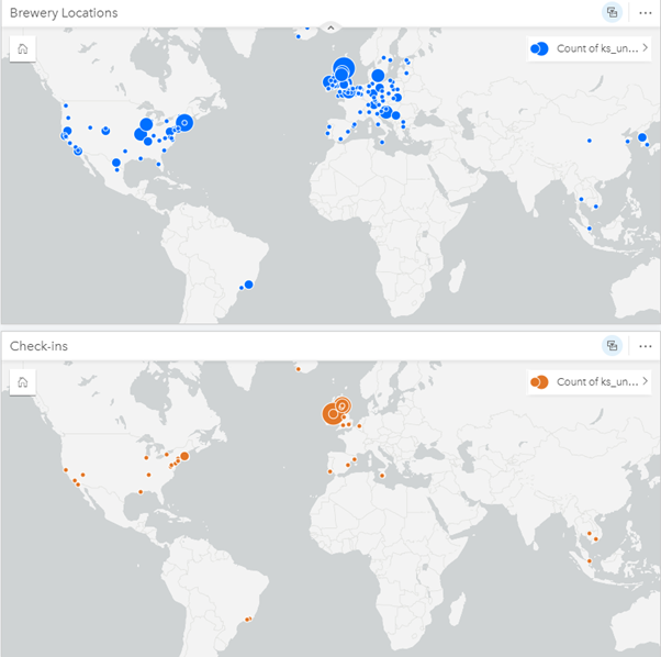
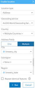 Finally, we get to look at some location data. The csv contained columns with the city, state/region and country for each brewery. Using the geocoding tools in Insights, I can plot the breweries on a map. To do this, I select the ellipsis beside the dataset and then choose Enable Location. From here, I can select the location type as address and use the ArcGIS World Geocoding Service, having ensured that Multiple Countries are selected. I then match the corresponding data so that the brewery_city field is matched to world cities and so on. When I’m ready, I click run and I get a new dataset which contains location data. I can then drag this into the map drop zone to generate a map of all brewery locations (see below).
Another useful map to create is where the beer has been drunk. The csv contains coordinates for each venue so the way to add this to a map is even easier. When enabling the location like before, instead of selecting address as the location type, we use coordinates. From here, simply match the lat and long values, choose the spatial reference and hit run. This can be added to the existing map by dragging onto it or we can just add it to another map.
When do I drink beer most often?
This is an intriguing metric to measure and I chose to do this by looking at it by; year, month, day of the week and time of day. In my csv, the created times were contained in a dd/mm/yyyy hh:mm format, which Insights understands and turns into metrics from year down to the second. I decided to display all of these on my workbook as column charts.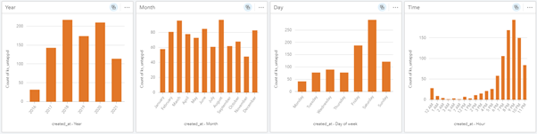
This delivered some predictable results, with no real change over years or months and days of the week leaning heavily towards the weekend. Time of the day was also predictable, with the majority leaning towards the evening and into the night. There was the case of a few check-ins occurring at 5 and 7 am. Selecting these times, the map showed that they occurred at airport bars which is slightly more acceptable I suppose…
Why am I rating some beers better than others?
This question was perhaps the most up for debate with a less obvious way of answering than the others. To find more about how I rated some beers better than others, I created a box plot showing how my ratings were reflected by beer type. Insights selected those which contained five values or more and plotted them. We can make out from the beer type plot that the different types of IPA’s tended to have a smaller box and higher median indicating that they are generally the most well liked. Lagers on the other hand were less well received and stouts, while generally highly rated, had some low outliers.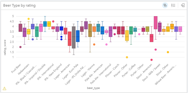
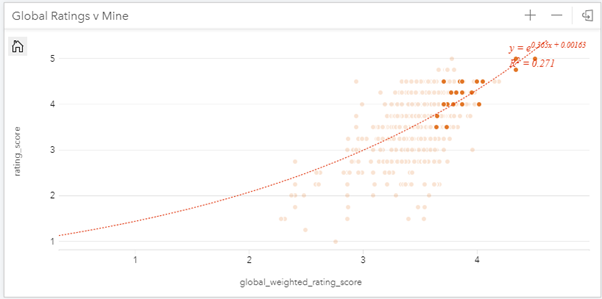
The other piece of analysis I performed to see how I’d rated beers was creating a scatter graph showing how my ratings compared to other Untappd users for each beer. I then selected two types of beers that were at either end of the box plot to filter on: Imperial/Double IPAs and American Lagers.
You can see from the graph that the correlation between my ratings and the global user scores was weak – confirmed by the low R score. For Double IPA’s, not only were my ratings relatively high, they were also often higher than the community average which should be an indicator that they’re among my favourite beer types:
For American Lagers, the exact opposite occurs. For all but two beers my ratings are lower than the community average, signalling that these may not be my favourites: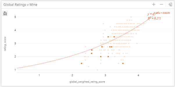
Hopefully these examples give a nice overview of how ArcGIS Insights work. Simply by dragging and dropping my data into a workbook, I was able to quickly visualise and explore different types of data. For me, having an interactive page which I could manipulate by selecting certain options such as time, location and brewery was incredibly revealing and quite enjoyable.
If you’d like to get started with Insights, you can sign up for a 21-day trial here.