The COVID-19 pandemic has presented governments, businesses and individuals with unprecedented challenges. During times of crisis, the ability to quickly extract intelligence from our data is of paramount importance. Through Esri’s Disaster Response Program (DRP) organisations can get complimentary access to a variety of ArcGIS apps and services. Recently added to the list of available apps is ArcGIS Insights, a self-service data analytics and visualisation tool. Insights allows you to rapidly build workbooks to perform spatial, statistical, predictive, and link analysis and share the results with your colleagues and the public.
Though the news cycle can make for grim reading these days, one positive has been the outpouring of support and appreciation for our frontline healthcare workers. The NHS promote data science and along with Public Health England (PHE) make a lot of data available to the public. A colleague did some work recently analysing General Practices (GP) data, and I wanted to build on that to show Insights in use. Insights pages are a great way to show multiple types of analysis in one place. Let’s demonstrate how we might try and understand:
-
Which GPs serve the most at-risk patients, and
-
How geographic relationships might affect decision making
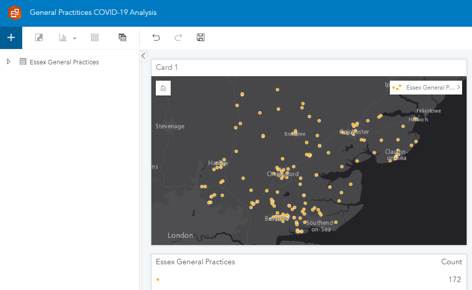
I have GP locations for the county of Essex from NHS Digital and some key indicator data obtained from PHE Fingertips service (fortunately the Esri UK InstantAtlas team did the data wrangling for me!). I’ve joined the indicator data to the GP locations using ArcGIS Pro and published the result as a hosted feature layer to ArcGIS Online. Now I can easily view my data on a map card in a new Insights workbook:
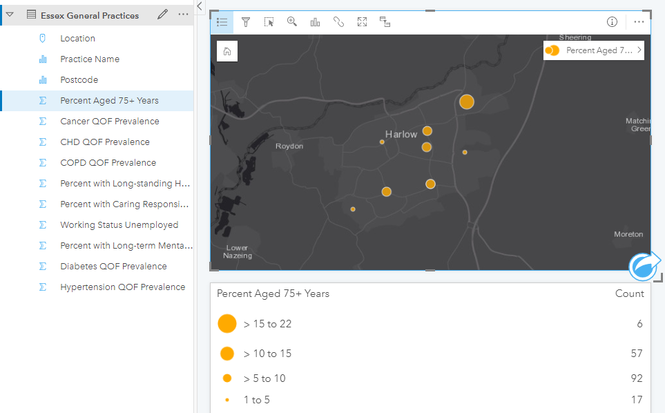
Mapping the GP locations is all well and good, but it doesn’t tell me much about the data I didn’t already know. We know our elderly population are dis-proportionally at risk from the disease, so let’s symbolise the data by percent of patients aged 75 and over:
That’s given me a means to compare GPs’ patient population, however we know that in addition to age, people with certain underlying health conditions are also at a higher risk of complications if infected. As you can see from the above, my data has attributes for the prevalence of cancer, chronic heart disease (CHD), chronic obstructive pulmonary disease (COPD), diabetes and hypertension (high blood pressure). It’s a bit difficult to make sense of this information in separate fields, however if I add and calculate a new field by summing the health indicators I get a more holistic (albeit simplified) means to compare GPs’ at-risk patient populations.
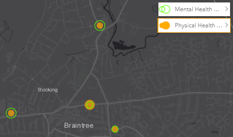
In addition to physical health, the new restrictions on daily life can have an adverse effect on our mental wellbeing as well. Using information on long-term mental health, caring responsibility and unemployment, we can identify which GPs might serve more of those with a higher risk of experiencing mental health difficulties. Displaying these layers together on the map gives the reader a more useful interpretation of the GP data.
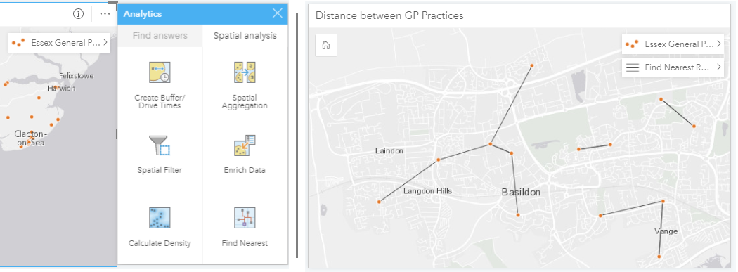
Insights also provides tools which allow you to quickly perform analysis on your data. In a scenario where some GPs were forced to close to help contain the spread of the virus, it would be useful to know which GPs are ‘hubs’, that is which GPs are the closest location to other GPs. The Find Nearest tool generates a line dataset representing the distance between each GP and its nearest neighbour. After running the tool, patterns emerge in our data suggesting which GP locations are hubs and could be more easily reachable for a larger number of patients:
I’ve added summary tables so readers can explore the data in more detail and the end result looks something like this:
Please note the above was put together for demonstration purposes only and should not be considered an authoritative source of information.
Hopefully the examples in this blog have given you some ideas of how ArcGIS Insights can help your organisation gain intelligence from your data. To access additional training exercises, check out the Insights and COVID-19 Discovery Path on Learn ArcGIS. Be sure to visit the Esri UK COVID-19 GIS Hub site to see some of the technical resources available to your organisation. These include useful datasets (including premium Ordnance Survey data services) and information on best practices.
#StayAtHome and stay safe everyone!


