Bivariate has always been an elusive term for me as a map-maker. Done well, bivariate maps can effectively double the amount of information represented in one visual. Done badly, the visual complexity outweighs any information gained, or in some cases shows nothing of value at all. I used to find the process of making a bivariate map in ArcGIS Pro a bit clunky (shared below), with no idea of what makes up an effective colour scheme.
Cautious map-makers like myself , fear no longer! ArcGIS Pro‘s 2.6 update brought the functionality to quickly create choropleth maps using bivariate colour symbology (as opposed to my previous clunky method). In this blog post, I’ll use HMRC’s Job Retention Scheme (JRS/ ‘furlough’) data for England, from July 2020, along with some recently updated Indices of Multiple Deprivation (IMD) data from the Living Atlas to show off ArcGIS Pro’s new bivariate tools.
GOV.UK Indices of Deprivation 2019 is comprised of seven distinct domains of deprivation which, when combined and appropriately weighted, form the IMD2019. They are; - Income (22.5%) - Employment (22.5%) - Health Deprivation and Disability (13.5%) - Education, Skills Training (13.5%) - Crime (9.3%) - Barriers to Housing and Services (9.3%) - Living Environment (9.3%).
First things first
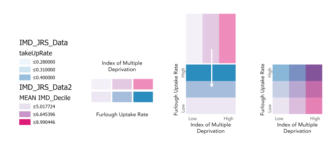
To cover the basic concepts, a traditional thematic choropleth showing one set of spatial data would be known as a univariate choropleth. To get to a bivariate choropleth, you need two variables on one map. Bivariates show whether the two variables are related by symbolising them as one product.
Bivariate maps are best when you have some idea that the variables will be related, otherwise the map and any apparent trends shown will not have value.
Fail to prepare…
The two datasets I used came in slightly different geographies. The furlough data from HMRC is per Local Authority, and the IMD data comes in per Lower Layer Super Output Area (LSOA). As one is more granular than the other, you can use the Summarise Within tool in ArcGIS Pro to calculate attribute field statistics about one feature within the other. I used an LSOA boundary from the Office for National Statistics (ONS) as the input polygon and IMD data as input features for the Summarise Within tool. This gave the output of IMD per Local Authority.
Using the deciles (integer values indicating a proportion of the population) of the indices, along with the trusty Field Calculator, I created a new field for the mean decile of an index within each Local Authority. For reference, 1 represents the most deprived and the value 10 represents the least deprived.
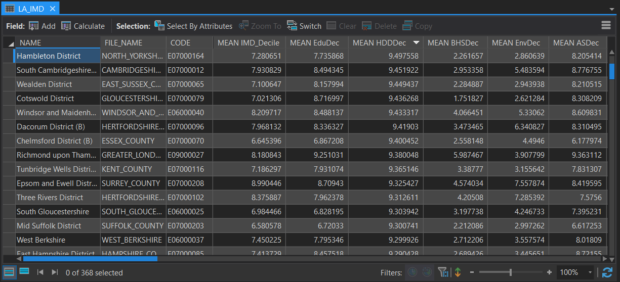
Attribute table fields showing the IMD deciles per Local Authority for Education, Skills and Training, Health Deprivation and Disability, Barriers to Housing and Services, Geographical Barriers and Adult Skills.
Previous bivariate method
Before the recent update my workflow to create a bivariate adopted a trial and error methodology, attempting to match two colour schemes (that I had no understanding if they would complement or not). Using this method, you would need to create a legend by hand using the below process. Fiddly and time consuming, to say the least.
The four-step process creating a custom bivariate legend, before the Pro 2.6 update.
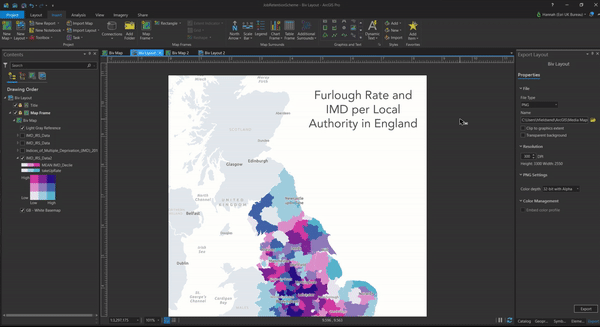
After exercising my graphics card with the on-the-fly transparency processing, the result is a blending of the two layers, or bivariate choropleth.
bivariate map showing the relationship between rate of furlough uptake and IMD in England.
Not bad, but not completely accurate.
Shiny new bivariate method
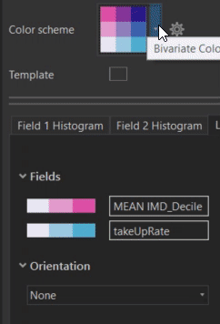
ArcGIS Pro’s 2.6 updated symbology allows you to render an accurate representation of both layers. Choose 2 attribute fields from one layer to symbolise the features. You can then choose whether you want to normalise each one, an important consideration for choropleth mapping. Normalising variables calculates the proportion of your mapped variable, whilst preserving the accuracy and integrity of your data.
In this case I didn’t need to normalise against another attribute since the JRS data was already calculated as a rate and the IMD indices came weighted and as deciles.
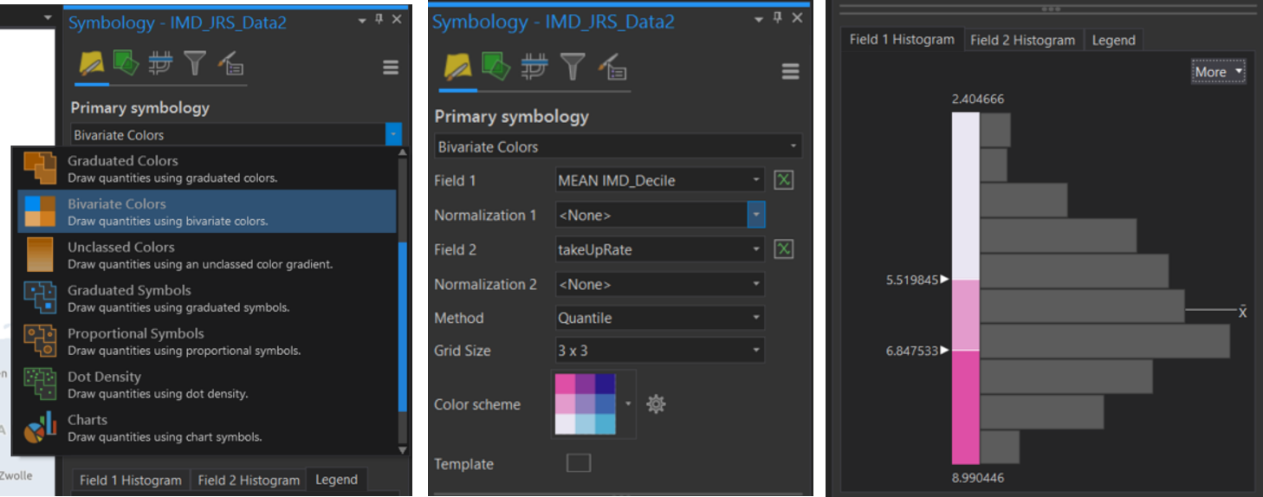
New Bivariate Colour symbology available in ArcGIS Pro’s 2.6 update. Functionality to normalise each variable and pick from 2 to 4 classes to be used. Note- the more classes used, the harder it gets to differentiate between the colours (4×4 = 16 separate colours).
There are 19 (yes, 19!) bivariate colour scheme options that come with this new update. Appropriate symbol (colour) selection is really important for map readability, so no more closing your eyes and picking a random colour for each variable (I would never..). From binary, qualitative, diverging to sequential, there’s a colour scheme for you.
These colour schemes can be formatted further in the Colour Scheme Editor.
I’ve highlighted the most appropriate colour schemes for different types of colour blindness:
- Deuteranomaly – Yellow-Blue-Black or Blue-Orange-Brown
- Protanopia – Yellow-Blue-Black or Mustard-Blue-Wine
- Tritanopia – Blue-Brown-Red or Pink-Blue-Purple 2
- Achronatomaly – Blue-Orange-Brown
In the Layout view, simply insert your legend and the patch arrives perfectly formatted!
Adding the bivariate legend to a layout in ArcGIS Pro.
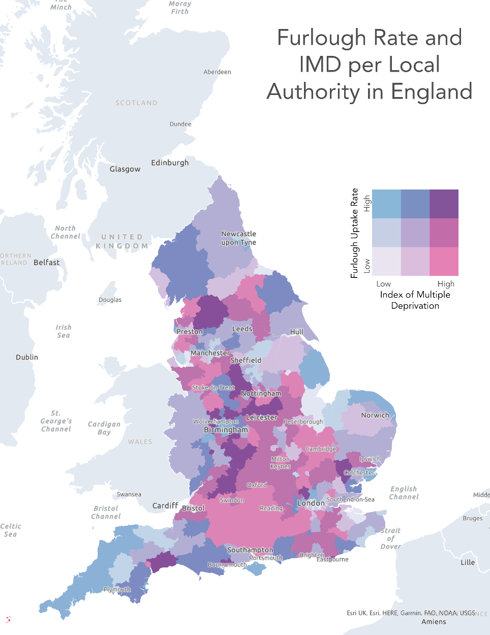
Final Result
This time, our result is a brighter, more accurate bivariate choropleth showing the relationship between rate of furloughed employments and Index of Multiple Deprivation for England. To the right we switched out the furlough variable and instead have the rate of self-employed people taking up the government’s SEISS scheme.
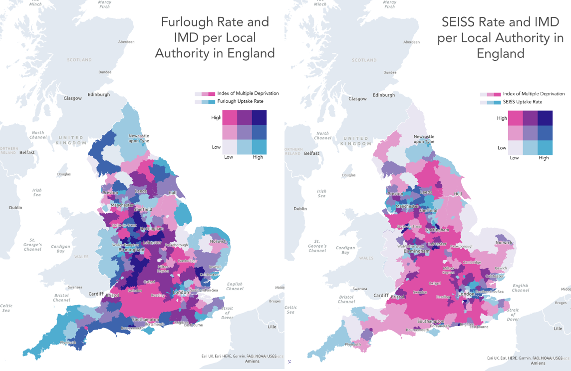
The Furlough Rate and SEISS Rate mapped against IMD values using bivariate mapping.
We can see across Wiltshire and Hampshire that low rates of furlough uptake (< 30%) among eligible employments is related to the high IMD, where the population is amongst the least deprived. The bivariate also shows local authority districts with higher proportions of neighbourhoods among the most deprived in England. For example Cornwall, Norfolk and Northumberland have high rates of furlough uptake (>40%), possibly as a result of the impact upon leisure and hospitality workers.
I had some fun exploring more choropleth bivariate colour schemes, looking at individual deciles and the relationships we can infer across Local Authorities in England, below. Thanks to ArcGIS Pro’s 2.6 update, bivariates truly have never been easier.
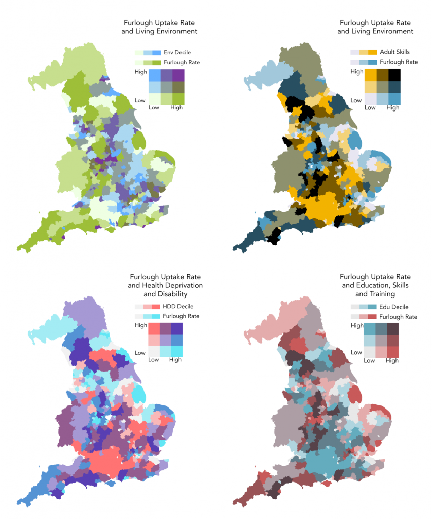
Exploring alternative colour schemes