One of the newest additions to the Map Viewer Beta is blend modes. The Map Viewer Beta is the trendy new map making tool for ArcGIS Online, which provides an enhanced experience for key map authoring workflows. The Map, powered by the latest Javascript 4x, renders instantly as you modify symbols, pop-ups, and more to create a quick and easy mapping experience.
Why are blend modes useful?
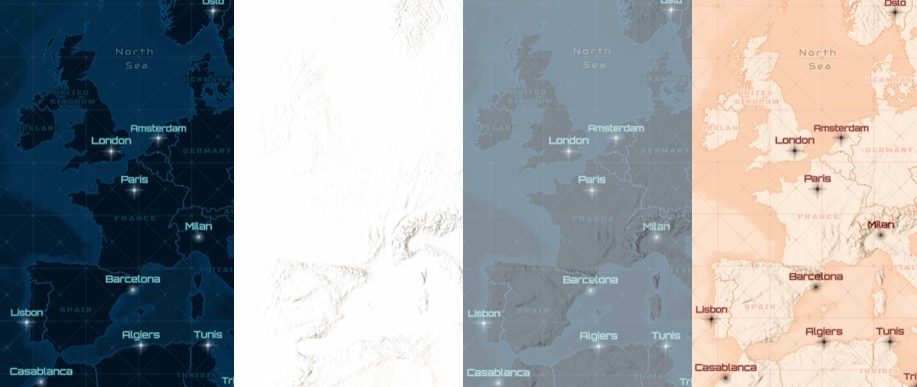
Previously when attempting to visualise two layers concurrently, you had to turn on the top layer’s transparency to see the layer underneath. The higher the transparency, the more the base layer shows through, but the top layer also becomes more faded (as seen in image below). Transparency is a trade-off between having a vibrant eye-catching map and expressing all the analytical detail. Blend modes are the solution, as they help you view multiple layers at once, while maintaining a vibrant colour scheme!
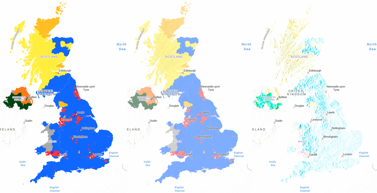
No blending (left) // Transparency 50% (middle) // Color Burn blending (right)
Getting Started
The Blending tool can be found in the Properties tab to the right of the Map Viewer Beta display. When first exploring blend modes, I used a terrain basemap and a feature layer of the UK’s general election results from 2019. My aim was to visualise both layers at once by making it look like the mountains were stained by the colour of the winning party in that region. I thought it would be fun to see which way the mountains voted!
There 32 different kinds of blend mode, which may seem overwhelming at first, but I began using them without knowing what they did or the logic behind them. Blend modes are extremely easy to use and I just wanted to find one that answered my question and made my map look pretty! Upon exploring them all to see what effect they applied to my map, I landed on one called Color Burn, which I liked the most as it accentuated the mountainous regions.
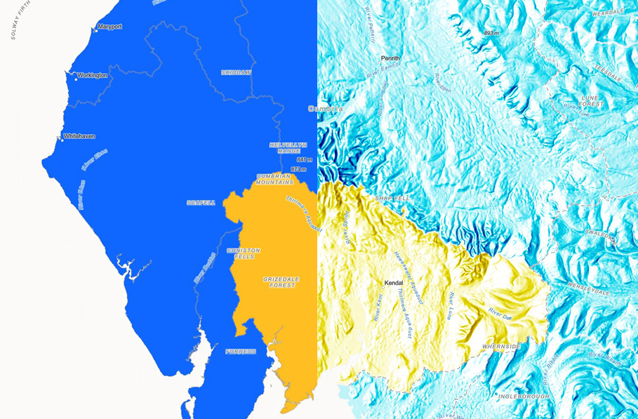
Cumbria: No blending (left) // Color Burn blending (right)
Color Burn selectively adds tints to the shadows, which emphasises the hillshading of the terrain basemap. In more complex terms, it intensified the dark areas in all layers and increases the contrast between top and background layers by tinting colours in overlapping areas towards the top colour. The opposite blend mode, called Colour Dodge, adds tints to the highlights and decreases the contrast between the top and background layers. You can find out more about what each blend mode does here.
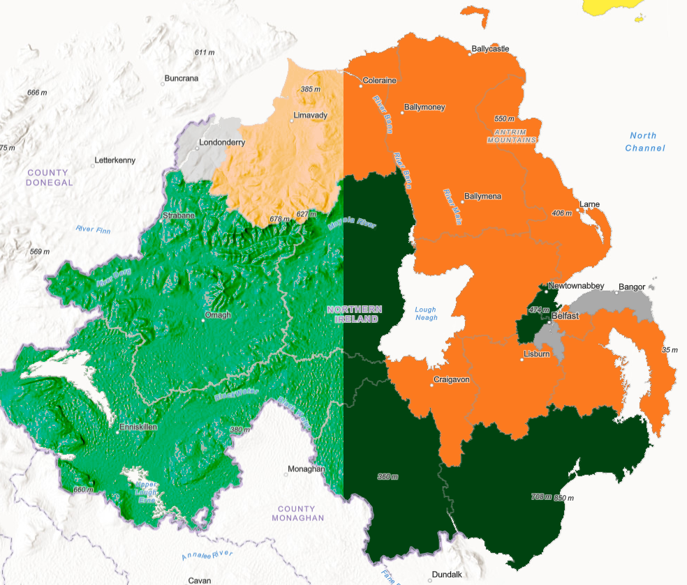
Northern Ireland: Color Burn blending (left) // No blending (right)
If you want to get even more creative, you can also blend multiple layers using multiple blend modes at once. The best part is that while blending makes it look like the layers of your map have merged into one, the map layers remain independent. So, you can switch up your blend mode as much as you like or turn it off and your map layers won’t be ruined!
Further Examples of Blend Modes
Earth at Night X-Ray Vision: created using the Overlay blend mode on the Imagery basemap and the Earth at Night (2016) tile layer from the Living Atlas.
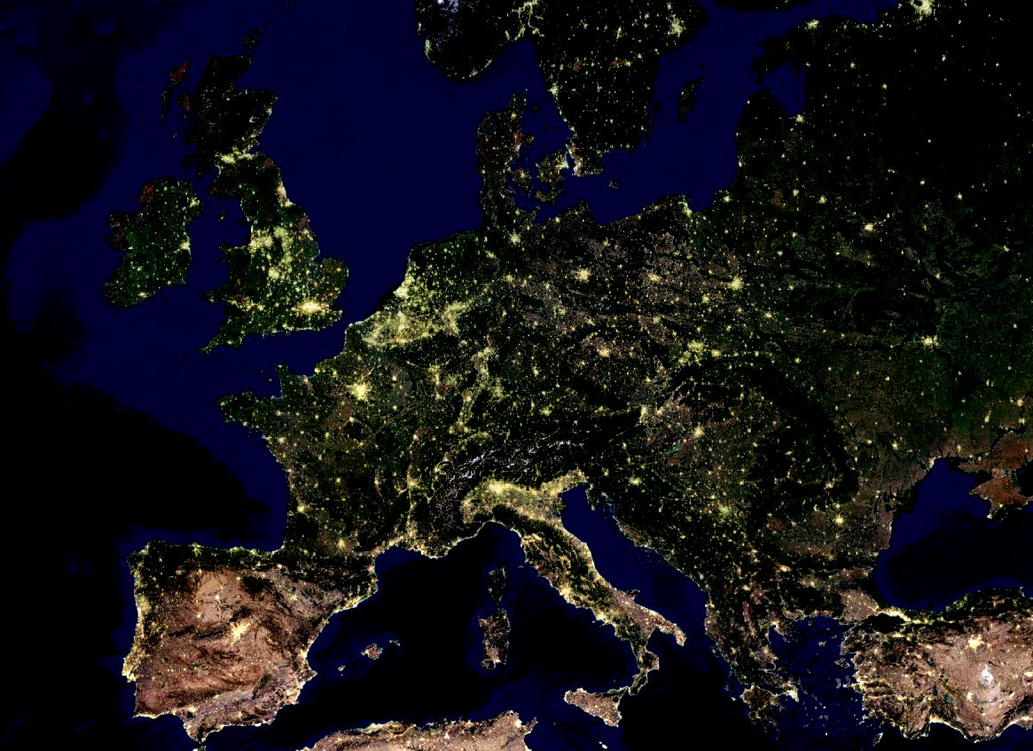
Earth at Night blended with Imagery
Average and Difference on the Nova basemap: created using the Average and Difference blend modes on the Nova basemap from the Living Atlas and a hillshade layer on top.
Nova Basemap (image 1) + Terrain (image 2) = Average Blend mode (image 3) or Difference Blend mode (image 4)
If you want to learn more about blend modes check out Blend Modes for Thematic Maps. Thanks for reading!