Basemaps are what the name suggests – background vector or raster layer(s) to enhance the data or visual display shown in the foreground, along with providing content and orienting the viewer. Sometimes basemaps are a blank slate, allowing the data to pop. At other times, they provide reference information such as boundaries, roads and water bodies and their corresponding labels.
Your map data is only as useful as its underlying basemap allows. Too bright, and it distracts the viewer from focusing on the data. When enthusiastically labelled, words clutter the screen. So how can we get something that’s just right? I’m glad you asked…
ArcGIS Online provides basemaps that are authoritative and up-to-date. They are ready to use, and can be added directly to your map to support your data. However, you can also get creative with these basemaps too! With a few tools and tricks, I will take one of these already useful resources and transform it into something which better supports my map’s specific purpose.
Basemaps at the ready
You want to have an accurate basemap for your (hopefully) accurate data, but where do you find one? Esri maintains a collection of basemaps within the ArcGIS Living Atlas of the World. They’re updated approximately every three weeks, making this an authoritative, up-to-date option. You can add them to your map directly through Map Viewer and Scene Viewer, so they’re easily accessible too.
The default basemap is the World Topographic Map but there are others designed for various use cases: global imagery, navigation, human-centred geography, and light & dark grey basemaps when you need visual contrast against your data. Depending upon your location, regional basemaps are also available such as Great Britain basemaps for UK- focused content. There are also artistic options like the Coloured Pencil or Modern Antique basemaps that I play with for more abstract projects. If none of these strike your fancy, feel free to use your own. Let’s take a browse through what’s currently available.
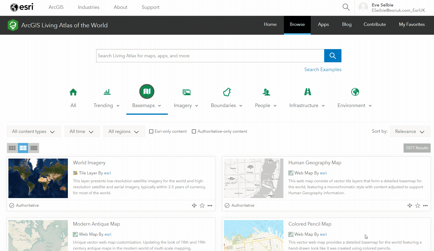
Scrolling through the Living Atlas basemap collection
Top tip: while all of these layers are listed as basemaps, you can use them independently as operational layers within your map too.
Tools in the toolbelt
We’ve seen what basemaps our data library offers, so let’s put one to work for a map of our own. In this case, an eye-catching reference map of Scottish ferry transport routes. We’ll make the World Topographic basemap into a nautical backdrop, perfect for portraying coastal point data.
Using Map Viewer’s styles and effects, we’re going to go from this…
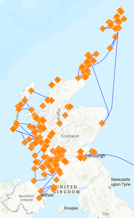
The World Topographic basemap beneath uncustomised ferry route and ferry port data in Scotland.
…to this.
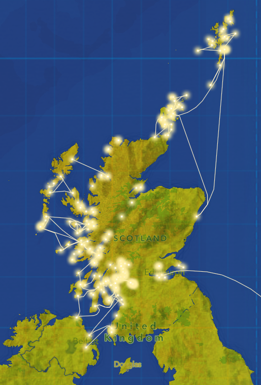
Our final reference map of Scottish ferry routes and ports.
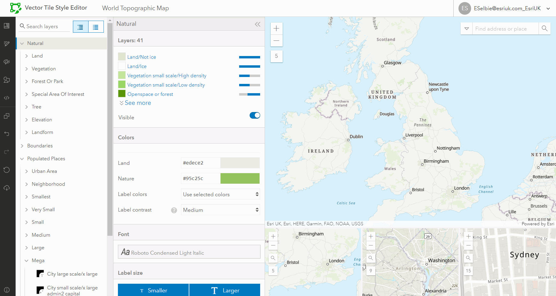
Vector Tile Style Editor
The Vector Tile Style Editor (VTSE) is a web application to copy, edit and customise ArcGIS basemaps to use within your ArcGIS Online or ArcGIS Enterprise account. Starting with any vector basemap provided by the Living Atlas, you can tinker with colour, labels, formatting and scaling. For an in-depth introduction to VTSE, click here.
I’m using it to define an oceanic colour scheme and to remove the majority of the labelling classes. This way, the viewer’s eyes are pulled to a vibrant shoreline as opposed to named cities and towns across the UK.
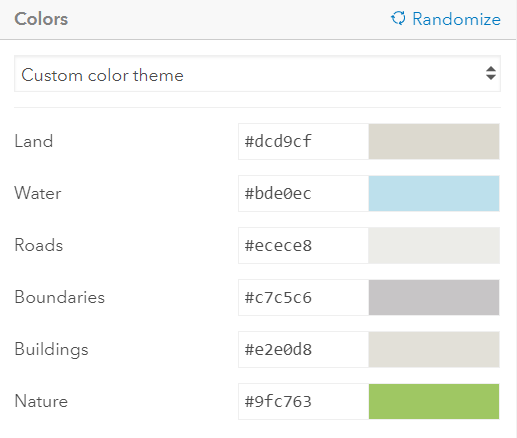
Starting with ocean inspired hex codes, I swapped the default basemap’s colouring for my own. I used the Quick Edit option to make broad changes to each category, and then went through layer by layer experimenting with hues until I was happy with the result. Like the maps themselves in Map Viewer, basemaps can be viewed at multiple scales, so test out how your colour scheme looks as you zoom in and out.
Initial hex codes in the World topographic basemap.
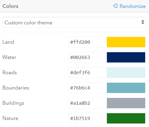
Using custom hex codes in VTSE.
This is also where I removed unnecessary labels by toggling off their visibility. And it isn’t as tedious as going through each layer’s label tabs one by one. Clicking any label on the map immediately navigates you to your desired layers and sub-layers.
Removing labels in VTSE.
With fewer labels and a distinctly blue background, VTSE helped me make the World Topographic basemap my own. If you have branding to adhere to, or a theme you’d like your map to follow, VTSE is a great tool to bookmark.
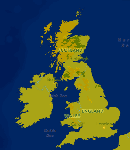
Our basemap after using VTSE for a dark and stormy scene.
Layering
In the wise words of Shrek, “[basemaps] are like onions, they both have layers.” Adding layers is a quick way to bring depth to your basemap. Whether that be through texture, providing additional context or simply making it more visually appealing. Using the Living Atlas, it’s simple to search keywords and try different layers until you settle on the perfect combination. I knew I wanted something to make my digital map more dimensional, so I opted for the Vintage Shaded Relief layer. To make this multi-layer basemap seamless, I also used a Blend option and applied a slight Transparency of the top layer. This helps the layers interact with one another smoothly.
Top Tip: you can find other fun textured layers here.
Effects
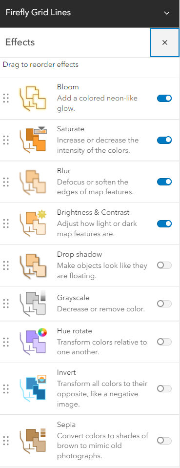
I think the map is almost there, but it could do with a stronger nautical theme to tie it together. Effects are one way to achieve this. Quickly enhance a map’s visualisation by adding or de-emphasising a given layer. I’ve added Firefly Grid Lines to my map, and can go through Effects tools one-by-one to see what works. Bloom and Blur make the background glow without taking attention away from Scotland. Saturate makes my grid lines beautifully blue. The Brightness & Contrast did exactly what the name suggested – brightened and contrasted.
Bon Voyage
And there you have it. With a few different tools I’ve taken a functional basemap and made it my own – it’s still functional, but I’d like to think that it’s a better fit for the data.
Mission accomplished.
Whether you’re creating a reference map, mapping trends or conducting spatial analysis, the best part of styling your map in Map Viewer is that it’s instantaneous. With these on-the-fly updates and options upon options of styling tools at your disposal, choosing and creating your own basemaps is smooth sailing.