Every year on April 22nd over a billion people across the world come together to observe Earth Day. First established in 1970, Earth Day was created to drive action in combating the ongoing global environmental and climate crisis. The theme of the 2021 event is Restore Our Earth. The 2021 Earth Day campaign covers various concepts for how we can restore our earth, but sometimes these can be difficult to visualise. We all understand that the planet and its climate look very different today than it has in the past – or will look in the future. Yet, that’s just it… what does that look like? Well, we thought we’d try to find out.
The Concept
We knew that encompassing all these concepts in a single map would be far too busy. So, this established the need for a map series.
The Earth Day message is all about countering the changes the human race is making to our planet. Large areas of forests are being cleared and land use across the globe is being altered for agricultural use. Even the night skies are different in the face of urbanisation and the climate is changing at unprecedented rates. These are the key issues that need addressing and shaped the map series presented in this blog. I know I struggle to comprehend the scale of these issues through articles and academia alone, so perhaps visualising it through a map would help. Now for the actual maps, deep breath in…
Changing Light Pollution
One way increasing human populations are impacting the Earth is the growth of urban areas. A significant, perhaps not so obvious effect of this is the greater amount of light pollution being emitted when the sun goes down. Who’d have thought that humans not only influenced the land but also the sky!
The data for this map comes from NASA’s Earth at Night series of satellite imagery, specifically, the NASA-NOAA Suomi National Polar-orbiting Partnership satellite. Composite maps of the Earth at night were created in both 2012 and 2016 by NASA scientists who went through a whole year’s worth of images, using clever code to pick out the clearest nights. It was these maps we used to deduce how light pollution had changed in this 4-year period.
GeoTIFF files from each year made available by NASA were put through a rather smart pixel-difference math bot in ArcGIS Pro. To be more specific, both the 2012 and 2016 images were inputted to the Minus Mathematical Raster Function which subtracts the pixels of one image away from the other. This results in a basic greyscale image showing where lights (or pixels) have increased or decreased between the two images. With some clever symbology changes, we can further highlight those changes. We turned the lights that have gone out to purple, matching the dark night sky, and those new lights we coloured yellow… obviously. All pixels where no changes have occurred are transparent. This results in this flashy map showing clear patterns of places where light pollution has decreased (purple) and where it has grown (yellow). The uneven onset of urbanisation across the globe becomes apparent, showing where changing land-use needs to be more considered.
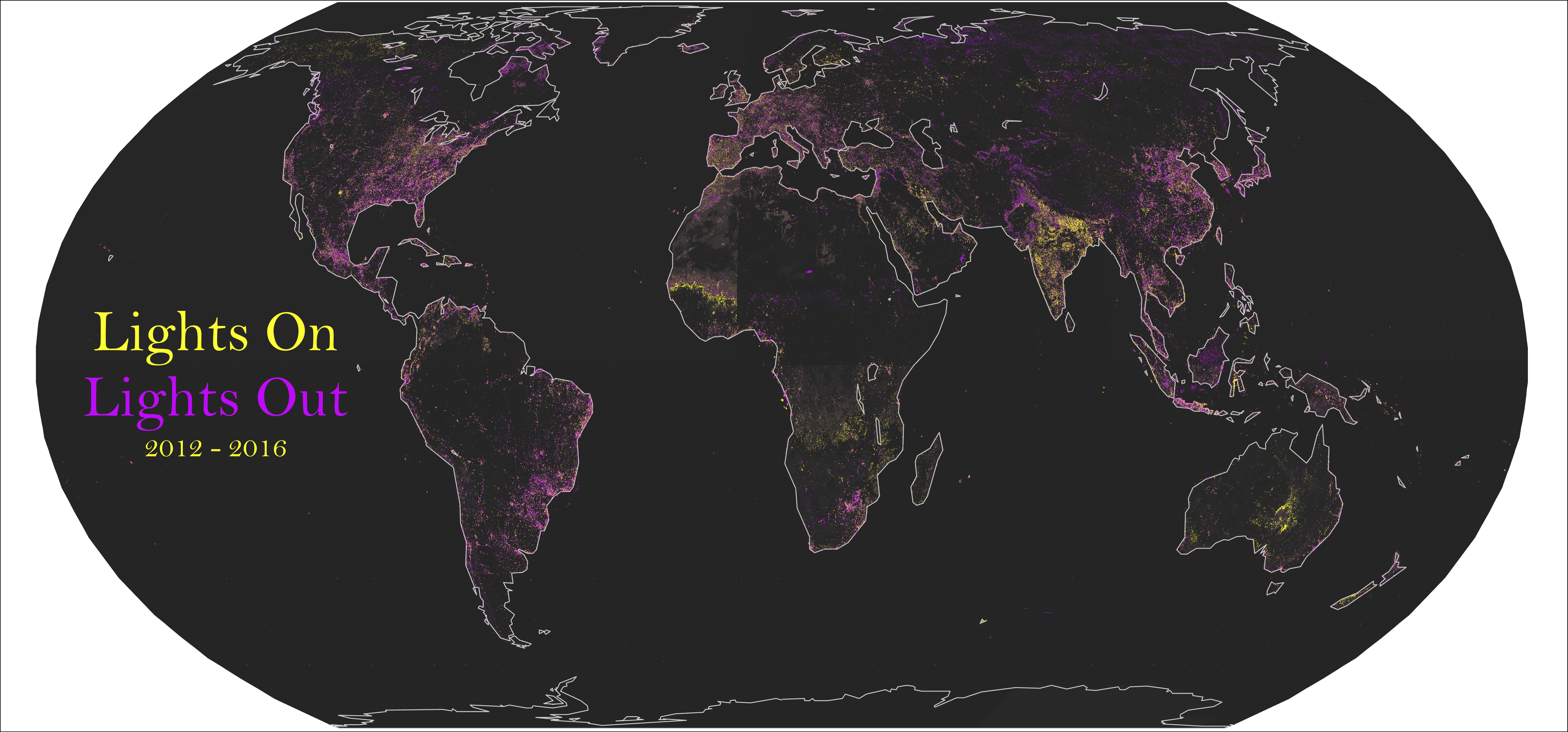
Source: NASA Earth at Night
Deforestation
If you were asked to name one way in which humans are dramatically changing the Earth, most of us would say deforestation. Large areas of forest are being cleared across the globe each year. According to the FAO, over 80 million hectares of worldwide forest have been removed since 1990. To truly understand what this looks like…you guessed it, we put it on a map.
Fortunately for us, the Living Atlas of the World already contains comprehensive data about the world land cover. The Global Land Cover 1992–2018 layer, courtesy of the European Space Agency Climate Change Initiative, is a time-series map of the surface of the Earth classified into 36 land cover types. Even more fortunate for us, we can use the pre-set processing templates of this layer to filter out everything except forest – dreamy. So now all that’s left to do is show the change that has occurred in this time.
By applying definition queries, we were able to isolate the 1992 and 2018 datasets from each other and present them in two contrasting colours. The shades of green represent different types of forest based on level of canopy cover, leaf type, and deciduous vs evergreen – providing a rather eye-catching visual. By changing the colour of the 1992 layer underneath to red, those areas which existed then but do not anymore will stand out. Regions particularly impacted by deforestation emerge such as the Amazon, Indonesia, and Central Africa. This provides some spatial context to the way we’re changing our forests and helps to highlight the need for important reforestation efforts like Earth Day’s Canopy Project.
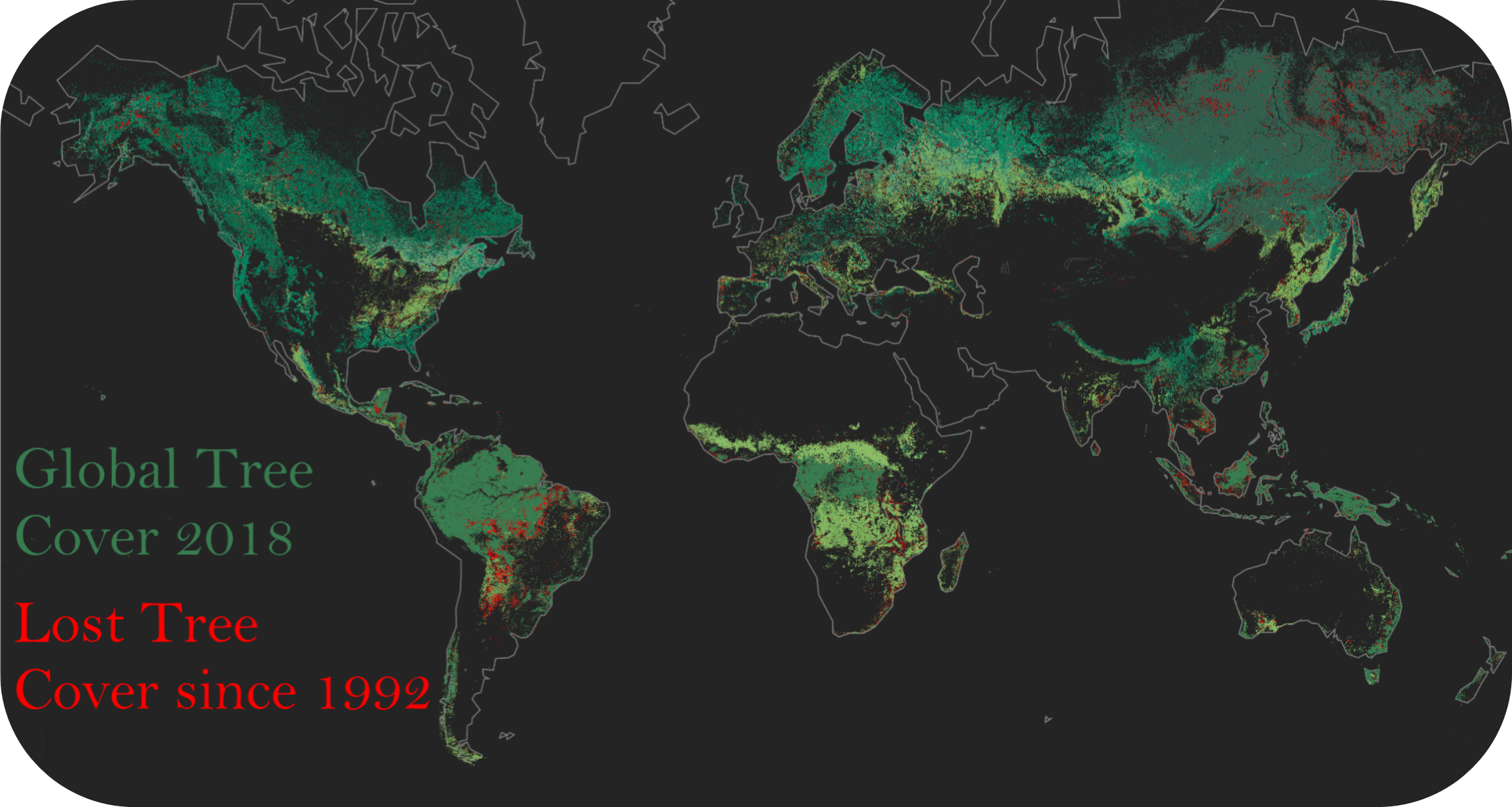
Source: European Space Agency, via Living Atlas
Agricultural Land Use
The largest driver of global deforestation is the perceived need for agricultural land. It is estimated that 70 – 80% of all deforestation leads to land use being transformed for the growth of crops and the raising of livestock. Like the clearing of trees, tackling the environmental impact of food production is a pillar of this year’s Earth Day campaign with the Foodprints For The Future initiative. Approximately 21% of all global land cover is dedicated to agricultural land, but what does that look like?
A familiar and frustrating challenge for all cartographers is the seeking out of good quality, relevant and up-to-date data. It is that last aspect that was the biggest sticking point here. Global land coverage data of both cropland and pastureland (livestock grazing land) is available from NASA – thanks again! However, this dataset relates to the year 2000. Part of a study published in 2010, the data was reliably formed using NASA satellite data from MODIS and SPOT vegetation sensors (that’s good) but is outdated (that’s bad). Lacking a good alternative, we’ve used this old dataset to show the scale of agricultural land use – just this once.
Fortunately for us, the data is made available in raster format, meaning it can be loaded directly into ArcGIS Pro. We’ve selected bright vibrant colours against the black base map, fitting in with the map series to highlight the patterns of agricultural land use across the globe. It becomes apparent that agricultural land use is widespread, and we can see just how much of the global landscape has been altered for this purpose. This draws attention to why Earth Day aims to improve food production practices, to help combat the impact the industry has on both Earth and climate change.
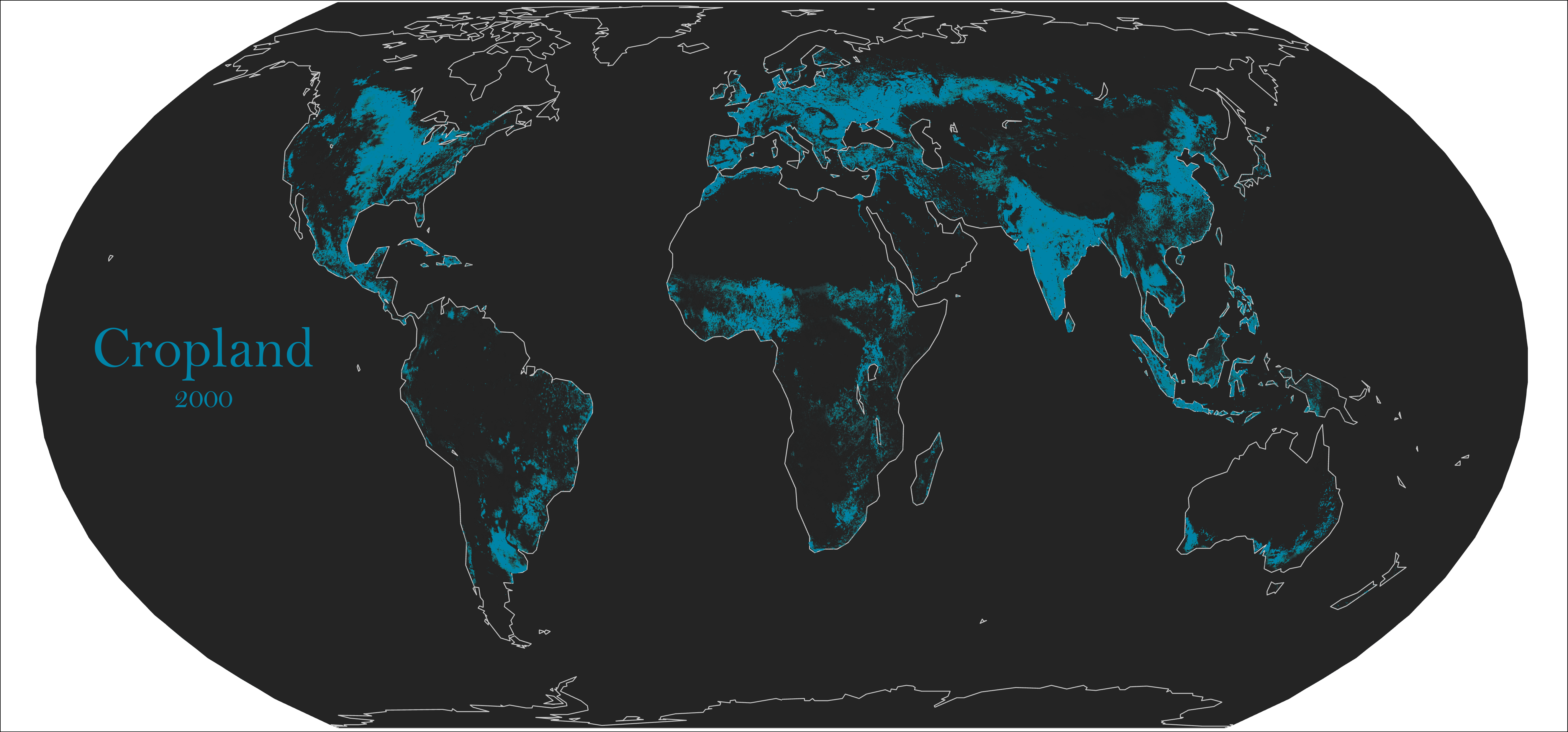
Source: NASA SEDAC
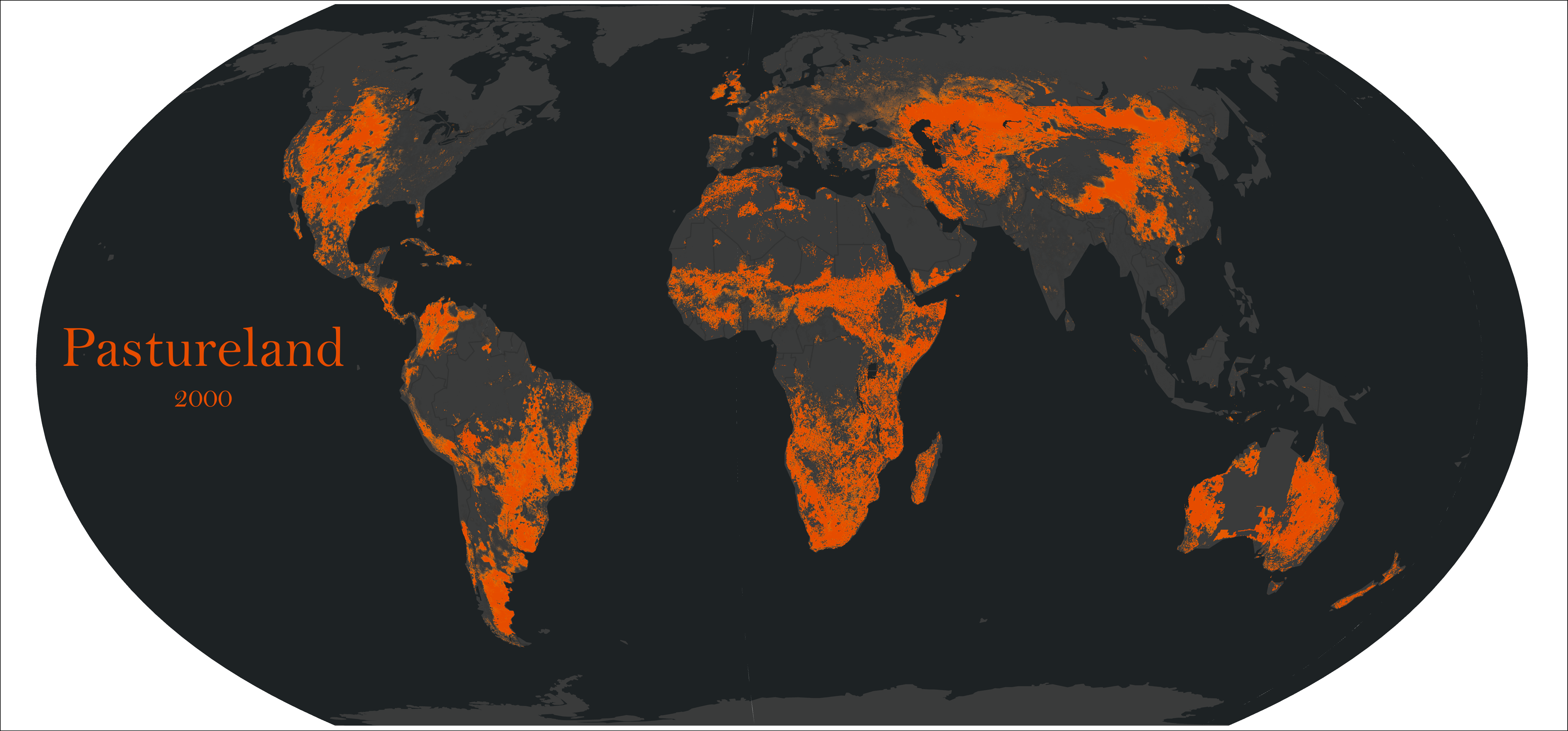
Source: NASA SEDAC
Future Climate Change
We all know that initiatives such as Earth Day are primarily focused on tackling future environmental damage, specifically climate change. Over the coming decades temperatures will increase, sea levels will rise, and weather will change dramatically. This is where we take our map series into the future, asking the question whether or not these climatic changes will impact the Earth equally.
The data we’ve used in this case comes directly from the Living Atlas of the World courtesy of the IPCC. In 2014, they devised 4 different predictive scenarios for the period of 2040 – 2059 based on varying levels of greenhouse gas emissions. The worst-case scenario, based on the highest predicted level of emissions, is what we have chosen to show as part of our series. Despite being labelled as the ‘worst-case scenario’, it is widely considered that this is now very likely to be our reality. The first map here shows predicted change in annual average temperature across the globe between 2040 and 2059, with the second map showing predicted change in annual average precipitation for the same period.
The maps reflect predictions of our future climate suggesting higher temperatures globally, with no exceptions. Northern regions will see more extreme change than southern regions and continental land masses will experience more change than oceans. However, warmer climates compared to today’s temperatures will be universal. There are also dramatic changes in precipitation, with heightened extremes found across the globe. Areas such as Western Australia, South Africa, and the Mediterranean will continue getting drier (brown shades in the map) whilst Asia and North America become wetter (green shades). The maps show the scale of the predicted impact of climate change, giving context and backing to the Earth Day campaign.
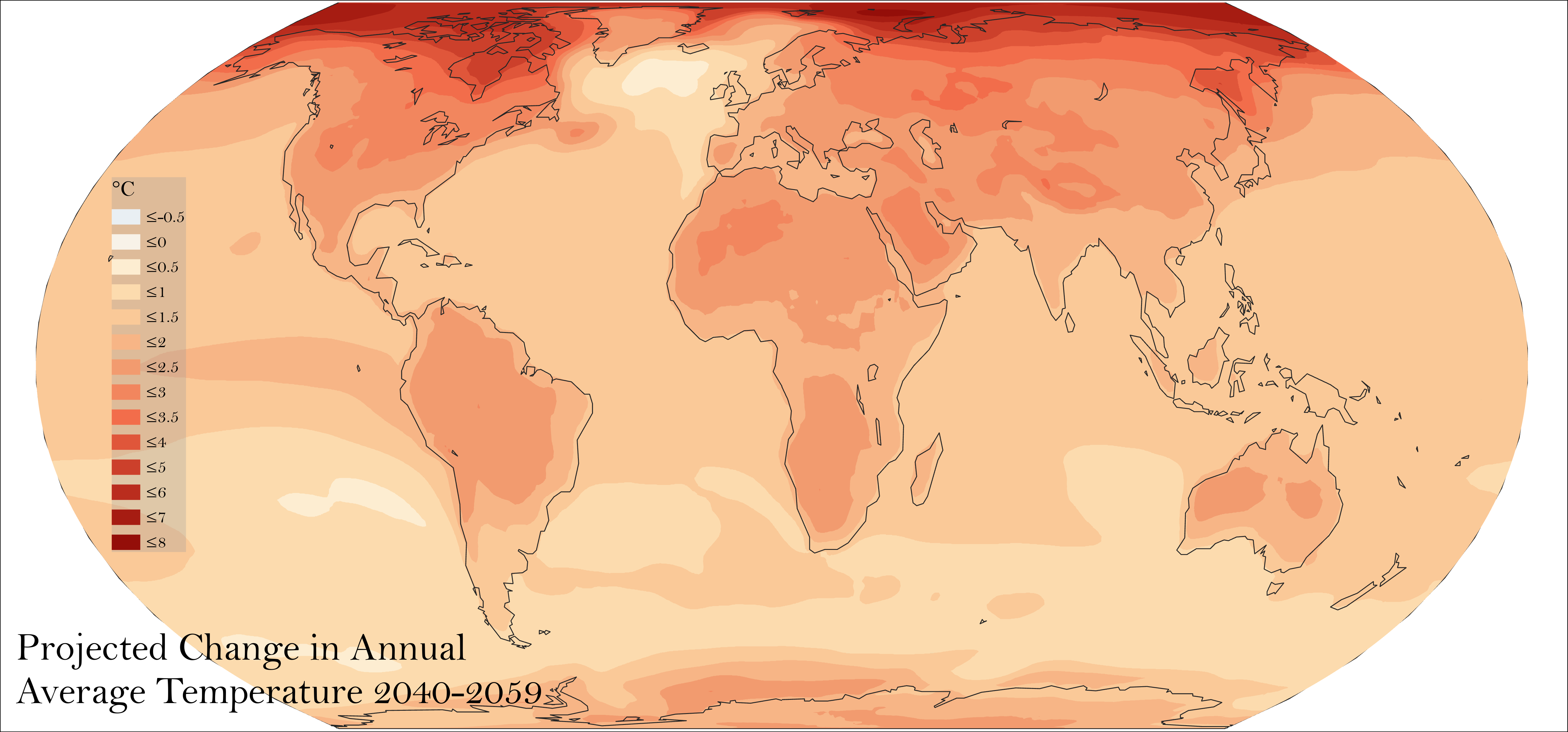
Source: IPCC, via Living Atlas
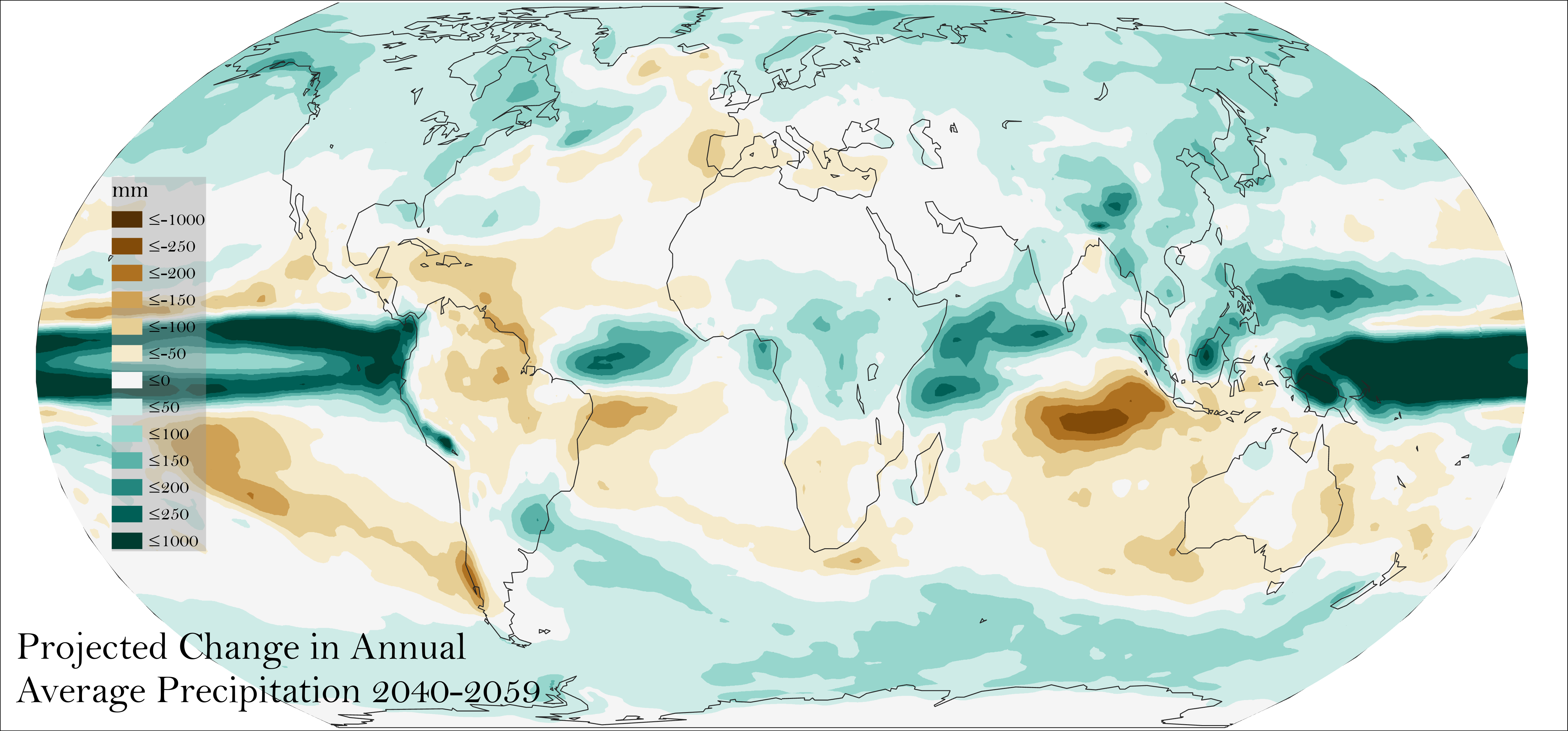
Source: IPCC, via Living Atlas
The Earth Day campaign, along with all those tackling the global environmental and climate crisis, is highly important – increasingly so with each year. Through mapping the data involved, we can unavoidably see the scale of these issues and better understand what needs addressing.