It’s that time again; on 12th December, people across the nation will cast their votes to decide who will be the United Kingdom’s Prime Minister. Elections offer plenty of opportunities when it comes to mapping results, so I’ve been using open-source 2017 election data to investigate just some of the ways we can do this.
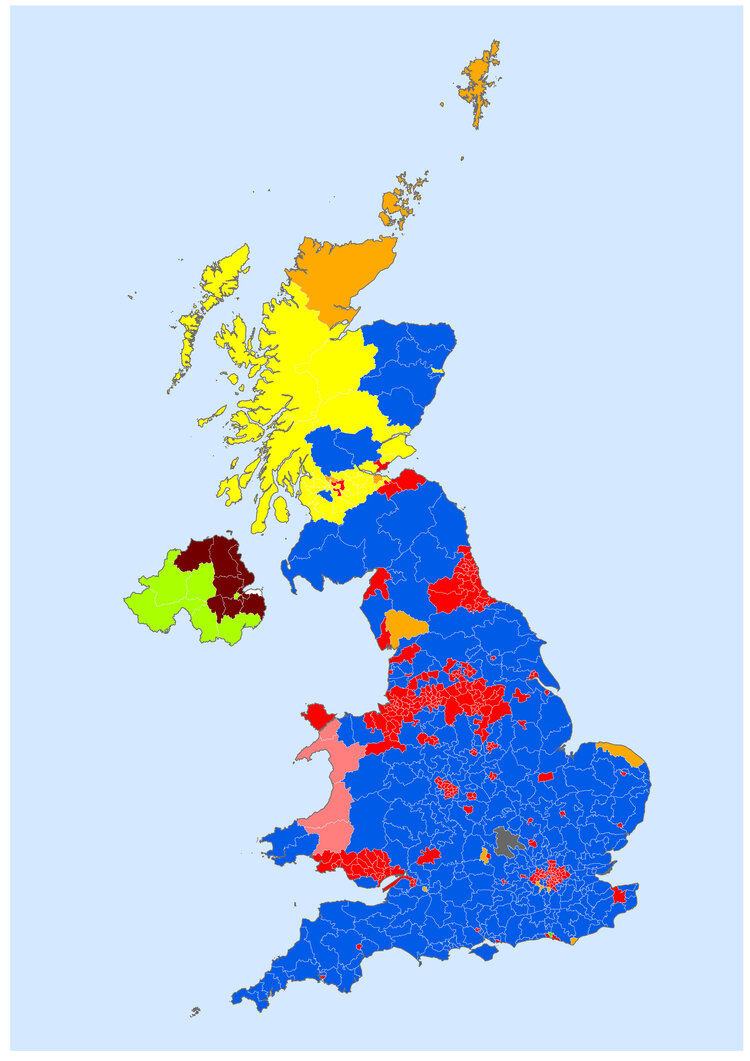
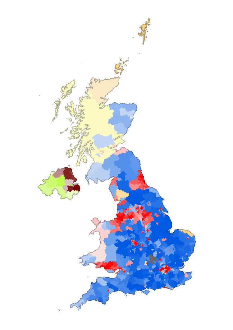
Choropleth Map
Choropleth maps are the tried and tested method for election mapping. Whilst useful for visualising the elected party in each constituency, it can however be tricky to understand the resulting representation of each party in the House of Commons due to the UK being divided into its 650 constituencies using population rather than geographic area. In the case of the 2017 election, this is demonstrated by a much greater portion of the map (below) being blue than red despite the Conservatives winning just 56 seats more than Labour.
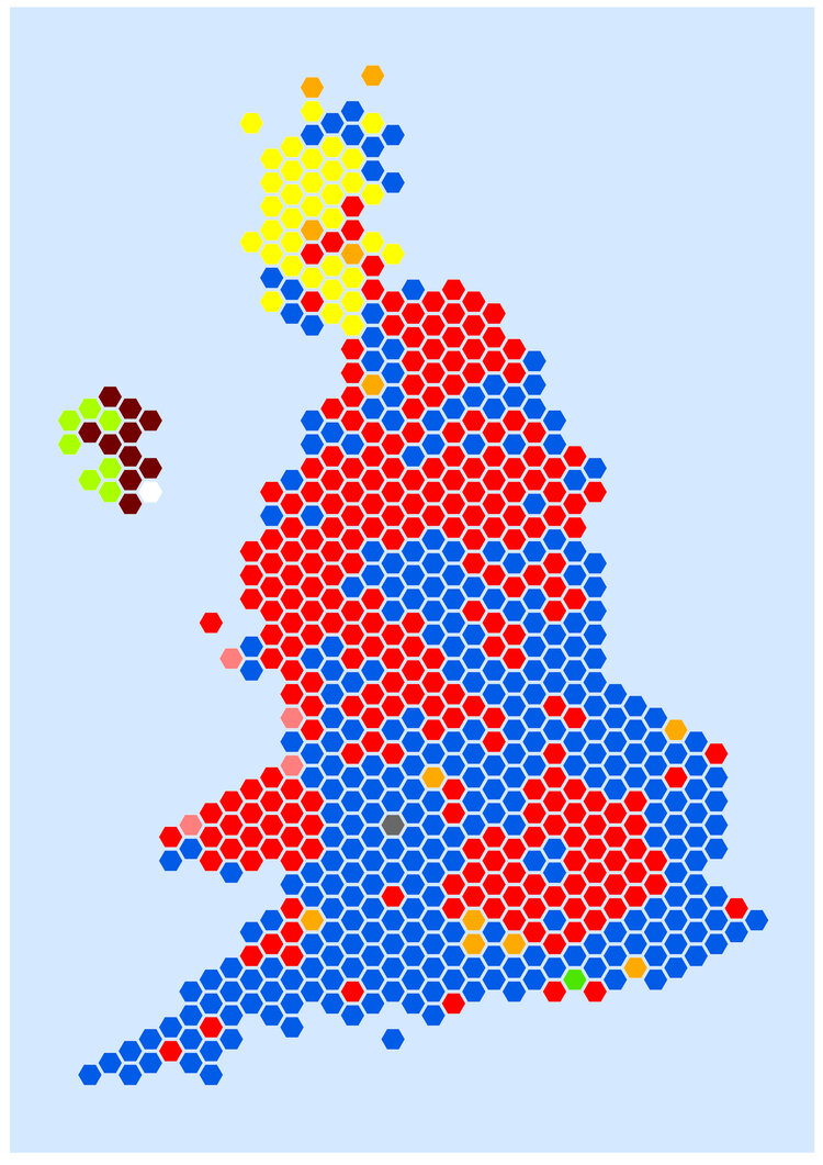
Hexogram
Hexograms overcome the issues faced by choropleth maps by using hexagons to standardise geography. Despite being unable to maintain exact shape or topology, the fact that hexagons tessellate well means that, as shown by a map of the 2017 election results, Hexograms can still produce a recognisable geographic representation. Also, it becomes much easier to understand party representation in the House of Commons. In comparison to a choropleth map it is clearer to see that Labour and the Conservatives are separated by just 56 seats.
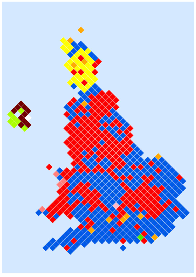
Diamond Cartogram
More recently, diamonds have also been used as a way of producing election cartograms. The Diamond Cartogram for the 2017 election shows that, like Hexograms, these too can give a clear visualization of election results within a reasonable representation of geography.
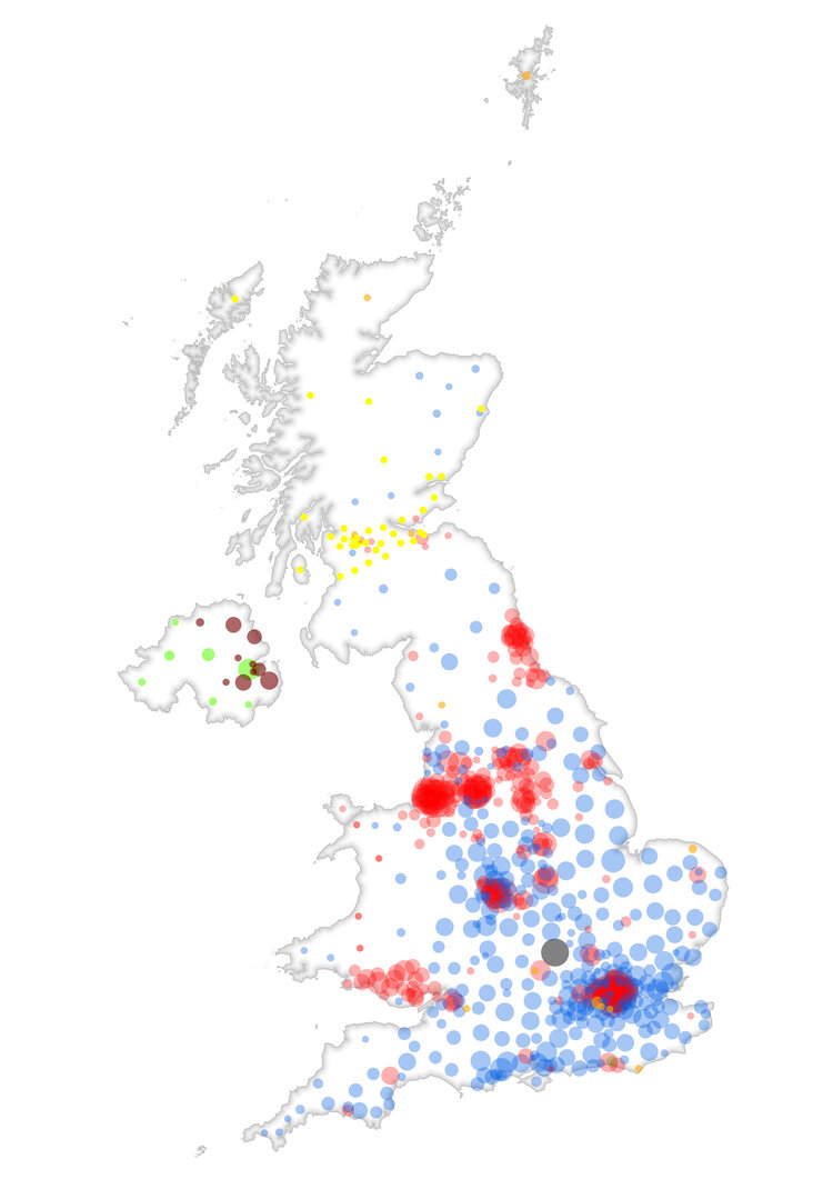
Proportional Symbols
Proportional symbol maps show how data categories and quantities simultaneously vary across space. Here, I’ve used colour to display elected party and then varied symbol size according to their percentage of the vote in each constituency. By removing symbol outlines and increasing symbol transparency, regions of the map with deeper colour shading show party strongholds.
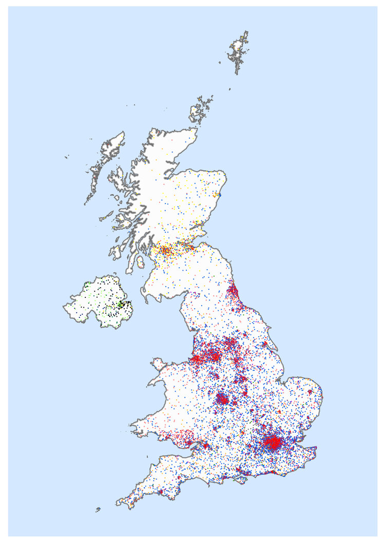
Dot Density
What if we wanted to understand the breakdown of votes for all parties across the UK rather than just those parties that were elected? Dot density maps allow us to do this, using individual dots to represent a number of votes for a given party in a given geographic area. For the 2017 election, I’ve used each dot to represent 2500 votes for a given party. This gives some insight into the breakdown of votes in each constituency and highlights how some parties, such as the Liberal Democrats, gained significant numbers of votes across the UK without having many elected MP’s.
Like this technique? You can now produce dot density maps using the new Map Viewer Beta in ArcGIS Online; why not try them out for yourself!
Value by Alpha
Value by Alpha is a technique that overlays one layer on top of another, which has been used here to show the elected party in each constituency and their percentage share of the vote using a transparency layer. Faded colours indicate areas where parties gained a lower percentage of votes, making it easier to locate marginal and stronghold seats.
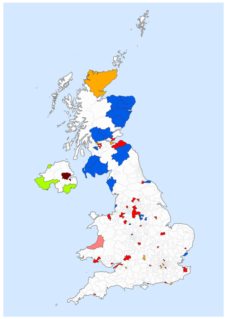
Choropleth Highlights
Choropleth Highlights allows us to concentrate on more specific results that emerge by only presenting the data you want to focus on. By applying a definition query, the map here only shows constituencies where there was a change in the elected party from the 2015 to 2017 elections. Time will tell what a similar map of the 2019 election results looks like and the implications of this!
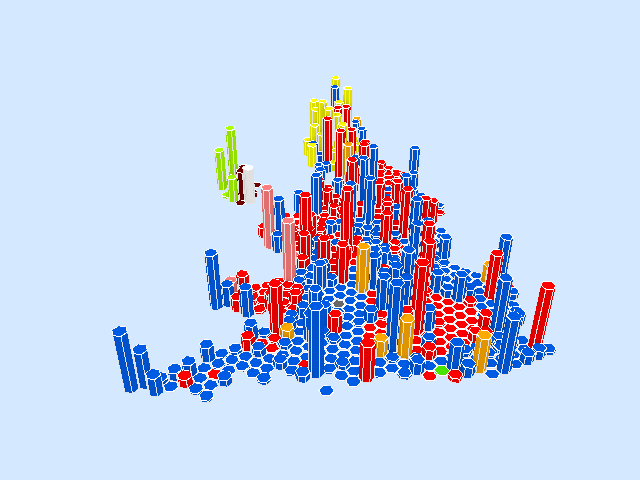
3D Hexogram
Who said election mapping could only be done in 2D? Having really liked the Hexogram method previously shown, I decided to develop this style further by creating a 3D version. For this, I wanted to highlight where the most closely contested seats were at the 2017 election, as these locations could be very important in deciding the outcome of the 2019 election!
To do this, I ranked the size of the majority held by the elected party in each constituency at the 2017 election from 1 to 650, where 650 represented the seat with the smallest majority (just 2 votes in North East Fife). I then used ArcGIS Pro to extrude each constituency’s hexagon to this ranked value, meaning more closely contested seats are represented by higher columns which are easily identifiable.
Animated Map
An iconic part of election day is the race to be the first constituency to declare a result, a title claimed by Newcastle Upon Tyne in 2017. In light of this, I produced an animated map to show the order in which results were declared across the UK - by creating a time-enabled map and then using the animation tool in ArcGIS Pro to generate a GIF. From this, we can see how the party holding the most elected MP’s changes through election night, as well as how a number of results in South-West England were called several hours after all the other results.
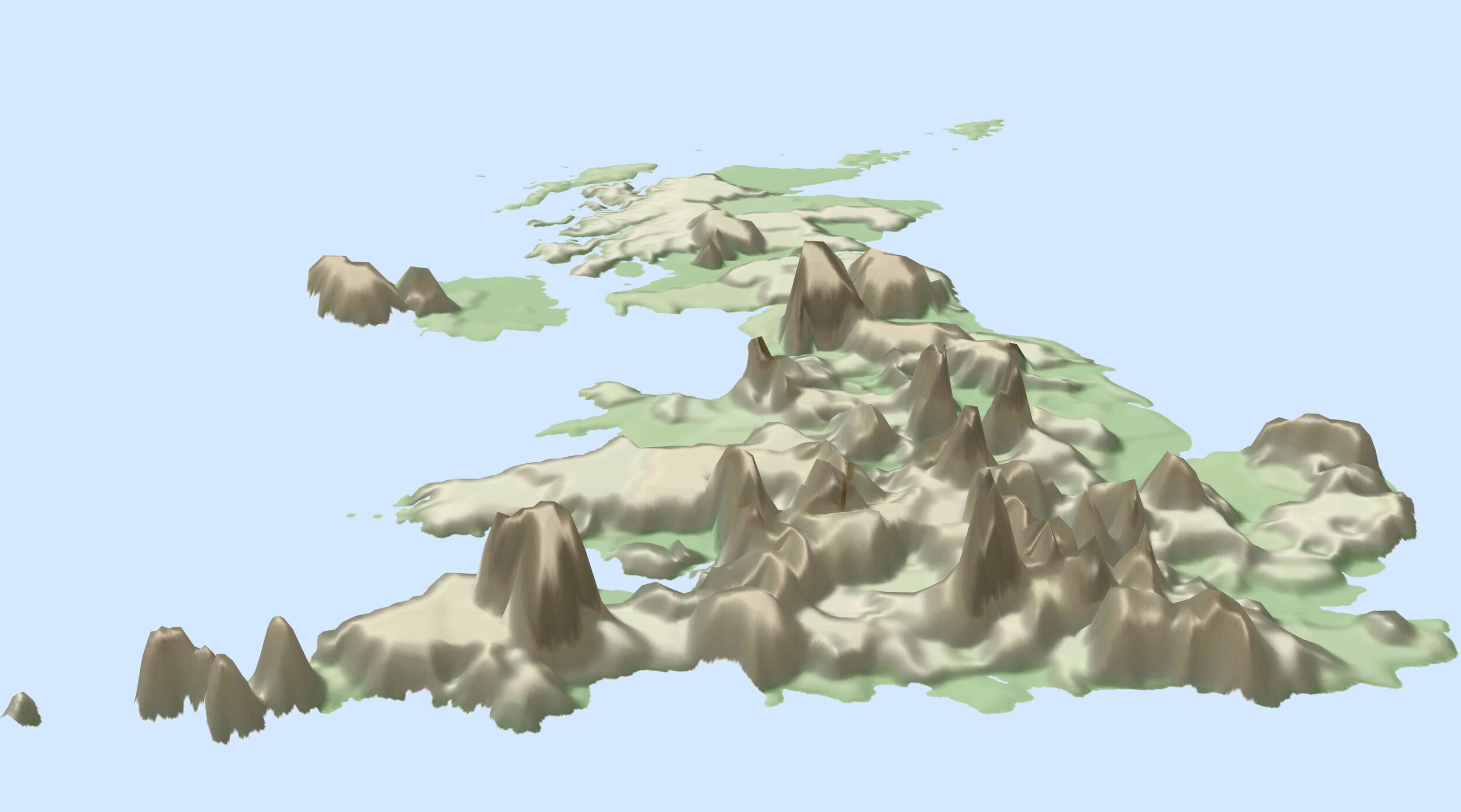
Election Mountains
I now wanted to produce something a little more creative. Inspired by recent IIB award-winning entry Earth at Night, Mountains of Light by Jacob Wasilkowski, I decided to try and display electorate turnout as mountains.
To do this, I calculated voting turnout as a percentage in each constituency and having squared these values to exaggerate areas where turnout was high, I generated a raster. I then interpolated this raster across constituency boundaries using focal statistics before using this as an elevation surface in an ArcGIS Pro local scene. I overlaid the turnout raster on top of this. Finally, I created a symbology that resembled mountainous topography and blended this with a multi-directional hillshade layer.
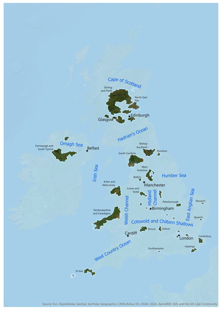
Blended UK
Having enjoyed Ken Field’s Blended USA map and my colleague Rob Collins’ Brexit Isles visualisation, I decided to create my own island-themed representation of the 2017 election results. For this, I wanted to identify constituencies where the results were particularly marginal, which I defined as a majority of less than 1000 votes. My idea behind this was to highlight regions of the UK where there are large amounts of people with different political views living side by side.
Having identified regions with marginal results, I then created an ocean layer and increased its transparency to give the impression of the rest of the UK being submerged. Additionally, I decided to loosely label the constituencies identified before finally creating fictitious ocean names to finish my creation.
Have you made an election map using a style that hasn’t been featured here? If so, we’d love to see it! Please do share your own election map creations with us by tweeting @EsriUK.