In ArcGIS Pro you can now cluster point features to simplify data visualisation. Each cluster represents two or more features in the dataset, and by default, a text marker displays on top of the cluster to communicate the number of features represented.
The clustering of these features are dynamic, so as you move around or zoom in and out of the map, the clusters change to represent features differently.
Clusters draw in place of features until you zoom into a scale where the geographic distance between the features is large enough for the individual points to display.
A challenge of using this method, in particular when displaying by Unique Value, is having disproportional data, where one or two values have many more features than others. This results in only the most prominent value being clustered, until you zoom further in.
Using data engineering, you can explore, visualise, clean, and prepare your data to give you a better result.
The following example will give you an idea of how these two new tools can be used. The map scale in the following graphics is set to be 1:10,000 so that we can see the comparison.
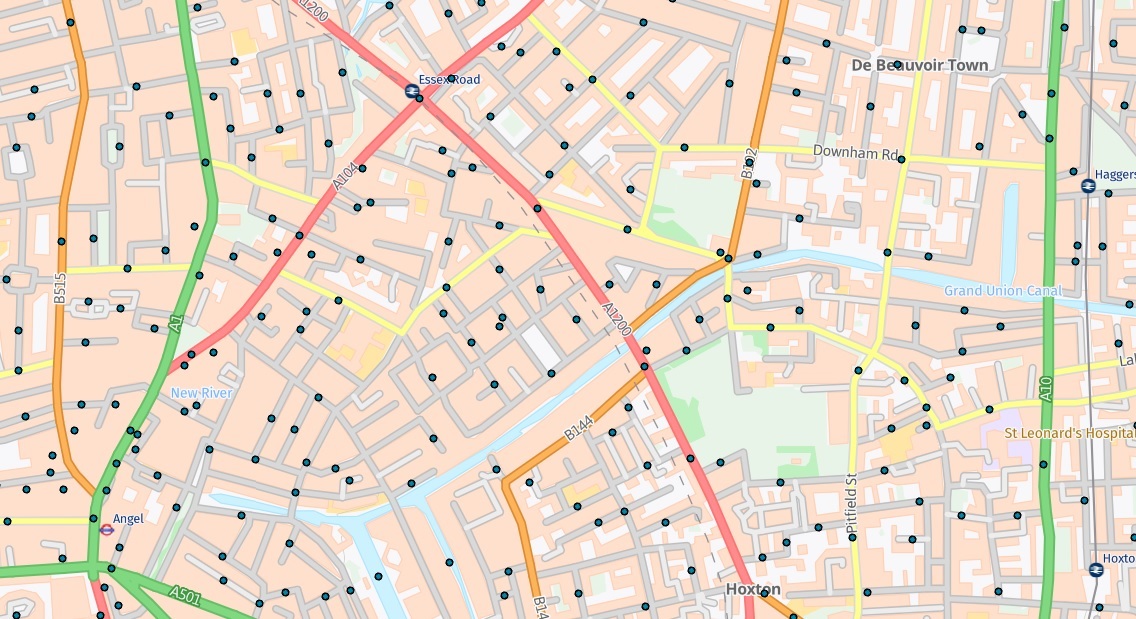
First, we have a dataset of city crimes:
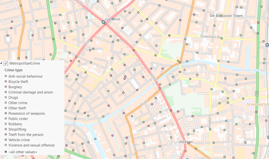
There are 14 crime types listed in the attribute table of this data, so let’s symbolise them using Unique Values (Crime type):
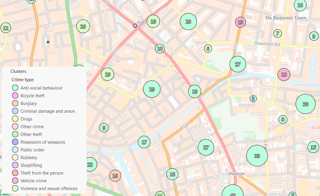
If we then use the Aggregation tool from the Appearance tab to cluster the points, it looks like the majority of crimes are ‘Anti-social behaviour’.
And that’s because they are, but how do we know that?
By right clicking on the layer in the Contents pane and selecting Data Engineering from the context menu, you are shown the layers data through statistics and charts:
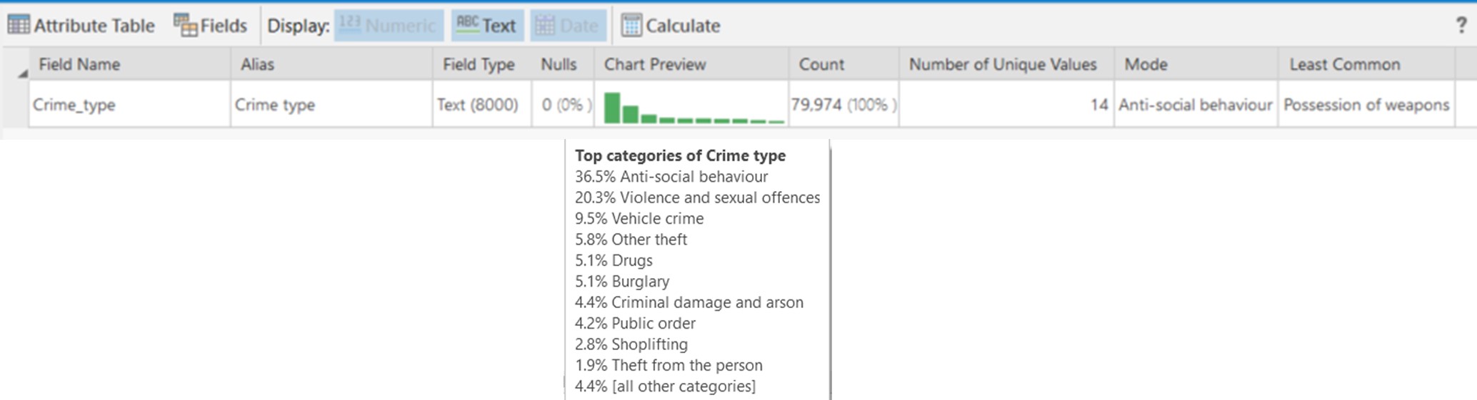
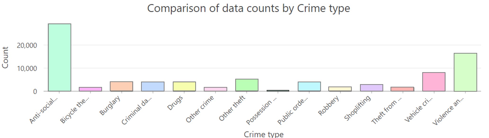
Straight away we can see that there are just under 80,000 crimes in total, 14 different crime types, with ‘Anti-social behaviour’ making up 36.5% of the data.
By using the data engineering tool to create a graph, we can see that ‘Anti-social behaviour’ makes up a very large majority, followed by ‘Violence and sexual offences’:
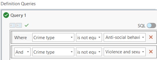
As these two crime types are dominating others, we could remove these types by using a definition query:
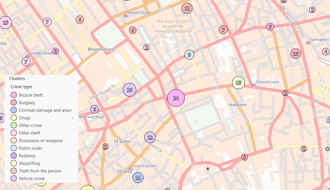
By doing this, dynamic clustering will provide us with a better understanding of where there are clusters of some of the more unusual crimes, even though these crimes may not be committed as often, they can still be committed in clusters and you need to know where these clusters are.
I have to say that these two new additions to ArcGIS Pro are very interesting and well worth investigating.
So have fun, I hope this blog has been helpful.