ArcGIS Dashboards are a staple when it comes to the Esri toolbox. Over the years, the user interface has been developed and there is a continually growing set of capabilities. Their purpose remains the same: to help users make decisions, visualise trends, monitor status in real time, and inform their communities. But how can one app do all that? This blog digs into what ArcGIS Dashboards has to offer, its key capabilities and how they are being used to support core aspects of organisation workflows.
Why use ArcGIS Dashboards?
Informative
Data analysis doesn’t have to just be for data analysts. ArcGIS Dashboards present data in visual and easy-to-interpret formats. From processing live events to detecting trends over time, all relevant information can be seen in one place through pre-configured data visualisations. This provides dynamic and accessible interpretations for a wide-ranging audience.
Intuitive
ArcGIS Dashboards are created using a widget-driven builder with multiple structure and design options available. Dashboard creators have the tools to build their apps to be as complex or simplistic as necessary, catering for technical and non-technical users.
Integrated
Data is constantly changing, and ArcGIS Dashboards accommodate this. Connecting into data sources allows users to take advantage of data hot off the press. Pulling in external content and seamlessly integrating with other web apps harnesses the full power of ArcGIS Dashboards.
Interactive
Linking components enables the user to interact with data, explore dynamic content, drill through filters, and make informed decisions knowing that they are working with the latest information.
Key Components
Elements
Once ArcGIS Dashboards has launched, begin by adding elements to the blank canvas. There are 13 elements to choose from and thousands of ways to configure, customise and connect them. Pick and choose from maps, charts, tables, and contextual components too. Each one can be explored in detail here.
Top tip: You don’t have to have a map element in a dashboard, connect standalone data sources to drive elements.
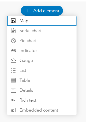
List of elements that can be added
Layouts
For an effective dashboard, consider the layout carefully. Keep it as clean, yet informative, as possible. Build a theme into the design for a professional, coordinated feel. A dashboard is composed of one or more elements that are designed to always occupy 100 percent of a browser window.
Make use of all the options: moving, resizing, tabbing, and grouping elements together in an intuitive way. When resizing a browser, the elements resize to fit, shrinking down to a mobile worker’s screen or scaling up to a multi-screen set-up in a national operations room.
Top tip: Hold shift key down when your moving elements to create seamless groupings.
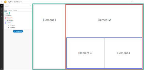
Diagram of highlighting element layouts in relation to the layout tree on the left-hand side
Interactions
In its default configuration, the information a dashboard displays changes only when the underlying data refreshes. To provide a more interactive experience for the viewer to explore, query and extract information, the creator can configure settings such as Actions, Selectors and, the recently added Data Download options.
- Actions are initiated by events such as a URL parameter change, map extent change, or a selection change and trigger a filter, change in extent, zoom etc.
- Selectors can be viewed as a specific type of action, filtering based on categories, numbers or date values.
- Data download is a game changer for a lot of users. Viewers can now download the data from data-driven elements if it’s enabled for that dashboard, and it’s not limited to extracting the source data. Users can also download any summarised or aggregated information from charts and tables too.
Top tip: Use URL parameters to pre-set interactions, such as opening the dashboard already zoomed to a specific location.
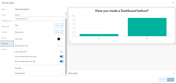
Enable data download toggles in General settings of a serial chart
Dashboards in Action
Esri categorises dashboards into four areas: Strategic, Tactical, Operational, and Informational. Many have adopted dashboards and use them as a standalone app while others incorporate them into a wider workflow
Strategic dashboards help executives track key performance indicators (KPIs) and make decisions by evaluating their organisation’s goals
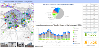
Information regarding Highland council housing completions are displayed temporally to compare the number of completions per housing market area per year.
Tactical dashboards help analysts and line-of-business managers analyse historical data and visualise trends to gain deeper understanding.
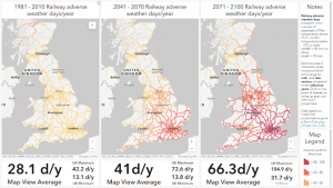
In a collaboration between Esri UK’s Education team and the Met Office, this dashboard allows users to explore the risk climate change poses to the UK rail network based on historic information.
Operational dashboards help operations staff understand events, projects, or assets by monitoring their status in real time.
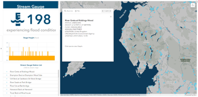
This Stream Gauge Dashboard provides information on the status of stream gauges globally. The Live Stream Gauges data is available from the Living Atlas of the World and is filtered to show information relevant to the user’s current location or selection.
Informational dashboards help organisations inform and engage their audiences through community outreach.
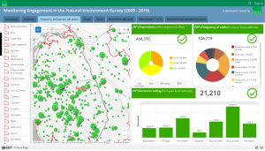
Natural England have created a dashboard to summarise results of their ‘Managing Engagement with the Natural Environment’ survey. This is embedded within an ArcGIS Storymap to add context to the project and group multiple dashboards into one location for easy public consumption.
Explore more fantastic examples in the community gallery to inspire you on the possibilities.
How to get started
Throughout this blog, links have been included to guide you to the extensive resource documentation that covers everything from the basics through to niche and advanced capabilities.
Our Learning Services team at Esri UK provide a comprehensive 1-day Getting Started with ArcGIS Dashboards course to step you through the different dashboard types, design considerations, layout options, and techniques to organise and focus dashboard elements to meet the specific information needs of your audience. Don’t hesitate to get in touch to find out more.