Selectors can really enhance your ArcGIS dashboards by making them interactive! Essentially, a selector describes any dashboard element that results in an action on another element of the dashboard. For example, zooming to an area on the map, making a pop-up appear or filtering a list or chart.
With so many different configuration options available, selectors can seem quite daunting. However, this is definitely not the case! I will show you how easy it is to get started with selectors by taking you through a worked example using data from the Living Atlas – WFD Site Classifications (2016) from the Environment Agency.
The dataset is a point dataset showing the health status of English waterbodies at various monitoring sites. For each monitoring site, the attribute table includes fields detailing the waterbody name, classification status, type of waterbody etc. More information on the dataset can be found here: Defra Data Services Platform. As this data is freely available on the Living Atlas, you can easily follow along with this blog and try out selectors for yourself!
Getting started
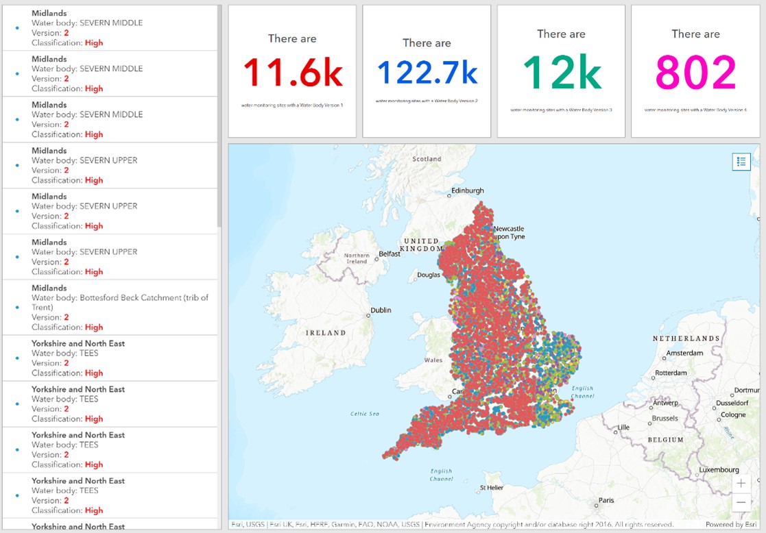
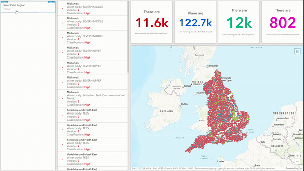
Firstly, I created a simple Web Map from the WFD Site Classifications dataset and changed the symbology to represent the field Classification. This field classifies the overall health status of the waterbody into categories such as ‘High’, ‘Moderate’ and ‘Poor’. I then created a dashboard which included my map, a list and indicators. The final dashboard looks like the image below:
Once the dashboard was set up and ready, it was time to configure the selectors. There are three main selectors I configured; lists, category and number.
List Selector
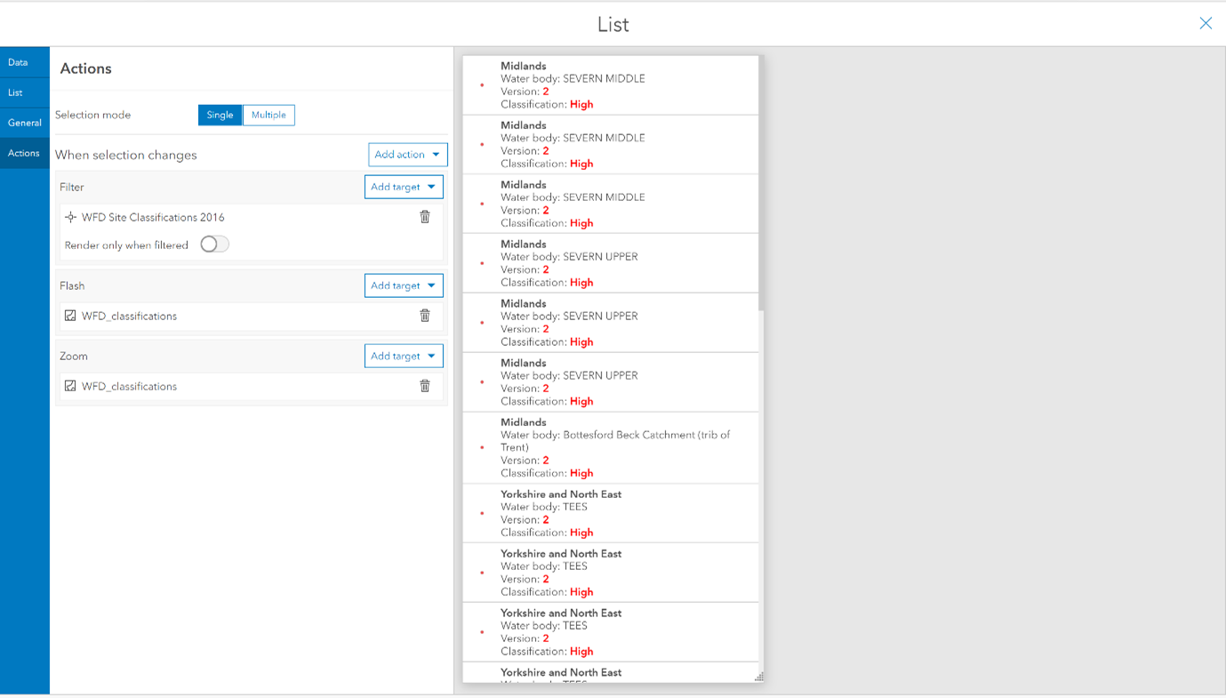
The first selector I configured was a list selector (for more information on setting up lists visit: List—ArcGIS Dashboards | Documentation). Lists can be configured to act as selectors. When you select a row in the list, it can trigger actions on other elements such as filtering and zooming to the point on the map and making the point flash.
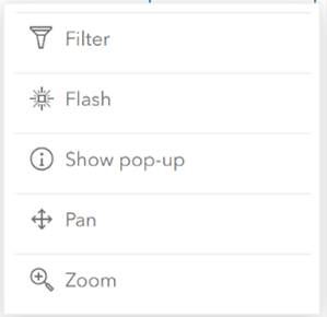
To start configuring the list’s selector, I clicked Add Action under the action tab. A whole range of actions are available to configure such as flash, pan and zoom.
First, I wanted to filter the map so only the selected point appears on the map. To achieve this I chose the filter action, clicked on Add Target and chose the WFD Site Classifications 2016 layer from my map. This filter has now been configured, it is as simple as that! I also repeated this process with the flash and zoom actions. Now the map would zoom to the selected point and make it flash.
Category Selector
The next selector I set up was a category selector. This selector is configured as part of the header and side panel elements. A category selector filters down the map, indicators and list based on a categoric field. In this case, I wanted to filter down by the region in England.
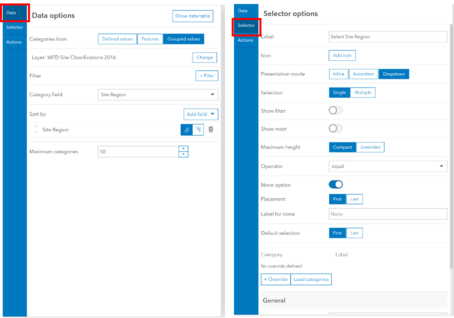
On a new side panel element, I added a category selector and set the Categories from option to be Grouped values. This will automatically group the attributes within the field into its categories. I set these values to be from the WFD Site Classifications 2016 layer and the category field to Site Region. To format the selectors appearance, under the selector tab, I gave the selector a label, chose a dropdown presentation mode and enabled the None option.
Finally, in the same way I configured the list, I set the filter action to target the map, list and indicators. This will now filter the points based on the selected region in England.
Number Filter
Next, I added a number selector. Similar to the category selector, I can filter down the map, list and indicators by a numeric field, such as Water Body Version. In the same side panel as the category selector, I added a number selector. In order to choose a numeric field from the WFD Site Classifications layer, the Limits From field must be set to Statistic. I changed the field to Water Body Version and set the presentation mode to Accordion. I also changed the display type to Spinner as this allowed me to have a None option.
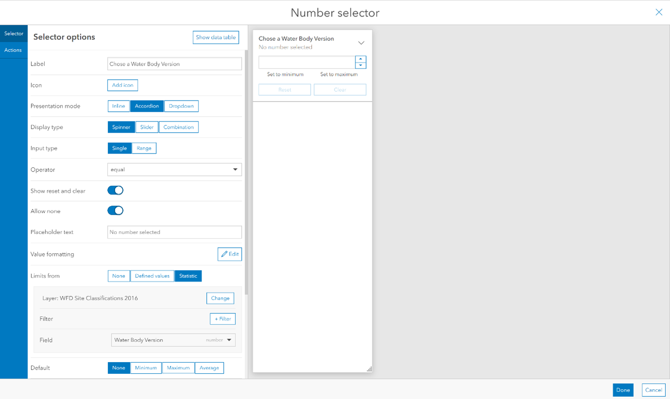
Again, I set the filter action to target the map, list and indicators. And that completes the number selector configuration!
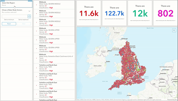
The category selector and number selector work together. This means we can filter down by both the region in England and Water Body Version, as shown below. I have only added two selectors but we could really enhance this dashboard further. I could add more category selectors to the side panel to filter the map, list and indicators down even further by fields such as Waterbody Name or Classification.
Other useful tips
Whilst not directly a selector, filtering the list and indicators as the map extent changes is really useful! Within the map configuration, this can be set under Map Actions. We can also add a filter to our chosen targets. I’ve chosen the indicators and list targets, so that when we zoom in on our map the list and Indicators change to reflect this.
If our WFD data had a date aspect we could also add a date selector. This does what it says on the tin: filters down any targets based on a selected date.
Lists, maps and indicators aren’t the only targets of selectors! Serial charts, Pie charts, Gauges and details can all be filtered down as a result of selectors.
Hopefully, you now feel equipped to get hands on with selectors in Dashboards. As mentioned earlier, the data used in this example is freely available on the Living Atlas so feel free to give it a try yourself!