Good map design can provide that all important link between functionality and aesthetics. While there is more to cartography than dressing a map up, if a map attracts a reader’s attention through its visual appeal, they will naturally be more receptive to that map’s message. As I explore in this blog post, some pretty creative cartography can result from using design features that serve a function too.
There may be many ideas churning in your mind about what to include in your latest map, from interesting contextual features to that new design trick you may have picked up on one of our blogs. But smart decisions need to be made to ensure that you avoid over-complicating your output. This can leave room for some creativity in your design approach – why not include features that have more than one purpose on your map?
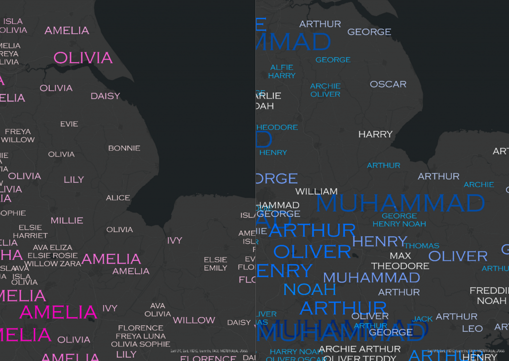
These maps aim to do just that by tapping into the power of functional aesthetics. Using proportional labelling, this pair of maps of England and Wales’ 100 most popular baby names displays the names of features, and scales the labels themselves to indicate their frequency too. All while harnessing a distinctive cartography style designed to catch the reader’s eye.
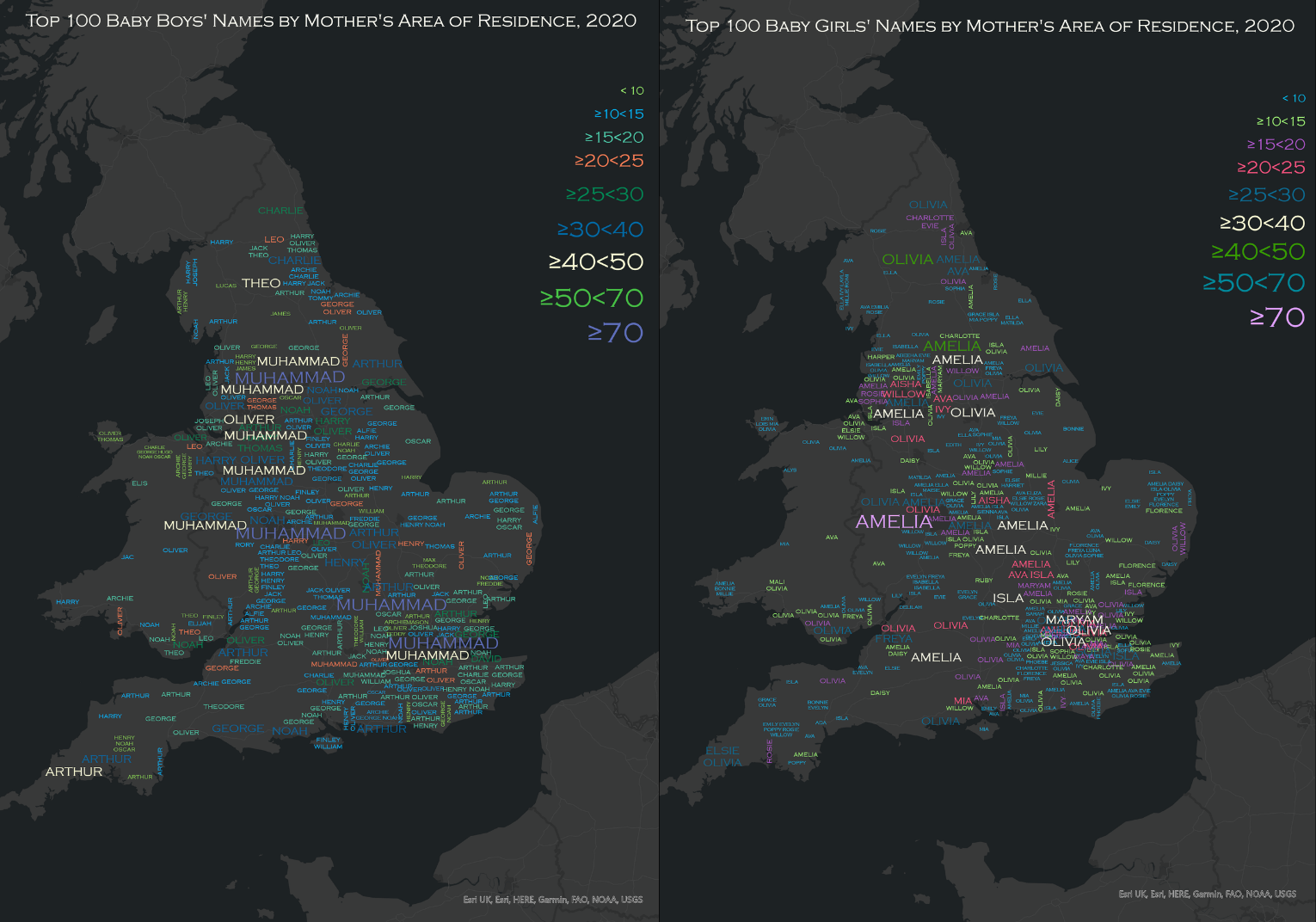
Taking a unique design approach inspired by some previous cartographic work by Kenneth Field and Dr. Linda Beale (you can check out their award-winning map of Irish Surnames here) and the word-cloud style visual representation that has been shown on many a school whiteboard since the 2010’s, this pair of maps illustrates the spatial and quantitative distribution of England and Wales’ 100 most popular male and female baby names in 2020.
Because who doesn’t love babies, right?
Word Cloud by Kent (2013) in The Cartographic Journal.
Attention Spans Aren’t What They Used to Be
One of the key aspects of cartography is deciding on the most important data to display. Too much information will result in a map that is less focused – and could result in losing your readers’ attention.
My duo of maps aimed to illustrate the approximate geographical distribution of the most popular names of new born boys and girls in England and Wales, because we haven’t managed to GPS track that stork just yet.
So, for the sake of clarity – the most popular baby name for each unitary boundary was selected as the sole display feature for the maps.
How it was Done:
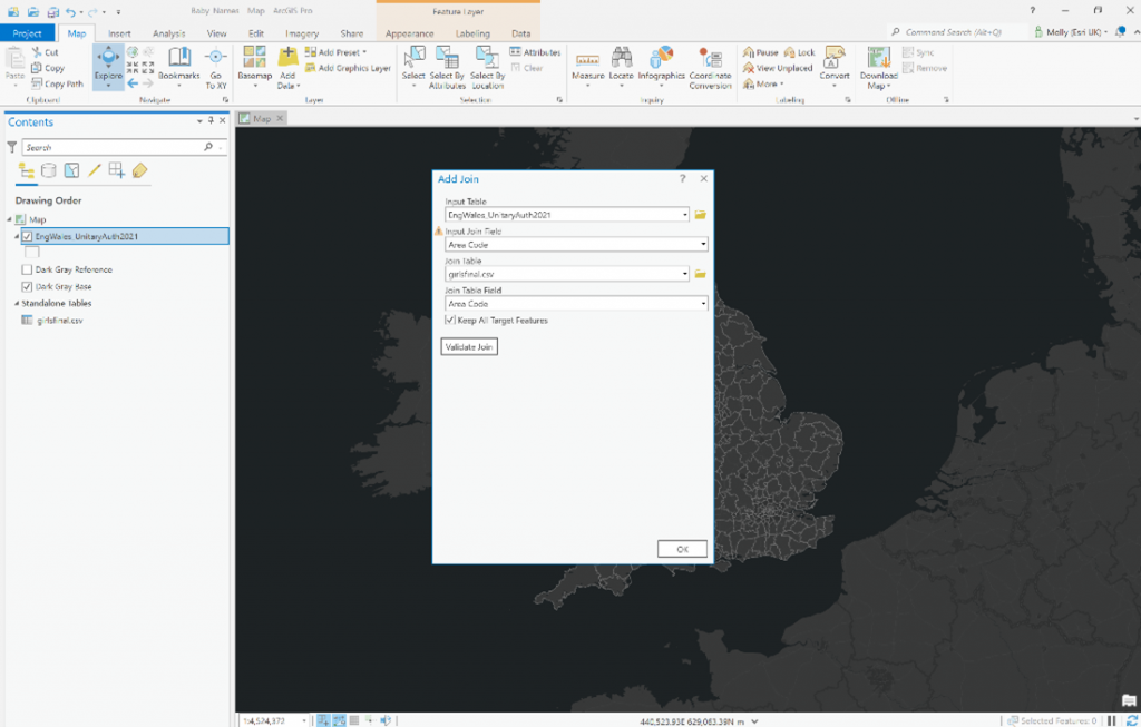
For each map, a polygon shapefile of the unitary boundaries of England and Wales was mapped in ArcGIS Pro.
A table of the 100 most popular baby names for England and Wales for males and females was then joined to the geographical boundaries. This can be done by right clicking your boundary layer and clicking Add Spatial Join in the Joins and Relates drop-down menu.
Counts rather than proportions of the most popular baby names were selected for these maps. This is because with the dataset used, the most popular name for each boundary out of the overall 100 most popular names in England and Wales was given, which would make proportional comparisons across boundaries more difficult.
Get Creative with Labelling
Proportional labels and symbols can be an efficient way of getting maximum information across, all while using minimal map space.
With the chosen dataset, each name has a count associated with it so they can be scaled by size. The legend also reflects that the larger the font, the higher count of babies with that name were born in the area.
How it was Done:
Labels were turned on for the baby name layer and set to display the top baby names for each unitary boundary.
- Labels can be turned on by selecting a feature layer in the Contents. On the ribbon, under Feature Layer, click the Labeling tab, and select Label.
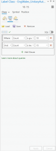
Next, the data was broken down into classes. Once I’d decided how many classes to use (9 in this case), this number of new classes was created.
- First, check that List By Labeling is the active method of displaying the Contents
 To do this, click List by Labeling. Ensure your chosen feature layer is selected in the Contents pane.
 - Classes can be created by selecting Create Label Class in the dropdown menu in the Labeling pane.
At this stage the classes were still empty, so it was time to define the intervals within each class.
- For each of your classes, select the label class from the Class drop-down menu and click the SQL Query tab.
- Build the query expression that identifies the subset of features you want to label, for example in this case, Class 2 = where count is greater than or equal to 10 and less than 15.
- Now specify the size, colour and font you want to use for each label class. For this map, the size of the labels increased with each class interval.
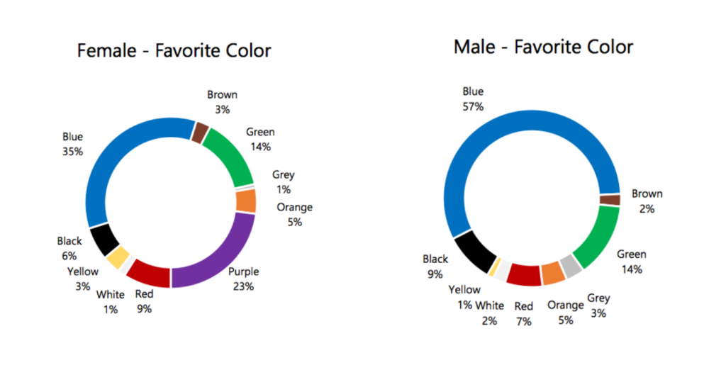
Consider Your Colour Choice
Colour selection is a powerful tool to leverage if you are looking to tell more with your data and better communicate the theme of your map.
Good design requires smart decision making, and often in map making you can find yourself at a crossroads between choices – with plenty of pros and cons for each. This example map was no different.
Choice 1:
The first option seemed a straight-forward one. By keeping one colour consistent throughout the map and using a stronger hue to indicate higher or lower frequency, things could be kept concise and clear.
With a topic like baby names the obvious choices appeared to be those typically associated with males and females. But this raises a key consideration when making design decisions – the importance of avoiding the communication of stereotypes and assumptions within your map.
Across many cultures globally, the choice of pink and blue as gender markers has been widely used, yet this selection of colours has been increasingly criticised for driving problematic gender norms. While cultural colour associations can be a useful tool in design – think political parties and sports teams – the issue with the selection of pink is that it is not universally accepted by the gender it’s designed to represent. For instance, in 2015 a poll on visualisingdata.com found that only 14 percent of women favoured pink to represent females, in contrast to 41 percent of men.
Choice 2:
Bearing the previous point in mind, the second colour selection is based on 2009 research by Hallock, that looked at the colour preference by gender in a study across 22 countries – finding that blue took the cake for both genders, dispelling that all too common pink-vs-blue misconception.
This selection, while containing more variance in its colour scheme, is an evidence-based design choice. So by avoiding a single colour ramp and potentially sacrificing a degree of clarity in the final visual, we opted to use a spectrum of colours to communicate the varying values and wonderful aesthetic properties.
Get Smart with Spacing
It’s important to find a balance between density of detail across the map – without leaving areas that are either too crowded or too sparse.
The Maplex Labelling Engine has some great tools that streamline the placement and distribution of your labels. Further information on labelling with ArcGIS Pro can be found here.
How it was Done:
Selections in the Labels Properties pane ensured that labels were placed on the boundaries they represent and were as evenly distributed as possible.
- Launch the Label Properties pane by right-clicking on your labelled feature layer.
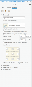
- The label classes were placed within their respective unitary boundaries by selecting to Place Within a Fixed Position of Each Polygon. This setting can be found in the Placement pane. This takes a lot of the heavy lifting out of the spacing of labels in a few clicks.
- To ensure that all labels were displayed on the map, in the Conflict Resolution pane, the Never Remove (Place Overlapping) feature was selected.
- Lastly, the labels were then Converted into Graphics, and some fun was had with manual editing. This can be done by right clicking the feature layer, selecting Convert Labels, and clicking Covert Labels into Graphics.
- Make sure you’re happy with the colours and font of your labels before doing so, as once the labels are converted into graphics it can be more difficult to change these selections across each class.
- As this was a design focused map, names were placed at approximate locations on each unitary boundary before removing the boundary lines themselves, and simple adjustments like rotating certain labels by 90 degrees created a unique finish.
The Finished Products
While looks aren’t everything, who says a map can’t be smart and pretty too? Or in more technical terms, have maximum usability and aesthetic appeal?
Try out some of these tricks and tips to find that right balance in your map design. And remember, the creative possibilities with cartography and ArcGIS Pro are endless – so have fun with it!