Have you recently dived into the world of Web AppBuilder (WAB) and perhaps found yourself a little lost with where to go, which colour to pick and when to stop adding widgets? There’s absolutely no shame in that, we’ve all been there… but I’m here to help! Throughout this blog I want to steer you in the right direction and show how a few small design choices can have a large impact on the final product. Grab yourself a cuppa and make sure you’re wearing your design cap.
You are not the end user (sorry)

Photo by Guillaume TECHER on Unsplash
One of the most daunting things about designing a web app is where to start. You probably have a rough idea in mind of what you want to create, but with so many directions to go in it can be hard to get going. Throughout the entire journey, the most important cheat code is to imagine how your end user is going to be interacting with your web app. Write a little post-it note and pop “you are not the end user” on it, as this will help keep you focused and shift your perspective. It’s very easy to tailor an app’s design to your own tastes, but this is like a DJ playing only their favourite songs and not the crowd pleasers – you’ve got to think about your audience! Once you are considering what the target audience wants to see, this will make it much easier to create an efficient and easy-to-use app.
Widgets
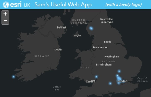
One of the common traps when designing an app, is the lure of having many many widgets. This leads to an over complicated and very busy interface, that quickly disengages your users. The key is to keep things simple. Only including the layers or widgets you absolutely need. Do you really need that print widget?? …no seriously, really? Avoid the ‘just-in-case’ widgets that might get used once every decade and keep the app streamlined, so not like the image below.

Having the legend widget is absolutely fine, the map needs some context, but make sure to tidy up the legend. Nobody is going to understand what “Buffer_v2_LondonFireData” refers to, so spend time simplifying the titles and only including those layers that are absolutely necessary on the map. The same argument applies in reverse, you probably don’t need a legend or layer list widget if you’ve only got one layer. Just like tidying your wardrobe every year, be ruthless in getting rid of the non-essentials!
Colours and Logo
I often see web apps with fantastic content, but the app is immediately let down by an unchanged ‘out the box’ default design. Easy changes will quickly spruce up your user experience.
First, let’s make the app look less like an Esri app and more like an ‘insert your company here’ app! Find out your brand colours and apply them to the app’s colour theme. If you’re unsure, head over to the company’s website and take a screenshot of the page; then head to Image Color Picker and identify the hex codes here. If you don’t have an obvious brand to choose from, why not match the theme to your map symbology? Some nice colour pairings can be found here.
If your app design let’s you add a logo, make sure you grab your organisation’s logo and throw it on – it’ll immediately deEsri-fy the design. Why tell everyone it’s a Jamie Oliver recipe when you can pretend it’s all your culinary expertise?!
Map Stuff
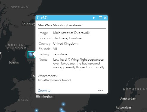
So at this point, your apps are looking like a million dollars/pounds/euros and the map just needs a little attention. As mentioned earlier, make sure you’ve tidied up the map layers; appropriate names, eye-catching symbology and they contribute to the map’s key messages. Further to this, it’s worth exploring the pop-up configuration menu in your web map. People will naturally click on your map’s data to see more info, so you’ll need to establish whether the pop-up information is required. If not, simply turn off pop-ups and avoid the confusion. If it’s key to give the data more context, make sure you clean up the pop-ups. Turn off layers that aren’t relevant and rename layer titles. Any excuse for a Star Wars reference…
Behind every good dataset, is an even better basemap. The unsung heroes of the mapping world. It’s important to pick a basemap that suits your dataset and promotes the information you lay on top of it. Do you need a clean, neutral basemap? Are roads and rivers important to the map? Can you interchange two basemaps at different zoom extents? If the right basemap doesn’t exist for you, you’ll have to roll up your sleeves and dive into the Vector Tile Style Editor. This is a fantastic tool to really tailor your basemap to your data, ensuring it complements the data both in colour and content.
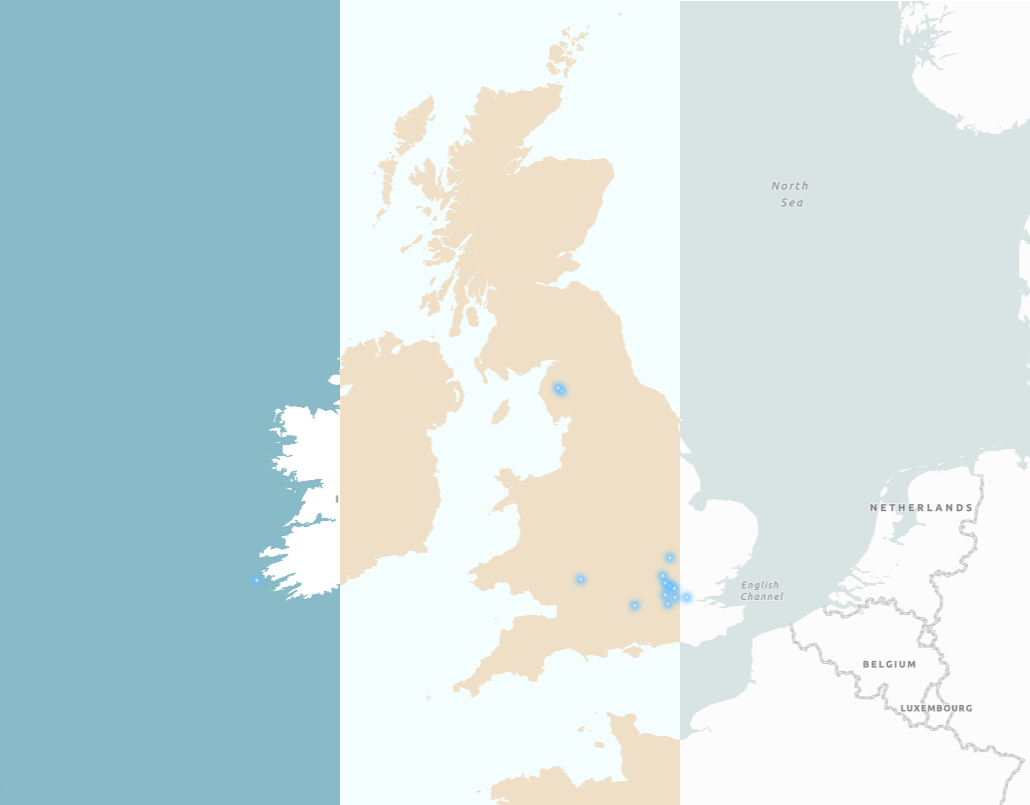
Finally, the last bit of map magic comes in the form of layer visibility ranges. Sometimes it’s impossible to condense the number of layers in your web map, but we don’t need to see all the layers at the same time. By using the layer Visibility Range, we can introduce new layers at different zoom levels. In the example below, the layer for local authority only switches on when I’m really zoomed in and the national layer switches on at a higher zoom extent. Give the user a fighting chance of digesting all that lovely information.
Well hopefully that gave you a gentle nudge towards adopting a design-first approach when making your web apps!