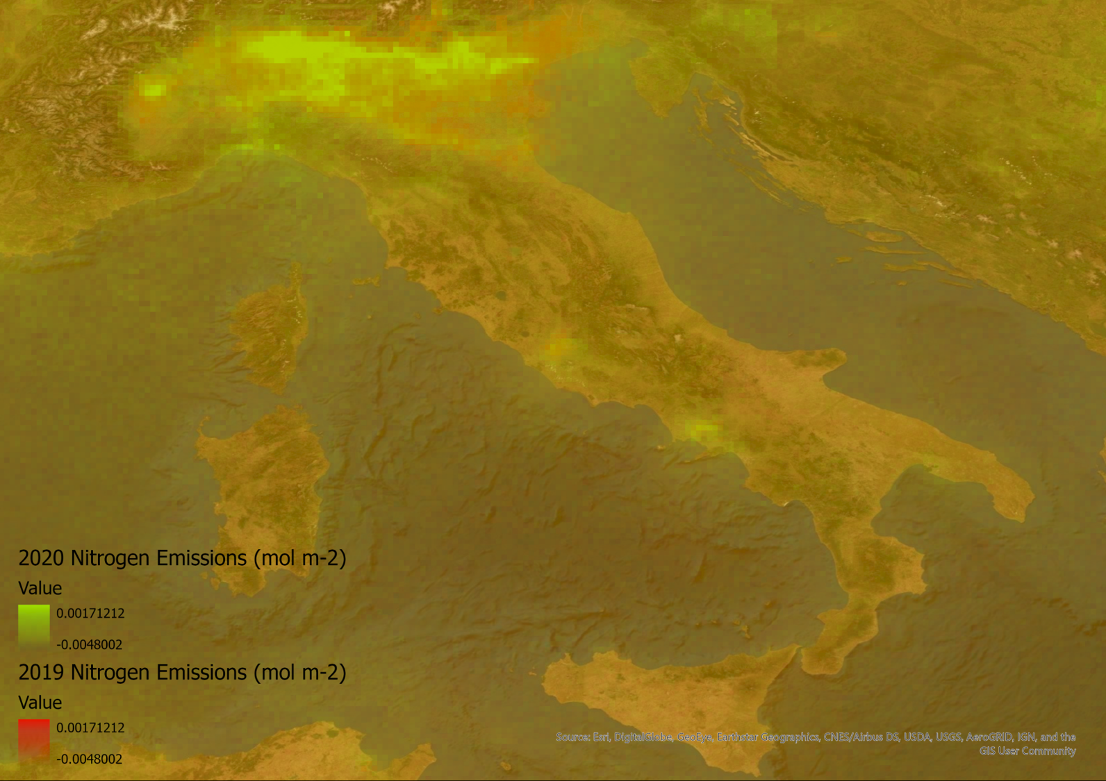
The COVID-19 pandemic has lead to lockdowns across Europe changing how people live and work over the last few months. It has had a huge impact on society but one more positive story is that emissions around the world are being reduced, discussed in this BBC article. How do you map these changes? In this blog, I will walk-through the steps of downloading, processing, and visualising emissions data from the Sentinel-5P satellite, so you can try it and help pass the time during this lockdown.
The Data
The European Space Agency Sentinel Satellites collect a wide variety of imagery and atmospheric data across the globe. A lot of the data, covering a large time frame, is available to the public through The Copernicus Open Access Hub. This data can be used to analyse emissions and other atmospheric changes. However, it can be hard to get your head around the data and know how to use it for creating visualisations, so here are the steps I took to process the data.
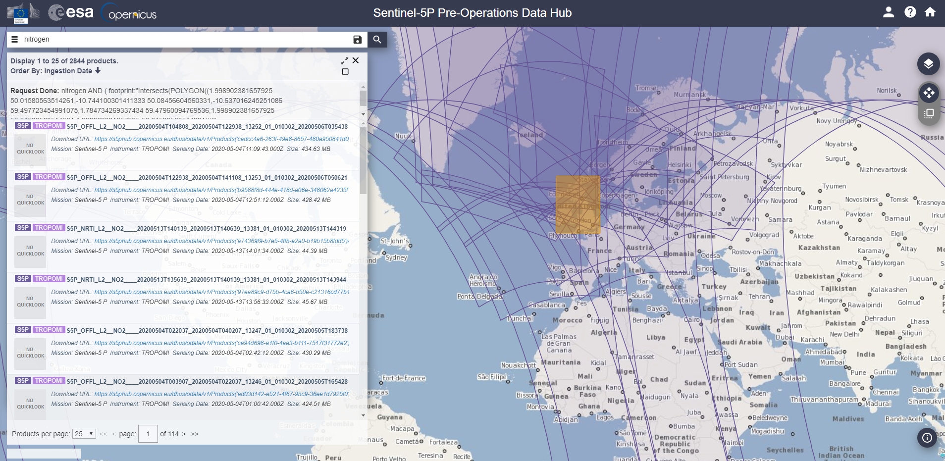
For emissions data, the Sentinel-5P pre-operations hub can be used to freely obtain data for different emissions types. Different types of emissions data can be downloaded, in my case nitrogen dioxide emissions. Once you have chosen the data you want, you will need to download a variety of files covering several days or weeks to look at change - as emissions data can widely vary from day to day averages more clearly show the changes. For my project I collected 2 weeks’ worth of data.
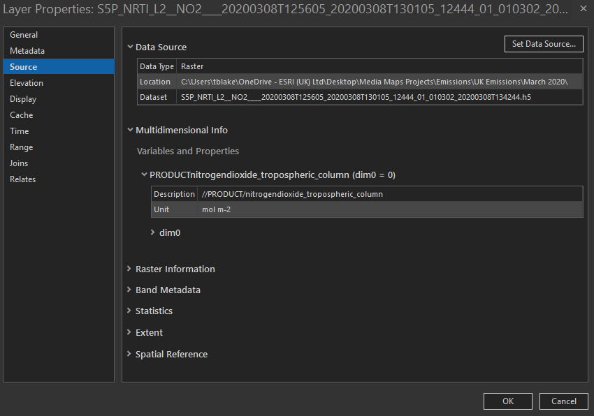
Once you have your data, you will need to manually change the extension of the files from .nc to .h5 to allow the data to be added to ArcGIS Pro. The data can then be added to ArcGIS Pro by using the Multidimensional Raster Layer from the Add Data dropdown. When adding these files, you will be presented with a variety of different variables to show the data. You will want to only select one or two variables as it takes a long time to add all that are available and you will end up with a unique layer for each item which will be hard to manage, I learnt this the hard way. For my data I used the Nitrogen Dioxide Tropospheric Column data, but you can choose data for different parts of the atmosphere. Once you have added the data you can identify the units used by clicking on the layer’s properties and going to the source tab.
Once you’ve added all the data to ArcGIS Pro you can then use the Cell Statistics function to calculate the mean value for all the rasters. This allows you to get an average reading of the nitrogen dioxide emissions over the time period you have data for. Repeat this process for a different period so you can compare the emissions. To make sure that both layers have the same scale, you can use Apply Symbology from the layer tool to replicate the symbology ranges for separate layers.
The Map
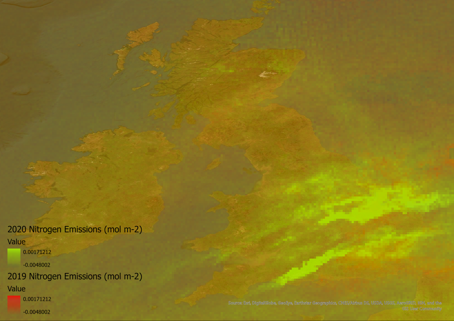
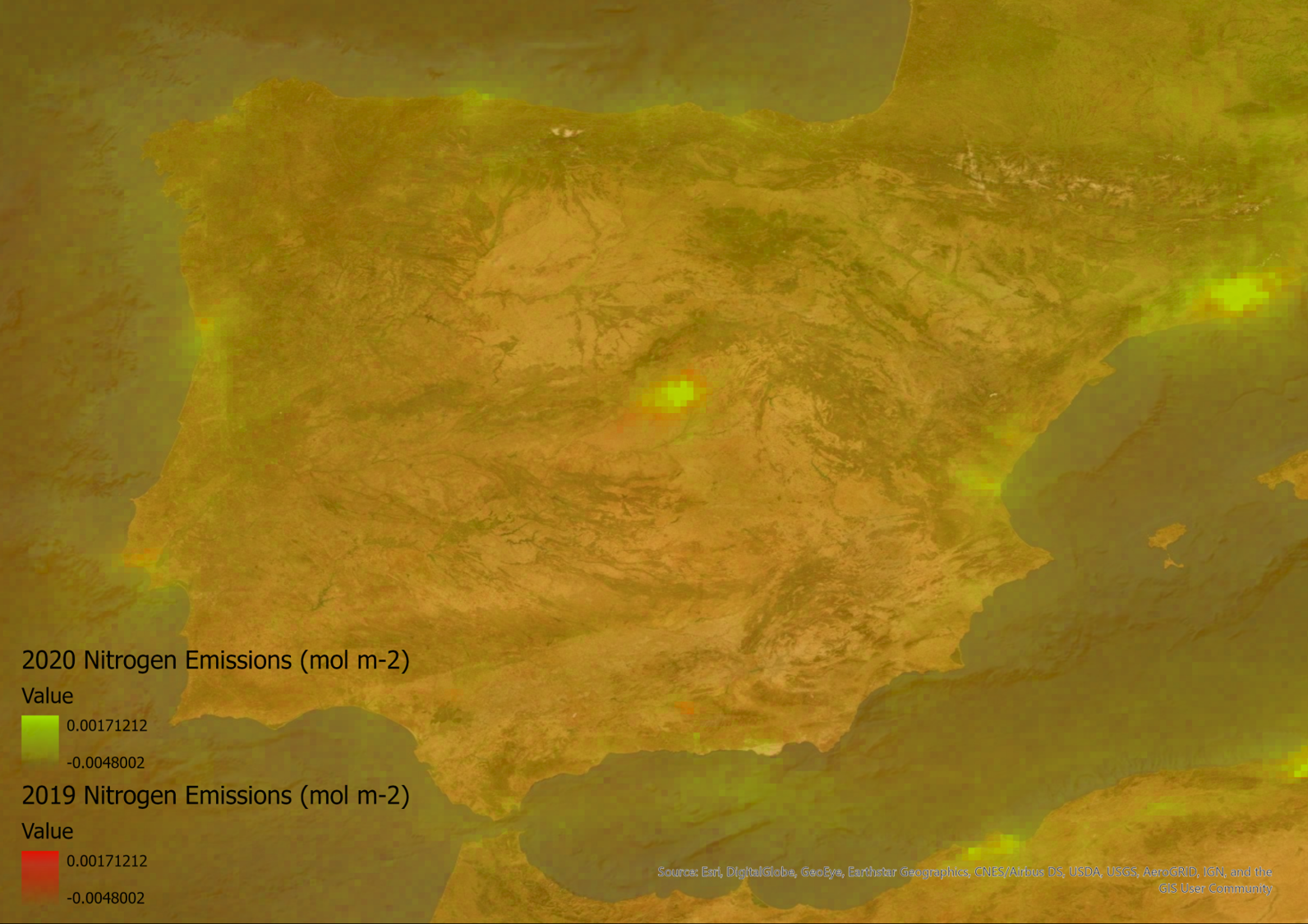
Once you have both layers you can adjust the symbology or use other tools such as ArcGIS Web AppBuilder to create an app to switch between the two layers, highlighting the difference between the two layers. Some examples of the data I have collected for Italy and Spain show that certain areas where emissions are concentrated around populated areas have decreased slightly from 2019 to 2020.
The following maps contain modified Copernicus Sentinel data 2019-2020' for Sentinel data.
The data I collected shows some of the changes that have occurred over Europe during March of 2020. The data for the UK does not show as much change as some of the other countries. This is likely due to differences in when governmental policies were set, so changes to emissions are likely to come into effect later. As emission rates are constantly changing over time, the data is also updated every 5 days as this is the temporal resolution of the satellite. As time goes on you could even collect your own data to see if the easing of lockdown measure effects emissions rates as well.
