For decades primate species have roamed around the globe in the wild. In Great Britain, these primate species are known for primarily being found in enclosed spaces such as zoo’s and play an important part in attracting thousands of visitors each year. BUT, did you think about a home for them in your own back garden? Yes, that’s right, around 4,000-5,000 primates from marmosets, tamarins, capuchins, squirrel monkeys, lemurs and other primates are legally kept as pets across Great Britain.
The Dangerous Wild Animals Act (DWA) is an important piece of legislation that dates back to 1976. It states that licenses should be obtained in possession of any animal listed under this act. Primate species are generally included under this act, however, a lot of these primates do not require a license, so the estimate is much greater than we think.
Here is a brief analysis of how I used ArcGIS Pro to map out primate populations in Great Britain whilst reflecting on some smarter cartographic enhancements to tell my story.

Searching for the right data
Over the past year or so it has become a topic of conversation for many that a ban on all primate species set by the UK government is predicted to come into action. Born Free Foundation, a charity that is passionate about wild animal welfare and compassionate conservation has been collating and analysing DWA data for over 20 years.
In 2020, Born Free obtained information on license holdings for exotic animals from Local Authorities around Great Britain using freedom of information requests. They received 364 responses out of 371 and were able to interactively map out the regions of Great Britain and where a range of Dangerous Wild Animals live. This map has successfully been implemented on their website.
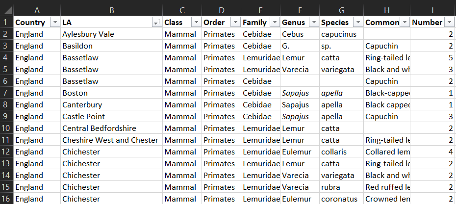
Once the data was obtained I analysed these results further using ArcGIS Pro, I started by uploading this raw data (CSV) and performed a ‘add join’ to a public Local Authorities dataset around the UK to apply spatial meaning to my data.

 Before
The first map looks at a simple overview of the local authorities (LA) and the number of primate species. Using the GB Dark Grey Basemap, I overlaid various red gradients which indicate high and low LA areas of primate species with the highest being 46.
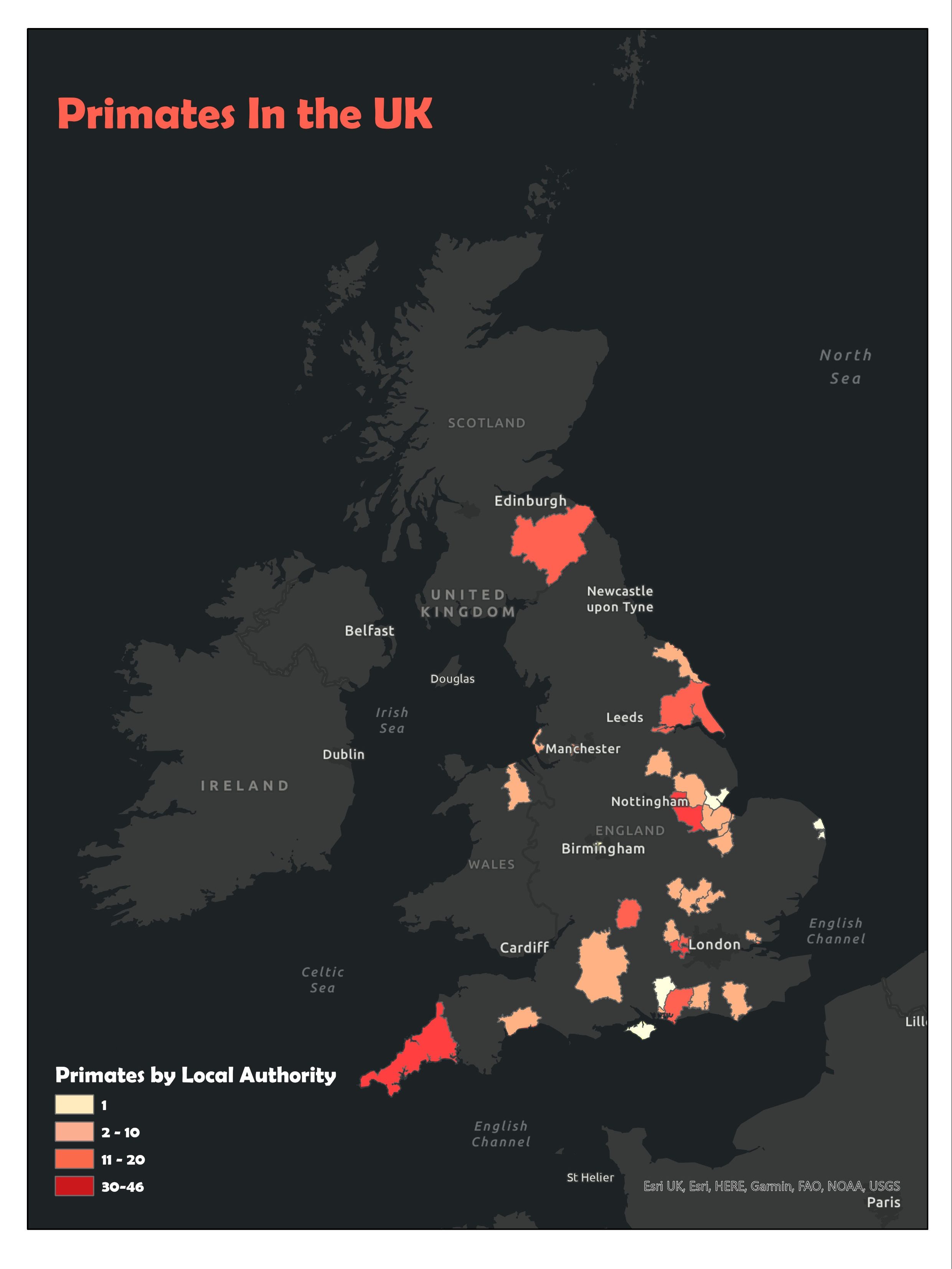
Outcome
On my first draft of exploring the dataset, I could explore which areas had higher rates of primate species but from a cartographic lens nothing, in particular, stood out to me. To enhance my cartographic skills further I went back to my raw dataset and looked more closely at trying to pick out trends such as the most common species, top 5 primates, etc.
On exploring the data, I began to extract the most common primate species in each Local Authority and mapped out these trends using the same workflow as before.
Challenges
When dealing with a lot of different layers for the data process it creates more room for minor errors which can affect the overall appearance of the map. The number of layers also tended to look quite cluttered, so the data needed to be managed correctly.
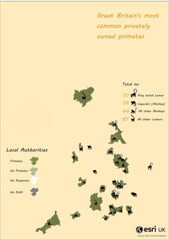
The main focus of the analysis that I wanted to look at was the breakdown of the most popular primate species that are privately owned.
Understanding the Map
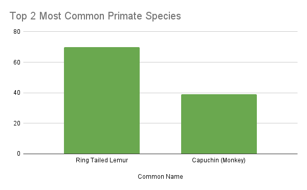
The ownership of Lemurs was by far the most popular choice of pet to own with over 150 in Great Britain. Out of that 150, there were 70 Ring-tailed Lemurs which took the lead in the most common privately owned primate and 39 Capuchin Monkeys. I decided to include all other lemur and monkey species on my map considering the rate was so high. The data was pretty extensive so it was also an easy way for people to understand the extent of this ownership.
When picking out the colour schemes for my next map it was important to make some effective choices that suited the theme of the story. I went for hex colours that were of a similar shade to nature with neutral tones of greens and beige.
After
Each of the 4 layers was manually uploaded from different CSV files to build up the visual layers on the final output. I manually inserted silhouette animal images of primates so that it was easy to locate which local authority region they were located in and it helped add a nice cartographic touch to the map.
Hopefully, this map has given you some cartographic insight into why building the right map is important for your story. For more tips and tricks on cartography, you can find more blogs on our website here.