There has never been a more pertinent time than now to access the internet and records show exponential rates of internet usage during the pandemic. For many, this has been a smooth transition, however, it has revealed more gaps and barriers in digital accessibility.
Accessibility simply put, considers all people regardless of their ability. We may be familiar with physical accessibility barriers but hidden throughout an abundance of online services are barriers affecting those with sensory impairments. With the vast number of tools available it can be quite daunting knowing where to start.
In this blog, I will highlight 8 different ways you can use our accessibility features, along with some top tips, so YOU as a GIS user can map with confidence…
Types of disabilities and impairments
Before we do explore those features in more detail, let’s look at some of the factors that need considering when establishing a multi-interactivity approach to improve accessibility.
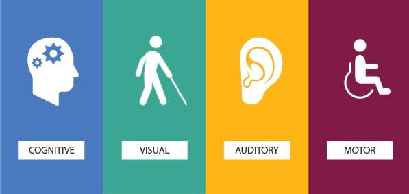
Cognitive: A broad group of impairments from language-based difficulties e.g., dyslexia, intellectual disabilities, and other conditions such as autism, ADHD.
Visual: Visual impairments can range from low vision to complete loss of sight or come in various forms of colour-blindness.
Auditory: Having hearing impairments in the growing world of multimedia usage is not well accommodated for. For those, it can vary from partial loss in hearing to complete deafness.
Motor: Motor impairments cover a wide spectrum but, in this context, generally they limit the interaction between the computer and the user.
A step in the right direction
As the reach of ArcGIS expands, Esri have made a start in leveraging tools and technologies that aim to implement accessibility best. There is clearly a lot more Esri can do, but they are actively doing the following:
- Review products for compliance
- Fix and enhance accessibility tools, features, and apps
- Sharing knowledge and best practices
- Taking on product feedback and development
Our first couple of key features can be found in our story authoring application ArcGIS StoryMaps, which lets you combine maps with written text, videos, photos, and audio. This popular application has taken a lead in following the World Wide Web Consortium’s (W3C) Web Content Accessibility Guidelines (WCAG).
Shana Crosson from Esri has provided a detailed blog on ‘Writing accessible StoryMaps content’ and we’ve picked some of the features that have been implemented over the years to enhance the accessibility of StoryMaps.
1. Alternative Text
You may have seen or come across ‘Alt text’ when uploading images onto StoryMaps. It is an alternative description that can be picked up by things like screen readers to help those with visual impairments. You simply navigate to the image options when inserting a photo and add text appropriately to accompany the image.
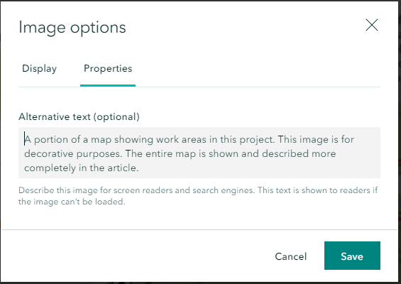
Select image > Image options > properties > save.
Tips…
- Be accurate and concise when captioning every photo
- Add more descriptive text where necessary for complex images
- Be considerate of blind users where these descriptions are read out loud via a screen reader so it’s important to form an accurate description.
If you want to see some examples of how you can achieve the most suitable Alt text, have a look at webaim alt text. Alternatively, if you want to learn how to add Alt Text from watching a video, then watch this Esri clip on how to navigate to inserting alt text.
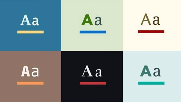
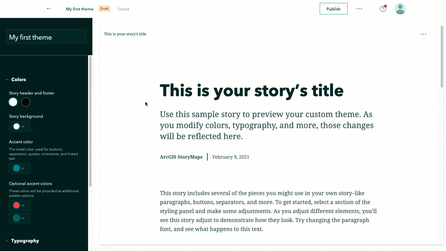
2. Theme Builder Colour and Fonts
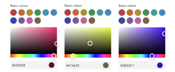
Our next enhancement looks at the new choices made available by theme builder in ArcGIS Storymaps. This has created expansive accessibility capabilities in colour choices, fonts, and much more.
These customised colour schemes and font choices allow you to express your own aesthetics into your story. The colours below have been carefully selected using the flexible colour picker tool for optimized contrasts and visual accessibility. These hex codes can be replicated into your own projects.
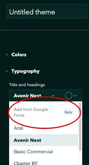
Additionally, theme builder offers a new wide variety of fonts. The Typography option on theme builder reveals multiple options in the Title and headings, Paragraph text, and Caption text. There is a mix of embedded fonts and access to a complete library of Google Fonts.
 The main impairments impacted by poor font choice is people with visual impairments and those with dyslexia.
Tips…
- Consider the readability as some embellished fonts can be difficult to read.
- Be clear and use bold for text you want to stand out, the additional contrast is easier for people with visual impairments.
- choose colour choices in the text that contrast with your background.
- Look for fonts that make meaningful visual distinctions between all characters
3. Basemaps
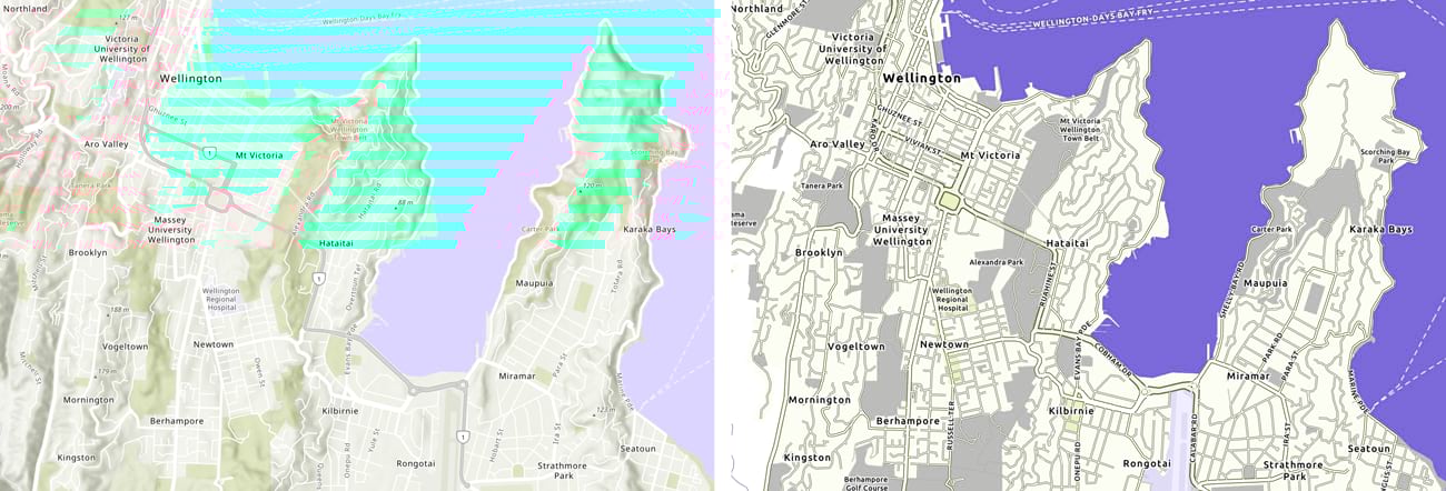
Basemaps are the foundation to enhancing our story and allows us to clearly visualise and analyse what is going on. Choosing the right basemap is a vital element to the delivery of your data, but have you ever considered the wider elements of accessibility and how you may be looking at something completely different to someone else?
Andy Skinner from Esri Inc has put together this blog which highlights the move to a more accessible basemap.
Take a look and use some of these examples in your own projects:
4. Customise your own basemap
Over the past few years, basemaps have had considerable improvements and adjustments and you can now design your own using various accessible colour schemes from our developers vector style editor. If you need some guidance on where to get started with colours then you can use the already made vector tile basemaps from our living atlas for guidance.
navigating to the accessible basemaps on the Living Atlas
5. Make use of online resources
Customising basemaps has become an incredibly useful tool to manipulate the base colours to suit the needs of visually impaired users and generally enhance the user experience for a more professional cartographic finish.
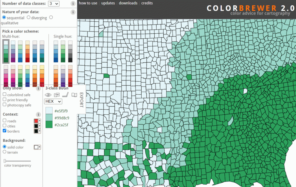
Colour Brewer 2.0 and Colour Oracle are platforms designed for the colour impaired and are free to use simulators that cover multiple designs to optimise your colour-blind friendly maps.
Colour Brewer 2.0 Colour blind safe
Tips…
- Tick the colour-blind safe box, print-friendly, and photocopy safe for fully accessible features.
- Try not to rely on colour as a navigational tool or as the sole way to differentiate items in images or texts.
6. Map Viewer
Map Viewer creates 2D maps containing a set of basemaps and data which you can embed into web applications. You can now access new colour configurations in the new Map Viewer, where there are up to 200 new colour-blind friendly ramps to choose from!
Tips:
- Make sure your basemap shows off your data in the most appropriate way to convey your story.
- Make the most of the 200+ colour options when embedding into applications
- Use different shapes and labels on your map as an alternative to relying on colour.
7. Web AppBuilder
Many of our configurable apps are now starting to implement more accessibility features. With a combination of maps and infographic-style data, Web AppBuilder is a popular app that provides an important space for visualisations and analysis. It is also a space for integrating some of the features highlighted above such as basemaps, use of colour ramps, and graphics.
Take a look at this screenshot below from the blog How accessibility features work in Web AppBuilder apps that shows using the Esc key to navigate around the features. This helps support those with motor impairments or those that struggle to interact completely with the software.
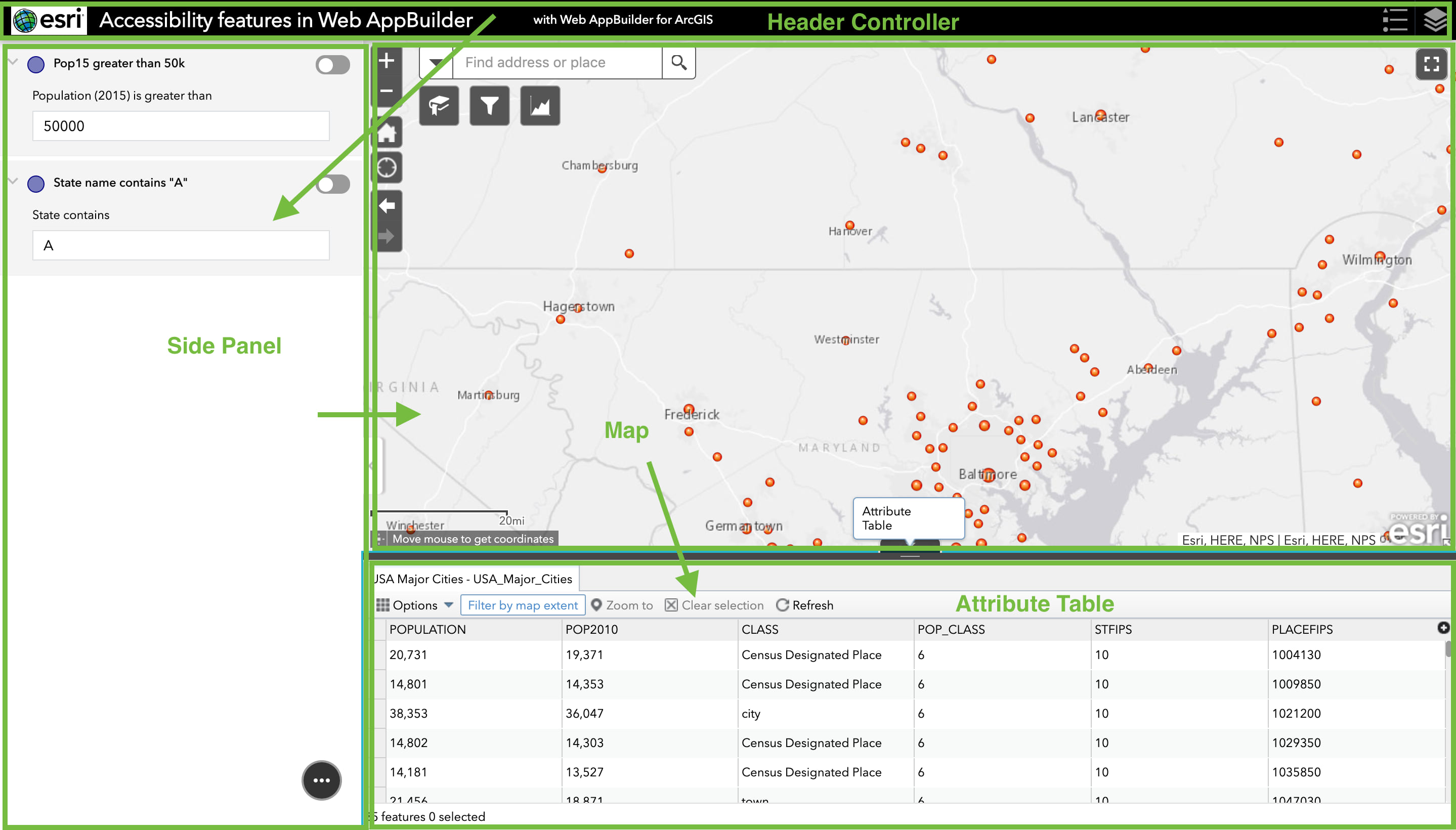
Use the Esc key to quickly navigate through sections in Web AppBuilder apps.
Easy to use keyboard navigation and widgets that support accessibility improves equal access and Esri hope to expand these widgets, so they support further keyboard navigation and ease of use in the application.
To find out more about accessibility compatibilities, Alt text, themes and widgets take a look at this blog article on Accessibility support for Web AppBuilder but do note the table contents are subject to change with incremental releases.
Tips…
- Try not to overuse widgets, just use those that are relevant
- Inserting navigational widgets allows people to have more choice using their mouse or keyboard.
8. Accessible PDF’s in ArcGIS Pro
Last but definitely not least Is our accessibility feature in ArcGIS Pro v 2.8 which now supports accessible PDFs! This makes files accessible by screen readers when adding alt text and including accessibility tags. Find out more in this blog on Creating Accessible PDF’s in ArcGIS Pro.
Tips…
- Add Alt text to all map outputs
- Make use of all the colourblind friendly ramp options in ArcGIS Pro
- Navigate using the keyboard in ArcGIS Pro
What’s next?
I hope this blog will help kick start your journey to mapping with confidence whilst keeping accessibility in mind. I’ve pointed out just 8 of the key accessibility features amongst our software, but do look out for more enhancements as we expand into a more multi-interactive approach to mapping.
To find out more on this topic you can take a look at all our accessibility resources or head to our community pages to see the latest activity and share your thoughts.