I recently had the opportunity to explore ArcGIS for Excel and find out what it’s for and what it can do. At this moment in time, I have a bit more experience in Excel than in ArcGIS so I was excited to see what I could do with it, both with and without logging into my ArcGIS Online account.
ArcGIS for Excel is an add-in for Microsoft Excel, and it replaced ArcGIS for Office in June 2023. It aims to combine the data editing capabilities of Microsoft Excel with the power of spatial analysis available through ArcGIS. It can work as a useful intermediary step, or as a capable mapping software with analysis elements.
What can I do without an ArcGIS Online Account?
First, I wanted to see what you can achieve in ArcGIS for Excel without an ArcGIS Online account – and it turns out it’s quite a lot!
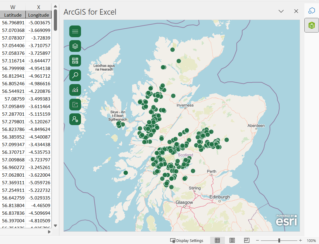
After opening the map window (through the Show Map button in the ArcGIS Map ribbon tab) I was able to easily create a map from my spreadsheet data using the latitude and longitude columns. However, you could also use coordinates, ESRI JSON data, geographic features, or spreadsheet data once organised into a pivot table. I enjoyed adding in data from the ArcGIS Living Altas of the World, which allows you to access authoritative datasets from organisations around the world.
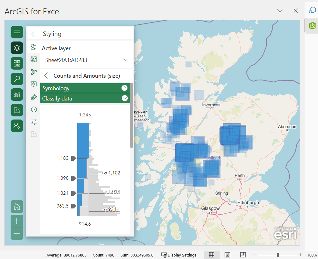
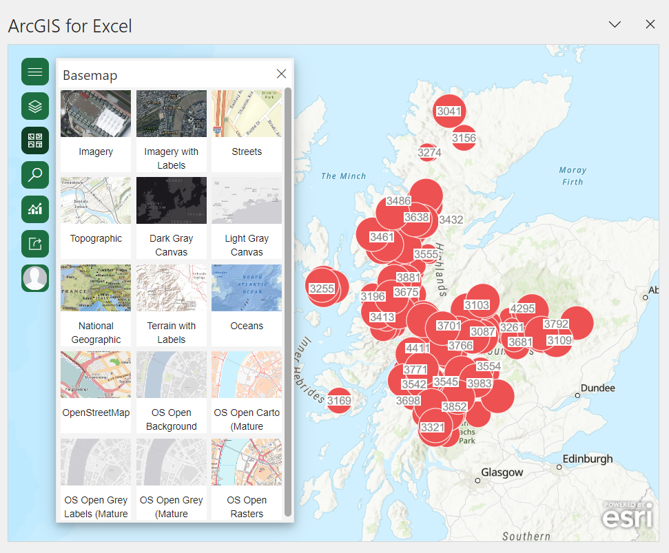
Once my basic map was created, I experimented with the customisation available to me – starting with resizing and relocating the map window. Through the Layer Options button in the Layers widget, I was also able to change the basemap, classify my data, and alter the symbology shape, size, and colour. I noticed clustering was another visualisation option, and you can change the radius and text colour. Being able to customise your map is great because it helps you visualise and gain meaning from your data.
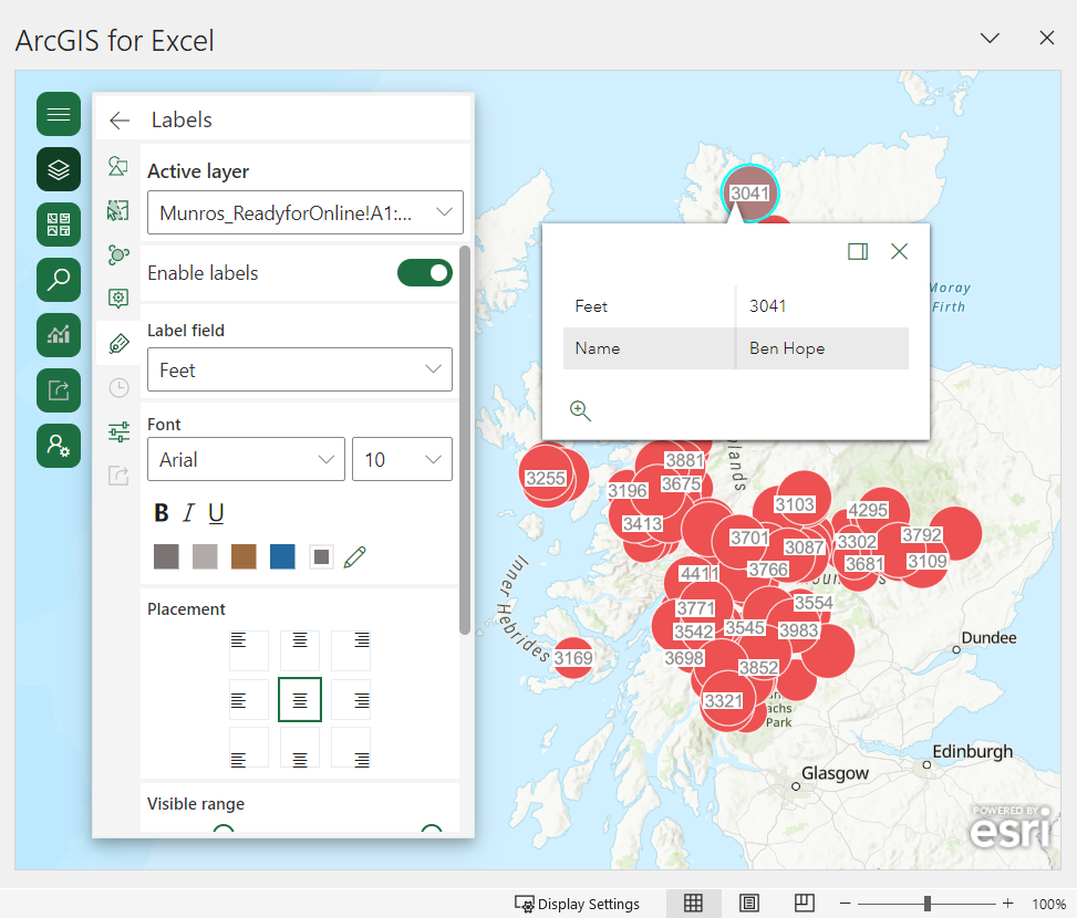
I was also able to alter my layers for efficient data exploration such as changing transparency or visual range to view different features on separate scales. Features selected in the map can be highlighted in your spreadsheet and vice versa, which helps identify the attributes behind noticeable patterns. I found you can also customise the pop-ups, add labels for different fields, and configure basic styling – such as changing the colour, size, and adding a halo effect.
Finally, the search function and the tailored Excel functions and formulas for ArcGIS meant I could find specific locations in my area of interest, and use capabilities such as routing, geoenriching and geocoding too.
What more can I do with an ArcGIS Online account?
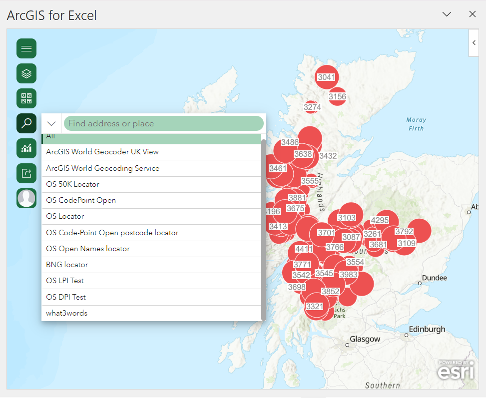
While you can create and view maps fairly comprehensively without needing an ArcGIS Online account, I wanted to see how you could go beyond that by logging in. After I did, I had access to my organisation’s data, layers, and basemaps, which would have been extremely useful if I was using ArcGIS for Excel for a long-term project. I also had more ArcGIS basemap options, including OS Open maps and imagery. Location search options were also expanded to include ArcGIS Geocoding services, Ordnance Survey address databases, what3words and more.
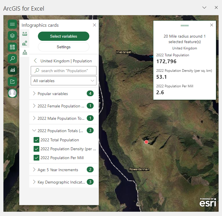
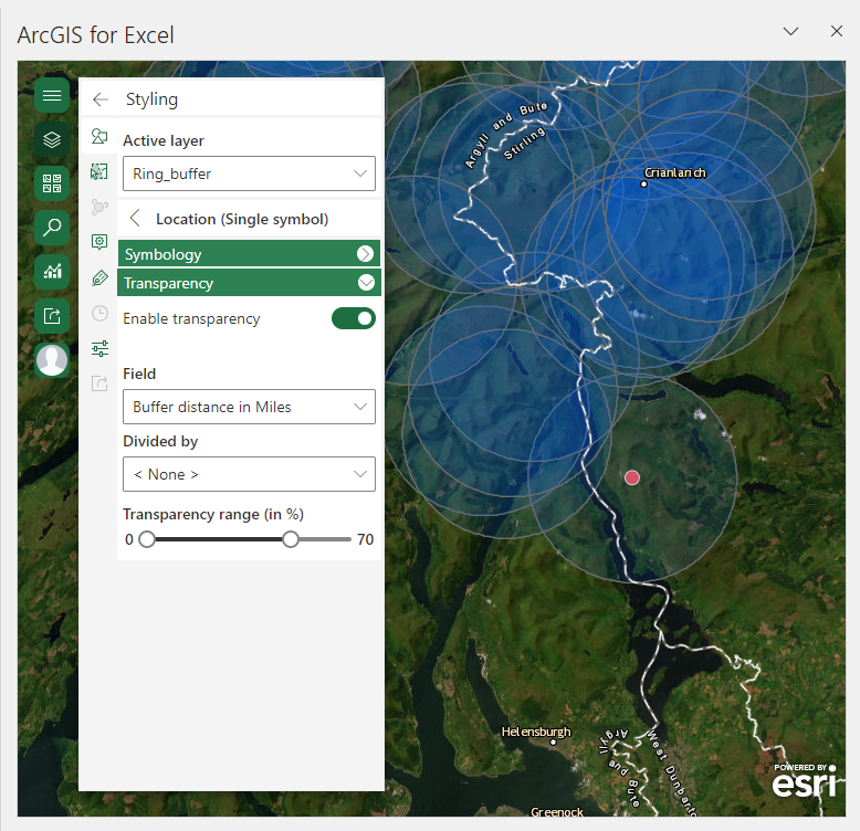
I found that some spatial analysis options became available and helped me identify wider patterns from my data. These included area and distance measurements. Demographic data related to my map locations could be explored as infographics in categories such as housing, spending, income, and education. Buffers could be created and drivetime analysis could be conducted including different mode options such as trucking, driving, walking and rural driving.
Another key difference was the ability to share the content I created in ArcGIS for Excel to the rest of my organisation – and I had the option of sharing finished maps or data layers as hosted feature layers. Once shared, I could view the layer I created in ArcGIS Online. Map layouts or extents can be printed out in a variety of file formats (including JPEG, PNG, PDF and GIF). I was able to specify the page size and DPI, and add a legend and metadata.
Overall, I was impressed with what I could achieve in ArcGIS for Excel, and as someone who likes preparing my data in Excel, I think it could be a really useful tool for exploring my data spatially while preparing it for further analysis. I’ll definitely be using it again in the future!
How do I access ArcGIS for Excel?
You can get access to ArcGIS for Excel if you have a Microsoft 365 account at a Business Standard level or above. Once you log into your Microsoft account in the Microsoft AppSource store you will be able to download it.
You won’t need an ArcGIS account to try it out, but you will need one to access the full capabilities of ArcGIS for Excel beyond creating and viewing maps. This can be purchased from the Azure Marketplace.
Where can I find further information?
I was able to find lots of helpful resources about ArcGIS for Excel – those listed below are a good starting point if you would like to find out more:
- Read the Esri blog on introducing ArcGIS for Excel.
- Visit the install and manage and get started webpages for more information on accessing ArcGIS for Excel.
- See the beginner get started with ArcGIS for Excel tutorial, or go further in the ArcGIS for Excel Basics
- Visit the frequently asked questions page.
- Visit the Esri Community page for ArcGIS for Excel to connect with other users and Esri staff.
- For information on the ArcGIS capabilities in other Microsoft software, visit the ArcGIS for Microsoft 365 page.
Credits
Data for the ArcGIS for Excel demonstration images were sourced from the Database of British and Irish Hills v.18. under a CC-BY licence.