The US presidential election of 2020 was a nerve-wrecking spectacle like we’ve never witnessed before. Across the world, people were clicking refresh again and again on web pages displaying electoral maps.
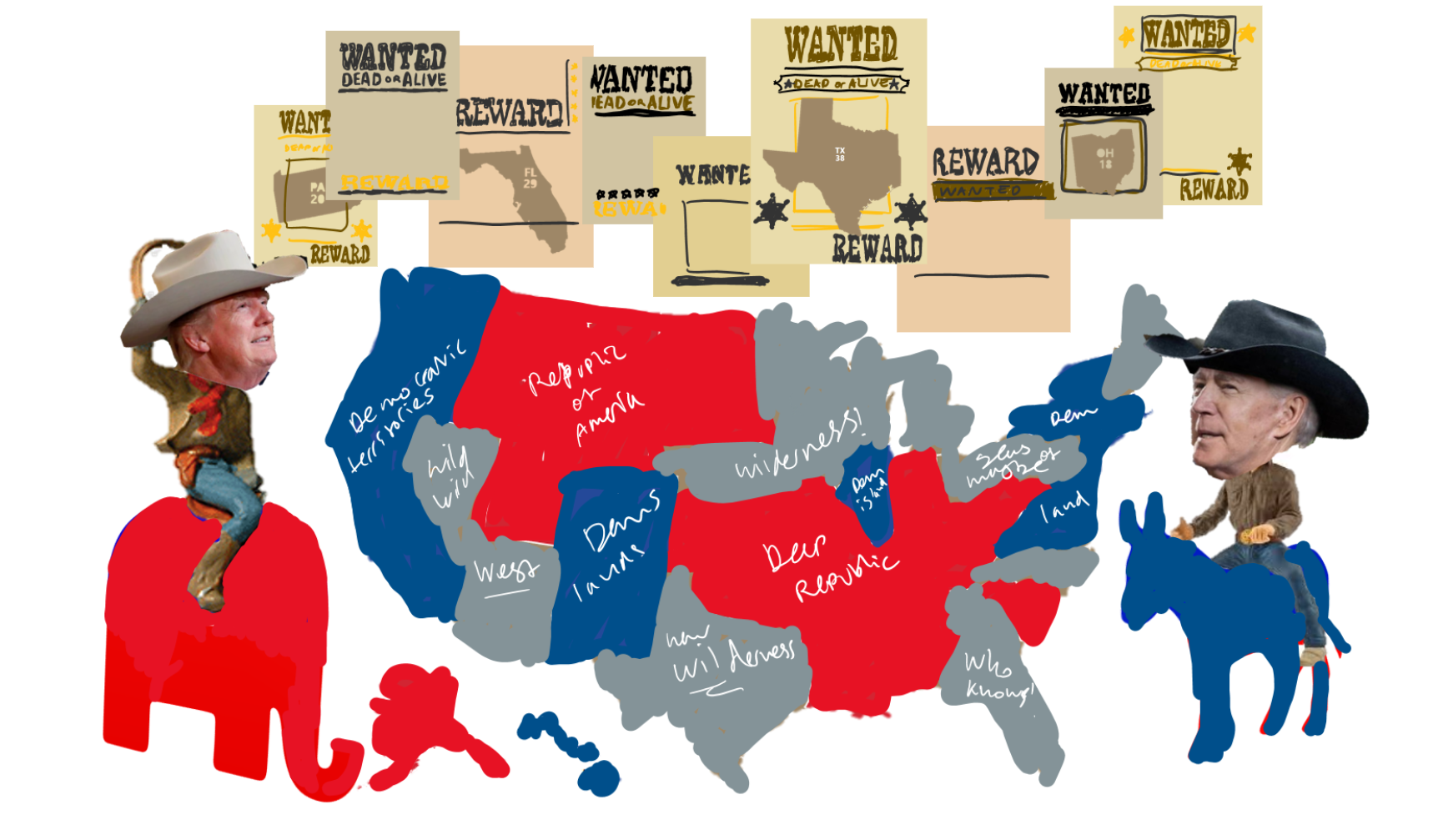
Inspired by the idiosyncrasy of this election cycle, I created a reference map to show where the deal-breaking action would be taking place when the results were coming in: what were the contested states to hold your breath for, which ones were going to be shockers if they flipped side from previous elections. I wanted to make a map that would ease the interpretation of incoming results for outsiders, who don’t know the voting tendencies of every state.
In thinking about an effective visualisation for this concept, I could not un-see the resemblance between the political climate of the US today and the early colonialist days as portrayed in Western movies. A fear-driven and uncooperative landscape terrorised by outlaw figures claiming as much territory as they could. I started building on this cowboy metaphor and made this sketch:
Sourcing Content
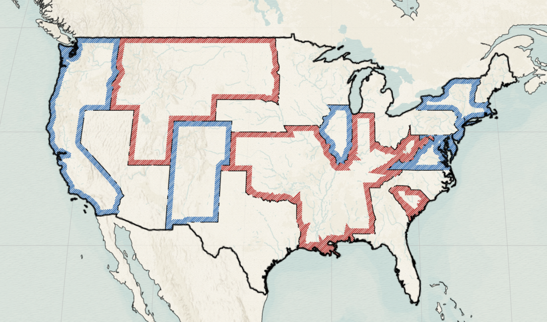
Following through with this map idea, a reliable source had to be consulted to determine the categorisation of ‘Democrat’, ‘Republican’ and contested ‘Wild West’ territories. As with any prediction, 100% accuracy cannot be guaranteed, but by following the trends forecasted from a reliable source you can still validate your content. I decided to polarise the predicted election outcome of 270towin as follows:
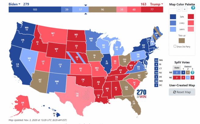
States marked as ‘safe’ and ‘likely’ (the two darkest shades of red and blue) in the original map were allocated as Democrat (blue) or Republican (red) territories. States in the ‘leaning’ (light red and light blue), ‘toss-up’ and ‘split votes’ categories were placed into the ‘Wild West’ bracket. This classification leaned towards a safer election prediction, because a large number of states were grouped into the we-don’t-know-yet category of the Wild West.
Starting with a style in mind
Next it had to be decided what exact design features and themes to pursue. I usually look for inspiration first, for example on social media pages like Think About Maps and Data Is Beautiful, which are dedicated to reposting outstanding maps and visualisations. I came across this old map of the United States produced by Jedediah Morse in 1820 (source: Old-Maps):
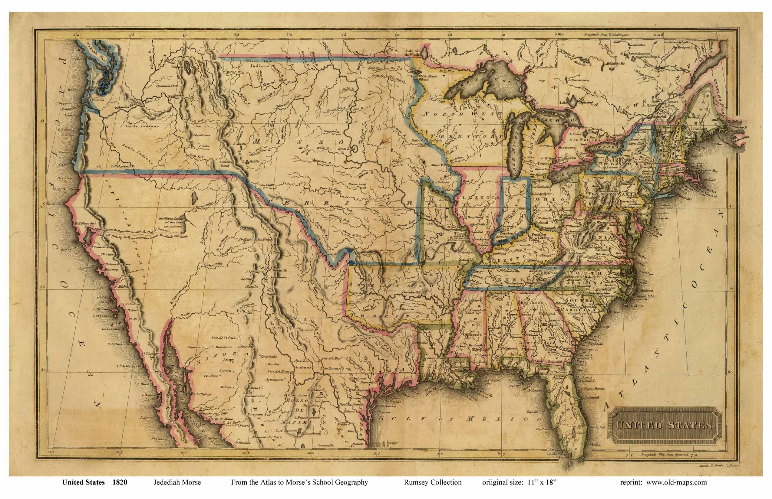
Morse’s map is simple, but its streamlined cartography speaks volumes and functioned well as a base line to work from.
Whilst ‘Wild West’ as a visual theme is quite pronounced in terms of colour schemes, symbology and decorations that could feed into it, you may find yourself having to produce a map for which there is far less scope for playful design. It’s always worth thinking about the vibe you want your map to convey. Whether it be ‘academic’, ‘casual’, ‘corporate’ or even just ‘plain’, there are styles that suit your map and make it more fit for purpose. Digital cartography bloggers like John Nelson and Sarah Bell offer great examples and often describe very hands-on techniques to apply in ArcGIS Pro to pursue specific map styles.
Piecing together data and ideas
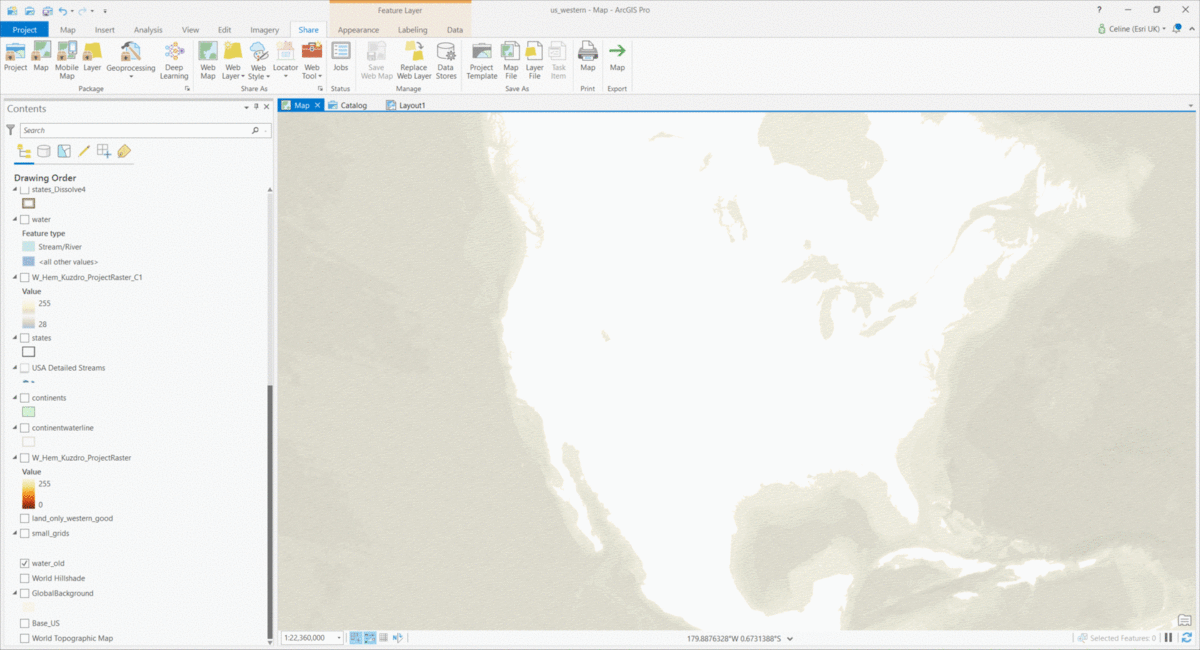
The foundations of the Wild West map were laid with vector feature layers courtesy of the Living Atlas: continents, gridlines, water bodies and the 50 states of America. The latter was joined with a spreadsheet I made of every state’s territory allocation (Democrat, Republican, Wild West) as derived from 270towin. States of the same territory categorisation were merged into one feature, forming unified blocks of political preference with plains of yet-to-be-claimed land scattered in between.
Aesthetical trial and error
Next came the challenge of sculpting my vision, inspiration and data into a cohesive whole. Cartography is a bit like cooking: you have your ingredients and equipment, and you follow a recipe – adding in your own preferences as much as you want.
The elements of Morse’s map I tried to imitate were; the display of rivers, gridlines, exaggerated borders, the title board and the frame around map (those last two come in later). I de-emphasised the grid lines by placing them behind, rather than on top of the land masses and applied a lighter colour on the rivers. I experimented with the order of the layers; the colour and texture of feature fills; the use of multiple inner and outer borders; the map’s projection and scale. Through trial and error, you can evaluate what does and what doesn’t contribute to the overall composition of your map. Here’s an intermediate version of the Wild West map:
Cleaning up
A dilemma I encountered in creating the aesthetic of an antique map is that the level of detail that seems inherent to such maps actually draws attention away from what I wanted to highlight – the anticipated election outcomes per state. Place names and mountain ranges in black ink produced too noisy a visual. So I started steering away from the Morse base line and kept labelling to a minimum by only displaying the state abbreviations.
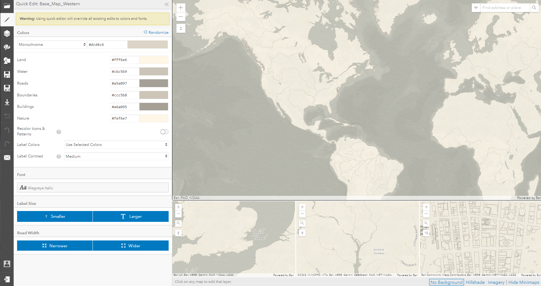
For visualisation maps, it often goes that anything you don’t need on your map, shouldn’t be on it. No one viewing the Wild West map would have benefited from a scale bar or a North arrow on it. A useful way to clean up irrelevant details is by creating your own Esri basemap in ArcGIS Vector Tile Style Editor. Every feature in any Esri basemap can be restyled (or hidden entirely) and saved into a customised style layer. For this map, only the bathymetry features of the Modern Antique basemap (one of the available styles in the Editor) were used:
To display topography, I also decided to go down a different path than Morse’s minimalist mountain ridges. I browsed the Shaded Relief Archive and adapted John Britt’s hill shade raster to a colour scheme that matched but also diversified the greyish-yellow of the Wild West theme. The map came alive by adding this layer! The combination of rasters as background and vectors as foreground elements can add great depth to a map. Digital cartography really does come down to draping the right layers on top of one another to draw the map reader’s attention towards some features and away from others.
Where to go after ArcGIS Pro?
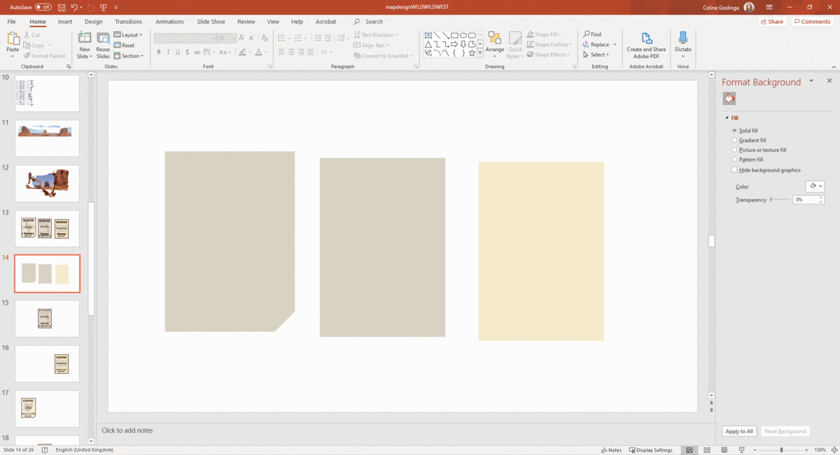
It is possible to add a legend and title to your map in the Layout view, but here I decided to create these after exporting the map from ArcGIS Pro. I used Microsoft Paint and PowerPoint to produce all the Western style graphics on top of the map. For those who know their way around more powerful products like the Adobe suite, you’ll have even more options available. However, if you are just getting started with digital design – and looking for a less steep learning curve – the simpler graphic editors can get you a long way. Have a look at how the ‘Wanted’ posters were made in PowerPoint:
All graphic elements were brought together in Adobe Acrobat. This process did include an excessive amount of exporting intermediate output every time an adjustment needed to be made. For my next project, I want to dive deeper into the use of Adobe Photoshop and Illustrator, so that all components are hosted in one environment. Sarah Bell wrote a useful blog post about the ArcGIS Maps for Adobe Creative Cloud extension, which eases the integration of the mapping stage and the final design of your project using ArcGIS Pro and the Creative Cloud.
Hopefully this gives a refreshing insight into methods that can be employed to produce a madcap piece of cartography. You can see the final result on our Maps We Love page. The craft of map making is not mastered in one go but a journey over the great plains of cartographic decision-making can lead to surprising destinations!