Patterns of Use
Operations Dashboards are intended to support many different use cases. Within one organisation you can have an operations dashboard, a real-time dashboard, tactical dashboards and strategic dashboards. Below are some innovative examples that go outside the standard patterns of use and can hopefully inspire you.
Dynamic Filtering
Brrrr… this Arctic Ice Explorer dashboard shows how dynamic filtering at run time can drastically change the view of a dashboard.
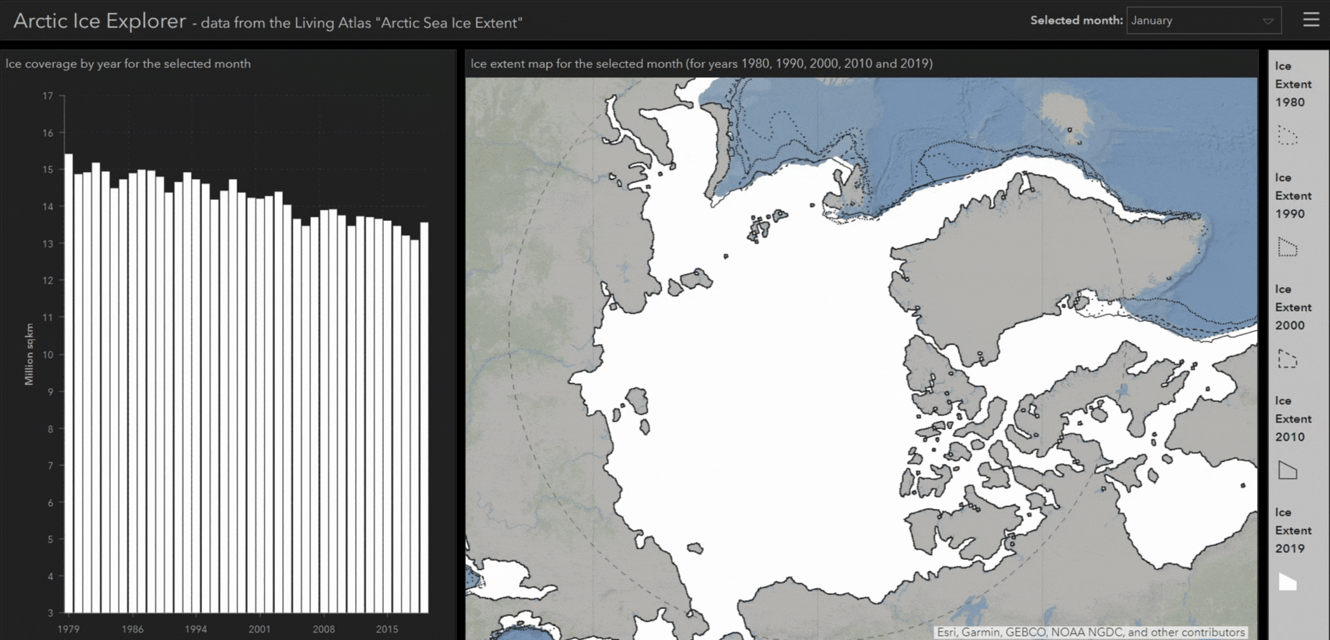
This dashboard was made using the arctic sea ice extent feature layer, available in the Living Atlas.
Styling
Through simple styling, the people working for the City Cancer Challenge (C/Can) have created a dashboard with a base map configured to match the style of their infographics. Base maps are easily styled using Esri’s new Vector Tile Style Editor.
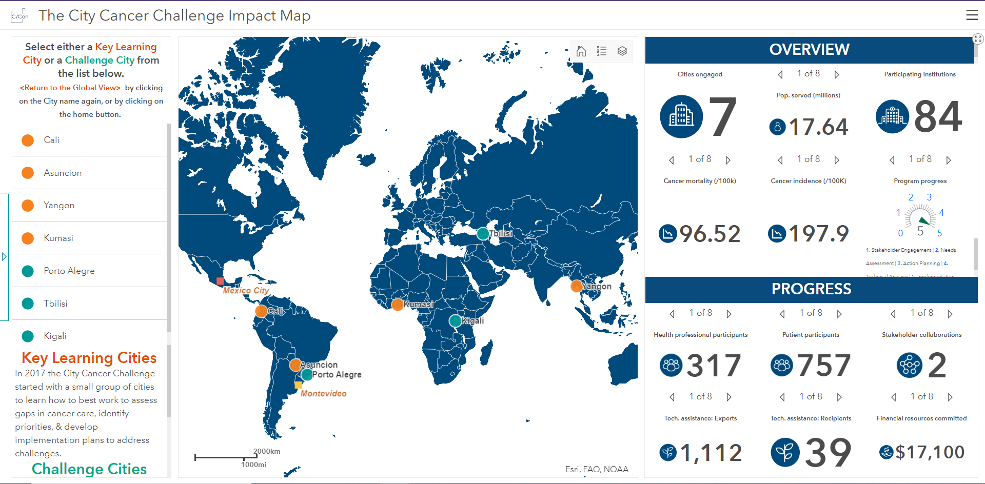
C/Can have styled their dashboard to show which cities they work with to reduce cancer deaths.
Data Storytelling
Updates to Story Maps mean you can now embed your Ops Dashboard within the new template, allowing for a whole new realm of data storytelling. Here I’m showing my own example story map which looks into the September 2019 Climate Strikes and features an interactive dashboard.
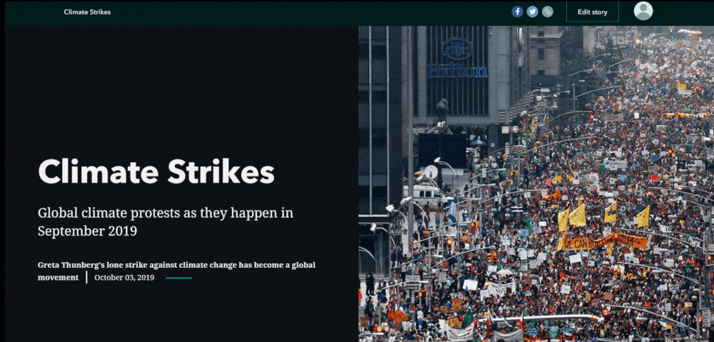
This data is fictional. But climate change is real.
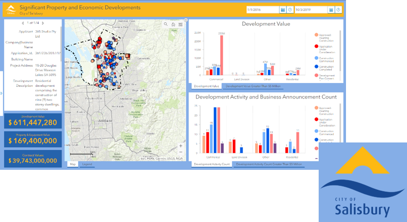
Branded Use
As part of their communications on urban development, the City of Salisbury, Adelaide, configured a dashboard to share their statistics. They took advantage of Operation Dashboard’s styling abilities to fit their brand.
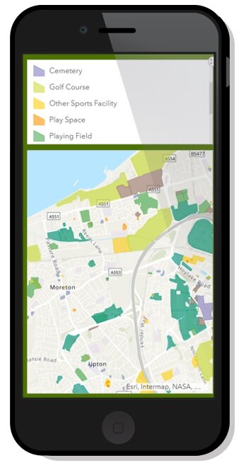
A streamlines, mobile ops dashboard, displaying OS Greenspace data.