For GIS people, visualising data spatially is the norm. However, sometimes a map alone only provides the audience with part of the data’s story. In these cases, you can use the ArcGIS system to create charts from tabular and raster data that you can include with your map, or that you can use to gain an understanding of your data before performing analysis.
There are many types of tabular charts available in ArcGIS Pro. Check out this list of options if you are wanting to:
- Compare categories or amounts
- Explore relationships and correlations
- Visualise distributions and frequencies
- Visualise change over time or distance
Purpose
First I need data and have recently discovered the Esri 2020 Land Cover Map (classification of human activities and natural elements on the landscape) in the Living Atlas. I will use this as the basis of experimenting with the making of a chart using ArcGIS Pro. Partly because it is straight forward to interpret due to the colours used to describe each land cover type but with an impressive spatial resolution.
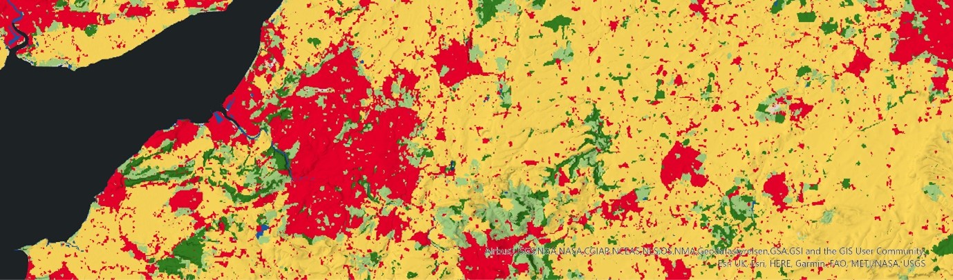
Esri Land Cover 2020 (Newport East – Bristol – Swindon West, UK)
So, to accompany my visualisation of the Esri 2020 Land Cover Map as a static map (shared further down this blog page) I am including a bar chart. I have chosen a bar chart because it allows me to summarise and compare the Land Cover categories.
This blog written by Vicki Lynn Cove is a great place to better understand when to apply a bar chart. Keep an eye out for the other blogs that Vicki has written about the other chart types available.
In addition to the Esri 2020 Land Cover, I will need the United Kingdom nations boundaries. Once added to a Map View, I inspected the data structures to understand how I could start to analyse with the mindset of accompanying my map with a bar chart.
Creating the Chart
The approach I have taken is the following:
- Use the Summarize Categorical Raster (Image Analyst extension > Multidimensional Analysis toolset) GP tool to generate a standalone table containing the pixel count for each class, of the Esri 2020 Land Cover.
- The resulting table consisted of a categorical field (Land cover class) and a number field (Pixel count).
- To create a chart, right mouse click on the feature layer/stand-alone table in the Content pane > Create Chart.
- I configured the bar chart properties to be a 100% stacked bar chart, because I am wanting to show the relative difference between the land cover categories (like a pie chart), not the absolute sizes because these figures can be massive and difficult to comprehend!
- The chart view was added to a Layout with the associated map view.
Putting it together
And this is my map with a stacked bar chart:
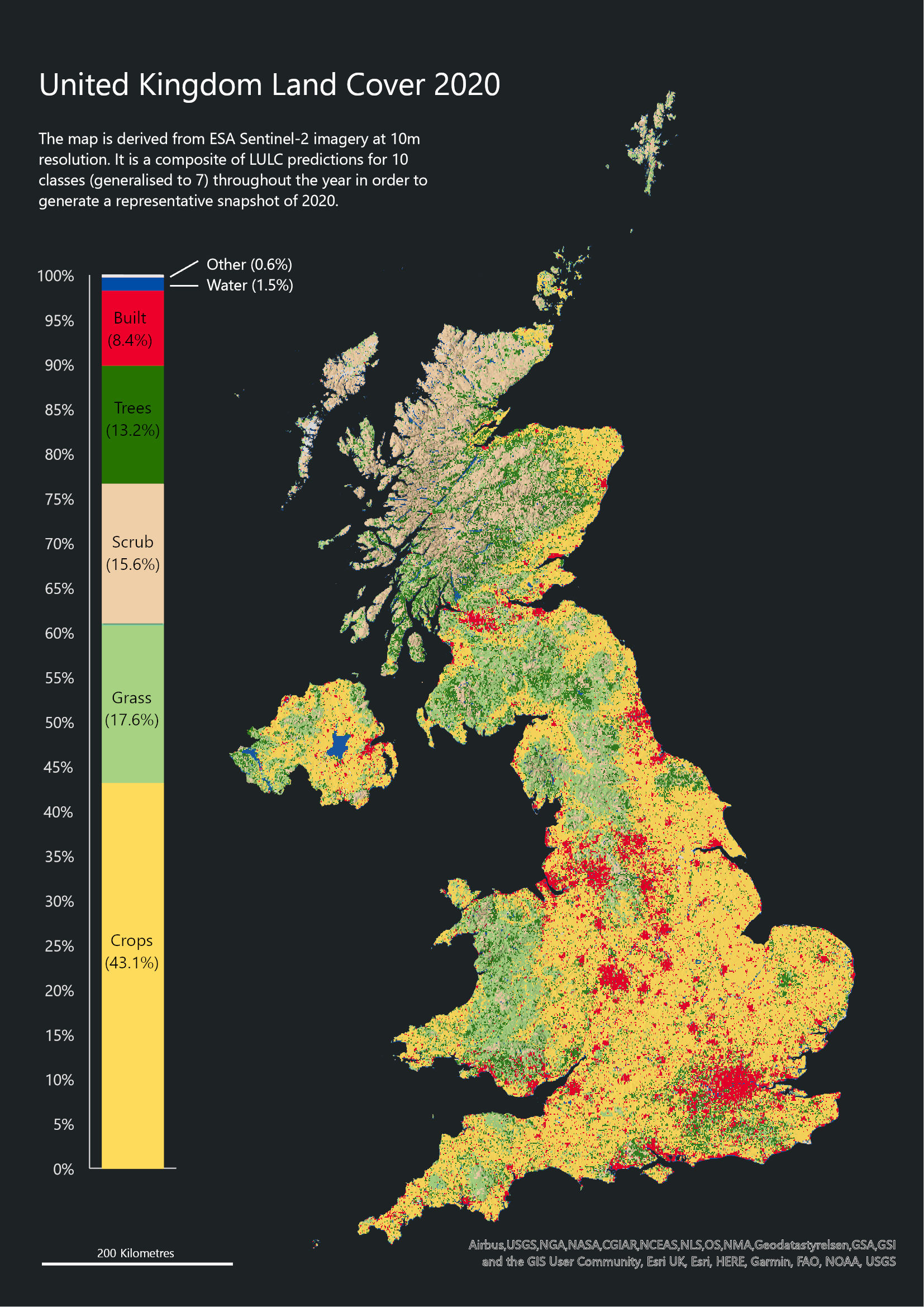
UK Landcover map with percent stacked bar chart
My thoughts whilst configuring the chart properties and map layout:
- Text: one font type used with different sizes. To aid readability, the paragraph text lines aim to have no more than 12 words and is justified to the left.
- Colour: I accepted the saturated colours to work against a dark grey background, to distinguish between figure-ground and assist with online viewing.
- Furniture: as part of configuring the stacked bar chart, I decided to apply the same saturated colours used in the land cover data so that it can act as a legend too. I have labelled the different categories along with a %.
- Layout: asymmetric design because of the UK Shape whilst maintaining an ISO page ratio should the map be printed.
Development
For a bit of fun, one direction I thought I could develop the visualisation is to smash the Percent Stacked Bar Chart with the shape of Great Britain to create a Percent Stacked Map?!?! (think of it like a fundraising thermometer).
To accomplish this visual, I completed the following steps:
- Dissolve (Data Management toolbox > Generalization toolset) the UK nations into a multipart polygon
- Use the Subdivide Polygon (Data Management toolbox > Feature toolset) to slice up the Great Britain Nations into 1000 horizontal slices, each slice representing roughly 71500 hectares.
- Calculate the % of the Land Cover classes and assign the appropriate class to the appropriate number of horizontal slices. For example: Trees cover 13.2%, so this translates as occupying 132 slices. This process is manual and does take some consideration.
- Assign the same colours used in the Esri Land Cover 2020 layer.
And this is my Percent Stacked Map of the United Kingdom Land Cover (2020):
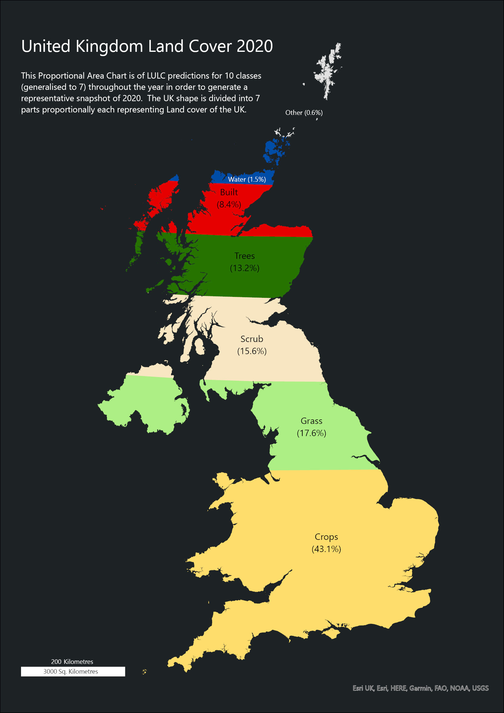
Percent Stacked UK land cover map
And again, a few of my thoughts whilst configuring this version of layout:
- Colour: applied the same colours used in the Esri Land Cover 2020 layer.
- Furniture: this approach allows me to reduce the number of graphics on the page as the graphic acts as a legend and stacked bar chart. I have also developed the scale bar to represent distance and area.
- Stacked Classes: I have ordered the classes based upon their relative size. The largest land cover (Crops) appears in the south and as we navigate north, the smaller land classes appear sequentially. The smallest classes (Water, Snow, Ice, Bare ground, Flooded vegetation, and Clouds) are in the most northern slices. This is good, stacked bar chart practice.
I hope you like the results and and please consider accompanying your future maps with a chart. It can really help tell the story of your maps and engage with more readers.
Learning Resources
If you would like to learn more about Cartography and Charts, then check out these learning resources:

The Esri Cartography 6-week MOOC with Ken Field and John Nelson starts 15th February 2022 and registration closes on 3rd March 2022. I attended this MOOC a few years ago and it helped me to refresh my cartography knowledge whilst learning how to get to grips with ArcGIS Pro.
An instructor led 2-day virtual course provided by Esri UK & Ireland Learning Services. Learn fundamental cartographic design principles and a standard workflow to produce print and online maps tailored to their purpose, medium, and intended audience. This course teaches ArcGIS Pro techniques to create and share a variety of professional-quality information products including print maps, web maps, and charts.
Or if you would rather use a textbook to learn more about Cartography then Designing Better Maps: A Guide for GIS Users, breaks down the myriad decisions involved in creating maps that communicate effectively. Cartographer Cynthia A. Brewer guides readers through the basics of good cartography, including layout design, scales, projections, colour selection, font choices, and symbol placement. Designing Better Maps also describes the author’s ColorBrewer application, an online colour selection tool.