Cartographers have always been influenced by artistic practices, so wouldn’t it be great if we could make maps in the style of our favourite paintings? This idea may seem a little outlandish but with the help of modern-day GIS technologies, the task that once would have taken months to complete by hand can now be done in a matter of days.
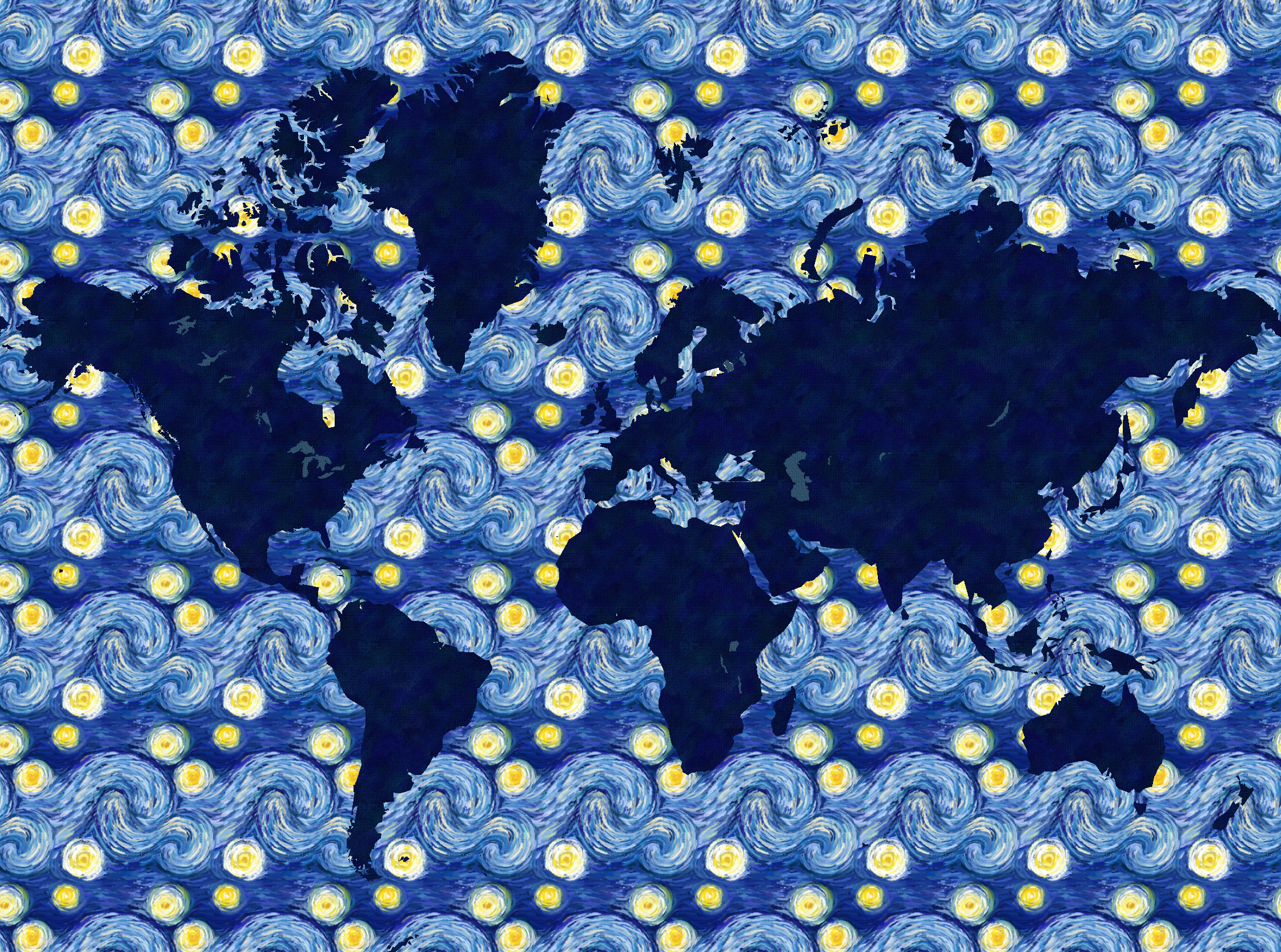
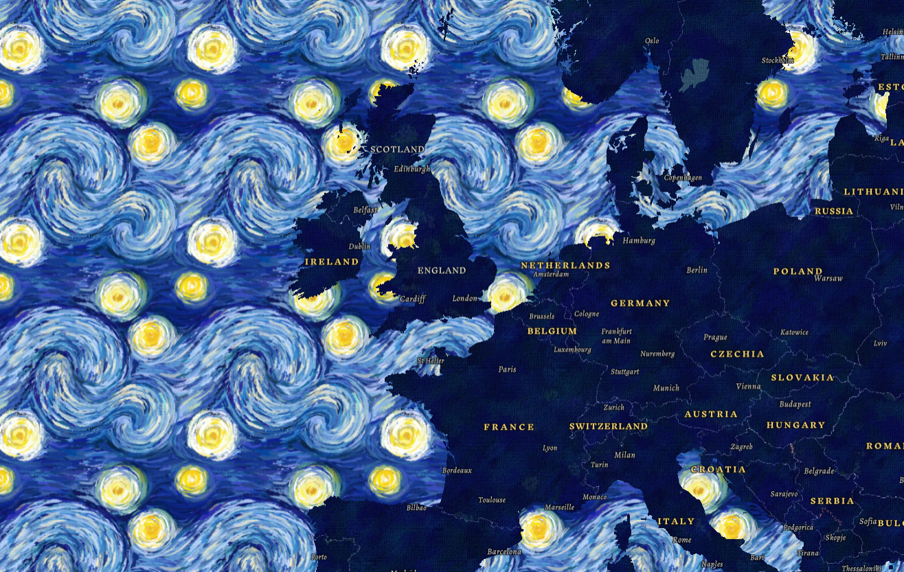
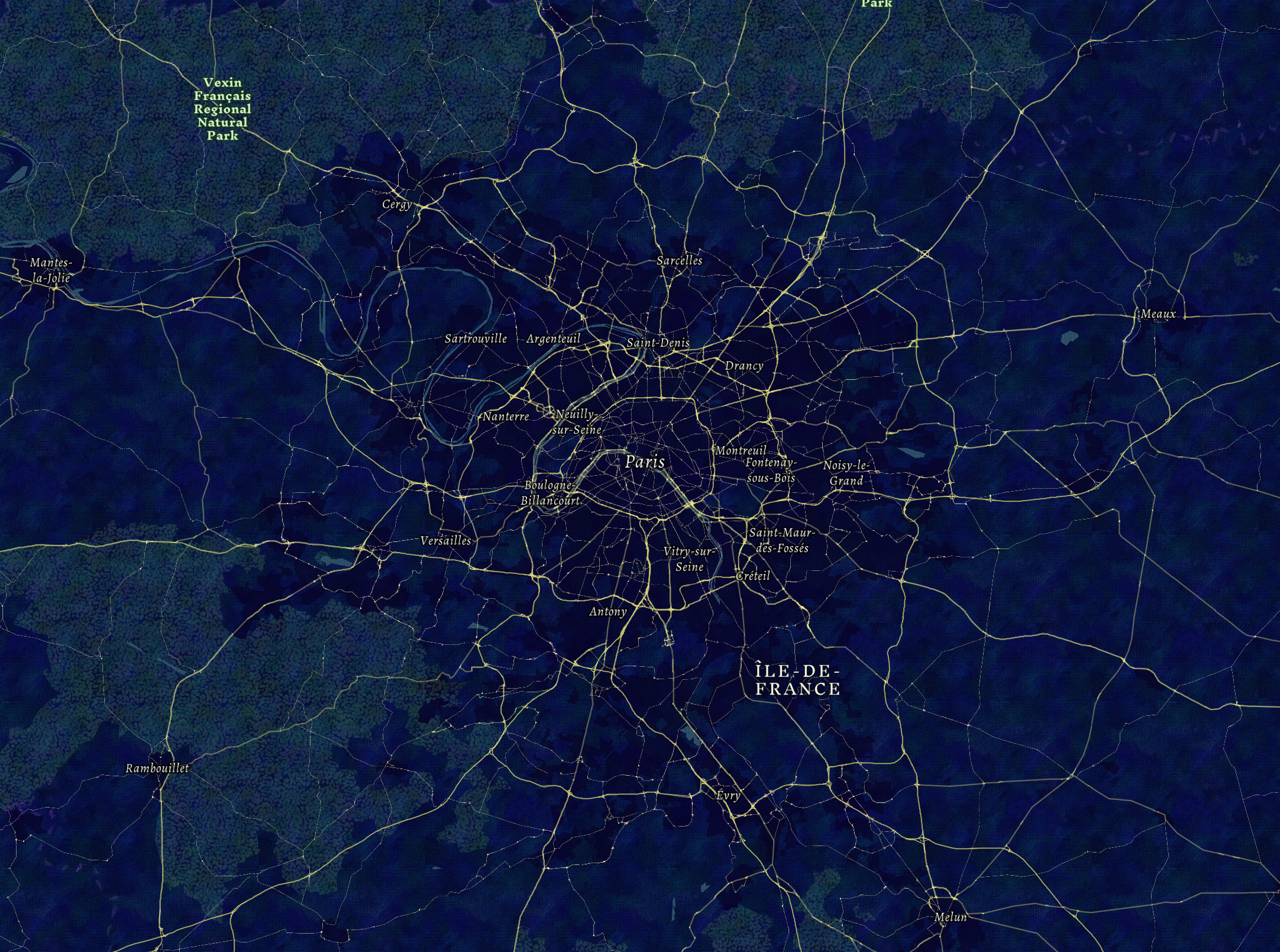
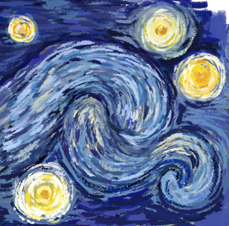
Vincent Van Gogh is one of my favourite artists, so I decided to create this ‘The Starry Night’ inspired basemap. The basemap is compatible for use within Map Viewer and ArcGIS Pro and is available up to a scale of 1:288,895. Feel free to use it in your maps! Below are some of the screenshots of the basemap. If you want to learn about how I made this basemap, keep on reading.
The Inspiration
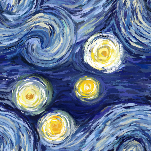
The Starry Night is one of Van Gogh’s most renowned paintings. Therefore, I knew I wanted to create a map inspired by this painting as it is instantly recognisable as one of Van Gogh’s works. The swirls in the night sky are very reminiscent of waves (with some art historians speculating that The Starry Night was partially inspired by Hokusai’s The Great Wave). Thus, I was immediately inspired to use the swirling pattern as the main focus of the map and to use it to depict the world’s oceans.
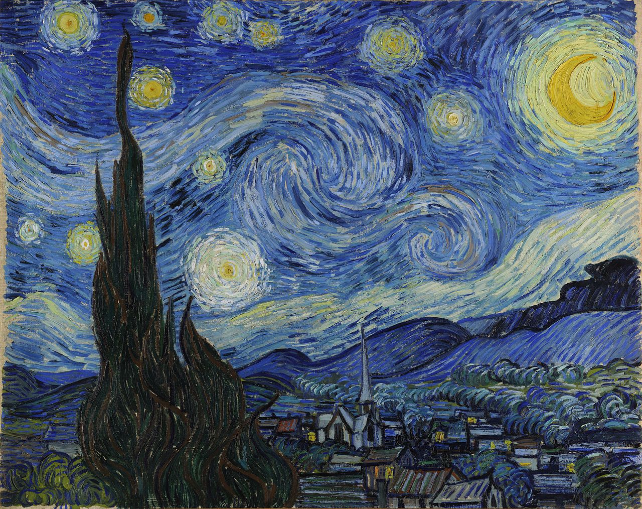 Van Gogh, Vincent. The Starry Night. 1889, Museum of Modern Art, New York.
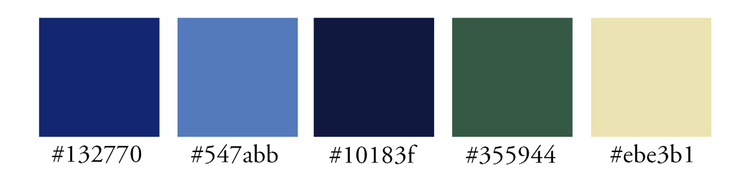
To create a general colour scheme, I used a colour picker and selected 5 shades within the painting. I will refer back to this colour scheme when deciding the symbology for my different map components.
The Artwork
Creating a seamless pattern can be confusing, but creating a seamless pattern with multiple brushstrokes and colours? Downright complicated. Fear not, I’ll break down how I painted my own version of The Starry Night swirl and made it into a seamless pattern.
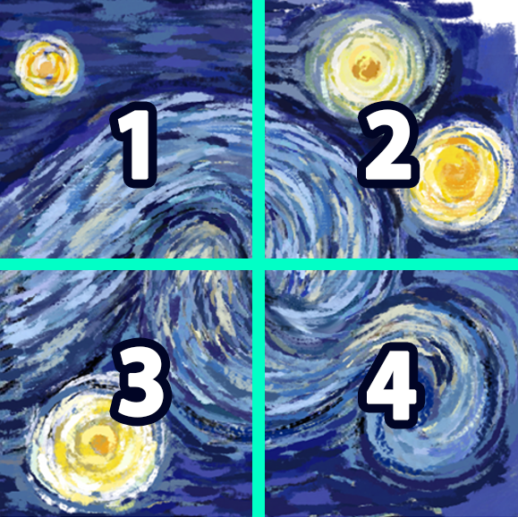
Step 1
First I’ll explain the principles of seamless patterns. Below we have two images. On the left, we have a simple polka dot pattern. On the right, is the same image that I have split into two sections; a blue section and a green section.
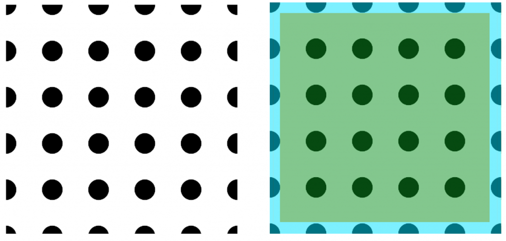
Within the blue section, the polka dots appear as semi-circles on the edges of the image and as quarters in the corners. This is because anything around the edges of your patterns must be aligned with each other to achieve a continuous effect. Anything in the green section can be freely drawn.
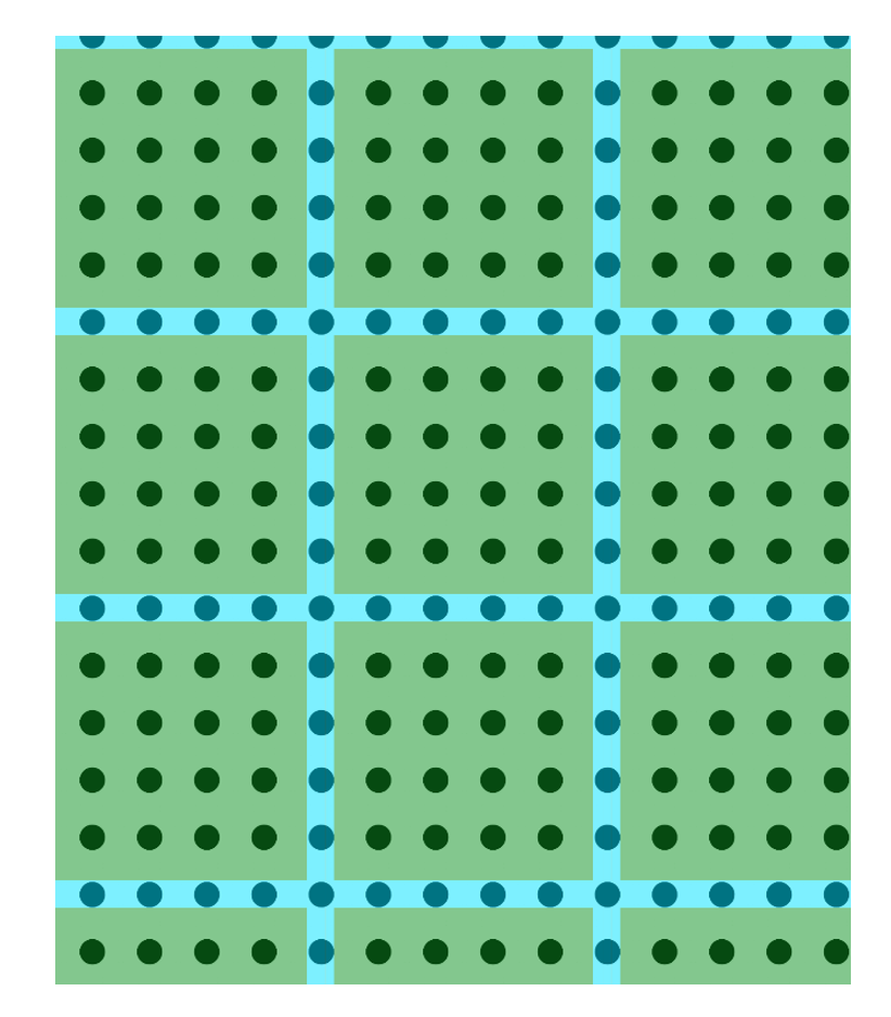
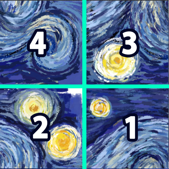
If I use this pattern to fill up a larger image you get the effect in the image below. As you can see, all the polka dots within the blue section away from the edges are now full circles.
Step 2
We can apply the same logic to a painting. Within Adobe Photoshop, I painted a rough version of my The Starry Night swirl. I ensured that my canvas was a square. At this stage, I added the most detail towards the centre of the image and paid less attention to what the painting looked like around the edges.
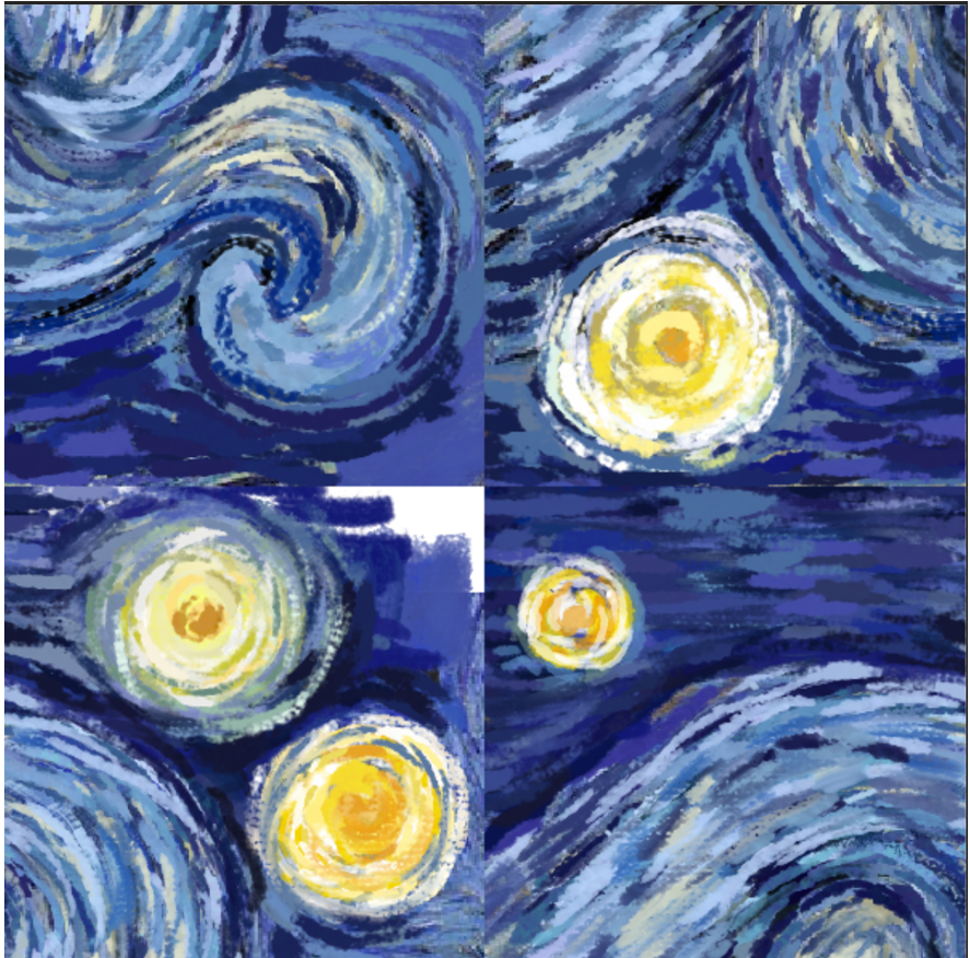
Step 3
Then I sectioned the painting into 4 quarters. It is important that each quarter be of equal size.
Step 4
Following this, I swapped the positions of each quarter. Quarter 1 was swapped with Quarter 4 and Quarter 3 was swapped with Quarter 2.
Without the lines and labels, my pattern looked like the one below.
By doing this, I have ensured that all the brushstrokes around the edges are aligned. However, you can see that the centre of my pattern now looks messy. Let’s refer back to the blue and green sections.
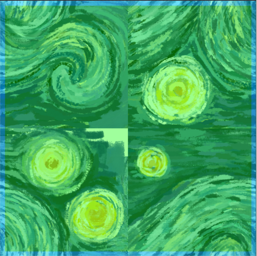
Following the principles in Step 1, I can paint over anything in the green section, as long as I make sure I don’t paint over the brushstrokes in the blue sections. After tidying up the central parts of my image, my seamless pattern is now complete and is ready to be used!
Using the same concept as above I created patterns for different parts of my basemap, such as forests, land and roads.
The Map Creation
Building a basemap from scratch can be a daunting task, but luckily I didn’t have to! To create my basemap, I used the ArcGIS Vector Tile Style Editor. A vector tile contains vector representations of data across a range of scales. Unlike raster tiles, they adapt to the resolution of their display device and can be restyled for multiple uses. Due to this, vector tile basemaps have become the default for ArcGIS Online.
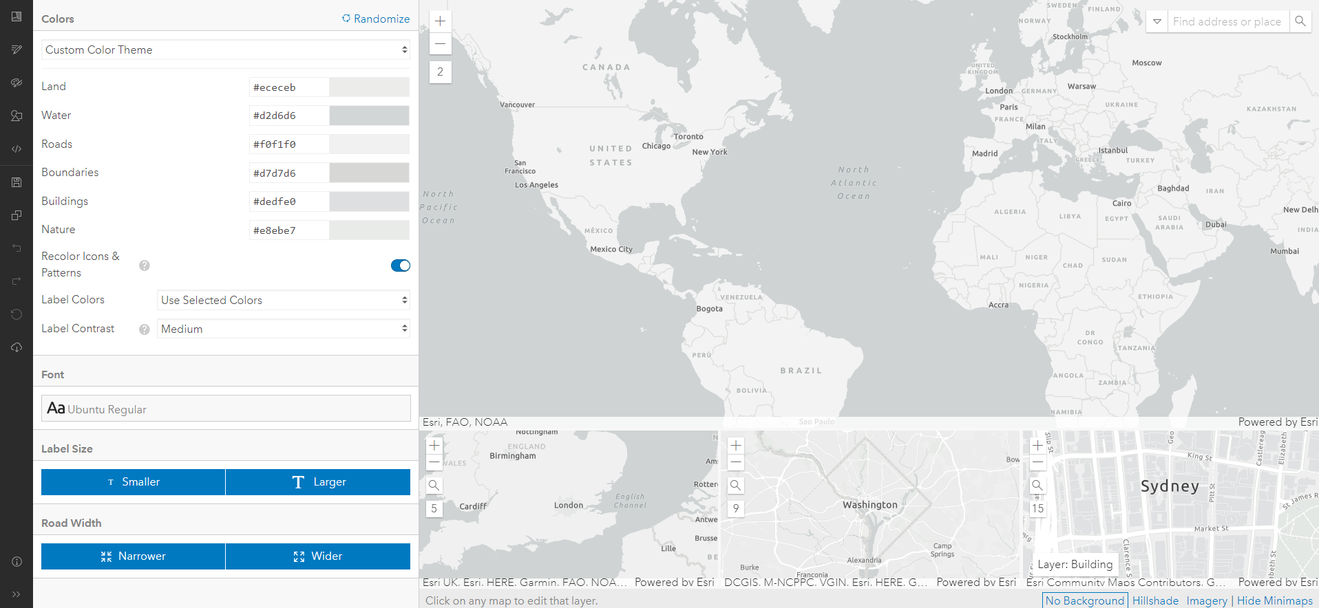
The ArcGIS Vector Tile Style Editor lets you customise any existing Esri vector basemaps. Each basemap has different map components and layers (for example the Light Gray Canvas basemap has only one layer for the ocean, but the World Topographic Map has multiple different layers for different bathymetry). I recommend having a look through the different layers for the available Esri basemaps before beginning to customise your own, so you can choose the most appropriate template!
I used the Light Gray Canvas basemap because I wanted to keep my basemap from looking too complex, as I was using quite detailed patterns for my symbology. The ArcGIS Vector Tile Style Editor has an interface that allows you to change the symbology of different layers of the vector tile components without the need to use any coding (though you still have the option to play around with the JSON script for further customisation).
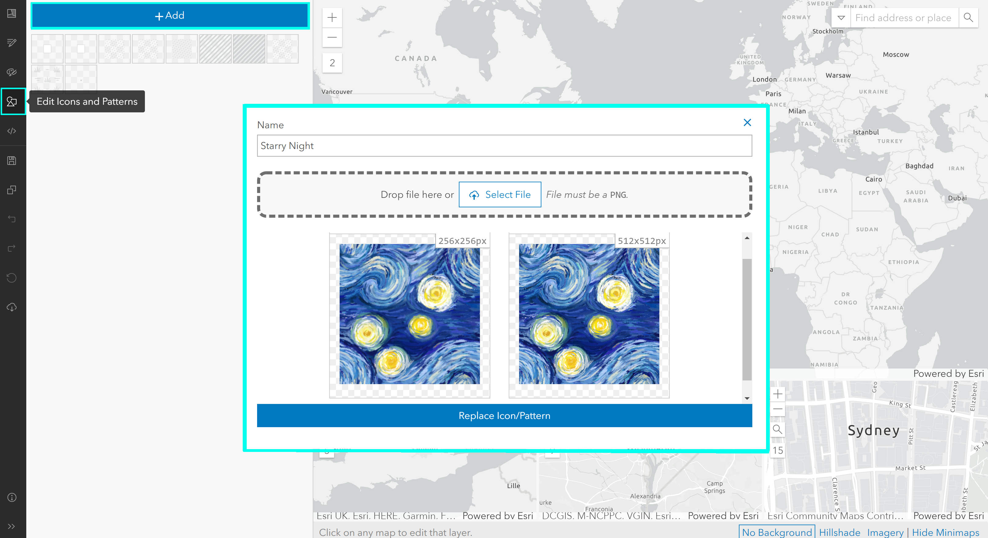
Within the ArcGIS Vector Tile Style Editor interface, I selected the Edit Icons and Patterns tab, where I can upload my pattern.
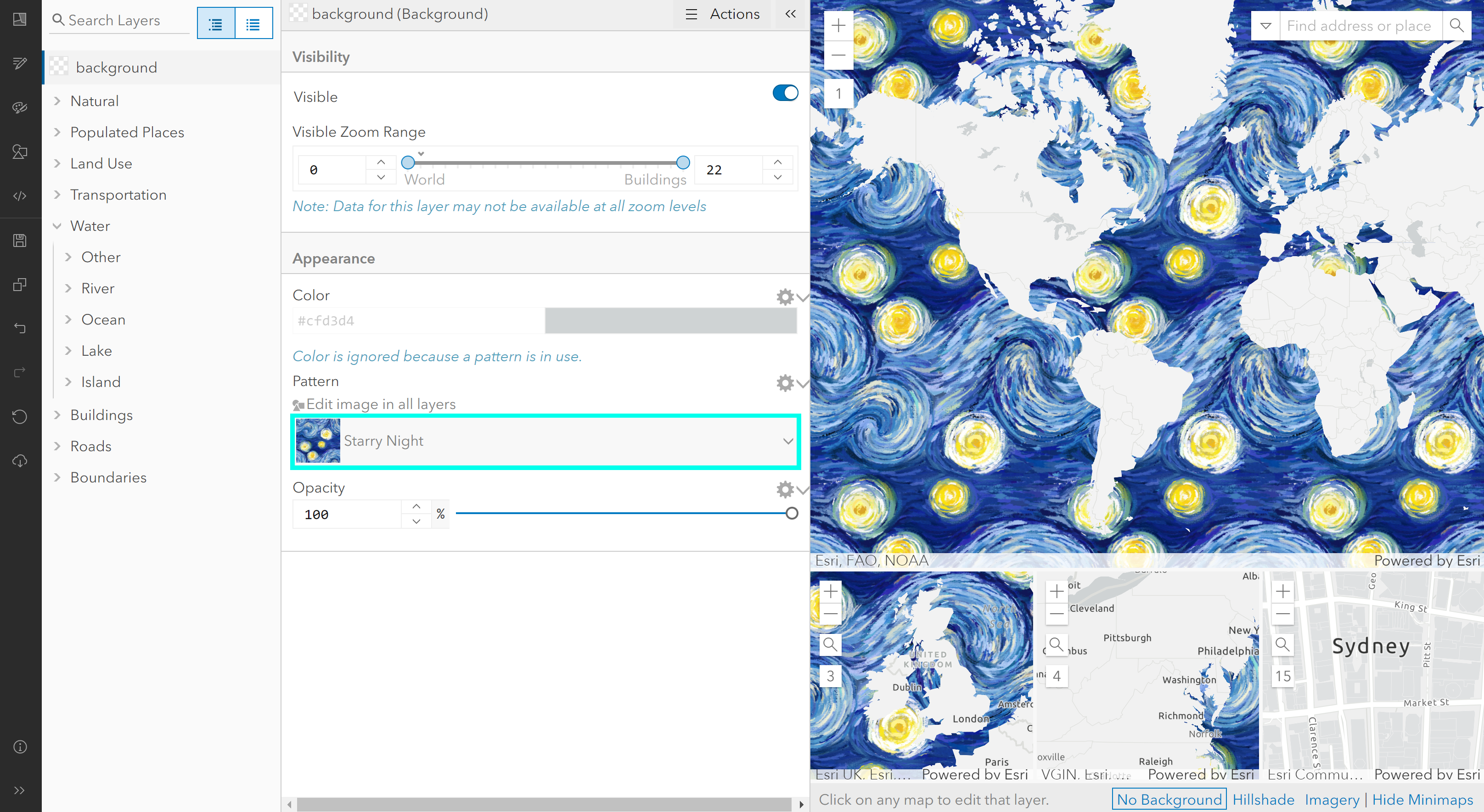
Then, using the Layers tab on the left-hand side, I selected the layer that holds the vector information for the oceans and chose my Starry Night pattern as a fill. The pattern then automatically fills and is scaleable at different extents. It’s that simple!
Final Thoughts
This was my first time using the ArcGIS Vector Tile Style Editor, so there was a lot of trial and error in terms of configuring the settings so that my different stylistic choices worked with each other. I followed this collection of ArcGIS Storymaps as a guide in creating my The Starry Night basemap.
Overall, I was surprised by how intuitive the interface of the ArcGIS Vector Tile Style Editor was and how quickly I picked it up. Hopefully, this has inspired you to try and get creative with your own basemaps using the ArcGIS Vector Tile Style Editor! For more cartography inspiration, check out our other blog posts here. Have fun mapmaking!