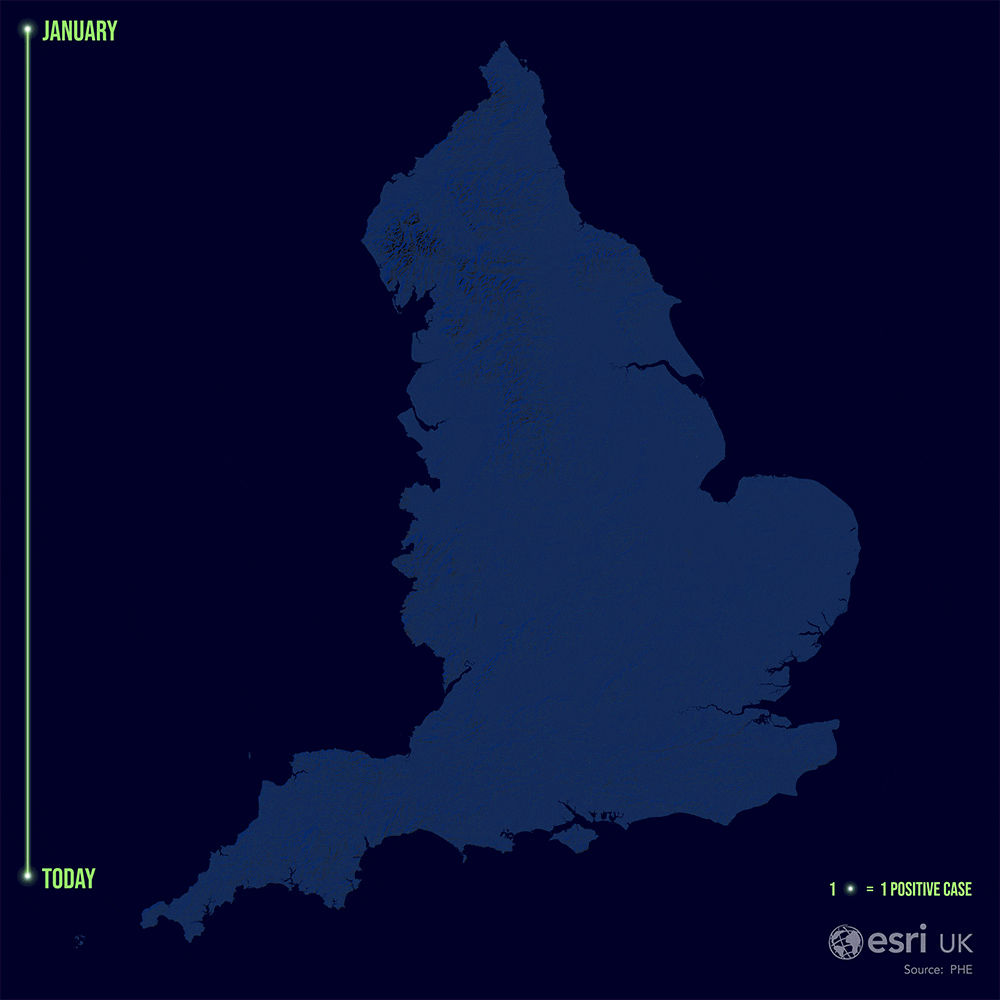
At the time of writing, confirmed cases of COVID-19 in England have surpassed a staggering quarter of a million. There are plenty of maps and dashboards showing the geographical extent of this disease, but I thought I'd try my hand at a different kind of visualisation (spoiler: this one glows).
The inspiration for this visual came from David Waldron's incredible Covid spread across the continental US - one of the best maps I've seen on the subject. It’s captivating and you find yourself stuck watching it glow on a loop as if you were an actual firefly.
With a relatively simple methodology, I was able to create my own version using the visualisation capabilities of ArcGIS Pro.
Data
For this map, I used weekly confirmed cases data from Public Health England*. I opened it in ArcGIS Pro along with Ordnance Survey’s Westminster constituencies from their Boundaryline data and then joined the two into a single layer using their Middle Layer Super Output Area code fields (MSOA have a mean population of 7,200).

Weekly cases data from PHE and medium sized output area boundaries from the OS joined to one layer in ArcGIS Pro.
Visualisation
Symbology was key for this project and as a result, I chose Dot Density over a Choropleth map to show weekly cases in each MSOA. Dot Density evenly distributed dots in the MSOAs, normalising the data’s geographic spread. It also exploits the Gestalt Principles of proximity and continuation, meaning viewers can identify patterns over time without overwhelming their cognitive load: 1 dot = 1 case. More on this can be found in data-vis specialist Chuan Jia (Jack) Zhao’s great blog.
Once I’d decided on symbology, I stole one of John Nelson's firefly styles for the points and fudged around with the size and transparency of the point symbol layers until I got the look I wanted (below). Transparency is particularly important here as the weekly layers were going to be stacked on top of one another, maximising the points' collective glow.

I went for the original firefly, not shimmer. kept the white centre and made the outer green circle double the size with 50% transparency.
Now for the juicy part. "How do I make such a beautiful custom basemap for my own vis project?" I hear you cry. Very easily, I reply to the voices inside my head. All that’s used here is the TopoBathy Hillshade imagery layer with the colour scheme given a black - navy hue and modified to highlight the hillshade.

TopoBathy Hillshade comes in a grayscale and provides a quick indication of the shape of the terrain at a range of map scales.
To create the surrounding mask, I added an England boundary shapefile and used it’s feature class to create a large rectangle polygon that covered the UK. Using the symmetrical difference tool as a 'cookie cutter' I was able to create a mask output with only my AOI visible.
Giving the mask polygon a dark blue colour makes the raster basemap come to life.

3 images side by side showing first the Hillshade basemap, then the basemap with week 18 data points and the final map with the England boundary mask added.
Subconsciously, I seem to have created a visual that references a certain alien character from a famous toy film franchise.. anyone else?
Layout & Animation
For the layout, I added a simple legend and used the firefly line style for the timeline- simplicity is key here so that the focus stays on the spread of cases. Something that makes David’s USA visual so strong was its temporal context. This element is necessary to communicate the spread of positive cases over time. It allows the audience to see the impact of various restrictions and the easing of these restrictions, over the last 7 months.
For each week I exported five images, or frames, with varying transparency for the text and points so that each week appears to 'flow' into the other. A timely process (shout out to my graphics card for exporting that raster basemap more times than I'd like to admit) but one that works well for the visual.
Carto considerations
Had I more time, I would have liked to use an urban extent polygon as a masking layer. The downside to our visual is that some might infer a dot locates an individual case (more info on this here). The mask would overcome this by accounting for England's urban geography, helping to prevent positive case points from being shown in super rural areas, or areas where no one lives.
If you would like to give this a go, you can download the ONS' urban extent for the UK here. Load this into your map and set it as the masking control under Advanced symbol options for your point layer.

Use an urban extent as a masking control layer to better represent your population data.
 in Isle of Wight/ Southampton area. Top image uses urban extent mask, bottom is without the mask. At this level, the impact of the mask is obvious, with points hugging the coastlines. Zoomed out, the impact is not as drastic.")
2 outputs showing positive COVID-19 cases for week 18 (w/c 27th April) in Isle of Wight/ Southampton area. Top image uses urban extent mask, bottom is without the mask. At this level, the impact of the mask is obvious, with points hugging the coastlines. Zoomed out, the impact is not as drastic.
To produce the animation, you can create a GIF/ video output using ArcGIS Pro’s built-in animation workflow. The result is an animated visual, highlighting the spread of positive COVID-19 cases and recent ‘flare-ups’ across the country over the past 7 months.
I hope you found something new or interesting in this methodology and that you’re staying safe during this time.
All the best!
David has kindly listed out his steps for creating his COVID-19 animation here.
* = We used the weekly confirmed cases by Middle Layer Super Output Area (mean of 7,200 people) up to Week 28 (w/c 6th July).
For Week 29 (w/c 13th July) and onwards, PHE are suppressing the data if fewer than three cases are confirmed in one of these areas. Full data statement by Public Health England, including clarification on pillar 1 and 2 data, can be found here.