Blog Archives
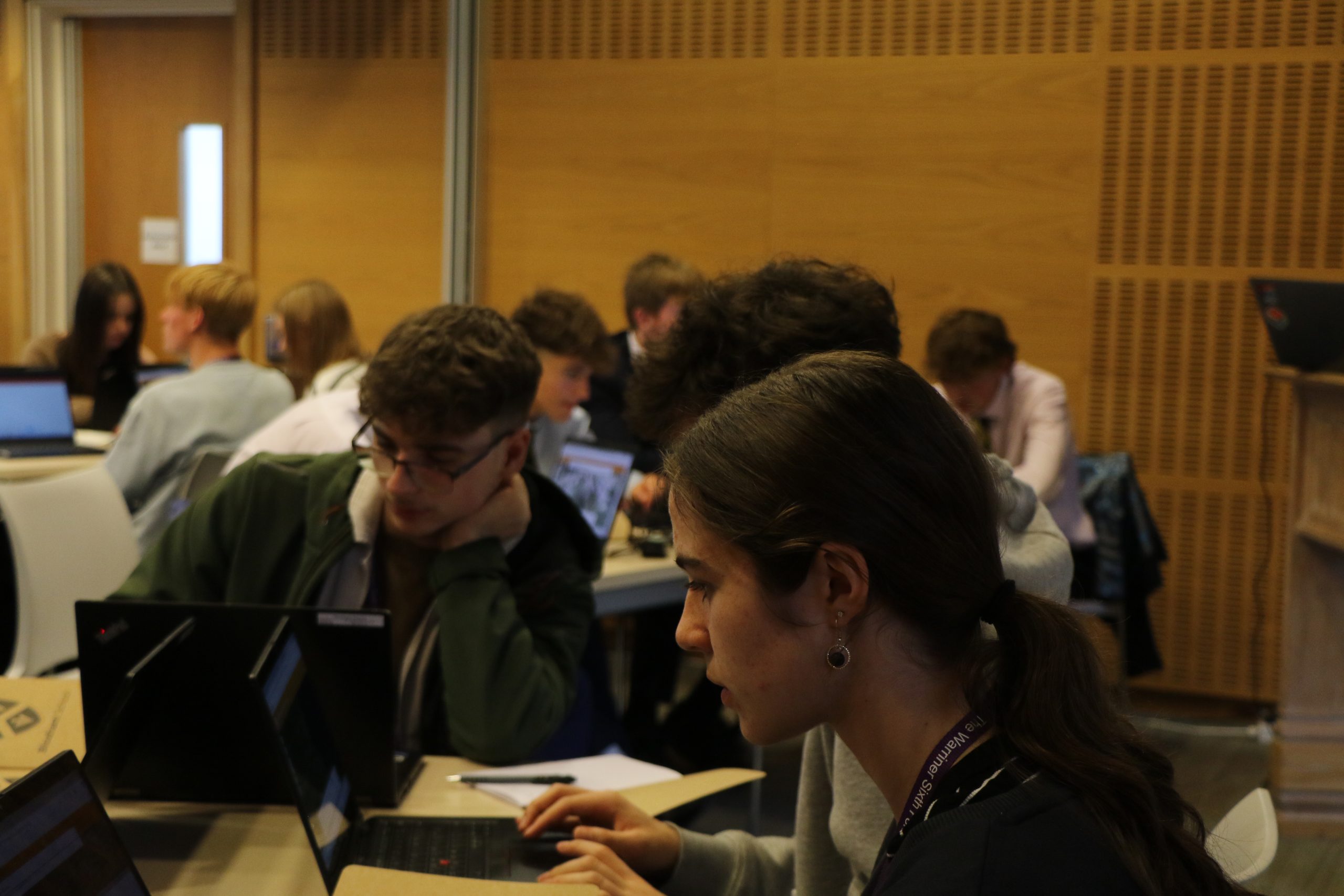
Bloxham School
Through the Bloxham Sustainability Challenge we are inspiring students to gain GIS skills and learn about sustainability.
In a creative new educational programme called the Bloxham Sustainability Challenge, schools in Oxfordshire and Warwickshire are working in partnership with Dalcour Maclaren to help young people gain vitally important skills for the workplace. Students have the opportunity to use ArcGIS tools to solve real-world problems and develop a deeper understanding of careers in the sustainability sector.
Students use ArcGIS tools including ArcGIS Survey123 to complete sustainability challenges.
Esri UK provides support for teachers and students, from the launch of each annual challenge to the judging.
Teachers deepen their understanding of GIS, through working with Esri UK and Dalcour Maclaren.
The Challenge
The Bloxham Sustainability Challenge was the vision of Claire Evans, Head of Geography at Bloxham School. She wanted to provide extracurricular opportunities for groups of Year 12 students to use geographic information system (GIS) technology to solve sustainability challenges and develop wider skills for the workplace. When she approached Dalcour Maclaren with her concept, the firm immediately seized the opportunity to get involved.
Dalcour Maclaren is a consultancy that unlocks planning consents for utilities and infrastructure clients. It employs a large number of apprentices and graduates and was keen to inspire more young people to consider careers in the sustainable development sector. Pooling their ideas and resources, Bloxham School and Dalcour Maclaren worked together to launch an innovative challenge for young people that has sustainability and GIS at its heart.
“Teachers can learn so much from working with industry partners like Esri UK and Dalcour Maclaren to increase learning opportunities for young people. Partnership is definitely the future of education.”
Claire Evans, Head of Geography, Bloxham School
The Solution
Teams of students participating in the Bloxham Sustainability Challenge are given a real-world scenario, a resource pack of background information and data, and access to Esri’s ArcGIS technology. They are then asked to evaluate a proposed development and identify the most sustainable option. In the first year, for example, Dalcour Maclaren challenged students to evaluate the impact of a potential solar park at Buckland Marsh and plan an appropriate route for an underground cable to connect it to the nearest electricity substation.
The challenge kicks off every year with a launch event, at which consultants from Esri UK provide training for students and teachers in how to use key tools within ArcGIS. In this way, the students quickly gain the core skills that they need to get started on the challenge. Useful resources, from the project brief to ‘how to’ guides, are hosted on an ArcGIS Hub website, where they can be easily accessed by students and teachers.
Students use ArcGIS Online to visualise the project area and analyse publicly-available data on habitats, land use, utilities and more. They also create ArcGIS Survey123 forms and use their mobile phones to capture data in the field. One year, Dalcour Maclaren asked students to evaluate a proposed reservoir at Abingdon, considering water supply, flooding risks, environmental impacts and water quality. They used ArcGIS Survey123 to capture the opinions of local residents, the water company and community groups.
At the end of each challenge, students present their findings and proposals to a judging panel comprising sustainability experts from Dalcour Maclaren and GIS experts from Esri UK. Teams can use ArcGIS to visualise their findings and justify their recommendations.
There has been strong interest in the initiative and, as a result, the Bloxham Sustainability Challenge has expanded since its launch to include students from other local schools including Stratford Girls’ Grammar School and the Warriner School. “We expect a further increase in participation in the years ahead and hope, one day, that the scheme might become a national one,” acknowledges Evans.
“All successful businesses need young talent coming in with the right skills and enthusiasm, and the more organisations can do to support schools, the better it will be for business in the long run.”
Mike Lee, Director, Dalcour Maclaren
Benefits
GIS skills acquired in fun projects
The Bloxham Sustainability Challenge is an innovative initiative that enables young people to learn how to visualise, analyse and collect data with ArcGIS. “These are all GIS techniques that we at Dalcour Maclaren use on a day-to-day basis, so students really are gaining very relevant knowledge, skills and experience,” observes Sarah Garvey, a Senior GIS Specialist at Dalcour Maclaren.
Experience of real-world sustainability challenges
The initiative gives students a deeper appreciation of the real-world challenges of developing sustainable infrastructure. For instance, in the Buckland Marsh challenge, students used ArcGIS to appreciate the complexities of laying a cable in close proximity to sites of special scientific interest, protected habitats and existing built infrastructure, and undertook cost benefit analyses of different routes.
Greater readiness for the world of work
Beyond gaining competence in using GIS, students learn how to communicate, problem-solve, plan research and present to audiences, all of which increases their readiness for employment. They also learn about careers in sustainability and gain inspiration for further study. “Students get the opportunity to see what the world of work looks like,” says Mike Lee, a Director of Dalcour Maclaren. “Then, when they come into the workplace, their journey is accelerated, and their confidence is so much stronger.”
Young talent nurtured for future roles
It isn’t just the students that benefit; Dalcour Maclaren recognises that it too benefits from its engagement with young people through this scheme. “Partnership with schools is so important for the long-term sustainability of business,” explains Lee. “All successful businesses need young talent coming in with the right skills and enthusiasm, and the more organisations can do to support schools, the better it will be for business in the long run.”
More confident GIS teaching in schools
Through the Bloxham Sustainability Challenge, teachers are learning more about how GIS is used in industry and becoming more confident teaching GIS skills. Teachers involved in the challenge now use GIS in more geography lessons with younger pupils to view live data on wildfires, for example. “Teachers can learn so much from working with industry partners like Esri UK and Dalcour Maclaren to increase learning opportunities for young people,” says Evans. “Partnership is definitely the future of education.”


South Woodford Society
An ArcGIS web map provides an effective way for residents, local businesses, developers and planning officials to collaborate on plans to improve South Woodford.
A resident-led community group in northeast London, called the South Woodford Society, has built an ArcGIS web app to help guide the future development of the neighbourhood. It aspires to make South Woodford a green, active and thriving urban village and is using digital mapping to share its vision and work collaboratively with stakeholders.
Residents, local businesses, developers and the council explore features of the area in ArcGIS Online
The society undertakes geospatial analysis to understand access to greenspaces and amenities
The solution was built using the templates and easy-to-use tools available in ArcGIS Experience Builder
The Challenge
The South Woodford Society was initially founded by a group of residents who felt disillusioned by local planning decisions and wanted to play an active role in creating a green, accessible and vibrant community. With input from over 500 members, it started to produce a neighbourhood plan and secured government funding to develop a digital design code, a set of design principles to inform future developments, based on effective community engagement and local aspirations for the area. The society needed to build on this strong momentum and work collaboratively with a wide range of partners to realise its vision and make South Woodford an even better place to live, work and visit.
“ArcGIS is a really good way to improve collaboration between residents, the society, developers and planning authorities and ensure that the best possible decisions are made about how to improve the area.”
Katie Dawson, Technical Director, EcoSpatial
The Solution
Volunteering for the community group, Jo Ashbridge, CEO of the housing charity AzuKo, engaged with Katie Dawson, Technical Director at the geospatial technical services consultancy EcoSpatial, to build a web-based mapping app. This interactive, digital solution was created in Esri’s ArcGIS Online, using the easy-to-use templates and drag-and-drop widgets available in ArcGIS Experience Builder. Known as the South Woodford Neighbourhood Forum Map, it consolidates a vast amount of local information, enabling residents, developers, local businesses and the borough council to clearly visualise the South Woodford area.
During the development of the solution, Esri UK provided advice on how to find appropriate geospatial data to supplement the data that the society was collecting itself. This led to the incorporation of open source kerbside data from Appyway, which shows the locations of parking bays and yellow lines.
Using standard tools in ArcGIS Online, the society can easily analyse the data in its Neighbourhood Forum Map to gain insight into issues that could inform development decisions. For instance, the society has created a buffer around South Woodford to indicate the areas that can be reached within a ten minute walk, in any direction, from any address. This zoning is incredibly valuable for analysing residents’ access to amenities like green spaces and parks, which may be outside of the South Woodford boundary but still close enough to enrich residents’ lives.
The Neighbourhood Forum Map is still in development, and more information will be incorproated in the near future, including cycling and walking routes to help encourage more active livestyles. South Woodford Society also plans to include 3D visualisations and real-time data, such as traffic flow and rainfall, using the ArcGIS Living Atlas of the World.
“The feedback that we have had from the community has been brilliant—and that just enthuses us to develop our ArcGIS map further!”
Pearl Arbenser-Simmonds, Co-Chair, South Woodford Society
Benefits
Constructive collaboration with stakeholders
ArcGIS Online provides a contemporary way for South Woodford Society to share its vision for the future and collaborate with other stakeholders to make it happen. The Neighbourhood Forum Map can, for example, be used by the society in council meetings to highlight underused areas that could become nicer green spaces. “We want to make South Woodford the best it can be,” says Dawson. “ArcGIS is a really good way to improve collaboration between residents, the society, developers and planning authorities and ensure that the best possible decisions are made about how to improve the area.”
Consistent approach to development
The Neighbourhood Forum Map helps to ensure changes in the urban landscape are consistent with the standards set out in the society’s design code. One developer has recently used the Neighbourhood Forum Map, in conjunction with the design code, to help inform its plans for a development in the area. “The map gives developers a better feel for the area,” says Pearl Arbenser-Simmonds, Co-Chair of South Woodford Society. “It enables them to see how their developments will fit into the surrounding environment and what steps can be taken to enhance green spaces.”
Clarity for prioritising investments
ArcGIS Online helps to highlight where new investments are needed to improve the area. For instance, the society can see where there are streets with no or few benches and present a clear case for new street furniture to improve pedestrian safety, comfort and mobility. “Asset mapping is a powerful tool that enables communities to understand what their neighbourhood has and needs,” says Ashbridge. “South Woodford Society can use its ArcGIS map to pitch for funding and develop a strategy to turn its vision for healthy streets and spaces into reality.”
Effective measurement of targets
The South Woodford Society plans to use ArcGIS Online to monitor changes and generate tangible evidence of how well it is achieving the targets in the neighbourhood plan. It has, for example, already used ArcGIS Online to calculate the percentage of greenspaces within the area and the percentage of canopy cover from trees. By repeating this analysis annually, the society can measure improvements in green spaces and nature in its urban environment over time.
Stronger community engagement
Undoubtedly, the Neighbourhood Forum Map helps to engage local people in conversations about the future of the area and fosters a stronger sense of community. When new developments are proposed, residents can use the map to see what is already in the area, better understand the implications of the project and make constructive comments as part of public consultation processes. Arbenser-Simmonds acknowledges, “The feedback that we have had from the community has been brilliant—and that just enthuses us to develop our ArcGIS map further!”

Sport England
The redevelopment of a pivotal data visualisation and analysis solution in ArcGIS is delivering benefits across the sport sector.
Sport England has reenergised strategic planning processes in the sports sector by upgrading its Active Places Power toolkit. Local authorities and sport governing bodies can now visualise and analyse the locations of sports facilities more easily and gain insight to inform their planning and investment decisions, while Sport England itself is making substantial cost and time savings.
115,000 sports facilities across England can be visualised and analysed using ArcGIS toolkit
£1 million in cost savings are estimated across the sector from using the ArcGIS-based data and solutions
30% cost savings are anticipated within Sport England from lower development and maintenance overheads
The Challenge
Sport England works with local authorities and sport governing bodies to help ensure the right sports facilities are provided, in the right places, to meet the needs of local populations and encourage active lifestyles. Decision makers need to know exactly where formal sports currently take place, what facilities are available and where there are gaps in provision, to help them plan future investments in sports.
To address this challenge, Sport England had previously developed a website called Active Places Power, comprising tools for exploring Sport England’s extensive database of over 115,000 sports facilities. This bespoke platform was, however, built on out-dated technologies and not fully integrated with the organisation’s other GIS systems. Every time Sport England wanted to make changes to the solution, it had to engage specialist software engineers, which made it costly and time-consuming to enhance.
“We use lots of different parts of the Esri technology stack, but they all talk to each other in a seamless way.”
Liz Clarke, Head of GIS, Sport England
The Solution
Recognising the urgent need for a new approach, Sport England began by building a foundational GIS platform to support its current and future geospatial applications. It was already using Esri’s ArcGIS desktop software and services within the organisation, so elected to create the robust, underlying geospatial data infrastructure that it needed using ArcGIS Enterprise, hosted in the cloud. At the same time, the organisation migrated its core database of sporting facilities (known as Active Places) to the new ArcGIS platform.
Next, Sport England reimagined Active Places Power, effectively building on top of the new GIS infrastructure. This cloud-based solution was created within ArcGIS Online and uses functionality from ArcGIS Hub Premium, ArcGIS Survey123, ArcGIS Experience Builder, ArcGIS Dashboards and Esri’s geoprocessing services to deliver a modern toolkit for users. “We use lots of different parts of the Esri technology stack, but they all talk to each other in a seamless way,” explains Liz Clarke, Head of GIS at Sport England.
The new-look Active Places Power is more intuitive to use and has more modern interfaces than its predecessor. Staff at Sport England, local authorities and sport governing bodies rely on it to inform their investment strategies and make sure they are providing the right facilities, in the right locations. The toolkit offers a wealth of capabilities, including spatial tools that estimate where populations can’t reach a sports facility and ‘demand calculators’ that enable users to estimate the additional demand for sports facilities that may arise from anticipated population growth in an area.
Sport England is now leveraging its new GIS infrastructure and single source of geospatial data to build more apps, maps and services for staff and stakeholders. For example, the organisation has recently launched a new ArcGIS solution, called the Small Area Estimates tool, that enables internal and external users to explore the results of Sport England’s ‘Active Lives’ surveys and estimate the proportions of adults, children and young people who are active or inactive/less active, by area.
“ArcGIS gives us the ability to deliver more applications to support our colleagues and the sport sector as a whole.”
Liz Clarke, Head of GIS, Sport England
Benefits
Estimated cost savings of £1 million
The new, ArcGIS-based Active Places Power toolkit relives local authorities, sport governing bodies and other stakeholders of the need to capture and maintain data and develop their own analytical tools, creating savings across the sector. For example, Sport England estimates that having access to playing pitch information through Active Places Power saves local authorities over £1 million per annum in playing pitch strategy production costs.
Multi-million-pound investments in sports
The Active Places Power toolkit underpins the evidence to secure investment into the sports sector. Using Active Places, Sport England alone negotiated £14.4 million into sport through the planning system in 2023/24. Commenting on this achievement, Nick Evans, Director of Planning and Active Environments at Sport England, says, “We have been able to quickly replicate tools within ArcGIS, which are intuitive to use, enabling our Planning Team, and others, to make a robust case for developer contributions for new sports facilities to offset the increased demand generated from new development.”
30% reduction in application maintenance costs
Sport England has compared the cost of carrying out continuous improvement on the new-look Active Places Power, the new ArcGIS-based Active Places database and the underlying ArcGIS infrastructure with the cost of carrying out the same tasks previously. Through this exercise, it has estimated that the new solutions will reduce costs for the organisation by at least 30%.
15-fold increase in development speed
Sport England no longer needs to engage specialist software engineers to carry out bespoke programming every time it wants to upgrade Active Places Power. As a result, updates that used to take between two and three working weeks to implement can now typically be delivered in just one day using ArcGIS, which is up to fifteen times faster. Simple fixes, like changes to the way pop-up boxes display, can even be done in as little as an hour, empowering Sport England to implement application enhancements on demand.
Capability and flexibility to innovate
The new ArcGIS infrastructure has given Sport England the capability, flexibility and, indeed, enthusiasm to deliver additional, value-adding apps. The organisation is, for example, currently converting spreadsheets into interactive dashboards, using the ArcGIS Dashboards app, which will provide added transparency about how Sport England is investing £250 million a year. “We are right at the beginning of an exciting new journey!” Clarke exclaims. “ArcGIS gives us the ability to deliver more applications to support our colleagues and the sport sector as a whole.”
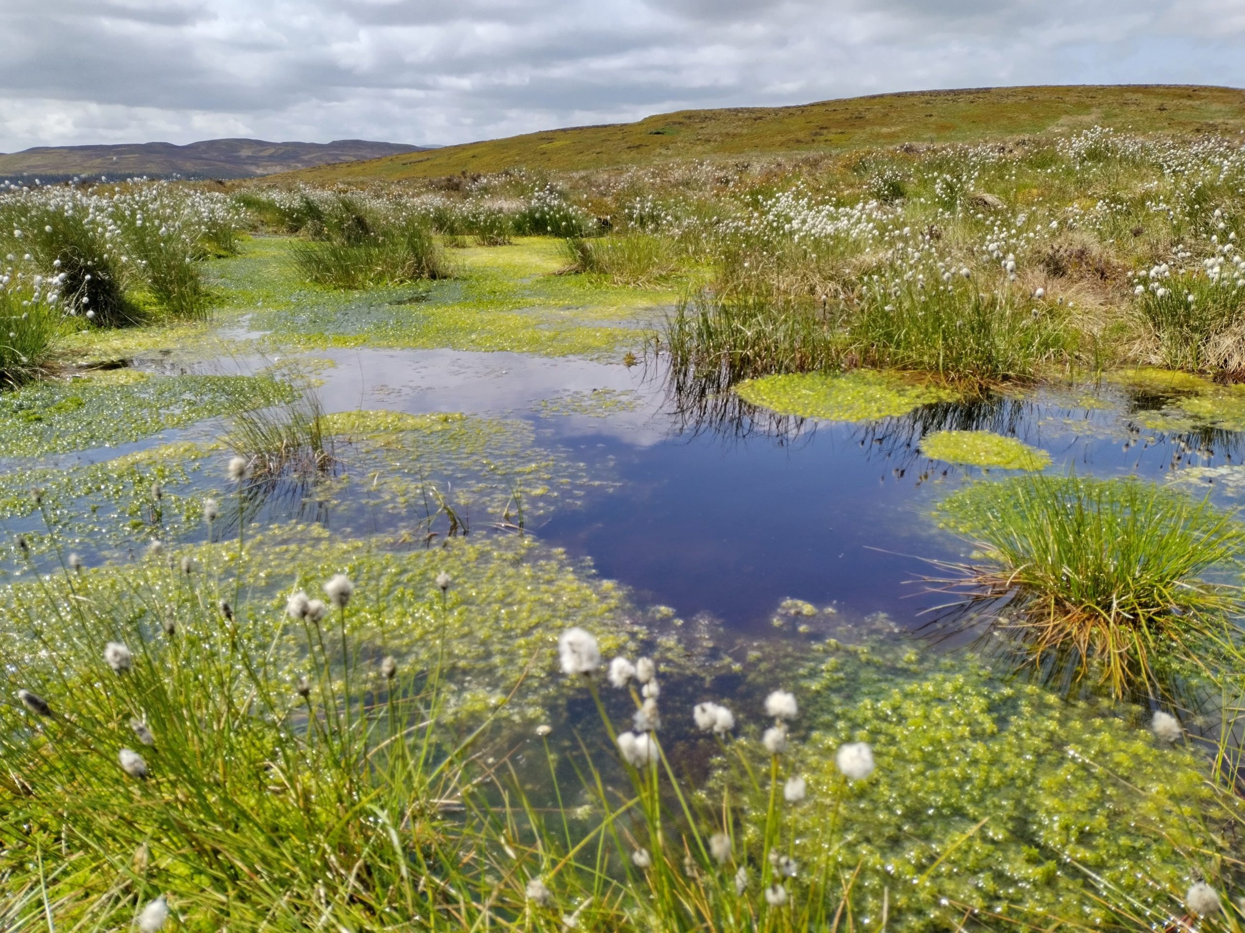
RSPB
Precious peatland habitats in Wales are being restored to health using a suite of ArcGIS products.
In a large-scale conservation programme in Wales, the bird and nature charity RSPB is using a suite of ArcGIS products to restore the health of precious peatland environments. It is able to plan restoration works very precisely and operate efficiently in remote, wild landscapes to create thriving new habitats where rare and endangered species can flourish again.
Peat formed over thousands of years is protected in restoration programme, managed using ArcGIS Pro
46 km2 area mapped using drone imagery, processed and analysed with ArcGIS Drone2Map and ArcGIS Pro
250 km of gullies, ditches and haggs blocked or reprofiled so far, by contractors using ArcGIS Field Maps
The Challenge
On the moorland surrounding Lake Vyrnwy in Wales, peat that had formed over a period of up to 3,500 years was degrading rapidly, with far-reaching consequences. In some locations as much as 20 years of peat formation was being lost in a single year. Unique habitats for rare plants and birds were declining in condition and the previously long-term peat accumulating carbon sink was becoming a carbon source.
With funding from the National Peatland Action Programme, Hafren Dyfrdwy (a subsidiary of Severn Trent) and other partners, RSPB Cymru (Wales) resolved to tackle the urgent problem and restore this precious peatland region. It aimed to create healthy wetland habitats where plant species could thrive to support stronger, sustainable ecosystems of insects and birds, whilst recreating conditions necessary for carbon sequestration.
“ArcGIS is pretty instrumental for a project of this scale, in a remote location.”
Ben Wilcox, Peatland Project Officer, RSPB Cymru
The Solution
RSPB Cymru’s Peatland Project Team began by creating a detailed digital map of the Lake Vyrnwy region in Esri’s ArcGIS Pro software. By digitising features that required intervention, valuable data on the health of the peatland was incorporated into the model, including the results of peat depth surveys. RSPB Cymru was then able to create a heatmap of the site, clearly showing the variation in peat depth and therefore identifying where peatland restoration is urgently needed.
Using drones, the project team conducted aerial surveys of the site, processing this data using ArcGIS Drone2Map. RSPB staff and volunteers then walked the site, using an app developed with ArcGIS Field Maps, to ‘ground truth’ the site plan and add restoration lines and features to the map while in the field.
In these ways, RSPB Cymru accurately digitised specific site features, such as gullies and ditches, and built up a highly detailed picture of the site in ArcGIS Pro. Around eight members of staff at RSPB Cymru now use this digital representation of the peatland on a daily basis to detect, analyse, prioritise, plan and manage restoration works.
The charity’s appointed contractors use an ArcGIS Field Maps app to navigate around the site and find where works need to be carried out. The app shows them the best routes for moving heavy machinery across the area to avoid damage to healthy sections of peatland. Contractors also use the app to mark changes, such as where dams have been constructed to form new pools.
The updates recorded by contractors in the ArcGIS Field Maps app are instantly visible to RSPB Cymru staff in ArcGIS Pro, enabling them to monitor projects very closely. Staff can also produce reports much more quickly, as they can instantly see live changes on site and use accurate data to produce maps for funders and other stakeholders.
“ArcGIS saves not only staff time, but also our contractors’ time, which enables us to deliver environmental projects very efficiently.”
Ben Wilcox, Peatland Project Officer, RSPB Cymru
Benefits
Greater understanding of peatland health
Visualising data in ArcGIS Pro gives RSPB Cymru and its partners a far clearer understanding of peatland health in the Lake Vyrnwy region. The maps generated, like the peat depth hotspot map, clearly show which areas need to be restored and where existing features like gullies are located across a vast moorland landscape of over 46 km2. “ArcGIS is pretty instrumental for a project of this scale, in a remote location,” says Ben Willcox, Peatland Project Officer at RSPB Cymru.
Effective planning of restoration works
RSPB Cymru can plan restoration works in specific locations with a fine degree of accuracy using ArcGIS Pro. Staff can work out the size of areas and the corresponding resources needed and cost of implementing remediation works. They can then create buffer areas around features to calculate the potential carbon savings. With this insight, the charity can approach funders with detailed information about the funding required to deliver tangible results in specific locations.
Time savings while working in the field
By empowering contractors and field-based staff with ArcGIS Field Maps, RSPB Cymru has ensured that all works carried out on site are completed as efficiently as possible. Everyone can view the same up-to-date maps in the field to see which areas have been improved and where works are taking place. “ArcGIS saves not only staff time, but also our contractors’ time, which enables us to deliver environmental projects very efficiently,” observes Willcox. “The more efficient we can be, the more we can achieve with our funding.”
Effective management of ongoing programme
While the peatland restoration programme at Lake Vyrnwy is still continuing, RSPB Cymru has already used ArcGIS Pro to manage many consecutive and successive restoration works across Wales effectively. By March 2024, the organisation had successfully rewet over 1,078 hectares of land, built 38,400 dams and blocked and reprofiled over 250 km of gullies, ditches and peat haggs, enough to stretch from Swansea to London. It has, therefore, significantly improved conditions for peat generation, leading to greater carbon sequestration and water retention, alleviating both flooding and drought effects.
Healthy habitats for special species
This highly successful ArcGIS-led project, is undoubtedly having a very positive impact on habitats and biodiversity. Across the site, rare species including sphagnum mosses and carnivorous sundew plants are becoming reestablished. Golden plovers are using recently restored peatland on the reserve for the first time in 25 years, and some of Britain’s rarest birds of prey, Hen harriers, Merlin and Hobby are relying on these sites as important foraging habitat. As Willcox rightly says, “Peatland is a rare, unique habitat, so when it is in good condition it attracts some very special species.”

The Crown Estate
Automated geospatial analysis conducted with ArcGIS provides the evidence we need to inform the future of marine environments up to 2050.
In an increasingly congested marine environment, The Crown Estate is using ArcGIS to evaluate and identify the best locations for new wind farms and carbon storage facilities, as well as areas for biodiversity and opportunities for other crucial sectors. Its leading Marine Delivery Routemap utilises advanced geospatial analysis to balance the demands of net zero, nature recovery and industry more effectively than ever before.
Optimum development scenarios across 12+ industry sectors are generated using ArcGIS Pro
Alternative options can be compared and evaluated on dashboards built with ArcGIS Experience Builder
Stakeholders are engaged in decision-making process using ArcGIS Hub and ArcGIS StoryMaps
The Challenge
The Crown Estate is responsible for managing the seabed and much of the coastline around England, Wales and Northern Ireland, an area greater than the entire UK landmass. Its remit is to unlock value from the sustainable management of this seabed and return its net profit to the UK government for the benefit of public spending.
With many competing demands on the marine environment, the organisation needed to be able to find the best locations for new sustainable energy facilities and other new developments, while taking into account a vast number of constraints, from the routes of underwater pipelines and shipping lanes to fishing grounds and areas designated for the protection of marine species, such as the bottlenose dolphin.
“ArcGIS enables us to run scenarios out to 2050, for all of our sectors and the environment, in a way that we have never been able to do before.”
Jamie Moore, Marine Delivery Routemap Director, The Crown Estate
The Solution
The Crown Estate developed a Resource Identification and Optimisation tool, known internally simply as RIO, using Esri’s ArcGIS Pro and ArcGIS Enterprise solutions. This sophisticated geospatial app identifies and evaluates all constraints on the seabed, revealing the most constrained areas in pink and less constrained areas in light blue on an interactive marine map.
Using ArcGIS Pro, the organisation then runs analysis to identify and evaluate different scenarios. This process has been fully automated using Python to effortlessly identify the optimum locations for different projects. To date, The Crown Estate has identified areas of opportunity for twelve sectors that it manages, including areas where different sectors could share use of a marine area, known as co-location opportunities. Whenever circumstances change, such as when a new wind farm is built, the solution automatically re-analyses and recalculates the optimum scenarios, across all industry sectors.
The different scenarios can be examined in depth using a data visualisation tool created with ArcGIS Experience Builder. Users can, for example, use this tool to compare two alternative ways to reach offshore wind targets on a dashboard, one being the lowest cost option and the other being the option with the fewest constraints.
The Crown Estate also uses a range of ArcGIS products to help it engage with stakeholders. For example, it has created a map-based discussion board in ArcGIS Hub that allows fishermen to review and annotate marine maps to show where fishing takes place. It has also built a story with the ArcGIS StoryMaps app builder to share its ambition for unlocking up to 4.5GW of new floating offshore wind capacity in the Celtic Sea by 2035.
“We can now focus on creating a thriving marine environment and delivering greatest value for the nation.”
Michelle Moore, Technical and Spatial Planning Director, The Crown Estate
Benefits
Faster delivery of net zero policy targets
Through this cutting-edge use of ArcGIS for geospatial analysis and data, The Crown Estate now has the potential to support faster, well-informed decisions, which could acceleratethe delivery of the UK government’s net zero policy targets. In a marine area that already has over 2,400 wind turbines and 40,000 km of cables, it can rapidly identify space for new projects and prioritise those locations with the lowest development costs and fewest impacts on the environment, industry and other marine users. “We estimate that ArcGIS saves us hundreds of days of analyst time,” says Joseph Sykes, Senior Marine Spatial Planning Manager.
Evidence-based Routemap for the future
The use of ArcGIS has delivered the insight that The Crown Estate needs to formulate a holistic, evidence-based plan for the future, called the Marine Delivery Routemap. “ArcGIS enables us to run scenarios out to 2050, for all of our sectors and the environment, in a way that we have never been able to do before,” explains Jamie Moore, Marine Delivery Routemap Director at The Crown Estate. “It enables us to understand the consequences of each scenario – both positive and negative – and create the best Routemap for the future. It really is a truly powerful tool.”
Informed decisions to support nature recovery
Critically, ArcGIS is helping The Crown Estate to make informed decisions about how to support and protect nature and achieve Good Environmental Status, while developing the marine environment. As Harriet Baldwin, one of the organisation’s Marine Spatial Planning Managers, observes, “With ArcGIS, we are creating an improved spatial understanding of where nature recovery activities could be most needed and the potential pressures upon them from other future activities.”
Interactive engagement with stakeholders
The Crown Estate values the way in which it can build interactive ArcGIS apps and services, using tools such as ArcGIS StoryMaps and ArcGIS Hub, to help it convey its complex analyses to stakeholders, across multiple agencies and sectors, and take into account their views. The organisation can involve dozens of interested parties in its decision-making processes and better understand the needs of people, like those whose fishing livelihoods depend on the sea.
An auditable, repeatable process
ArcGIS has enabled the creation of a fully auditable and repeatable process, so The Crown Estate can rerun, update and evolve its spatial models as new data and evidence becomes available, to make robust decisions and deliver on government priorities, while managing marine environments sustainably. Confident that the organisation now has the capability to balance conflicting demands on the seabed, Michelle Moore, Technical and Spatial Planning Director at The Crown Estate, says, “We can now focus on creating a thriving marine environment and delivering greatest value for the nation.”

CBRE
ArcGIS has always been a vital tool for our business. We utilised the capabilities of ArcGIS Enterprise 11.1 to redevelop DataViz, our centralised platform to visualise and analyse geospatial data, helping to provide an even swifter service for our clients.
As a leader in commercial real estate, CBRE prides itself on its services and ability to transform clients’ businesses. By implementing ArcGIS, CBRE has replaced traditional spreadsheets, consolidating its geospatial data into one, centralised platform. This allows for the visualisation of essential business data and equips brokers with advanced analytical tools, improving both their efficiency and the level of service provided to clients.
Most DataViz users have no GIS experience and use the system to visualise, manage and analyse geospatial data
Brokers work more efficiently and respond more quickly to client requests thanks to centralised geospatial data management
More than 7,500 separate sites have been uploaded to the system along with tracked floor space increased from 200 million to 600 million square feet
The Challenge
Operating across every dimension of commercial real estate CBRE takes pride in its deep market knowledge, enabling its clients to transform their businesses and achieve greater success. The company’s brokers play a crucial role in ensuring the smooth operation of client accounts, frequently managing multi-million-pound deals and assisting clients with everything from expanding to consolidating property portfolios.
The Consumer, Supply Chain & Talent Consulting team is responsible for providing the wealth of geospatial data that is essential for brokers to deliver these services effectively. Previously, data collection and storage were handled through Excel files, with brokers across different UK offices emailing each other with data requests. This led to multiple disparate spreadsheets across various locations, causing brokers to face issues such as version conflicts and data integrity challenges.
What they required was a centralised data management system with visualisation and analytical tools that would allow brokers to input their own data. “When I joined CBRE the brokers already knew what they needed and had already created a Proof of Concept. Our job was to build a tool that could streamline their workflows and empower them to make more incisive and timely decisions” observed Erik Pearson, Director, Consumer, Supply Chain & Talent Consulting, CBRE Ltd.
“Erik’s in-depth understanding of the value of data, combined with his advanced technical skills and tenacity to develop this tool are hugely valued. This market-leading tool is now widely used across our business and sets us apart from our competitors. It allows our team to make more informed decisions to better meet the needs of our clients, by offering up-to-date information and helping us to offer the most innovative solutions.”
Ciaran Bird, Divisional President, CBRE Advisory Services and CEO UK & Ireland
The Solution
CBRE was already using ArcGIS Enterprise, so the initial version of its new centralised data management and analytics solution was developed with Experience Builder and named the Industrial & Logistics Data Visualization Suite, or simply ‘DataViz.’ Data from 1,000 industrial sites was initially uploaded, representing a major shift in brokers’ access to information.
With the upgrade to ArcGIS Enterprise 11.1, additional functionality and automation have been integrated, creating a richer and more intuitive user experience. By collaborating with an Esri UK pre-sales advisor - who outlined the ‘art of the possible’ - and utilising additional scripting tools, Python and Arcade, Version 2 of DataViz was delivered on schedule within just two weeks.
The system is now regularly accessed by more than 200 users across the UK, one fifth of whom have editing rights allowing them to add, maintain and edit their own data within a single, centralised ArcGIS-based platform. Remarkably, only two of all users have formal GIS knowledge, underscoring DataViz’s ease of use even for those with no GIS experience.
Brokers have access to the same data, visualised in map form. Those with view-only licenses can navigate, query, analyse and export the data with ease, fulfilling their needs without requiring advanced training. DataViz has significantly impacted the broker’s day-to-day operations, improved workflow efficiency and enhanced decision-making.
Furthermore, DataViz has expanded online access to critical information, with over 7,500 sites now entered. The floor space of tracked buildings has increased from around 200 million square feet to over 600 million square feet, with all the data being entered and maintained directly by users.
“Erik has been instrumental in visualising CBRE's extensive industrial and logistics data that leaves our clients coming back for more. By combining and applying his brilliant technical ability with innovation and a practical common-sense approach, Erik has developed DataViz into becoming the best data and visualisation tool in our industry. It has raised the bar and is now the benchmark for quality.”
Jonathan Compton, Senior Director, UK Industrial & Logistics, CBRE Ltd.
Benefits
Building new skillsets
Less than one percent of all users – only two out of over 200 - have formal GIS knowledge or training. New users have required only one internal briefing session to optimise their use of DataViz, helping them to build new skillsets, and add value to their roles. Since inception, DataViz has had more than 16,000 visits, each with multiple interactions, over 51,000 to date (February 2025).
Improved accuracy of data
With its group of approved contributors, data quality management is assured along with accuracy and security of all geospatial data. Geospatial data relating to more than 7,500 separate sites has been uploaded, up from an initial 1,000 in the original DataViz, and the floor space of tracked buildings has increased from around 200 million square feet to over 600 million square feet.
Increased efficiency and productivity
Having access to all geospatial data through one, centralised online platform, allows the brokers to undertake more rapid analytical tasks, work more efficiently and respond more quickly to client requests. Contributors are empowered to enter and maintain their own data, which is accessible to all users, enabling them to perform necessary tasks online to fulfil their roles.
More informed decision-making
Having access to visualised data helps brokers to make more informed decisions, more quickly. They can see site availability instantly, and no longer must search through disparate, non-interactive spreadsheets to find the data they need to perform analysis and make client recommendations.

Lancaster City Council
We have used ArcGIS StoryMaps and Experience Builder to display research and outputs from the Lancaster High Streets Heritage Action Zone.
After successfully securing funding from Historic England to support local heritage initiatives, Lancaster City Council used Esri’s ArcGIS software to create digital assets, to display research and outputs from the Lancaster High Streets Heritage Action Zone programme. The aim was to help multiple audiences better understand the city’s heritage while informing more insightful decision-making about future developments.
The in-house team can spin up new digital assets using out-of-the-box ArcGIS tools without having extensive development expertise.
With heritage assets now digitised council no longer have to perform lengthy and laborious archival searches to fulfil enquiries.
Accessible and interactive digital tools deepen the public’s understanding of the city’s rich industrial heritage.
The Challenge
In 2020, Lancaster City Council secured match funding from Historic England through the High Streets Heritage Action Zone (HSHAZ) programme. The funding, one of over 60 grants awarded across England, was to help create and deliver an exciting programme of investment in buildings and spaces together with community engagement and capacity building focusing on a historic part of Lancaster’s city centre.
The brief was challenging: to create live and digital assets that would share information, spark curiosity and reshape perceptions to support and enhance the wider HSHAZ regeneration programme.
Key to the success and legacy of the project was engaging the community, especially younger generations, who are often under-represented in consultations around planning processes. Digital tools to bridge the gap between heritage, conservation management and public participation were essential, as was leveraging Lancaster’s rich archive of historical materials and data to connect past and present in meaningful and engaging ways.
“Our approach focused on leveraging existing software – the ArcGIS System – rather than reinventing the wheel. It’s easily replicable and scalable for other local authorities without compromising on the quality of these exciting new engagement tools.”
Elanor Brown, GIS Officer, Lancaster City Council
The Solution
Throughout the project Lancaster City Council’s GIS team sought to bridge a stronger connection between conservation management planning and public engagement. Their goal was to help audiences understand why buildings look the way they do and visualise how appropriate interventions could transform them.
Esri StoryMaps and ArcGIS Experience Builder were identified as the ideal tools to present research and outputs from the HSHAZ initiative with a focus on the Mill Race area - a historically significant area enjoying ongoing regeneration. The apps traced the project’s evolution from 2D representations, including archival data and a new conservation management plan, to 3D visualisations.
The team further built on the HSHAZ work with funding from the Ministry of Housing Communities and Local Government PropTech Round 4, collaborating with Lancaster University and other partners. Using advanced geospatial analysis tools in ArcGIS City Engine, they imported historical CAD drawings from SketchUp for more detailed evaluations of designs, environmental and spatial factors.
StoryMaps play a vital role in displaying these outputs and were selected for their ability to effectively engage younger audiences, learning online. Their multimedia capabilities and integrations including the Mill Race Area 3D point cloud provide a dynamic and immersive storytelling experience. The use of historical maps has been particularly impactful, offering enriched insights into the evolution of spatial data over time.
Key innovations include the integration of 2D and 3D datasets to create comprehensive visualisations, using historical maps to highlight the evolution of the urban landscape and presenting a data-rich resource for local historians, building owners, planners and architects. Users can navigate freely in the model, exploring old planning application data, the heritage plaques in the Mill Race Are and how renovations completed under the new conservation management plan would look.
“By improving understanding of the heritage significance of the area we can support high-quality and sympathetic future development and help aid better decision-making.”
Jonathan Noad, Chief Officer Sustainable Growth, Lancaster City Council
Benefits
User-friendly software
The team leveraged Esri’s ArcGIS System to create impactful apps without the need for extensive development expertise. The outputs, including the StoryMaps, are accessible to a broad range of users including those without a technical background and feedback has been overwhelmingly positive, highlighting how intuitive and easy it is to navigate and use the 3D app.
Time-savings
Previously, requests to review archive data, historical maps and datasets would have been time-consuming and laborious for the GIS team to fulfil. Similarly, interested parties no longer have to submit formal requests to the city council or county records office and can now access, view and interrogate a wealth of vital historical records by clicking the online links.
More effective communication
By blending archive data with cutting edge GIS technologies, the GIS team has created accessible tools that deepen public understanding of the past, while supporting informed planning for the future. The StoryMap and apps bring the city’s rich heritage to life, sharing data in an easy-to-understand way that would otherwise have been inaccessible to many interested parties and members of the public.
Preserving the city’s heritage
Better access to the legacy of the architecture of the city will help future generations make better planning decisions about the city’s future. Audiences have an insightful perspective into the evolution of spatial data over time, which will help to shape and inform new developments that will enhance the city’s historical status and protect its rich industrial heritage.

Virtual Bradford
Working collaboratively with ArcGIS, we achieved our shared vision of a Virtual Bradford
Driven by a common goal, Bradford Council and the University of Bradford have joined forces to create a three-dimensional digital twin of the city centre, called Virtual Bradford. Their inspirational collaboration on this project was facilitated by Esri’s ArcGIS technology and is helping to shape the district’s future.
Teams from the public sector and academia work together to create a digital twin using ArcGIS Online collaboration tools
Interactive resources are built with ArcGIS StoryMaps to engage people with their local heritage
3D visualisations of planned new infrastructure are shared with the public to support consultations
The Challenge
For many years, Bradford Council had aspired to create a 3D model of the city to support urban planning. Meanwhile, the University of Bradford had a similar ambition to create 3D models of over 1100 listed structures across the district. For both organisations, this was a daunting undertaking, but when they discovered that they shared the same vision of a ‘virtual’ Bradford, they realised that they could achieve their goals through collaboration.
“ArcGIS has supported a wonderful two-way flow of knowledge between the university and the council and enabled the successful delivery of Virtual Bradford.”
Professor Andrew Wilson, Chair of Archaeological and Forensic Science, University of Bradford
The Solution
In this highly innovative project, Bradford Council and the University of Bradford are making extensive use of Esri’s ArcGIS technology to build and expand the digital twin, and optimise its use.
The two organisations use ArcGIS Pro to plan drone flight paths and street-level data capture missions. They then use the many collaboration tools available in ArcGIS Online to share the data captured and work together effectively. For instance, council staff use ArcGIS Online to quality control the data captured by the university and refine the 3D model. When new data becomes available, it can be dropped into the collaboration space in ArcGIS Online, making it immediately available to teams across both organisations.
Known as Virtual Bradford, the digital twin currently covers the historic city centre, with additional coverage for Saltaire UNESCO World Heritage Site and the Southern Gateway. It comprises 3D visualisations of nearly 4,200 addressable properties, from homes to train stations, including 843 listed structures, and plans are in place to expand it further in subsequent project phases. All the data in Virtual Bradford is available in an open data format, so that it can be used by anyone for any application, from urban planning to online city tours and virtual reality games.
Bradford Council and the University of Bradford are using ArcGIS to leverage Virtual Bradford in a wide range of ways. The two organisations have, for instance, combined their expertise to create educational resources using the ArcGIS StoryMaps app builder in place-based research. These apps bring the heritage of Saltaire UNESCO World Heritage Site to life in 3D and help people engage with the unique industrial history of the area.
Virtual Bradford has become a central component of Bradford Council’s Digital Strategy and is now playing a fundamental role in data-driven decision-making for the future development of the district. The council has recently acquired ArcGIS Urban and plans to use solutions including ArcGIS CityEngine to support 3D district master planning, as well as transportation planning and much more besides. “The only limitation in the use of Virtual Bradford is our imagination,” says Adrian Walker, Transformational Services Manager at Bradford Council.
“The only limitation in the use of Virtual Bradford is our imagination.”
Adrian Walker, Transformational Services Manager, Bradford Council
Benefits
Effective collaboration in innovative project
ArcGIS Online provided the collaboration space and tools that Bradford Council and the University of Bradford needed to share data and work together to create the digital twin. “This project has collaboration and innovation at its core,” says Professor Andrew Wilson, Chair of Archaeological and Forensic Science at the University of Bradford. “ArcGIS has supported a wonderful two-way flow of knowledge between the university and the council and enabled the successful delivery of Virtual Bradford.”
Greater public engagement in city planning
Bradford Council can now visualise proposed new city centre regeneration plans in 3D, to show people how new buildings are situated within the historic environment. For example, plans are in progress to visualise potential designs for a new railway station and viaduct as part of a public consultation process. “Using Virtual Bradford, we can engage better with citizens and help them understand planning proposals,” says Walker.
Informed delivery of clean growth strategy
Bradford Council is using Virtual Bradford and its ArcGIS tools to help it deliver its clean growth strategy and other city regeneration projects. It has, for example, visualised outputs from air quality monitoring studies and projections using Virtual Bradford, to show the impacts of Bradford’s successful new Clean Air Zone. Virtual Bradford will similarly be used to support initiatives to reduce carbon emissions, plan biodiversity net gain schemes and predict energy consumption.
A creative, interactive record of change
By enhancing Virtual Bradford with new street-level and aerial images, at regular intervals, the project will effectively create an interactive record of changes in the city. Virtual Bradford will show where new street murals are being painted across the city to help mark the Bradford district’s year as UK City of Culture 2025. As it continues to evolve, Virtual Bradford will provide a record of how the skyline of the city changes and where historical structures have been restored and preserved.
Raised awareness of Bradford’s heritage assets
Virtual Bradford is being used by the council, the university and other stakeholders to raise awareness of the heritage of the city, enhance tourism and encourage greater civic pride. The digital twin and story maps enable people to explore much of the city online, from the historic City Hall and Wool Exchange to the original medieval street plan. “Bradford is a hidden gem!” exclaims Wilson. “There are lots of reasons to love Bradford and the Esri technology helps to convey our enthusiasm and delight in our city.”

Nottinghamshire County Council
Using ArcGIS Experience Builder we have created a website to showcase the results of the Digital Pathfinders Project, with the website including a series of interactive, impactful maps to show how digital connectivity varies across Nottinghamshire.
Digital connectivity is essential for economic growth, social inclusion, and community resilience. The Digital Connectivity team at Nottinghamshire County Council has harnessed ArcGIS tools through its Digital Pathfinders Project to map connectivity gaps, guiding stakeholders toward targeted improvements in mobile network coverage.
Visualising large amounts of mobile speed data previously hidden in Excel files has revealed actionable insights
Maps can be viewed on a variety of devices and platforms with different screen sizes, improving the overall viewer experience
The Digital Connectivity team can more easily collaborate with mobile network operators and key stakeholders to improve connectivity
The Challenge
Access to dependable, high speed mobile connectivity is essential for residents, businesses and organisations across the country. Like many regions, Nottinghamshire has faced varying levels of mobile signal coverage, and the 4G and 5G connectivity maps provided by network operators often fail to accurately reflect real-world conditions faced by residents, businesses and public sector organisations.
Recognising this gap, the Digital Connectivity team was successful in securing funding from the Local Government Association’s (LGA) ‘Digital Pathfinders Programme’, and selected Birmingham City University (BCU) as the academic partner for the project to collect data and map actual mobile connectivity across the county (see footnote reference 1). Over an 18-month period, data was collected by a network monitoring device that synchronously measured all four Mobile Network Operators’ (MNOs) 4G and 5G mobile signal coverage across the refuse collection routes operated by the seven District Local Authorities in Nottinghamshire. The survey collected data across 7,723 roads across Nottinghamshire’s districts and boroughs, resulting in 7.7 million data points being collected.
Whilst this vast amount of data was held in Excel files, it was difficult to analyse efficiently and present to those who could benefit most from it. Without the ability to visualise the data it is virtually impossible to interpret and to effectively present the results to MNOs and other key stakeholders. The Digital Connectivity team realised it was vital to bring this data to life, creating use-friendly visuals that clearly highlight connectivity across all MNOs with a focus on areas of poor signal and gaps in coverage. These visuals would then be used in discussions to influence interventions and investment in improved network coverage.
“A clear and accessible viewing experienced offered on all platforms, especially mobile devices, was essential to the Council’s own brand, credibility and reputation. Experience Builder certainly fulfilled this requirement.”
Jonathan Hall, GIS Officer – Digital Connectivity, Nottinghamshire County Council
The Solution
Nottinghamshire County Council provides public access to real-time insights and in-depth analysis of local trends through the Nottinghamshire Observatory, which is fully hosted and managed using Esri UK’s Data Observatory. Already leveraging Report Builder for ArcGIS to create detailed reports and visualisations, the Council identified the Observatory as the ideal platform for presenting the results of the Digital Pathfinders Project.
To map and share the huge amounts of data surveyed, the Digital Connectivity team chose ArcGIS Experience Builder, a commercial off-the-shelf solution, which empowers users to create a high quality interactive and compelling website without the need for complicated coding. The process was streamlined, enabling the team to create the maps and then to build the web pages, starting with an existing web page template and then using the customised widgets and design preferences as needed.
Colour-blind palettes were selected for the maps, ensuring the maps are accessible to users with colour vision deficiencies, aligning with the Council’s accessibility and inclusion goals. “A clear and accessible viewing experience offered on all platforms, especially mobile devices was essential to the council’s own brand, credibility, and reputation, and Experience Builder certainly fulfilled this requirement,” commented Jonathan Hall, GIS Officer – Digital Connectivity, Nottinghamshire County Council.
Users can now explore the findings through mobile-friendly maps, zoom into specific areas, flip between separate webpages of the four MNOs in Nottinghamshire (Three, EE, Virgin Media O2 and Vodafone) whilst ensuring that the maps retain the same zoom and extent, and check 4G and 5G availability – from ‘not spots’ (no network coverage) to areas with excellent connectivity. The maps are optimised for various screen sizes including large screens, tablets and mobiles, thus giving a pleasant viewing experience.
By identifying areas with poor connectivity and ‘not spots’, the team can now prioritise these areas for intervention and engage with the MNOs and other relevant partners/stakeholders to devise solutions to drive improved mobile connectivity.
“Being able to clearly see the results of our Digital Pathfinders Project is helping us to work collaboratively with mobile network operators, resolve connectivity issues, and support digital inclusion for all.”
Emma Branston, Digital Projects Officer, Nottinghamshire County Council
Benefits
Delivering mobile equality
By visualising its mobile connectivity data, Nottinghamshire County Council has a clearer view of the ‘not spots’ and poor signal areas and can have meaningful and collaborative conversations with mobile network operators to address poor connectivity issues. The maps will also be used to track developments and changes in mobile connectivity as 6G is trialled and previous generations of mobile communications (eg 3G) become obsolete.
Updatable
Future data additions can now be seamlessly integrated, enabling clear visualisation of progress and changes. This allows for continuous mapping of underserved areas, including public spaces inaccessible to refuse collection lorries, ensuring comprehensive coverage and targeted improvements.
Demonstrating insights
Maps have been created to visualise the seven million plus data points, allowing users and stakeholders to uncover insights that were previously hidden in Excel files. The interactive, zoomable maps with multiple user features demonstrate the impact of the collected data, enabling the Digital Connectivity team to showcase the results of its work to the LGA, which funded the Digital Pathfinders Project.
Better viewing experience
Residents and businesses can view the maps on a variety of devices with different screen sizes, thanks to the technology employed in Experience Builder. These web apps automatically adapt to the user’s screen size, ensuring a seamless experience across devices. Features like the colour-blind palette also make the maps accessible to users with colour vision deficiencies, allowing everyone to read and understand the maps clearly.
Walk Wheel Cycle Trust
By supplementing our in-house data with additional third party data in ArcGIS Online, we gained the insight needed to inform the future development of the National Cycle Network.
Driven by its mission to create better paths for everyone, Walk Wheel Cycle Trust is using data from LANDCLAN and the Esri Living Atlas of the World to help it improve the way in which it plans, implements and monitors improvements to the National Cycle Network. Data is streamed directly into the charity’s ArcGIS apps, enabling faster decision making and the effective management of improvement projects.
Up-to-date, third-party land data from the Esri Living Atlas and LANDCLAN is streamed directly into ArcGIS Online
Walk Wheel Cycle Trust’s employees view, query and analyse the land data using a variety of ArcGIS web apps
Senior managers plan and monitor network improvement projects using ArcGIS tools and dashboards
The Challenge
Walk Wheel Cycle Trust's goal is to improve the safety and accessibility of the 12,786-mile National Cycle Network and provide quality paths where everyone can enjoy walking, cycling and wheeling. The charity formulated an ambitious Network Development Plan, but some improvement initiatives were hampered by insufficient data on land ownership. Recognising this, Walk Wheel Cycle Trust decided to use its existing ArcGIS system to give its employees access to additional land data, which they could then use to improve the implementation of network improvements.
“ArcGIS has all the functionality Walk Wheel Cycle Trust needs to bring together vast amounts of data, from many different sources, and make it available across the organisation in a variety of apps.”
Ralph Hughes, GIS Manager, Walk Wheel Cycle Trust
The Solution
Initially, Walk Wheel Cycle Trust collected additional land ownership data by contacting around 150 local authorities individually. Then, at an Esri UK Conference, Walk Wheel Cycle Trust met with LANDCLAN, an Esri UK partner that provides spatially-joined land and property data for use in ArcGIS. Through its government sponsors, Walk Wheel Cycle Trust entered into a licence agreement for selected LANDCLAN datasets, including data on land ownership, public rights of way, habitats and transport.
At the same time, Walk Wheel Cycle Trust began to make greater use of data from the Esri Living Atlas of the World. This global, online resource provides easy access to authoritative maps, apps and data layers that can be easily integrated into ArcGIS projects. Walk Wheel Cycle Trust discovered valuable data in the Living Atlas on everything from environmental changes and flood risks to heritage sites that could support its decision-making.
Walk Wheel Cycle Trust's employees now consume the additional data from the Living Atlas and LANDCLAN using a variety of ArcGIS apps, maps and dashboards, including ArcGIS Pro on desktops and hundreds of project-specific web apps developed with ArcGIS Experience Builder. Network Development Teams, for example, can click on the ‘add data widget’ in ArcGIS Experience Builder to browse and select data from the Living Atlas and/or the curated LANDCLAN datasets, which are organised in eight themes.
The new data from the Living Atlas and LANDCLAN is proving especially useful for users of the charity’s ArcGIS-based Network Development Tool. Employees can zoom into the National Cycle Network, geolocate sections of the route that need improvement, understand constraints arising from land ownership or flood risks and draw in planned improvements. For example, they can see where land boundaries are and identify the owners of adjacent fields when considering if there might be support for widening a section of path.
When individual improvement projects are ready to proceed, ArcGIS is used in many different ways to support their implementation. In particular, Walk Wheel Cycle Trust has created a Network Development Plan Dashboard in ArcGIS Online to enable senior managers and stakeholders to monitor the status of around 17,000 individual improvement projects that are planned, in progress or completed. Updated daily, the dashboard shows them key KPIs such as the number of barriers that have been removed to improve accessibility.
“Using LANDCLAN data in ArcGIS helps us to understand the risks and constraints of future projects—and that is invaluable.”
Simon Pratt, Head of Network Development, Walk Wheel Cycle Trust
Benefits
A shared understanding of land ownership
As Walk Wheel Cycle Trust is now making more data available via its ArcGIS apps, tools and dashboards, everyone in the organisation has an improved, shared understanding of landownership within a 50 metre radius of the National Cycle Network. According to Ralph Hughes, GIS Manager at Walk Wheel Cycle Trust, “ArcGIS has all the functionality they needs to bring together vast amounts of data, from many different sources, and make it available across the organisation in a variety of apps.”
Improved visibility of potential project constraints
Using ArcGIS apps, such as the Network Development Tool, employees can now clearly see which areas of land are in private, corporate or public ownership and identify locations where planned network improvement projects may meet resistance from land owners. “Using land ownership data from LANDCLAN in ArcGIS helps us to understand the risks and constraints of future projects—and that is invaluable,” says Simon Pratt, Head of Network Development at Walk Wheel Cycle Trust.
Faster decisions to accelerate network improvements
With easy access to additional land data via their ArcGIS apps, Walk Wheel Cycle Trust’s employees can make faster decisions and accelerate the delivery of the National Network Development Plan. “Having fast information about land ownership means that ideas about potential new improvements to paths can be discussed, evaluated and moved forwards quickly,” says Pratt. “The right improvement projects can be prioritised to deliver the greatest benefit for path users.”
Hours of effort removed by streaming data
While the amount of data that Walk Wheel Cycle Trust uses has increased immeasurably, the amount of time spent by the in-house GIS team preparing and managing data has reduced considerably. “The best thing about streaming data from the Esri Living Atlas and LANDCLAN is that it is always up-to-date,” says Hughes. “Hours of effort sourcing, maintaining and updating data in-house are completely removed.”
More effective and collaborative project management
Walk Wheel Cycle Trust's decision to supplement its own in-house data with additional land data from third parties will undoubtedly help it to deliver its vision of ‘paths for everyone’. Senior managers have greater insight into the locations of planned projects, can collaborate with the right landowners early on and monitor projects in a live ArcGIS Dashboard. As Hughes says, “The additional data that we are now using within ArcGIS is helping us to drive change.”