Blog Archives

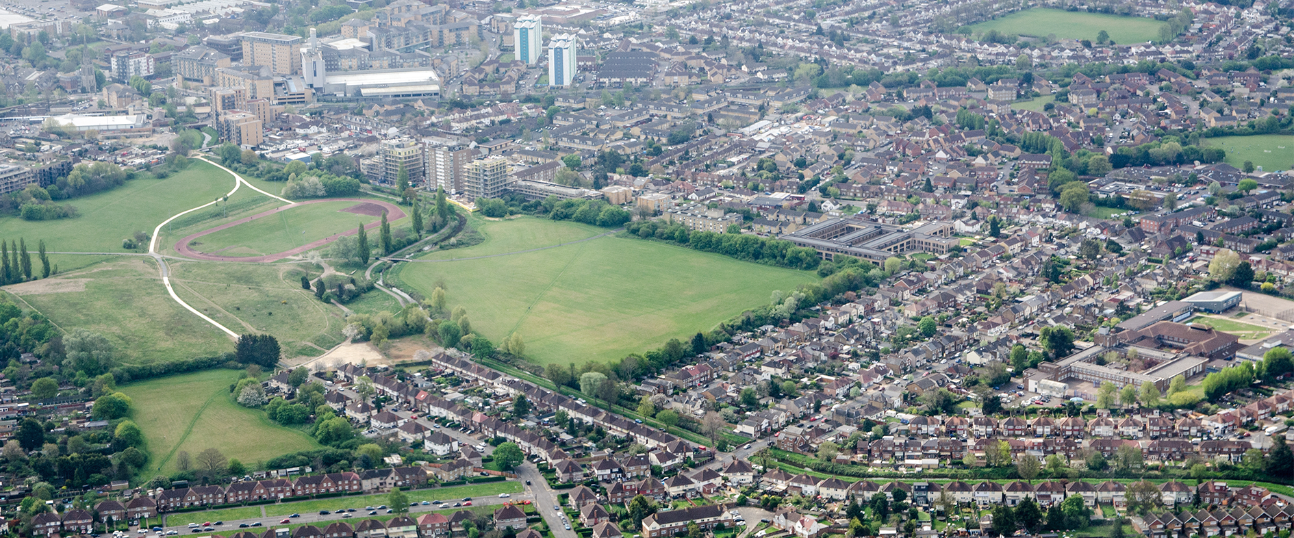
The University of Warwick
Visualising, understanding and managing a 200-hectare campus is now so much easier with a Digital Campus, built with ArcGIS.
The University of Warwick is creating a digital twin of its entire campus that enables staff to clearly visualise everything from buildings and underground services to biodiversity sightings and energy usage. This Digital Campus is now contributing to more efficient maintenance operations, improving strategic decision making and helping the university to achieve a more sustainable future.
Built with ArcGIS Pro, the Digital Campus provides a single source of information for campus management
Arborists use an ArcGIS Survey123 app to survey and collect data about 11,000 trees across the campus
The Sustainable Campus Operations Team uses an ArcGIS Dashboard to record and monitor biodiversity
The Challenge
The University of Warwick is already one of the UK’s top universities, but in a bold strategy entitled ‘Warwick 2030’ the organisation sets out its ambition to become one of the most exceptional universities in the world. Its aspirations extend beyond excellence in academic teaching and research to include excellence in estate management as well.
One of the university’s key priorities is to develop an energy-efficient, ‘green’ campus and enhance the biodiversity of its entire 200-hectare site. However, plans to improve estate management were being hampered by siloed data. Critical information on natural and man-made assets, including trees, wildlife species, underground pipes, streetlights and buildings, were held in multiple systems and spreadsheets, making it difficult to visualise opportunities for improving efficiency and sustainability.
“With Esri UK’s support, we’ve made massive progress, not only in what we have delivered but also in our understanding.”
Brett Plant, Systems and Digital Information Manager, University of Warwick
The Solution
With access to Esri’s ArcGIS System through a Chest Agreement for the education sector, the University of Warwick began exploring the potential of geographic information system (GIS) technology. It invited Esri UK to lead four workshops at the university, to help it plan its approach, and a clear vision quickly emerged for what is now known internally as the university’s Digital Campus.
Using ArcGIS Pro and the Scene Viewer tool, the Estates Team collated, cleansed and geo-referenced data from multiple systems, creating an interactive, digital twin of the entire campus in 2D and 3D. As part of this process, the team consolidated and uplifted 650 layers of data from AutoCAD files. It then integrated BIM models into the Digital Campus to create realistic representations of buildings, and incorporated supplementary data such as each building’s energy usage.
One of the university’s first applications using the Digital Campus was a mobile GIS solution for surveying over 11,000 trees. Arborists now use ArcGIS Survey123 in conjunction with ArcGIS Field Maps to verify the locations of trees, add more trees and collect data on each tree’s size and condition. Consequently, the Estates Team now has a detailed, visual map of trees on the campus, rather than just lines on a spreadsheet.
In a subsequent initiative the university created a Biodiversity Dashboard using ArcGIS Online, combining data previously held in three separate systems as well as newly collected data. This dashboard shows all species sighted across the campus, such as hedgehogs, grass snakes, geese and rare plants, and is used to inform biodiversity improvement projects.
The Business Analytics Team has also used ArcGIS StoryMaps to enrich the university’s reports, including its Annual Energy and Carbon Report. The story maps incorporate time sliders, videos and 3D maps alongside traditional text and data to bring what were previously very static business reports to life.
The ongoing development of the university’s Digital Campus is being supported by consultants from Esri UK’s Professional Services team. “We’ve done such a lot in a short amount of time,” says Brett Plant, Systems and Digital Information Manager at the University of Warwick. “With Esri UK’s support, we’ve made massive progress, not only in what we have delivered but also in our understanding.”
“ArcGIS provides the ability to view lots of information, understand and question campus performance and make quick analyses of situations, which leads to better strategic decisions.”
Jo Bishop, Head of Estates Information and Systems, University of Warwick
Benefits
Effective visualisation of campus information
ArcGIS has given the University of Warwick the ability to centralise and use multiple data sets to visualise and better understand its campus. For example, an interactive 3D campus map clearly shows where solar panels have been installed over time, and how this contributes to the university’s carbon saving targets, building by building.
Well-informed strategic decision-making
With clear ArcGIS Dashboards and interactive reports presented in ArcGIS StoryMaps, managers can make well-informed operational and strategic decisions, based on accurate data and a comprehensive understanding of the entire estate. “ArcGIS provides the ability to view lots of information, understand and question campus performance and make quick analyses of situations, which leads to better strategic decisions,” says Jo Bishop, Head of Estates Information and Systems at the University of Warwick.
More efficient maintenance operations
While the Digital Campus is still being rolled out to operational staff, the Estates Team anticipates that it will facilitate significant improvements in operational efficiency over time. Already, ArcGIS has been used to model likely tree root spread and pinpoint where roots may be causing damage to underground utility services. This has resulted in faster identification of potential causes of performance issues around the campus.
Improved management of biodiversity
The ArcGIS Dashboard for biodiversity is informing the development and implementation of key biodiversity improvement initiatives around the campus. More than this, it is also raising awareness of biodiversity, as the dashboard format is engaging. “Warwick is a huge campus,” observes Plant. “Already, the ArcGIS Dashboard is generating more interest in biodiversity, and we believe it will lead to more reports of wildlife sightings.”
Progress towards vision of ‘Warwick 2030’
Having captured the imaginations of senior managers, the university’s Digital Campus will eventually be used extensively for all aspects of campus management, and there are plans to integrate it with other operational systems. Increasingly, it is being used to evidence of progress towards achieving the university’s vision of ‘Warwick 2030’ and creating a more efficient and sustainable university. As Bishop explains, “With ArcGIS, we can clearly see the gap between where we are now and where we want to be – and understand how to close it.”


Local Government Boundary Commission for England
Sweet for ArcGIS is making a fundamental difference to how the Local Government Boundary Commission for England works, driving improved accuracy and substantial effiencies.
The Local Government Boundary Commission for England (‘the Commission’) has the Parliamentary remit in law to deliver fair electoral and boundary arrangements for local government electors in England. By using Sweet for ArcGIS, it has revolutionised the way in which it carries out boundary reviews, driving improved accuracy and substantial efficiencies for the organisation.
Data integrity is assured and the opportunity for errors eradicated, vital for legislative requirements
Real-time calculations are now done on the fly, saving time and improving productivity
More effective stakeholder engagement driven by StoryMaps reducing the need for analogue reports
The Challenge
A small, lean organisation, the Commission conducts electoral reviews by considering the electoral boundaries of local authorities and recommending any changes to Parliament. The scale of the task is daunting. At any one time the Commission’s review teams are handling approximately 25 to 30 reviews, each one lasting approximately 15 months.
Each review has to ensure that, within all local authorities, every councillor represents a similar number of electors. Boundaries need to be appropriate and reflect community ties and identities and all reviews delivered need to be informed by local needs, so community engagement is vital. Legislation requires projected electors to be factored in five years after each review has been enshrined in law; consequently, the accuracy and precision of the Commission’s work and boundary editing is critical to support electoral fairness.
There are multiple factors impacting the number of electors in a local authority area, from population growth and migration, to new housing developments. Review officers check evidence-based data from each local authority, detailing the number of electors in a local authority and the projected five-year forecast. These electors are then placed into different wards, to be represented by either one, two, or three councillors.
Previously, the boundary editing process could only be done in the office, which could be frustrating for review officers out in the field, who could be often looking at six or seven different boundary options. The process was time-consuming and, with separate software and Excel programmes, there was a high risk of error. The Commission urgently sought to improve its IT infrastructure to improve the efficiency and accuracy of processes, as well as looking at how it could exploit digital technologies to impact the way reviews are conducted and presented.
“Because our work becomes law, it is crucial we are accurate. Sweet for ArcGIS ensures that data is always correct and has made a fundamental difference to how we do our job.”
Jonathan Ashby, Review Officer & Mapping Lead, Local Government Boundary Commission for England
The Solution
The Commission initially worked on a highly successful proof of concept using Sweet for ArcGIS Online Builder, to build simple but smart apps for boundary editing; this enables the team to edit their own GIS data on the web.
With its extensive library of customisable rules and Sweet for ArcGIS’ unique locking system, multiple users can access the same app simultaneously, in the office or out in the field, while data integrity is maintained.
Beforehand, the Commission’s Data Officer would have to undertake a series of quality checks throughout each and every single review process. With Sweet for ArcGIS, the Data Officer only has to do one data check at the beginning of a review thanks to the built-in configurable data quality checks. No lengthy QA (Quality Assurance) analysis is needed before the data is used for further analysis or reporting, thereby saving significant amounts of time while being assured of accuracy of data.
Multiple drawing modes, including freehand, allow review officers to modify boundaries with mobile devices while out in the field, a key feature that was previously not available to Commission staff. Officers can also work on multiple boundary options of a single review at any one time. This is essential, given there are often up to six or seven options for each review. Sweet for ArcGIS calculates field values, clips data and automates other repetitive tasks to improve the user’s efficiency and save time. Bespoke functionality is a further benefit - for example, the Commission is looking to integrate Google Maps into the app.
ArcGIS StoryMaps are used for internal and external presentations, including the two public consultations, which form part of each review. “StoryMaps are a phenomenal presentation tool. We get much better feedback from local communities and the final submissions are of a much higher quality, and easier for the Commission to assess” adds Jonathan Ashby.
“StoryMaps are a phenomenal presentation tool. We get much better feedback from local communities and the final submissions are of a much higher quality, and easier for the Commission to assess.”
Jonathan Ashby, Review Officer & Mapping Lead, Local Government Boundary Commission for England
Benefits
Time savings
Real-time calculations of forecast electoral variances can be undertaken in the office and out in the field, saving significant amounts of time. For example, one task that would previously have taken fifteen minutes, now takes 30 seconds. Review officers now work on multiple boundary options at any one time, which they could not do previously.
Greater accuracy
Built-in configurable data checks eradicate the opportunity for error, helping review officers to edit accurately the first time, every time. Data integrity is maintained and users can create, edit and explore spatial data in the browser or across multiple devices (Android, iOS and Windows) whether out in the field or in the office, even when disconnected.
Improved productivity
All the Commission’s Sweet for ArcGIS apps are interoperable with the rest of their GIS products, helping to further improve productivity. Intuitive, configurable and easy-to-use, everyone benefits from using the same secure data for better-informed decision making.
More effective stakeholder engagement
ArcGIS StoryMaps are used both internally and externally to share information, gauge feedback and support decision-making. Some consultees have found interactive ArcGIS StoryMaps easier to access and engage with. Internally ArcGIS StoryMaps are used in presentations, making data and recommendations far more accessible than the previous analogue reports.

Thames Tideway Tunnel
Our geospatial strategy and using GIS throughout the life of the Tideway project, has given us consistent means of engagement with every single stakeholder, from construction partners to community groups and local authorities.
London’s super sewer is designed to protect the River Thames and serve London’s residents for the next 120 years. GIS has been used on the project from the start, providing a huge range of applications for enabling and recording activities while providing one platform for stakeholder engagement, helping Tideway to manage and monitor this extraordinary infrastructure project with greater efficiency.
One single repository for data accessed by all delivery partners supports better decision-making and better outcomes
Public engagement tools such as StoryMaps are hugely successful, with up to 2.4 million hits for the Tunnel Boring Machine Map alone
Apps and dashboards can be quickly spun up, presenting data in easily digestible formats supporting all business and construction requirements
The Challenge
During the scorching summer of 1858 an episode known as ‘The Great Stink’ took place in Victorian London. The smell of human waste and industrial effluent pouring into the River Thames reached an unbearable level, even the Houses of Parliament was affected. The politicians acted, and the result was the extensive Victorian sewer network, an engineering marvel of its time. However, it was designed to serve the needs of four million people, not the nine million residents and workers who currently rely on the system.
Unsurprisingly, every year, the equivalent of eight billion toilet flushes enter the Thames in central London. But the long wait for London’s Super Sewer is almost over; at 25km long and 7.2m in diameter, running mostly under the tidal section of the Thames and due for completion in 2025, it will capture, store and convey almost all the raw sewage and rainwater that currently overflows into the estuary. It has been designed to protect the river for at least the next 120 years.
Bazalgette Tunnel Ltd (BTL) is the licensed infrastructure provider set up to finance, build, and maintain the Thames Tideway Tunnel. Back in 2011 the project team, commonly known as Tideway, identified that a geospatial strategy was vital to the success of this massive infrastructure project.
Esri’s ArcGIS System has supported Tideway’s needs during every phase of the project from concept planning with Desktop GIS, implementing web mapping supporting the public planning hearings in 2013 in the early days of digital construction to a modern, integrated information management portal-based tool.
“Geospatial is the one discipline that ties different elements of the project together. Our GeoViewer platform remains a key tool that everyone from accountants and engineers, to the public viewing our latest work, have access to and use.”
Martin Turner, GIS Manager, Tideway
The Solution
Tideway’s geospatial strategy means that the company can deliver one consistent means of engagement with its stakeholders including its three construction joint venture partners, the systems integrator, Thames Water - the future operator - as well as government, public and community groups. At any one time, hundreds of Tideway and partner colleagues use the centralised information portal, GeoViewer, where data pertaining to many aspects of the project can be accessed. This includes, but not exclusively, planning records, tender selection and the acquisition of construction sites, riverbed surveys and construction progress tracking.
GeoViewer has been used at every single stage of Tideway, one of Europe’s biggest environmental infrastructure projects, and gives users a quick, simple and easy way to share and view data and interrogate the status of activities. Maps and dashboards provide intuitive means of sharing information, and tools to run business functions as well as supporting workflow management are used by more than one in three people involved in the project, from accountants to engineers on the ground.
During the public planning enquiry in 2013, the web platform was used as a tool for participants to view hundreds of digital maps, rather than producing analogue printed versions, saving time and money during the hearings and speeding up the Development Consent Order process. Additional tools were added when the project tendered for construction and supporting services, enabling the Tideway team to plan for and visualise the next five-year cycle and beyond sharing the same, consistent information with its partners.
As ArcGIS Enterprise itself developed, GeoViewer’s functionality became further enhanced. Web applications were built to record and support different enabling activities including land acquisition, site preparation and environmental consents. Dashboards have been quickly spun up to clearly show progress of works and activities. The GeoViewer platform also ensures that all plans and activities are retained and can be archived, fulfilling regulatory requirements and enabling Tideway to fulfil its statutory obligations.
ArcGIS Online continues to be used principally for public engagement with the publication of StoryMaps, such as the live-screen dataset map published during the tunnelling period, letting the public see the location of the tunnel boring machines during different stages excavations. This one StoryMap gained over 2.4 million hits in the four years it ran live.
“Having this one-stop-shop capability means we are so much more efficient. Costs would have been considerably greater, and deliverability compromised, without GeoViewer. It has vastly improved the way we manage land and property access as well as consenting with local authorities.”
Stuart Grant, Head of Commercial Agreements & Property, Tideway
Benefits
Improved outcomes
Having one, single repository for data means that all stakeholders have access to the same information across the entire project, from beginning to the end. Consistent, accurate data reduces the risk of data duplication and potential for error, helping all four joint ventures and stakeholders to make better decisions, contributing towards the best possible outcomes for a successful project.
Enhanced community engagement
Details and activities can be shared externally through tools including StoryMaps resulting in high levels of public engagement such as the 2.4 million hits for the Tunnel Boring Machine Map.
Fulfilling regulatory requirements
The GeoViewer portal consolidates all records of activity throughout the duration of entire infrastructure construction process, creating a contemporaneous history of what happened, when and why. These evidential records of activity can be quickly and easily accessed and referred to as required, acting as a record of proof and demonstrating that all regulatory requirements have been met.
Speed of deployment
The GeoViewer platform has supported Tideway during every single phase of the project. The ability to quickly spin up tools and dashboards means that all business needs are supported as and when required and having a centralised view in an easily digestible format means Tideway can monitor overall efficiency, with users needing no specialist GIS skills to access information.

AtkinsRéalis
We are using ArcGIS Portal, ArcGIS Pro and ArcGIS Field Maps to drive the AtkinsRéalis SpatialCDE, used by multiple stakeholders to make construction projects more efficient while driving Biodiversity Net Gain.
Infrastructure renewal and growth are vital to economic and societal growth and, thanks to new methodologies, biodiversity enhancement can sit parallel to these aims. The AtkinsRéalis SpatialCDE platform (or Spatial Common Data Environment) uses a technology stack including Esri to deliver huge qualitative and quantitative benefits while supporting Biodiversity Net Gain.
More efficient data collection and management saves each project £300,000 per annum
Quickly developed custom tools deliver £40,000 in cost savings per quarter, per tool
A 1000 per cent increase in Biodiversity Net Gain is projected thanks to use of this technique on one project
The Challenge
Biodiversity Net Gain (BNG) strategies have been introduced to mitigate against the impact of construction projects, and the Environment Act 2021 makes BNG mandatory for all but small sites with Environmental Impact Assessments (EIA). However, the legislated requirements can be complex and time consuming. The process is constantly changing, and it can be difficult for developers and their partners to keep pace.
AtkinsRéalis’ Geospatial team observed that, at any one point, there could be up to 500 people working on large development projects such as a road design or rail construction, and every individual team member requires the most accurate, up-to-date data. This could be within a single large multidisciplinary organisation or spread across multiple contractors. And the specialties required use vastly different techniques, terminology and task plans; an ecologist surveying badger setts for instance, versus a civil engineer considering the curve of a junction. Offering the same centrally managed data to all is a challenge, but also an opportunity for enhanced collaboration, and development of innovative methods such as BNG analytics.
When designing its SpatialCDE in 2015, AtkinsRéalis identified the opportunity for major process improvements; what was required was a standardised, geospatial approach to improve workflows, bring context to reporting and increase collaboration across all the contractors on any one project. The development of a common SpatialCDE techstack has enabled design and roll-out of multiple tools, frequently utilitising the ArcGIS python powered widgets within interactive WebApps.
“Our Spatial CDE system gives colleagues an incredibly rich user experience. ArcGIS puts data in the real world and enables us to make significant process improvements while delivering impressive cost and resource savings.”
Elspeth McIntyre, Geospatial Associate Director, AtkinsRéalis
The Solution
AtkinsRéalis knew that the ArcGIS System offered the versatility it required to create an integrated digital geospatial platform and data system. The resultant AtkinsRéalis SpatialCDE (Spatial Common Data Environment) combines spatial analysis techniques with qualitative assessments, enabling a broad range of specialists working on any one construction project to share data, insights and knowledge.
Field workflows are now streamlined with ArcGIS Field Maps, which is downloadable to any mobile device. Ecologists use map-driven mobile forms to capture different assets and observations to complete their work efficiently and accurately. Data is automatically uploaded to the AtkinsRéalis SpatialCDE and, where there is no reliable data connection, they can continue to work offline.
Portal for ArcGIS allows users across a complex project to access the AtkinsRéalis SpatialCDE with a simple log-in and, with its gallery of spatial apps including Map Viewer and ArcGIS Dashboards, view and analyse data collected in 2D and 3D. A custom integration of FME and Microsoft Azure enables the data management toolbox used to manage both primary data collection, and data collated from other sources such as the Environment Agency. The whole platform is aligned with ISO 19650 and is BIM Level 2 compliant.
Flexibility is another important requirement for the AtkinsRéalis team. The FME server back end allows the team to update any legislative changes or project requirements. Using ArcGIS Python libraries, the team can build custom tools quickly and easily, vital for new Environmental Risk Assessments, and for Bio Net Gain. These can now be spun up in a matter of hours, rather than the weeks previously taken.
AtkinsRéalis initially integrated Esri’s ArcGIS System into the SpatialCDE in Europe in 2021. Since then, access has been widened to Canada and the USA, as well as to colleagues in the Middle East, and plans include extending the Spatial CDE to teams in the Asia Pacific region.
“A geospatial approach via the AtkinsRéalis SpatialCDE is vital to make construction projects more efficient while driving Biodiversity Net Gain. We all have a responsibility to protect our Natural Capital and mitigate against the impact of economic and societal growth.”
Harriet McQuade, Geospatial Business Lead, AtkinsRéalis
Benefits
Tangible cost and time savings
More efficient workflows and vastly improved data management is saving projects in the region of £300,000 per annum. Ecologists spend less time collecting data and have their time freed up to explore new processes and deliverables. Custom tools are deployed more quickly, each one saving £40,000 per project per quarter. Future plans include daisy-chaining to support further automation.
Gains for biodiversity
Using a proactive analysis approach, making BNG assessment within projects faster and more effective, and at reduced financial and environmental cost, AtkinsRéalis has achieved a potential 1000 per cent increase in BNG on one project alone. Taking a geospatial analytical approach mitigates against unnecessary damage and delays during the construction process, while identifying areas to conserve.
Enhanced data quality and decision-making
Improved data collection, both in speed and quality, makes it easier for ecologists on the ground to work more efficiently and effectively. Accurate and timely data is quickly and easily shared across multiple teams and organisations, further enhancing the decision-making process.
Ease of use
No specialist training is required to access the SpatialCDE, and its intuitive user interface makes it easy for new users to become familiar with interrogating data. As a one-stop-shop the SpatialCDE supports all spatial and statistical data needs, with easy-to-share maps and dashboards that improve everyone’s understanding of the project in hand.

Anglian Water
We are reducing pollution and flooding risks through the use of ArcGIS solutions.
Anglian Water has successfully targeted £1 million in cost savings by using Esri’s ArcGIS system to implement a new proactive sewer maintenance business model. Through this new approach, it has reduced sewer blockages by 51% and significantly decreased the risks of flooding and pollution.
ArcGIS Online provides an accurate digital twin of Anglian Water’s water and waste water network
ArcGIS Dashboards provide clear visualisations of hotspots of potential risk for flooding and pollution
ArcGIS mobile solutions help engineers to find assets and understand water movements
The Challenge
The largest water and water recycling company in England and Wales by geographic area, Anglian Water is committed to improving the sustainability of its operations. Driven by its ethos ‘Love Every Drop,’ it aims to reduce water leakage and deliver a high quality service to its seven million customers.
Like other water companies across the UK, it is challenged by climate change. In particular, extreme weather events are leading to increased flooding and pollution. Anglian Water wanted to be able to better manage these risks and plan maintenance works more proactively to help it protect the environment.
“In the first year of operations, we have targeted a million pounds’ worth of saving.”
Michael Wingell, Geospatial Strategy Manager, Anglian Water
The Solution
Anglian Water uses solutions from Esri’s ArcGIS system to help it visualise and manage the entire water cycle, from supplying and distributing it to customers’ taps to treating it and putting it back into rivers. Providing a digital twin of the water and waste water network, ArcGIS is used both on desktops and in the field, where engineers refer to ArcGIS mobile apps on tablets to find assets and understand how the water is moving.
One of the organisation’s most recent innovations with ArcGIS is a Water Recycling Risk Tool that enables employees to better understand where future flooding and pollution events are more likely to occur. The tool analyses the performance of sewers according to fifteen risk factors, ranging from material, size, proximity to the water course, historic pollutions, floodings, blockages and proximity to bathing areas. The results of this analysis are then visualised on interactive maps in ArcGIS Online.
Employees use operational dashboards, created with ArcGIS Online, to gain full visibility of risks and interrogate the data. Using these dashboards, employees can easily see hotspots of potential risk highlighted on digital maps. They can then plan proactive risk mitigation activities and proactive maintenance strategies, rather than relying predominantly on reactive approaches, such as fixing sewers when pollution events occur.
Anglian Water plans to further develop its Water Recycling Risk Tool in the future by incorporating telemetry data from remote sensors, machine learning and AI tools. In this way, it aims to give employees a real-time view of what is going on across the network, so that they can further improve their ability to predict where pipe bursts and blockages might occur.
“By embedding digital technology into the decision-making processes within our business, we can drive change and improve performance.”
Victoria Wilkinson, Strategy Manager, Anglian Water
Benefits
Effective implementation of proactive risk mitigation
Through the development of its Water Recycling Risk Tool, Anglian Water has been able to successfully change its business model from reactive interventions to proactive risk mitigation. As Laura Hinchcliffe, Geospatial Reporting Manager, explains, this is helping it to address the challenges of pollutions and floodings. “We want to make sure that we are protecting the environment and our customers,” she says. “With ArcGIS, we are able to display our data clearly and visually. We can, therefore, identify where our hotspots are and target them proactively.”
£1 million in cost savings
The new proactive approach has led to a reduction in customer service issues relating to blockages and has contributed to significant cost savings. Engineers have one single source of the truth, so less time is wasted on unnecessary callouts and aborted works, and carbon emissions are reduced. “The project has been a massive success,” says Michael Wingell, Geospatial Strategy Manager at Anglian Water. “In the first year of operations, we have targeted a million pounds’ worth of saving.”
51% reduction in blockages
Just six months after the Water Recycling Risk Tool was deployed, Anglian Water reduced blockages by half, with just 436 blockages recorded, as compared to the 899 that were predicted. “We’ve had a 51% reduction in blockages and moved 8 tonnes of debris, which is more than the size of five blue whales,” says Wingell. “Yet, I feel like this is only the start of the journey in terms of how we use the risk tool. As we develop more and more data sets, it will allow us to much better target sewers accordingly.”
Well-informed decision-making
The use of ArcGIS Online Dashboards improves data sharing throughout the organisation, ensuring all stakeholders are making decisions based on the same up-to-date information. As information is available on demand, on digital maps, decisions can also be made more quickly and teams dispatched immediately to the exact locations of events like flooding incidents. Victoria Wilkinson, Strategy Manager at Anglian Water, comments: “By embedding digital technology into the decision-making processes within our business, we can drive change and improve performance.”

Thames Water
We are proactively addressing the data sharing requirements, and the needs of internal and external stakeholders with our end-to-end geospatial portal, built with ArcGIS Enterprise and ArcGIS Online.
Thames Water has proactively addressed the needs of its data sharing requirements by building an end-to-end geospatial portal, centralising data sources, allowing for internal and external stakeholder feedback, interaction and knowledge sharing all of which are helping to shape and drive commercial decision-making.
Datasets from multiple sources are centralised giving internal and external stakeholders one single view of all data
Access to previously hidden insights supports evidence-based analysis and more confident predictive modelling
Improved business efficiencies include massive time savings with internal requests now delivered in weeks rather than six months
The Challenge
Responsible for moving seven billion litres of water and wastewater as part of its daily water cycle, through 31,000km of managed water mains and 109,400km of managed sewerage mains, Thames Water serves 15 million wastewater customers across London and the Thames Valley.
Its ability to extract and gain optimum value from different data sources is integral to supporting its ability to extend, improve and maintain robust and resilient drainage and wastewater systems while fulfilling its regulatory requirements, including the Drainage and Wastewater Management Plan (DWMP). Regulatory body Ofwat also requires water companies to demonstrate open and trustworthy data ecosystems.
At the outset of developing its data sharing portal, Thames Water was faced with colossal amounts of data from a multitude of internal and external sources. “We had so much data only available to a small group of users, it was difficult to visualise or understand it,” said Graeme Kasselman, London System Planning Lead. To solve this complex challenge the company identified the need for a technology platform that could incorporate this data all in one place and give internal and external stakeholders the ability to analyse and inform predictive planning, while providing the public with an engagement portal to provide their input.
“ArcGIS and Data Interoperability extension was fundamental to converting complex hydraulic modelling outputs into spatial insights that could then be shared with key stakeholders.”
Zeshan Alli, GIS Specialist, Asset Strategy & Planning, Modelling & Insight, Thames Water
The Solution
In the co-creation of its DWMP, Thames Water worked with around 2,000 partner organisations and stakeholders on national, regional and local levels as well as the general public. To fulfil its DWMP obligations, Thames Water identified three critical deployments that could be built using ArcGIS Enterprise for internal and ArcGIS Online for external data management, access and collaboration.
These deployments needed to be quick and streamlined, offer different levels of access and be easy to update. “We have a principle within our teams to use COTS products, though we also need the ability to deliver on specialised requirements,” said Louise Bates, GIS Architect for Thames Water.
The System Planning Portal, the heart of the data sharing portal, resides in ArcGIS Enterprise and provides the single, central data repository. The GIS team used ArcGIS Pro and ArcGIS Data Interoperability Extension Tool to perform the detailed analysis required and then prepare the data, which was passed to the platform team to publish content including layers, services and maps in the apps, making it securely available to a wider internal audience. This System Planning Portal also ensures that the DWMP is reflective of the combined views of technical specialists incorporating external datasets like the CAMELLIA (Community Water Management for a Liveable London) project.
The Practitioners DWMP Portal is an external enterprise platform, using data from the System Planning Portal. Views are replicated from the System Planning Portal, such as hotspots, but with anonymised data attributes thereby preventing the release of data which may have an adverse impact on an individual or property.
This partnership working tool ensures that the DWMP is reflective of the combined views of technical specialists especially Lead Local Flooding authorities and River Catchment Partnerships, while optimising overall efficacy of the plan.
The Customer Portal, built in ArcGIS StoryMaps is an external public resource giving non-specialists the ability to view the DWMP, gain access to data and input ideas and share data. A series of interactive maps provide complete transparency of reporting from initial catchment screening and risk assessments to the main outputs of the final plan.
“By taking a geospatial approach, our portal confidently shows how citizen engagement and stakeholder involvement can influence and inform commercial activities, for the benefit of all parties.”
Graeme Kasselman, London System Planning Lead (Wastewater), Thames Water
Benefits
Optimising value from data
Diverse datasets from multiple sources are now centralised in one single, end-to-end solution, giving users the ability to analyse, plan and undertake predictive modelling fundamental to the evolution of the DWMP. Different layers can be analysed that show previously hidden insights, helping the business to better understand what it needs to do to support better operational performance and improve customer satisfaction.
Enhancing stakeholder involvement
The System Planning Portal, Practitioners DWMP and Customer Portals all deliver on data sharing requirements which include access to comprehensive, evidence-based and transparent data. Internal and external stakeholders are empowered with unprecedented, secure access to the same data, analysis and views while the general public can interrogate, interact with and share data for submission.
Improved business efficiency
ArcGIS Enterprise and ArcGIS Online mitigate the need for different software solutions and the GIS team now has the tools and views making it easier to implement updates. Ready-to-go capabilities and tools limit the need for coding, so that internal requests can be responded to in a matter of weeks rather than six months, helping to add value to the business.
Driving collaboration with stakeholders
Both portals and the ArcGIS StoryMap are driving collaboration both internally and externally. Stakeholders have access to the same data, though at different levels of detail for optimal security, enabling the company to present a fully transparent, evidence-based picture of its operations and future planning frameworks to all its stakeholders, while addressing regulatory requirements.

Fauna & Flora
Creating a single GIS platform for the whole organisation with ArcGIS has led to a 580% increase in GIS usage and transformed the way that we analyse, visualise and communicate conservation priorities.
In critical conservation projects all around the world, the international nature conservation charity Fauna & Flora uses Esri’s ArcGIS system to better understand the risks for threatened species, monitor changes in landscapes and prioritise intervention initiatives. Used by 175 staff across 20 countries, ArcGIS empowers everyone to make the best possible decisions and save nature.
ArcGIS Pro is used to analyse geospatial data and gain insight into conservation challenges
Landscape changes and trends are visualised on ArcGIS web apps, dashboards and story maps
Data is collected within conservation areas using ArcGIS Survey123 on mobile devices
The Challenge
Fauna & Flora works to protect all kinds of nature from pygmy hippos and turtles to ancient magnolia trees and seagrass meadows. Through partnerships with local communities, the charity addresses some of the most challenging global issues, including habitat destruction, illegal poaching and plastic pollution.
In conservation projects in Africa and the Asia-Pacific, around 30 conservationists had begun to use open-source geographic information system (GIS) software to map habitat changes. Outside of these small pockets of GIS usage, however, the technology was not widely known within the organisation and there was no common approach. “There were other teams who were not using GIS and didn’t know that they needed it,” explains Harriet Branson, Technical Specialist, Remote Sensing and GIS, at Fauna & Flora. “We wanted to make a wider range of GIS capabilities available to everyone and have a single GIS strategy for the whole organisation.”
“Being able to analyse data in a robust, accurate way is what makes conservation work.”
Harriet Branson, Technical Specialist, Remote Sensing and GIS, Fauna & Flora
The Solution
After evaluating different options, Fauna & Flora opted for Esri’s ArcGIS system, recognising that it offered a complete package of desktop, online and mobile solutions for analysing geospatial data, collecting data, story-telling, monitoring change on dashboards, sharing data via web maps and storing data centrally. “We felt that having a full range of GIS tools and capabilities, all in one place, would boost the accessibility and use of GIS throughout our organisation,” recalls Branson.
The Conservation Technology Team at Fauna & Flora implemented ArcGIS Online and ArcGIS Pro, utilising the Esri UK training catalogue. It then organised live training sessions, with follow-along activities, to make regional teams aware of the ArcGIS capabilities available to them and show them how to best use their new GIS resources.
Almost immediately, the number of people using GIS internationally doubled from 30 to 60 and, within four years, there were more than 175 people using ArcGIS across 20 countries. These employees now use GIS for far more than just map generation, taking advantage of the full the range of ArcGIS solutions to gain insights, streamline data collection in the field, aid collaboration and improve data sharing.
In north west Liberia and southern Guinea, for example, Fauna & Flora used ArcGIS Pro classification tools on the desktop to create landcover mapping at three time intervals between 2000 and 2019. The regional team then used ArcGIS Survey123 on mobile devices to verify existing land cover conditions and conducted further analysis with ArcGIS Online to identify priority restoration areas, including wildlife corridors.
Fauna & Flora has developed a host of ArcGIS web apps and ArcGIS StoryMaps to aid communication and raise awareness of conservation projects. Visually stunning and highly compelling, two of its StoryMaps have been named as finalists in Esri’s global StoryMap competition: The Guardians of Cao Vit Gibbons; and Community-Based Wildlife Crime Prevention.
“ArcGIS allows us to visualise the landscape, monitor patterns across time and location, and see more clearly where conservation activities are urgently needed.”
Harriet Branson, Technical Specialist, Remote Sensing and GIS, Fauna & Flora
Benefits
Deeper insight into conservation challenges
The creation of a single organisation-wide GIS platform triggered a massive uplift in the use of GIS. Geospatial data analysis is now routinely used to inform a wide range of conservation projects and has revealed far deeper insight into the challenges of climate change, pollution, deforestation and habitat loss. “Being able to analyse data in a robust, accurate way is what makes conservation work,” explains Branson. “We can now properly understand deforestation risks and how are species moving across the landscape and all this knowledge allows us to implement effective conservation strategies in the right locations.”
More efficient data collection and data sharing
By using ArcGIS Survey123 on mobile devices, instead of paper-based survey methods, Fauna & Flora has significantly improved the efficiency of its data collection workflows and achieved a tenfold increase in data sharing between in-country teams and the charity’s UK headquarters. In Uganda, for instance, monthly primate species surveys are now available for analysis in the UK and Uganda almost straight away, saving at least five days per survey round. Consequently, faster decisions can be made about where buffer crop planting might be required in response to chimpanzee presence.
Improved visualisation of conservation priorities
Fauna & Flora can clearly visualise its data with ArcGIS to better understand the pressures on the natural environment and see where interventions are most needed. “ArcGIS allows us to visualise the landscape, monitor patterns across time and location, and see more clearly where conservation activities are urgently needed,” Branson says. “Using ArcGIS we can, for example, begin to understand the relationship between cardamon growth and the thinning of the forest canopy and then make better decisions about what to do.”
Effective empowerment of partners and communities
Through the use of ArcGIS web apps, dashboards and story maps, Fauna & Flora can more easily share information with corporate partners, regional stakeholders and local communities and empower them to make the best decisions. In a recent marine sensitivity project in the Adriatic, the charity created an ArcGIS web app for a corporate partner that enabled it to interrogate grid cells and look deeper into the data. As Branson says: “Sharing our data in visual formats makes it easier for other people to use it to improve their efforts on the ground, prioritise conservation projects and understand impacts on a wider scale.”

Amey
Using the powerful analysis and data visualisation capabilities of ArcGIS Pro and ArcGIS Dashboards, we have turned big data into business insight.
In an award-winning new approach to public transport planning, Amey has used ArcGIS to glean fresh insight from big data. It conducted advanced geospatial analysis of anonymised mobile phone data to reveal changes in demand for bus services in Plymouth and shared this information with its client in highly visual, interactive and meaningful dashboards.
Millions of rows of data processed and analysed with ArcGIS Pro
5 million journeys and travel patterns visualised for the first time on ArcGIS maps
3 ArcGIS Dashboards created to share insight with leading transport provider
The Challenge
The sustainable infrastructure company Amey was approached by a client with a data analysis and data visualisation conundrum. Go Ahead Group, the operator of Plymouth CityBus, wanted to instigate a data-driven approach to public transport planning in the city of Plymouth to help it plan future bus services and encourage more sustainable travel choices.
Amey used its Citi LogikTM capability and mobile network data to show people movements, consisting of many millions of individual trips in Plymouth, but this pivotal dataset extended to tens of millions of rows. Recognising the challenges of working with big data, Go Ahead Group then asked Amey to help it gain insight from this vast dataset and present the findings visually in a format that could be easily understood.
“The project was technically challenging due to the enormous volume of data to process, but ArcGIS enabled us to remove the complexity and make millions of rows of data understandable to everyone.”
Kieran Fitzsimmons, GIS National Lead, Amey
The Solution
Amey first narrowed down the feature classes within the dataset, focusing on the types of information that would be most useful for Go Ahead Group, including the time of travel and age bands. It then used a Feature Manipulation Engine (FME) to convert the raw data provided by Citi LogikTM into a coherent geospatial dataset and began to process and analyse it with Esri’s ArcGIS Pro software.
Amey took advantage of powerful tools within ArcGIS Pro to build links between journey origins and journey destinations, enabling it to visually represent journeys as “desire lines” on digital maps. It also leveraged spatio-temporal data, to highlight when people travelled, by time, day of the week and school term or school holiday period. In this way, Amey was able to analyse and learn from the movements of thousands of mobile devices and five million observed trips undertaken in Plymouth in a single month.
Next Amey created three ArcGIS Dashboards, to enable its clients at Go Ahead Group to easily interact with the ArcGIS maps and filter the data to view, for example, journeys to a specific location or journeys near an existing bus route. Using this insight, Go Ahead Group can now plan bus routes in the right locations and vary its services by time and season to capitalise on demand. The dashboards are hosted on Amey’s ArcGIS Enterprise platform, making it easy for Amey to share them with its client in a secure and controlled way.
In recognition of the project’s innovative approach, Amey received the Public Transport Award at the Intelligent Transport Systems UK 2023 Award Presentation Ceremony. Judges commented: “The project showed the impact of using data to support increasing ridership. A very worthwhile project with a clear outcome and impact!”
“This is an excellent project which helps us to shape services to meet our customers’ needs.”
Mark Anderson, Customer and Commercial Director, Go Ahead Group
Benefits
Abstract big data turned into valuable business tool
Amey has successfully taken a vast amount of abstract data and turned it into a highly valuable transport planning tool for Go Ahead Group. “The project was technically challenging due to the enormous volume of data to process, but ArcGIS enabled us to remove the complexity and make millions of rows of data understandable to everyone,” says Kieran Fitzsimmons, GIS National Lead at Amey. “ArcGIS adds value to big data by giving it a geographic context.”
Clear visualisation of 850,000 daily journeys
Mobile network data for 850,000 daily journeys is now displayed on interactive maps, so it is easy for Go Ahead Group to identify patterns in journey types and understand the need for bus services, by location, time of day and time of year. According to Fitzimmons, “The most important part of this project was visualising the data. ArcGIS enables our clients to see journeys on a map of Plymouth and surrounding areas and compare them to existing bus routes.”
Improved decision-making using dashboards
The clarity provided by the ArcGIS Dashboards enables transport planners at Go Ahead Group to make evidence-based, data-driven decisions about the future of bus services in Plymouth. They can easily use the interactive charts and maps on the dashboards to focus on specific locations and bus routes and plan new services in the right places to meet the needs of customers and encourage greater use of buses. Mark Anderson, Customer and Commercial Director at Go Ahead, says: “This is an excellent project which helps us to shape services to meet our customers’ needs. It is a good example of the way big data can be used in an imaginative, visually striking, accessible way.”
Rapid, cost-effective project delivery
By taking advantage of pre-built tools, included as standard in ArcGIS Pro and ArcGIS Enterprise, Amey was able to complete this entire project in around six weeks for Go Ahead Group. What is more, Amey now has a repeatable process that it can use to help more transport providers evaluate their bus services and better meet passenger requirements. “There is a definite appetite for data-driven solutions like this that help transport companies to understand demand for bus services,” Fitzsimmons says. “What we have is a proven methodology for using mobile network data to gain insight into transport needs that we can now offer to other organisations in more cities and regions around the country.”
Lincolnshire Resilience Forum
30+ partnership organisations can now not only respond faster during emergencies but also collaborate effectively in proactive disaster planning and recovery initiatives.
From floods and fires to pandemics and pollution events, the Lincolnshire Resilience Forum is using ArcGIS to help it respond effectively to all kinds of potentially catastrophic incidents. The multi-agency group has built common operational dashboards, mobile data capture tools and versatile web apps that enable strategic and tactical commanders to make fast, appropriate and coordinated decisions to improve public safety.
30+ partner organisations in Lincolnshire make decisions using a single, shared ArcGIS Dashboard
First responders and volunteers on the ground capture live, incident specific information with ArcGIS mobile solutions
The suite of online and mobile ArcGIS solutions was built with support from Esri UK’s Professional Services group
The Challenge
Lincolnshire Resilience Forum responds to all major emergencies that impact on the wider county of Lincolnshire and that require a coordinated, multi-agency response, such as flooding and pandemics. Responsible for an area of 2,292 square miles and over 750,000 people, the partnership comprises more than 30 category one and two responding agencies. These organisations need to be able to share information and collaborate effectively in order to preserve life, livelihoods and the environment during serious incidents.
“We didn’t realise just how much ArcGIS would enable us to do. It has vastly outperformed our expectations.”
Steve Eason-Harris, Emergency Planning Officer, Lincolnshire County Council
The Solution
Lincolnshire Resilience Forum worked with consultants from Esri UK’s Professional Services group to build a range of solutions with Esri’s ArcGIS system to improve collaboration and information sharing. “Professional Services was second to none,” says Steve Eason-Harris, Chair of the Tactical GIS Cell in Lincolnshire Resilience Forum and Emergency Planning and Business Continuity Officer at Lincolnshire Fire and Rescue Service. “With Esri UK’s support, we hit the ground running and got things right the first time.”
The organisation’s foremost ArcGIS solution is an interactive dashboard that consolidates data from a myriad of different third party systems and provides a common operating picture for teams from all partners. Built using ArcGIS Dashboards and ArcGIS Experience Builder, it can be viewed online, on mobile devices or on huge touch screens in the County Emergency Centre and Force Control Rooms, giving everyone an accurate, shared understanding of fast-changing situations.
Using this dashboard, Lincolnshire Resilience Forum can quickly identify critical national and local infrastructure (such as gas and oil terminals), plan evacuation routes, forward command points and places of safety, and model potential hazards to establish wider impacts. The ArcGIS solution allows officers to identify property and vulnerable people at risk and calculate the time it takes for officers to door knock an area, before deploying operational staff to the scene, reducing the time needed to directly warn and inform the public.
Lincolnshire Resilience Forum has also developed a series of ArcGIS Field Map apps to make it far easier for first responders to collect and share information, on the ground, about damage to infrastructure or new risks. First responders can also use apps built with ArcGIS Survey123 to record contact information for people who are evacuating their homes, register the people sheltering in rest centres and highlight any urgent medication or support needs individuals may have.
In addition, Lincolnshire Resilience Forum is currently developing a new capability with ArcGIS Workforce to help it manage resources, deploy police officers and optimise the use of volunteers. It also plans to use drones and ArcGIS SiteScan to create a 3D digital twins of areas at higher risk of impact from emergencies. “We have done so much, yet we’ve only scratched the surface!” Eason-Harris says. “We didn’t realise just how much ArcGIS would enable us to do. It has vastly outperformed our expectations.”
“Professional Services was second to none. With Esri UK’s support, we hit the ground running and got things right the first time.”
Steve Eason-Harris, Emergency Planning Officer, Lincolnshire County Council
.
Benefits
Improved collaboration between agencies
ArcGIS has delivered the common operating picture that Lincolnshire Resilience Forum needed, enabling all partners to share the same information and respond to emergencies in a way that is coordinated, proportionate and appropriate for the incident taking place. Following the collision of two tankers in the North Sea in 2025, an ArcGIS Survey123 app was used to gather data on the pollution that washed up on beaches. Throughout this incident, an ArcGIS dashboard provided multiple organisations, from multiple Local Resilience Partnership regions, with a shared understanding of where pollution was occurring and if clean-up and recovery activities were needed.
Faster decision-making during emergencies
With instant access to accurate, up-to-date, multi-agency information, strategic and tactical commands have all the information they need to make the right decisions, faster, as situations change. This improved decision-making capability has been clearly evidenced in a major, national exercise based on a flooding scenario, which necessitated the evacuation of thousands of people from coastal properties and static caravans.
Enhanced safety of officers, volunteers and communities
During emergencies, ArcGIS helps to improve safety for everyone in affected areas, whether they are residents or first responders. In a recent exercise in Horncastle, residents were successfully evacuated from the vicinity of a hypothetical gas explosion and registered in rest centres using ArcGIS mobile apps. The exercise clearly proved the value of the GIS-led approach, contributing to improved safety for displaced members of the community.
Clearer communication with the public
Lincolnshire Resilience Forum recognises the advantages of using ArcGIS for communicating clearly with the public. It has, for example, used the ArcGIS StoryMaps app builder to convert its Community Risk Register from a pdf document into an interactive digital story to help people understand how to protect themselves. As stories and public web maps can be created very quickly with ArcGIS, they can be produced during emergencies to show members of the public where road blocks, cordons and rest centres are located.
Better understanding of risk
Long before emergencies occur, Lincolnshire Resilience Forum uses ArcGIS to build up a deeper understanding of communities and infrastructure at risk. Use of the new 3D mapping capability, for example, helps the partnership to pinpoint properties that are at greatest risk from flood, wildfire and isolation and put targeted mitigation plans in place. Summing up, Eason-Harris, observes: “ArcGIS gives us a collaborative solution that we can use before, during and after major events. It’s far more than just maps.”
London Borough of Hounslow
Using InstantAtlas we have matured our approach to data management. We now have a collection of data sets and can deliver insights to target our services more effectively and provide our communities with the support they need.
London Borough of Hounslow has transformed the management of its data with Esri’s InstantAtlas enabling Council staff, community groups and residents to access data about the borough all in one place. Data-rich insights presented in dynamic, interactive reports are being used to support the optimum targeting of services and address challenges such as the cost of the energy crisis and public health issues.
Unrivalled access to accurate, timely data informs better decision-making
Greater insights into residents’ needs optimises targeting of services from warm spaces to public health programmes
More impactful resource deployment enables teams to focus on generating insights rather than managing data
The Challenge
As with any local authority, London Borough of Hounslow is responsible for a Joint Strategic Needs Assessment to help improve the health and wellbeing of its residents. A large suburban district interspersed with green space in West London, Hounslow is one of London’s most diverse boroughs with almost 300,000 residents.
Up-to-date, accurate and timely internal and external data plays a vital role in helping Hounslow’s information analysts understand the needs of the Borough’s population. Until recently, bureaucracy and red tape were amongst many restrictions in sourcing accurate data. Data from multiple sources had to be managed and consolidated before it could be analysed and the findings were then presented in static PDF reports, not dynamic and, therefore, often out-of-date within a month of publication.
Having access to timely, reproducible and verified data would make a significant difference in how Hounslow could shape its services. What was needed was an innovative approach to data management, a dynamic platform that could bring together demographic, socio-economic, health, education and other community data to inform audiences about geographical patterns and comparisons on a diverse range of statistics and indicators.
“Having the latest, up-to-date data at our fingertips gives us the ability to quickly create reports to support our colleagues with their work. Identifying problems and looking at trends can help us to deliver the most appropriate, targeted and cost-effective services.”
Sukhjeet Gill, Programme Delivery Manager, London Borough of Hounslow
The Solution
The Hounslow Data Hub enables residents, community groups and Council staff to easily access data about the borough, from a one-stop source. Fully hosted and managed by Esri UK through its InstantAtlas Data Observatory, it removes the burden of data management from the Hounslow team so they can focus on the Data Hub’s analytical capabilities.
The Hub’s main data resource is the National Data Service (NDS), an integral element within InstantAtlas, which brings together thousands of key statistical indicators from a range of providers including NOMIS, ONS, Office for Health Improvement and Disparities and the Department for Levelling Up, Housing and Communities.
Council staff have the option to add their own data sets such as aggregations from internal Adult Social Care data and external data not already on the NDS such as data regarding some aspects of Childrens Social Care, to further enhance the analytical possibilities of the National Data Service data sets. Hounslow are also heavy users of the National Data Service within ArcGIS Online, using Report Builder for ArcGIS Online to build their own customised, in-house reports. Additional web pages and resources are easily added by the Hounslow team using the popular WordPress content management system and embedded Power BI dashboards.
InstantAtlas Data explorer apps connect directly to an InstantAtlas Data Catalogue in ArcGIS Online giving users the ability to browse and download data and create graphics for documents and presentations. These simple to use apps enable the Council’s Insight and Intelligence team to compose highly interactive reports and make presentations that combine statistics and maps, to deliver added insights and aid decision making for teams throughout the London Borough of Hounslow.
New service initiatives include ‘warm spaces’ for residents, along with wider winter planning. Regular Data Hub training sessions demonstrate how users can self-service, helping them to work more productively.
“A better understanding of our population’s needs through greater data-driven insights means we can deliver better services that are appropriately targeted and thus more cost-effective.”
Thomas Morgan, Insight & Intelligence Team Manager, London Borough of Hounslow
Benefits
Improved community services
The use of various data sets such as Energy Performance and CACI income data, were combined to provide rich data insights to guide Hounslow’s work to address the cost-of-energy crisis challenge within the Borough. Using this insight the Council has been able to respond with a network of over 30 warm spaces across the Borough, giving those who cannot afford to heat their homes somewhere safe to go.
Time savings
InstantAtlas removes the burden of managing and keeping Hounslow’s data store up to date, freeing up a vast amount of expertise and labour. Analysts can focus on in-depth analysis and reports which produce more information. For example, producing new knowledge on the protected characteristics about its population such as sexual orientation and gender reassignment using data from its 2021 Census. This ensures that service areas are more fully aware of the different cohorts within the population with the primary outcome of improved targeting of services.
Enhanced data integrity
Data from credible sources available in one place gives a wide range of users’ access to the same data. This one version of the truth is leading to smarter requests; from analysts previously being asked to identify trends, they are now looking at what could be behind trends they are seeing. With shrinking budgets in the public sector, decisions can be evidenced and also prioritisation of decisions can be evidenced if required.
Democratisation of data
A broad range of colleagues across the Council and externally now have access to the same data. People living in local communities can use it to access information about local services and challenge policies and hold elected Members to account. This transparency of consistently accurate data continues to support collective and collaborative decision-making.