Blog Archives
Nottingham City Council
We have created a highly-detailed, city-sized digital twin of Nottingham and are proud to be sharing our experiences with others.
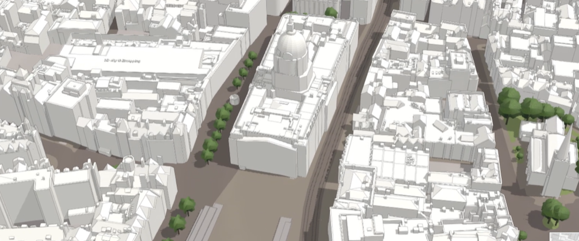
Nottingham City Council has created an immersive, interactive and highly-detailed 3D model of the entire city to support development planning. This advanced digital twin enables planners to understand proposed new developments more easily, have more interactive discussions with developers and accelerate the planning process.
The large-scale, 3D digital twin of the city of Nottingham was created using ArcGIS Online and is hosted in the cloud
Nottingham City Council has received government funding to help other UK planning authorities use 3D modelling
Esri UK’s Professional Services team helped the council to deliver the digital twin and optimise the use of 3D data
The Challenge
Nottingham City Council was an early pioneer in the field of 3D urban planning. It began to use digital 3D modelling techniques nearly 20 years ago, primarily for long-term strategic planning and major regeneration schemes. As demand for 3D visualisations grew, the council realised that it needed to replace its desktop software with a more flexible, web-based approach, and it started to explore the 3D capabilities of Esri’s ArcGIS system.
First the council developed a couple of lightweight public applications using ArcGIS, including an app for helping tourists to discover and appreciate the vast network of caves that lies beneath the historic city centre. Soon, though, a bold ambition arose to create a detailed 3D digital twin of the entire city, covering more than 73 square kilometres and depicting thousands of historic and modern buildings, open spaces and infrastructure.
“We have successfully fused together traditional 2D planning information with a state-of-the-art 3D GIS environment, to create a single, comprehensive digital twin of the city of Nottingham.”
Mick Dunn, GIS Service Manager, Nottingham City Council
The Solution
Building on its prior experience, using its existing ArcGIS licenses and leveraging its accumulated knowledge and 3D data, Nottingham City Council created an extensive and immersive 3D cityscape that could be accessed and shared via the Internet. It developed this digital twin using ArcGIS Online, hosted in the cloud, receiving support from Esri UK’s Professional Services team to create the pilot solution and optimise the generation of 3D data at Level of Detail 2 (LoD2).
Far more than just a 3D model, the citywide digital twin embeds and visualises a vast amount of contextual information, including 2D data on conservation areas and flood plains, and street-level videos from CCTV cameras. The solution also includes a 3D photo-realistic mesh from Bluesky and live traffic data, both of which are streamed directly from Esri's Living Atlas of the World.
The Nottingham City Digital Twin is now used for site assessments and is fully embedded within the council’s pre-application planning process. When developers submit planning proposals, their plans and Building Information Modelling (BIM) files are incorporated directly into the digital twin. Planners can then click on different points on the 3D city map to visualise the proposed new street views, see potential constraints and identify other issues that might present planning concerns.
In recognition of the enormous value that can be gained from the use of urban digital twins, Nottingham City Council has now received government funding, from the Department of Levelling Up, Housing and Communities PropTech Innovation Fund, to develop this capability further to drive public engagement, and help other UK Local Planning Authorities establish 3D capabilities. With support from Esri UK, it will be creating demonstrators, learning resources and tools that other councils can leverage to develop their own digital twins and transform their planning processes cost-effectively.
“We are proud to be leveraging our investment in Esri technology and maximising the value of our existing 2D data in a 3D environment to modernise the planning process and increase user engagement.”
Mick Dunn, GIS Service Manager, Nottingham City Council
Benefits
A single source for all planning information
For the first time, Nottingham City Council’s planners can see all the information they need relating to the pre-planning application process in a single GIS application. Whether they need information on flood risks, listed buildings or traffic congestion—relating to a residential development in Mapperley Park or an office block in Lace Market—everything is visible in a highly-detailed, city-sized digital twin. “Our 3D, ArcGIS model of Nottingham is a UK first, in terms of the level of detail that it delivers and the size of the urban area that it covers,” says Mick Dunn, GIS Service Manager at Nottingham City Council. “We have successfully fused together traditional 2D planning information with a state-of-the-art 3D GIS environment, to create a single, comprehensive digital twin of the city of Nottingham."
Quicker decision making in planning process
Using the Nottingham City Digital Twin, planners can now make faster, well-informed decisions about the potential impacts of new developments on the city’s distinctive character and skyline. “Having this tool allows planners to understand proposals better,” explains Dunn. “Planning proposals can therefore be approved faster, allowing construction to start sooner and developers to realise their commercial goals more quickly.”
Improved transparency and engagement
Planners can use the Nottingham City Digital Twin in meetings with developers to improve the transparency of the planning process and support interactive discussions about any modifications that need to be made to plans. In addition, the digital twin can be used by members of planning committees to make complex information clearer and improve understanding of the impacts of new developments. “The next logical step is to make the Nottingham City Digital Twin publicly accessible, to improve transparency with everyone, which is what we are planning to do soon,” shares Dunn.
Greater ROI from ArcGIS and 2D data holdings
Dunn is justly proud of Nottingham City Council’s achievements and recognises that the development of the Nottingham City Digital Twin has significantly increased the return on investment that the council gains from ArcGIS licenses and staff training. The digital twin has given the council an exciting new platform, based on familiar technology, that can be used as the foundation for other value-adding planning tools in the future. “We are proud to be leveraging our investment in Esri technology and maximising the value of our existing 2D data in a 3D environment to modernise the planning process and increase user engagement,” Dunn concludes.


Jurassic Fibre
We have put ArcGIS at the heart of our business to help our teams collaborate effectively and accelerate the rollout of ultrafast broadband.
The telecoms company Jurassic Fibre uses Esri’s ArcGIS system to build, validate and share a trusted digital twin of its actual and proposed broadband network. This digital twin provides over 460 employees, from surveyors and planners to construction engineers and sales people, with a single version of the truth that they can depend on for real-time decision-making.
Surveyors and construction teams use ArcGIS mobile apps to view, collect and validate network data in the field
Planners and designers use ArcGIS web apps and tools to devise the optimal roll-out plans for new broadband networks
Senior managers monitor live information on the status of build projects and sales on ArcGIS Dashboards
The Challenge
Jurassic Fibre was founded in 2018 with the aim of bringing full fibre, ultrafast broadband to digitally-deprived areas of South West England. As a brand new, start-up business, it needed a complete suite of solutions that could be deployed quickly to support end-to-end business processes, from network planning and design to construction and sales. Esri’s ArcGIS system met this requirement perfectly, providing out-of-the-box applications and tools that could be easily configured to support the new company’s preferred ways of working across all business teams.
“ArcGIS offers that complete package of field, mobile, desktop and online apps and displays.”
Gemma Malone, GIS Data Quality Assurance Manager, Jurassic Fibre
The Solution
Jurassic Fibre selected ArcGIS Enterprise and deployed this foundational software in the cloud on the Microsoft Azure platform. It then steadily rolled out a succession of ArcGIS solutions to support all of the company’s 460 employees, across every team and business function. There are also 30 ‘super users’ in GIS, IT and planning teams who manipulate geospatial data and use the ArcGIS system intensively.
When Jurassic Fibre identifies a new target area for the roll-out of ultrafast broadband, existing address and telecoms infrastructure data is loaded into the ArcGIS Enterprise database to give the company’s surveyors a starting point. The surveyors then use the ArcGIS Field Maps app on mobile devices to view this information in the field, collect additional information and mark potential broadband network routes on maps. All of this information is fed directly into ArcGIS Enterprise creating a rich digital twin of Jurassic Fibre’s existing and planned telecoms network.
Back in the office, designers use the ArcGIS digital twin to inform their network designs; planners view the digital twin to organise construction; and the construction team views the same digital twin on mobile devices during the build phase to manage activities on site. All departments within Jurassic Fibre have discrete mapping apps, giving them precisely the functionality they need, as well as their own ArcGIS Dashboards allowing them to track their progress against targets.
Jurassic Fibre particularly appreciates the ease at which geospatial data can be shared with different groups of users, in real time, and transferred seamlessly between its many ArcGIS apps, dashboards and solutions. “ArcGIS offers that complete package of field, mobile, desktop and online apps and displays,” says Gemma Malone, GIS Data Quality Assurance Manager at Jurassic Fibre. “Pretty much every part of the business uses ArcGIS to some extent, whether this is updating maps, collecting data, creating designs or monitoring progress on dashboards.”
“For us, ArcGIS is a critical system of engagement that enables us to ensure that a single version of the truth is transferred and communicated to all teams, at once.”
Arindam Basu, Head of GIS and Inventory, Jurassic Fibre
Benefits
A single version of the truth
The primary benefit of ArcGIS is that it enables Jurassic Fibre to provide all employees with one trusted source of live data. Everyone can see the current situation, on any device, which is particularly beneficial downstream during the build phase. “For us, ArcGIS is a critical system of engagement that enables us to ensure that a single version of the truth is transferred and communicated to all teams, at once,” says Arindam Basu, Head of GIS and Inventory at Jurassic Fibre.
Effective internal communication and collaboration
As all teams are working from the same digital twin, they can communicate and collaborate highly effectively – whether they are installing fibre networks in rural Dorset, managing sales at the head office in Exeter or working in the technical team in Jamaica. “In an industry in which things change on a daily basis, having live maps and dashboards enables all employees to understand, monitor and communicate what is going on in the network,” Basu says. “ArcGIS is the heart of the whole business.”
20x faster business workflows
Jurassic Fibre has recently used ArcGIS to create a new mobile process, enabling surveyors and other employees working in the field to verify the ‘as-built’ infrastructure from their mobile devices, by just clicking on assets on digital maps on their mobile devices. Any assets that are not shown correctly can be flagged and records updated quickly. “The as-built verification process is at least 20 times faster than before,” explains Kimani Williams, Senior GIS Map Developer at Jurassic Fibre, “plus we are capturing much more data through this approach, which is enabling us to improve the accuracy of our digital twin.”
High quality service for customers
Using its ArcGIS mobile and web-based solutions to capture and edit data on a daily basis, Jurassic Fibre is now constantly improving the quality and accuracy of its digital twin. This is important because the more accurate the digital twin becomes, the less likely it is that unexpected issues will be encountered at the installation phase. Consequently, the company can avoid unnecessary delays in customer installations and provide a high quality service for customers.
Rapid roll-out of broadband network
The single version of the truth, the improved collaboration and the streamlined processes, that have all been achieved with ArcGIS, help Jurassic Fibre to accelerate the delivery of ultrafast broadband and optimise revenues. “ArcGIS definitely helps us to roll out our fibre network at a faster pace than we would be able to do otherwise,” Malone says. “ArcGIS also helps us to more accurately calculate build costs and understand business opportunities that exist within our expanding network.”

Ramblers Scotland
ArcGIS Hub Premium is helping us to engage the support of 250 volunteers and share information about Scotland’s 40,000 mile network of walking paths.
Ramblers Scotland has created the nation’s most comprehensive interactive map of walking paths using ArcGIS. Now, hundreds of volunteers throughout Scotland are auditing the condition of these trails using ArcGIS Hub Premium and gathering up-to-date information that the charity can use to encourage more people to discover the joy of walking.
Around 40,000 miles of paths are now visible for the first time on a single, interactive map of Scotland, powered by ArcGIS
Hundreds of miles of paths have been mapped for the first time by layering diverse data sets in ArcGIS and integrating local knowledge
8,600 trails have been audited by 250 volunteers using the easy-to-use functionality and templates in ArcGIS Hub Premium
The Challenge
Ramblers Scotland is a walkers’ charity that works to protect and promote access rights and inspire people to spend time walking for pleasure. It recognises that walking is a very powerful activity that can improve health and wellbeing, as well as create wonderful memories for families and friends to share.
One of the charity’s key missions is to make information about Scotland’s paths easily available to everyone. However, there wasn’t a single, unified source of data about Scotland’s entire path network. Luke Phillips, Project Manager at Ramblers Scotland, explains, “There are lots of places where you can walk in Scotland, but there were not necessarily the resources available to show people where they could actually go.”
“This is the best ever map of Scotland’s trails, and it’s only going to get better as we expand and refine the data in the years to come.”
Danny Carden, Communications Manager, Ramblers Scotland
The Solution
Setting out to address this challenge, Ramblers Scotland first used Esri’s ArcGIS software to bring together a wide range of datasets about Scotland’s paths, from multiple sources. Very soon, a comprehensive picture of all the trails in Scotland began to emerge, from remote mountain passes to pushchair- and wheelchair-accessible paths in town and city centres.
Then, using ArcGIS Hub Premium, Ramblers Scotland set up a community hub that would allow volunteers and community groups to submit local knowledge about paths, walk along local routes, gather data about the condition of paths and upload this information. The charity has over 250 volunteers from the Shetland Islands to Dumfriesshire. Using out-of-the-box functionality and templates, it was able to create a straightforward process for submitting data and images, that was very simple for volunteers of all ages and backgrounds to use and easy to scale up in the future.
The initial test run of ArcGIS Hub Premium took place in the west of Scotland, using path data amalgamated from around twelve different sources. This trial enabled the project team to see what the new ArcGIS-based paths map would look like and understand the role that volunteers could play in auditing paths. “The results were amazing,” says Danny Carden, Communications Manager at Ramblers Scotland. “We couldn’t believe how many hidden trails suddenly emerged from the data. The test gave us confidence to go further across the nation.”
“I’m really proud to have worked on this project, because we’ve taken an idea and built it into something that’s really big and growing that will benefit the whole country, helping people get outdoors and be more active.”
Luke Phillips, Project Manager, Ramblers Scotland
Benefits
A single paths map for Scotland
Powered by ArcGIS, the Scottish Paths Map is now live on the Ramblers Scotland website, enabling anyone to zoom into a specific area and find new trails to explore. The Scottish Paths Map currently shows around 40,000 miles of paths including many that are not shown on Ordnance Survey maps. In the first month alone, the Scottish Paths Map attracted in excess of 30,000 visitors, demonstrating just how valuable a resource this is for people living in and visiting Scotland. “This is the best ever map of Scotland’s trails, and it’s only going to get better as we expand and refine the data in the years to come,” says Carden.
New paths revealed for people to enjoy
By using ArcGIS to combine all known data sets about paths, from many different sources, Ramblers Scotland discovered hundreds of miles of paths that it had not previously been aware of. “So far, the data has revealed tens of thousands of miles of paths and we’ve gathered possibly two to three thousand additional miles through volunteer participation,” says Phillips. “I’m really proud to have worked on this project, because we’ve taken an idea and built it into something that’s really big and growing that will benefit the whole country, helping people get outdoors and be more active.”
Routes easily audited by volunteers
The community hub created using ArcGIS Hub Premium is very easy for people to use, without training or technical knowledge. Consequently, almost everyone who enjoys walking can get involved in auditing trails and use ArcGIS to collect high quality data that Ramblers Scotland can then refine and share. “We wanted to share Scotland’s path network with more people, and the best way to do that was to create an inclusive tool that our volunteers could populate themselves,” says Carden. “Using ArcGIS Hub Premium, we have been able to create a really easy-to-use and straightforward tool for volunteers.”
Positive engagement with communities
Since implementing ArcGIS Hub Premium, Ramblers Scotland has successfully audited 8,600 paths, covering many thousands of miles. “The numbers are really impressive, but what’s really encouraging for us is how we’ve inspired communities to start recording their path networks, and auditing and sharing them with others, so more people right across Scotland can get active on foot,” Carden says. “Our whole purpose is to link communities, so the idea that we are getting volunteers out on the ground through ArcGIS to make that happen is hugely encouraging.”

NHS South, Central and West
ArcGIS has enabled us to build a complete, end-to-end process for allocating funding objectively to eligible community pharmacies.
Working on behalf of a wide range of NHS stakeholders, NHS South, Central and West has developed an end-to-end solution to support the equitable allocation of funding to community pharmacies throughout England. Built using ArcGIS, the solution is helping the Department of Health and Social Care to reduce health inequalities and ensure 89% of the population lives within a 20-minute walk of a pharmacy.
ArcGIS Pro is used to determine eligibility for funding based on walking distances between pharmacies
ArcGIS Hub enables the entire decision-making process to be transparent to all stakeholders and pharmacies
An online form, built with ArcGIS Survey123, integrates with an ArcGIS Dashboard to facilitate an effective review process
The Challenge
There are over 11,600 community pharmacies in England, and around 1.6 million people visit a pharmacy every day for healthcare advice, medications, and healthcare services like vaccinations*. The Department of Health and Social Care aims to ensure that everyone throughout England has access to a pharmacy near where they live, work or shop. To support this aim, it provides financial support for pharmacies in more remote locations that may be less viable as businesses but that are nonetheless incredibly valuable to the communities they serve.
The Department of Health and Social Care wanted to know the distance between each pharmacy and the closest five other pharmacies, so that it could use this information as part of its funding criteria. It approached NHS South, Central and West (SCW) and asked it to analyse data to help determine which pharmacies would be eligible for support through the Pharmacy Access Scheme (known as PhAS). Whilst the department’s initial request was for a spreadsheet showing the results of this analysis, SCW proposed a more innovative approach that far exceeded the department’s expectations.
* PSNC 2022
“What Esri UK has enabled us to do is bring together a huge range of technical solutions in one easy-to-use final product.”
Clare Scarborough, Principal Geospatial Analyst, NHS South Central and West
The Solution
SCW’s big idea was to develop an end-to-end solution to support the entire PhAS process using Esri’s ArcGIS suite of products. It worked closely with a large number of stakeholders to deliver this solution, including the Department of Health and Social Care, 13 regional teams at NHS England, as well as the Pharmaceutical Services Negotiating Committee, representing community pharmacies.
Initially, SCW was able to geocode the locations of all 11,600 pharmacies in England and created an accurate pharmacy dataset using Esri’s ArcGIS Pro. It then used the network analysis capabilities of ArcGIS Pro together with Ordnance Survey’s highways network data to calculate walking distances from each pharmacy to the five closest pharmacies.
SCW next built an interactive web portal, using ArcGIS Hub, to enable all stakeholders, including the individual pharmacy owners, to see the results of the analysis. With NHS branding and links to supplementary information about PhAS, the ArcGIS Hub site includes an embedded ArcGIS Online web app enabling users to zoom into any pharmacy and see the walking route calculated to other nearby pharmacies.
Recognising that some pharmacies may want the decisions made to be reviewed, SCW subsequently built an online form using ArcGIS Survey123 that is easily accessible from the ArcGIS Hub site. Now, if pharmacies spot a problem, such as a walking route that has been plotted via unsafe steps or unlit pathways, they can use this online form to upload information and evidence.
Finally, SCW built an Esri Dashboard using ArcGIS Enterprise, called the Reviewer Dashboard, which enables regional teams within NHS England to review details relating to decisions made. This dashboard draws in information from the ArcGIS Survey123 forms and provides easy access to all the information that reviewers need to make a balanced judgement. “What Esri UK has enabled us to do is bring together a huge range of technical solutions in one easy-to-use final product,” says Clare Scarborough, Principal Geospatial Analyst at SCW.
“The Pharmaceutical Services Negotiating Committee signed the project off as the best they had seen so far in terms of PhAS work.”
Cliff Mwando, Geospatial Technical Manager, NHS South Central and West
Benefits
A complete, end-to-end process to support the PhAS funding scheme
SCW’s solution is a single, end-to-end process for allocating funding to community pharmacies through PhAS providing a far greater level of information than a simple spreadsheet of distances. Developed in collaboration with all key stakeholders, the solution met the desired requirements – from identifying eligible pharmacies to handling reviews. Justly proud of his team’s achievements, Cliff Mwando, Geospatial Technical Manager at SCW, commented, “The Pharmaceutical Services Negotiating Committee signed the project off as the best they had seen so far in terms of PhAS work.”
Targeted allocation of funding to relieve health inequalities
The use of ArcGIS Pro for analysis ensured that all funding decisions were objective, based on evidence and a consistently-applied policy. As a result, the Department of Health and Social Care could be confident that its budget was being targeted at the right pharmacies to maintain equitable access to pharmacists and reduce health inequalities. The department could better understand walking distances between pharmacies, helping it to ensure that 89% of the population has access to a community pharmacy within a 20-minute walking distance.
Greater transparency about how decisions were made
ArcGIS Hub significantly improved the transparency of PhAS, by enabling all stakeholders and each individual pharmacy owner to see the walking routes calculated. The Reviewer Dashboard also provided an accurate record of which pharmacies asked for reviews, what decisions were made and why. Both solutions enable users to view and interrogate the data, helping them to better understand the decision making process.
A more structured and efficient review process
By incorporating the review process into the end-to-end solution, SCW has provided stakeholders with an effective way to engage with pharmacies and respond to queries on a case-by-case basis. “The SCW team has enabled us to deliver a robust and transparent review process for community pharmacy contractors; and the portal has delivered a streamlined and largely automated process,” says Stephen Riley, Senior Policy Lead at NHS England. “Overall, this led to an efficient process and contributed to consistent decision making, supporting appropriate access to the Pharmacy Access Scheme.”
Carter Jonas
We now have a highly efficient, standardised digital process for conducting property inspections nationwide that is saving us time and improving our service for clients.
The multi-disciplinary property consultancy Carter Jonas has completely transformed its property inspection process using Esri’s ArcGIS system. The new end-to-end solution removes 25,000 hours of manual administrative work every year and enables the business to provide a more efficient and sustainable service for clients.
Property inspections nationwide are completed in a consistent way on smartphones using ArcGIS Survey123 forms
Asset managers view inspection results and property management information via a mapping app created with ArcGIS Maps SDK for JavaScript
Accurate, up-to-date information about all properties in large property portfolios can be viewed and analysed in ArcGIS Dashboards
The Challenge
Carter Jonas manages large portfolios of commercial, residential and rural property on behalf of its clients, many of which have hundreds of individual properties all around the country. As part of these property management contracts, the organisation carries out more than 5,000 property inspections per year, including condition and hazard inspections for tenanted homes.
Historically, all these inspections were completed using paper-based forms. It then took asset managers up to six hours to type up the survey data when they got back to the office and attach pictures to their reports. This manual process was not only time-consuming, but also resulted in inconsistent approaches across different teams in the UK and, as data wasn’t centralised, it could not be easily analysed to identify common issues across large property portfolios.
“The time savings that we are achieving are freeing us up to spend more time interacting with tenants and delivering an improved level of service for our clients.”
Simon Nigh, Head of Geospatial Services, Carter Jonas
The Solution
Carter Jonas had recently migrated to the ArcGIS Enterprise system, hosted on Azure in UK-based datacentres, after using ArcGIS desktop applications for several years. When a new team was established at Carter Jonas with the specific remit to advance the use of digital property management solutions within the business, a plan emerged to harness the capabilities of ArcGIS to build a new, fully integrated, end-to-end digital solution for property inspections.
Now in use across Carter Jonas’ 34 offices nationwide, the new solution has replaced paper-based forms with a series of digital surveys, built with ArcGIS Survey123 and ArcGIS Field Maps. Asset managers capture inspection information on their smartphones while at client properties and attach pictures. All the inspection data is uploaded directly to a centralised ArcGIS database, where it is combined with data from the company’s property management system, as well as contextual geospatial data from the Esri Living Atlas of the World and Esri UK Premium Data Services.
When back at their desks, asset managers then use a web app known as Survey Manager to view and edit the inspection data. Built using the ArcGIS Maps SDK for JavaScript, Survey Manager allows asset managers to explore large property portfolios on a mapping interface, click on individual properties to view inspection data in a familiar template format and simply tap a button to export pdf reports.
As an extension to this core process, Carter Jonas has also built a number of ArcGIS Dashboards and web apps that give asset managers a high level oversight of the progress of inspections and any issues highlighted across large property portfolios. The integration of property management and inspection data enables asset managers to analyse inspection findings, monitor rent arrears and access documentation, such as gas safety certificates, all from one screen. In the future, the organisation plans to further integrate its inspection data with data from indoor positioning systems, drones and remote sensors, creating digital twins that will help it manage properties throughout their lifetime.
“We now have a very secure way of collecting and handling inspection data and have confidence that the data in our system is absolutely up-to-date.”
Simon Nigh, Head of Geospatial Services, Carter Jonas
Benefits
25,000 hours saved annually
Using the new digital inspection process developed with ArcGIS Enterprise, Carter Jonas can now produce inspection reports in 45 minutes, rather than 4-6 hours. It is consequently saving around 5 hours per report, which equates to 25,000 hours of staff time per year or 12 full-time positions, based on the average figure of 5,000 annual inspections. “The time savings that we are achieving are freeing us up to spend more time interacting with tenants and delivering an improved level of service for our clients,” says Simon Nigh, Head of Geospatial Services at Carter Jonas.
More cost-efficient property maintenance
Using the Survey Manager portal and ArcGIS Dashboards, asset managers can now easily identify similar issues across multiple properties and help their clients to reduce maintenance costs. For example, asset managers would be able to see if twenty properties nationwide have faults with doors, enabling the client to order twenty new doors and take advantage of bulk purchase discounts. “Because all our inspection data is stored in one place, in the same format, for the first time, we can query it more easily,” Nigh explains. “Our new ArcGIS inspection process gives us a better understanding of issues across large property portfolios, enabling us to provide more valuable information to our clients.”
Reduced carbon emissions due to standardised process
As all inspections, for all clients, across all regions of the UK, are now conducted using the same, consistent digital process, asset managers can inspect any property, not just the properties within a specific portfolio. Carter Jonas is, therefore, beginning to allocate inspection jobs to the asset managers that live closest, significantly reducing journey times, cutting carbon emissions and supporting the company’s desire to operate more sustainably.
Improved data security and data currency
Carter Jonas no longer holds client data relating to inspections on a plethora of paper forms, which reduces data security risks. Furthermore, its new end-to-end ArcGIS process also ensures that up-to-the-minute inspection data is captured centrally in near real-time, without the delays associated with typing in information manually. “Data security and data currency are key considerations for clients,” Nigh says. “We now have a very secure way of collecting and handling inspection data and have confidence that the data in our system is absolutely up-to-date.”
Skanska UK
By integrating GIS and BIM Skanska is transforming the delivery of construction projects delivering unprecedent value internally and externally, for partners, communities and society at large.
Skanska UK, one of the UK’s leading contractors, is driving digital transformation of the Construction sector by leveraging its construction expertise alongside advancements in digital technologies. Integrating the power of GIS (Geographic Information Systems) with key information management processes such as Building Information Modelling (BIM) and digital technology, Skanska UK is deploying Esri’s ArcGIS technology and BIM outputs to develop a smart, collaborative, agnostic, geospatial twin which, in return, is transforming project delivery and delivering economic, social and environmental value.
Up to 40% time savings across the project lifecycle
Vastly improved digital productivity and collaboration with stakeholders
Improved quality, health & safety during project delivery
The Challenge
Access to data of the right quality and at the right time, in a format that is trusted by all parties, is increasingly recognised as a critical enabler of digital transformation across the construction sector. How can we use data to break the silos, enhance cross-organisational collaboration and transform the customer experience, while playing a central role in the shift towards a low-carbon economy? All the while adhering to a high level of ethics and the most rigorous application of the best health and safety processes and procedures to ensure best quality during the construction and operation of built assets, from project delivery to beyond.
Skanska UK, one of the world’s largest construction companies, has always taken great pride in integrating construction intelligence with innovative technologies. A leader in the GIS space, Skanska believes that adoption of geospatial technologies is vital in accelerating decision-making, while underpinning collaboration and process improvements, even more notable in an industry often seen as resistant to change.
Integration with BIM aims to improve cross-disciplinary collaboration throughout the entire project cycle, from the tender stage and planning and design, pre-construction and construction, through to project handover and O&M. As each stage has its own challenges, Skanska UK is implementing a holistic digital strategy to improve decision making by providing accessible and trusted information to all project stakeholders through geospatial digital twins.
“Skanska’s leading, innovative and inclusive culture inspires innovation and utilisation of GIS as part of a lifecycle Digital Twin strategy, demonstrating our customer-centric focus and capability to lead the Digital Transformation of the construction industry”
Georgios Floros, Head of GIS, Skanska UK
The Solution
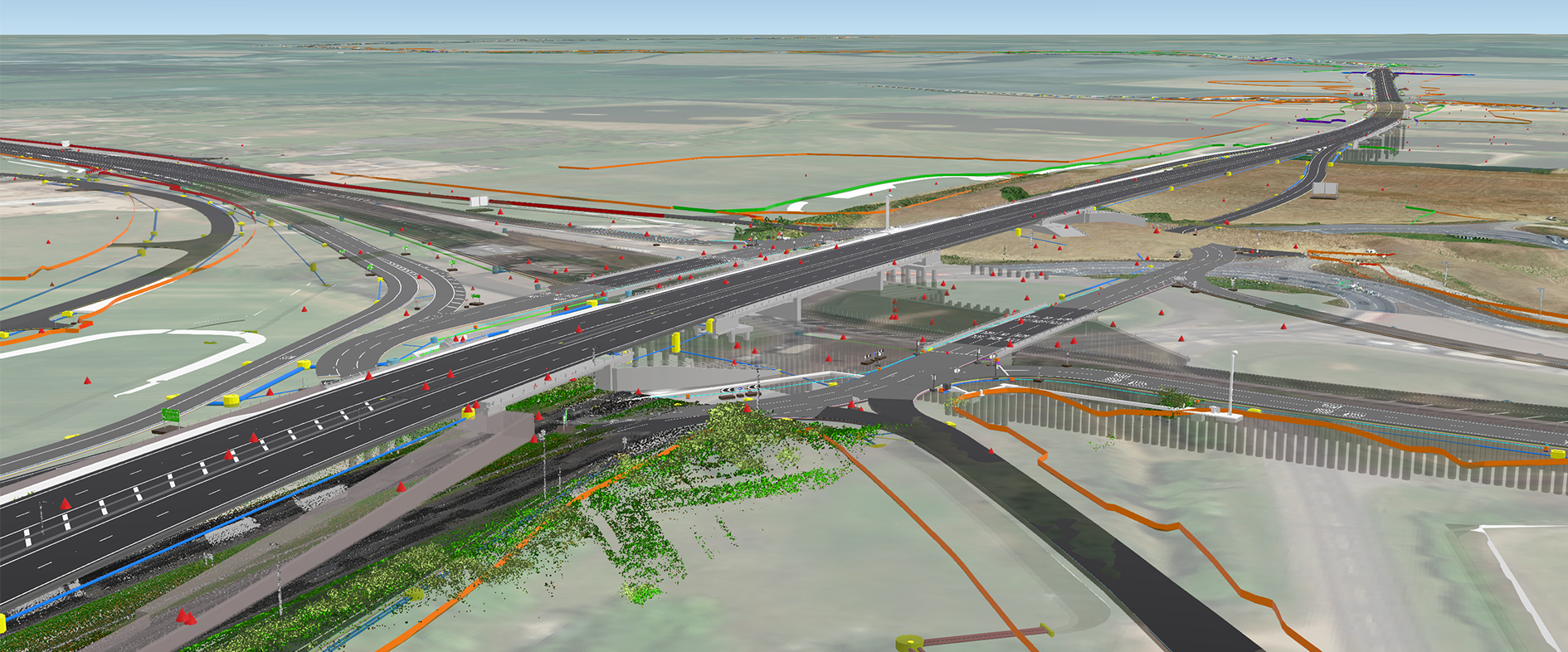
Skanska UK is integrating Esri GIS technology (ArcGIS Enterprise) and BIM outputs to develop a smart, agnostic, cloud-based, geospatial twin, by connecting multiple Common Data Environments (CDEs) and workflows. The entire ArcGIS Enterprise stack is used including dynamic apps which support the visualisation of geospatial Digital Twins, 3D virtual representations of built – and natural – environments.
By following a geospatial approach different types of data and systems are connected to create a single view that can be accessed throughout the entire project life cycle. Data capture and integration is enhanced, improving real-time visualisations providing advanced analysis and automation of future predictions. The system fully supports information and collaboration both internally and externally, across multiple organisations, breaking down barriers and empowering cross disciplinary collaboration and decision making.
George Floros, Head of GIS highlights: “Digital technologies are here to empower the construction teams. The adoption of GIS has been a team effort and result of a collaborative and inclusive approach between project delivery, technical and commercial teams.”
Integrating GIS and BIM is revolutionising the different stages of the project lifecycle. At the tender stage, for example, ArcGIS Enterprise is used to consume numerous data formats and make the information accessible across entire teams. ArcGIS Story Maps is used to communicate plans with local communities, inviting input through interactive engagement tools.
At the outset of any project, Construction Design Management (CDM) hazards are captured within ArcGIS Online enabling numerous stakeholders to collaborate over the identified hazards. The design team can raise a CDM hazard which is reviewed by the designer and contractor before being handed over to the construction and, eventually, Operations & Maintenance (O&M) teams. The construction team incorporates CDM hazards into site briefings and, at the project end, CDM hazards can be closed out before the final hand-over to O&M.
During construction, GIS is used to track and report construction progress, by integrating with BIM and quality information. This connected, geospatial ecosystem streamlines collaboration between operations, quality, planning and project management teams. Georeferenced field construction data and reality capture information such as point clouds and meshes, are automatically uploaded on dedicated project GIS web applications, boosting productivity, empowering engagement and accelerating decision-making.
“GIS has given us the capability to make information easily accessible to everyone working on a project, empowering our project delivery teams including our supply chain with an intuitive platform and enabling efficiency improvements in the delivery of complex infrastructure projects, contributing to our customers’ success.”
Susan Ryall, Technical Director
Benefits
Time Savings
Accessible, up-to-date information, automated digital workflows and the removal of silo working due to connected systems have led to times savings up to 40% during the project lifecycle. Working with virtual representations of multiple components supports proactive asset management, freeing up resources to work on other aspects of any given project.
Cost savings
Entire project lifecycles are enjoying improved digital productivity and saving millions through data and systems integration, as well as enabling a streamlined, more efficient, digital way of working. Time and money are saved from the team’s ability to iteratively model changes, test how components or systems function and troubleshoot malfunctions, inexpensively, in a virtual world.
Enhanced Health, Safety & Quality
Health and Safety hazards are captured within the 3D GIS-BIM portal, flagging up early hazard detection enabling a more collaborative, standardised approach among stakeholders. Multiple parties can focus on proactive rather than reactive construction hazard strategies. Learnings are consistently shared as identified hazards are handed over to the construction stage and then to the handover stage, creating additional efficiencies from collecting the information once and using it multiple times.
Accelerated Project Delivery Through Collaboration
Automated geocentric digital processes using GIS to connect data, disciplines and people are helping to release significant business benefits and expedite the construction process. Simon Lawn, Construction Manager explains: “Anyone who uses the platform will immediately understand the huge potential that is being unlocked. These are exciting times with the platform having the potential to bring together design, construction, temporary works, utilities, stakeholder, customer, commercial, planning and others into one arena.”
Align JV
Situational awareness is being delivered through GIS and BIM integration transforming project delivery
Align JV is a joint venture playing a key role in the construction of HS2 Phase One. It is using ArcGIS to deliver new, innovative, near real-time data visualisations of surface works, helping senior management and stakeholders across engaged organisations make vital decisions on a daily basis. As a result, management of planned works has been transformed helping deliver the programme ahead of schedule.
Situational awareness helps multiple teams act on information in real-time
More than ten dashboards support wider collaboration accelerating project delivery
Outmoded systems replaced by real-time digital asset tracking tools supporting real-time decision making
The Challenge
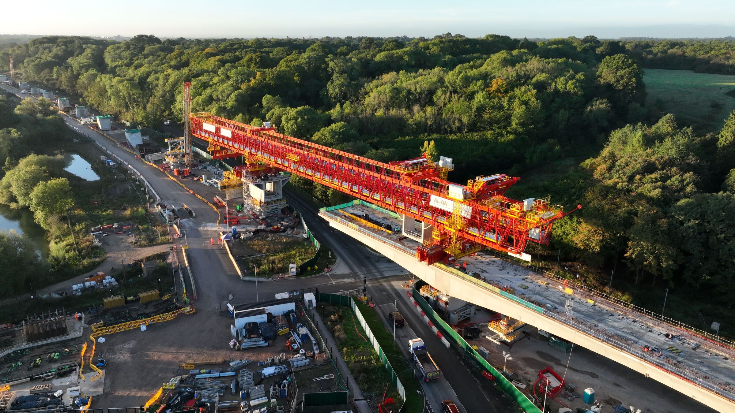
The geology and scale of works are among the enormous geotechnical and engineering challenges faced daily by construction partners working on the HS2 project. Align JV, a joint venture formed of Bouygues Travaux Publics, Sir Robert McAlpine and VolkerFitzpatrick, is charged with the delivery of the complex Central 1 section of HS2 Phase One, in a rural environment. This section includes the Colne Valley Viaduct at 3.37km long, what will become the longest railway bridge in the UK; a 16km twin-bored tunnel, the longest tunnel in HS2 Phase One sector and five vertical shafts to provide necessary ventilation and emergency access.
The viaduct alone requires 1,000 unique concrete segments, each up to 140 tonnes in weight, which will form the deck of the viaduct and over 100,000 precision-engineered 8.5 tonne concrete segments are required to build the concrete rings that line the tunnels. Managing the impact of this significant construction programme necessitates minimal disruption to residents and businesses, reducing the impact on the road and transport network, minimal impact on the environment while keeping communities informed at every stage.
To deliver on all this, while liaising with numerous other partners and the supply chain, it was vital for Align JV to have optimal situational awareness of the entire works. Being able to track the progress of multiple elements of the project at any one time would help not only to reassure local communities and ensure that the structures are being built and operated to the highest safety standards, but also adhere to the Government’s Code of Construction Practice and Considerate Constructors Scheme.
“Having real-time situational awareness of surface operations helps our senior team take faster, more informed decisions, supporting more efficient project delivery.”
Dani Jimenez, GIS Specialist, Align JV
The Solution
The AEC sector has, for many years, been using Esri GIS (Geographic Information System) solutions to improve workflows, bringing context to projects and enhance collaboration throughout project lifecycles. More recently construction companies have broken away from old-school engineering practices to find new, innovative ways of tracking progress and providing vital information to stakeholders.
Align JV’s GIS team had first-hand knowledge from working on previous projects as to how GIS and, specifically, integrating GIS with BIM data, could provide best in class situational awareness tools. Dashboards had not previously been used and were seen as vital to better understand the progress of surface works in this mammoth operation. Initially a number of mock dashboards were created using out-of-the-box apps (ArcGIS Web AppBuilder and ArcGIS Dashboards) in ArcGIS Enterprise, which were shared amongst technical and non-technical colleagues across the organisation. By integrating the ArcGIS stack using ETL tools, data is harvested from various systems and pushed into ArcGIS Enterprise in order to visualise it, helping personnel to understand events as they happen and make more informed decisions. Positive feedback enabled the GIS team to finalise the workflows required to set up a number of dashboards, tailored to different audiences.
Thirteen dashboards and two apps now give access to real-time project data, all in an easy-to-read format. The main boardroom conference screen features a dashboard presenting the data required for senior executives to track KPIs and make strategic decisions based on project goals. Examples of construction dashboards include viaduct pier and pile progress, jetty construction progress, segment and deck progress, tunnel cross passage progress, headwall installation and barrette installation progress.
This unprecedented situational awareness of the operational status of and construction components is not only helping with project efficiencies but driving a step-change in industry standards for health and safety performance.
“The implementation of these out-of-the-box tools has resulted in substantial qualitative gains at the highest levels of management and decision making. We have successfully replaced outmoded trackers with easy-to-understand, data driven GIS solutions.”
Derek Van Rensburg, Surface Works Construction Director, Align JV
Benefits
Data-driven Decision Making
Complete situational awareness and the status of different construction elements across the project enables both senior management and operational teams to make assessments on progress, and deviations from KPIs can be flagged immediately. This access to exponentially more information helps teams act on information in near real-time and supports increased accountability across project teams.
Enhanced Collaboration
13 dashboards (and applications) have been created helping Align JV quickly collaborate with numerous internal and external stakeholders. For example, working with the viaduct segment factory and girder launching teams, enabling teams to track the whole lifecycle of segments from the factory to the storing yard, and to the launching girder.
Effective GIS & BIM Integration
Bringing together the most up-to-date CAD design models alongside production and planning trackers into GIS datasets and into dashboards, allows a much wider audience near real-time access to information. A digital twin model of the development of the viaduct and tunnel construction assets is represented in near real-time is a game-changer and set to be vital tool for future joint ventures.
Management Time Savings
The implementation of dashboard tools has resulted in substantial gains at the highest levels of management and decision-making. Considerable time is being saved by management from the replacement of former industry-standard and cumbersome trackers, with easy-to-understand and data-driven GIS solutions to support near real-time decision-making. The new dashboards also negate the need for Align JV to invest in other costly, digital solutions.
Lancashire County Council
Making the most of all the tools and capabilities of ArcGIS Online, we are delivering innovative digital solutions for Lancashire.
Lancashire County Council is putting Lancashire on the map in more ways than one. It is using ArcGIS Online to share information about the county on interactive web maps and, at the same time, showcasing best practice ways of using ArcGIS in local government as part of its Digital First Strategy.
Much-used Mario platform upgraded and enhanced with ArcGIS Online to deliver new features for users
New mapping apps and dashboards built with ArcGIS Online tools and arranged in themes to make data more accessible
Accelerated pace of innovation, with many council processes now being streamlined with ArcGIS apps
The Challenge
Maps have been front and centre at Lancashire County Council for more than twenty years, ever since the launch of Mario. When it was built in 2001 using Esri ArcGIS software, Mario (Maps and Related Information Online) was a ground-breaking geographic information system (GIS) portal enabling the council to share geospatial data on interactive maps. An instant success, Mario was visited in excess of five million times in the two decades that followed, delivering 800 million views of Lancashire maps.
A consultation conducted in 2021 revealed just how much Mario was much appreciated by the many public sector employees, volunteer organisations, small businesses and individuals who referred to it regularly. Users were, however, keen to have more features, including the ability to access Mario on smartphones, download data and view real-time information. In response, Lancashire County Council decided to harness the latest capabilities of ArcGIS Online to upgrade Mario, meet users’ expectations and help it become even more data driven, in line with its new Digital First Strategy.
“Using the whole ArcGIS Online toolset we have the ability to improve the accessibility of data, transform council services and ultimately better serve the people of Lancashire, which is what we are here to do.”
Maria Adamson, Senior ICT Engineer (GIS), Lancashire County Council
The Solution
Mario was redeveloped in-house by the council, using out-of-the-box ArcGIS solutions and templates to minimise bespoke development work and coding. Now, Mario users can view maps on their smartphones and tablets, access live information and stream accurate data directly from Mario into their own systems.
The next-generation Mario still has the same comprehensive online map viewer as before, but also presents the content in ‘themes’ for the first time, making it much easier for people to find the information they need. For example, there are specific maps for finding out when roadworks are scheduled, which is the nearest school and where the mobile library will stop. “We thought about which questions people might have, what data they might need to see to answer these questions and how we might best present it,” explains Maria Adamson, Senior ICT Engineer/Designer (GIS) at Lancashire County Council.
The council has taken full advantage of all the capabilities of ArcGIS Online to create new content for Mario in a variety of formats. Many of its new themed web apps were created with ArcGIS Experience Builder or Instant App templates, while others were built with ArcGIS Dashboards, including a new dashboard showing the number of collisions involving pedestrians or cyclists by year on a map, graph and pie chart. “The ArcGIS system gives us the capability to build much of what we need in one space, thus enabling us to respond more rapidly to the needs of our customers,” Adamson says.
Increasingly, Lancashire County Council is now also using the full suite of ArcGIS solutions to help it build end-to-end processes. For instance, it used ArcGIS Survey123 to capture information from the public during a walking and cycling consultation and presented the results in an interactive mapping app, created with ArcGIS Web AppBuilder and shared via Mario. The development of innovative new solutions like this earned the GIS team the well-deserved accolade of ‘Lancashire County Council Team of the Year 2022’.
“Mario is a great example of how the council is continually striving to offer ‘digital first’ solutions, putting citizens and staff at the heart of innovation and ensuring sustainable digital services fit for the future.”
Sharon De Vall, Digital Strategy Manager, Lancashire County Council
Benefits
Easier access to local information
The redevelopment of Mario has undoubtedly made it easier for members of the public and businesses to find and use local information. In addition, as Mario can now be accessed on smart phones and tablets, it is easier for council employees and public officials to find the information they need and respond to enquiries from their constituents confidently, straight away.
Rapid delivery of new public services
Using the latest capabilities of ArcGIS Online, Lancashire County Council has the capability to respond to crises and deliver new public services exceptionally quickly. For instance, it took only one week to build an ArcGIS-based workflow to process applications from organisations able to provide warm spaces for vulnerable people. Over 60 organisations successfully used an ArcGIS Survey123 app to register, and urgently-needed, up-to-date information about warm spaces was made accessible on the council website within just a few weeks.
More efficient, streamlined council processes
Through the process of enhancing Mario, the ICT has successfully raised awareness of GIS and stimulated demand for more GIS services to help streamline council processes. As a result, a range of new ArcGIS-based solutions are currently in development including a highways maintenance dashboard. “The use of GIS is growing exponentially now,” Adamson says. “Using the whole ArcGIS Online toolset we have the ability to improve the accessibility of data, transform council services and ultimately better serve the people of Lancashire, which is what we are here to do.”
Strong endorsement of Digital First Strategy
The success of Mario is a strong endorsement for the council’s Digital First Strategy, which aims to make the council more data driven and drive the use of innovative technologies to benefit Lancashire. According to Sharon De Vall, Digital Strategy Manager at Lancashire County Council, “Mario is a great example of how the council is continually striving to offer ‘digital first’ solutions, putting citizens and staff at the heart of innovation and ensuring sustainable digital services fit for the future.”
Forest Research
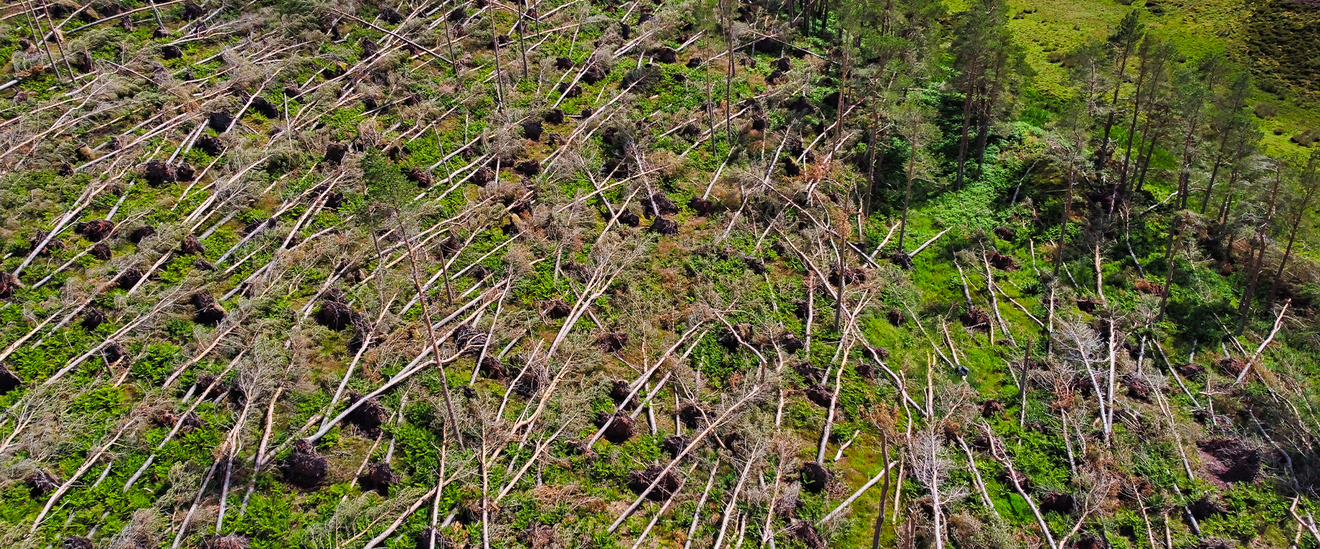
In the aftermath of Storm Arwen, ArcGIS enabled us to engage the help of citizen scientists and accurately assess the devastating impact of this natural disaster on the UK’s forests and woodlands.
In the aftermath of Storm Arwen, Forest Research used ArcGIS to enable people to check, edit and capture data in the field about the locations of 22 million fallen trees. This citizen-science app allowed the organisation to verify data generated via machine learning technology and build up a more accurate and comprehensive picture of the full scale of the natural disaster.
Forest Research created its citizen-science platform using ArcGIS Hub Premium within just one day
Citizen scientists could verify and edit data in the field with an easy-to-use ArcGIS app on their smartphones
The estimated number of felled trees increased by over 250% with citizen involvement
The Challenge
In November 2021, Storm Arwen swept across Scotland and Northern England causing catastrophic damage to woodlands and forests. Stunned by the scale of the destruction, foresters and land owners needed to know how many trees had fallen and exactly where, to help them recover wood safely that could be used for timber production. Fallen trees that are not harvested quickly will soon become unviable, leading to the waste of a valuable resource, increasing the release of carbon, creating a breeding ground for pests and diseases and augmenting the risks of wildfires.
“We were able to spin up a citizen-science portal using ArcGIS Hub Premium in less than a day.”
Tony Farndon, GIS Specialist and Development Manager, Forest Research
The Solution
In the first instance, data engineers and data scientists at Forest Research used Sentinel Synthetic Aperture Radar (SAR), a technology that detects changes in the forest canopy cover by measuring radio waves between satellites and the ground. The organisation compared SAR readings from before and after Storm Arwen and created a model using machine learning techniques to identify areas where there had been a notable disturbance in canopy cover.
This initial dataset estimated the loss of around 8 million trees, providing the first indication of just how much devastation the storm had caused. When Forest Research published its data, however, it began to receive reports from local authorities, utilities and the general public about additional areas of tree loss. It conducted site visits to forest areas near its office in Edinburgh to see the situation on the ground, but simply didn’t have the staff required to validate its tree-loss data across all of the affected areas of Scotland and Northern England. That’s when citizen-science was raised as a possible solution.
Forest Research had been using solutions from Esri’s ArcGIS suite for many years and was familiar with ArcGIS Hub Premium, an online data sharing platform that allows thousands of people to submit and edit data via the web or mobile apps. It realised that it could use ArcGIS Hub Premium to engage the help of people across the industry and the general public as citizen scientists to validate its tree-loss data.
Working exceptionally quickly, Forest Research set up a dedicated landing page for the initiative on ArcGIS Hub Premium and built a mobile app using ArcGIS Survey123 to enable people to view, edit and validate data using their smartphones. “We were able to spin up a citizen-science portal using ArcGIS Hub Premium in less than a day,” says Tony Farndon, GIS Specialist and Development Manager at Forest Research.
Forest Research shared the app with the forest industry, local councils, utilities, road departments and the general public, encouraging everyone to help validate the SAR-generated data so that it could refine its model, improve its machine learning and reach a more accurate estimate for the actual number of trees felled by the storm. Although the organisation initially had some concerns about how easy it would be for non-GIS experts to edit data in the field, the Survey123 app was widely used and delivered a large volume of quality data.
“As a result of the citizen-science validation, we can now confidently estimate that 22 million trees came down in the UK on one night during Storm Arwen.”
Tony Farndon, GIS Specialist and Development Manager, Forest Research
Benefits
Improved confidence in the accuracy of tree-loss data
The citizen-science approach that Forest Research implemented using ArcGIS Hub Premium enabled it to quickly validate data across thousands of square miles of land throughout Scotland and Northern England and gauge the impact of Storm Arwen with far greater accuracy and confidence. It discovered that more than two and half times more trees had been damaged than initially estimated. “As a result of the citizen-science validation, we can now confidently estimate that 22 million trees came down in the UK on one night during Storm Arwen,” Farndon says.
Better planning for commercial timber production
Forest Research was able to share accurate information about the locations of fallen trees with organisations throughout the forestry industry. Consequently, forestry and commercial logging companies could make faster, better decisions about where to focus their resources to harvest fallen trees before they began to degrade. Similarly, sawmills were able to use the data to better plan how to manage the sudden surge in demand and store the additional volume of wood that would be coming to them.
More information to support sustainable forest management
Forest Research’s data is now being used to help foresters and landowners plan their ongoing clean-up activities and identify areas where action may be needed to mitigate the risks of disease and pests. The data is also being used by tree nurseries to help them understand the volume of seeds and young trees that will be needed to replant areas devastated by the storm and ensure the sustainable management of forests and woodlands.
A proven approach for future storms
The citizen-science-led initiative that Forest Research developed in the aftermath of Storm Arwen, using ArcGIS Hub Premium and ArcGIS Survey123, has given the organisation a proven approach that it can reapply in future storm events. “With climate change, events like Storm Arwen are estimated to happen more often,” Farndon says. “We now have a hub, a model, a mobile data capture solution and a proven citizen-science approach that we can use to respond quickly following severe storms and gather the accurate information the forestry industry needs.”

Thirteen Group
Thirteen Group’s Community Resilience strategy works to understand local communities better, inform decisions and signpost customers to the services available.
Thirteen Group manages and owns more than 35,000 homes across the North East, North Yorkshire and the Humber. Their community resilience strategy uses ArcGIS to map communities with external location-based data at a local level. They use this to target resources in neighbourhoods, to improve customers’ lives and make their communities safer, healthier and more sustainable.
ArcGIS maps internal and external data to localities for the community team to use in planning and decision making.
ArcGIS reveals the different needs of each local community and displays the amenities and support that exist in the location.
Thirteen Group uses ArcGIS to track the impact of capital investments. It also provides solid data to support applications for funding.
The Challenge
Thirteen Group’s community resilience strategy is helping communities to become resilient and become sustainable in the long term. It focuses on understanding customers’ needs better, making the best possible use of assets and understanding how they can engage with its customers and collaborators to make a difference in a community.
Covid presented challenges, and the future can seem uncertain with rising prices, job insecurity and the threat of climate change. Thirteen Group is responding by mapping its communities and assets at local levels to offer targeted support and enable communities to thrive and become more resilient.
“We are passionate about using GIS to understand our communities. We are on a journey and there will be much more we can do with our data".
Rebecca Dick, GIS Lead, Thirteen Group
The Solution
Thirteen Group has been using Esri’s ArcGIS solutions since 2010. Initially they used ArcGIS to plan maintenance of their properties and grounds. Now more departments use ArcGIS and they have added ArcGIS Online and Esri’s Living Atlas to learn more about their communities.
In housing, mapping communities is key. It relates homes to external data such as the managing authority, LSOA, ward and the built environment. It also shows the proximity to towns and transport. Thirteen Group maps all of this data and then uses the multi-criteria analysis and widgets in ArcGIS to manipulate the data and present it in the required way.
ArcGIS Online allows them to share the data with selected colleagues. Colleagues can then click on a location and drill down to interrogate the information.
Rebecca Dick, GIS Lead, Thirteen Group, says: “A data table of addresses will not show you that one street backs onto another. We use ArcGIS to map and see the entire picture of the housing services we manage, in the context of the local communities”.
By using the system, they have been able to:
Map their housing datasets in ArcGIS to reveal the hotspots for housing demand and identify areas with many empty homes.
Overlay their data with data from partners, such as the local authorities, schools, charities and universities. They add data from Esri’s Living Atlas, the foremost repository of geospatial data in the world. Combining data reveals how communities differ and shows where they should target resources. The datasets from ArcGIS form the basis for collaboration and customer consultations and enable targeted interventions in communities.
Create a ranking system in ArcGIS that shows where to focus new services and who would benefit from them.
Study the impact of recent capital investments and measure how projects have impacted our communities.
“GIS data is very ‘interpretable’. We can view a wealth of data together which is extremely useful for decision-making.”
Rebecca Dick, GIS Lead, Thirteen Group
Benefits
Highlighting local issues helps operations
ArcGIS presents a clear view of the factors affecting communities and the hotspots for frontline services. It helps to manage factors such as the turnover of tenants and debt that increase costs, and target resources to improve customer satisfaction. It is very easy to understand the maps because they are visual. The team particularly like the interactive maps and heat spots because they are so intuitive and easy to understand.
A better understanding of how to support communities
Thirteen Group is using ArcGIS to map the social and environmental factors affecting their communities and understand their needs at a grassroot level. The information is then used to tailor initiatives to individual areas. For example, they have mapped areas of high crime and overlaid the data with neighbourhood watch areas. Their teams then worked with the community to help establish new Neighbourhood Watch groups. They have also mapped areas with unemployment and high arrears and overlaid the data with local support services to identify any gaps. The information has then been used to develop interventions within the community, such as eco shops, employment and skills academies, as well as benefit campaigns.
ArcGIS helps with planning and grant applications
ArcGIS shows where demand for homes is greatest and where it could become even higher. It helps target areas of focus and look for development opportunities. The data supports their applications for grants and community renewal funds. It is important that they can make evidence-based decisions, supported by data from ArcGIS.
ArcGIS can also show why certain areas are given priority for resources. Thirteen Group can track the impact of interventions over time to understand how they are helping customers, and if there should be requests from the community, the GIS data allows them to respond in an informed way.
Partnerships are more effective with ArcGIS
Housing associations need to collaborate with partners. ArcGIS enables Thirteen Group to map their partners’ amenities in relation to their own communities and work more effectively with the partners without silos or duplication of services. Where there is a particular community need, they can signpost customers to the right partner. Where a service works well in one community, they might repeat it in another area with a similar situation and profile.