Wow, what a bumper release ArcGIS Pro 2.7 is. I started scrolling through the What’s New list and just kept on going… There are some obvious key additions but there are so many smaller enhancements too. Oh and there are 67 new geoprocessing tools in Pro 2.7 – yes 67!
First things first
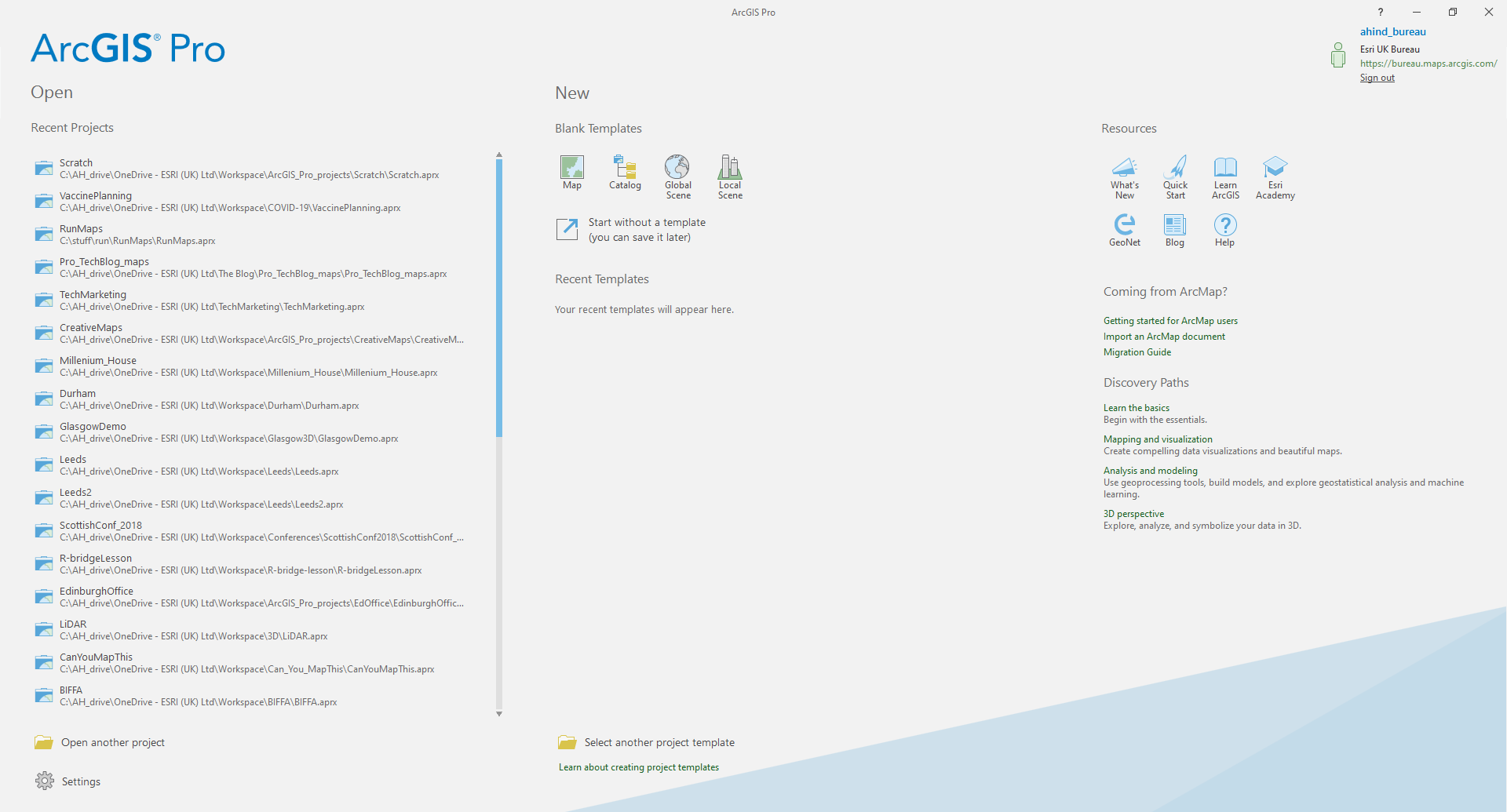
The first thing you’ll notice is a new Resources section on the ArcGIS Pro start page. This gives you links to the What’s New page, the Quick Start guide, the GeoNet community and other useful resources.
The other thing you’ll notice when you open up a map and start working is that the pop-ups have had an overhaul. The default look for a fields element is to alternate the row colours: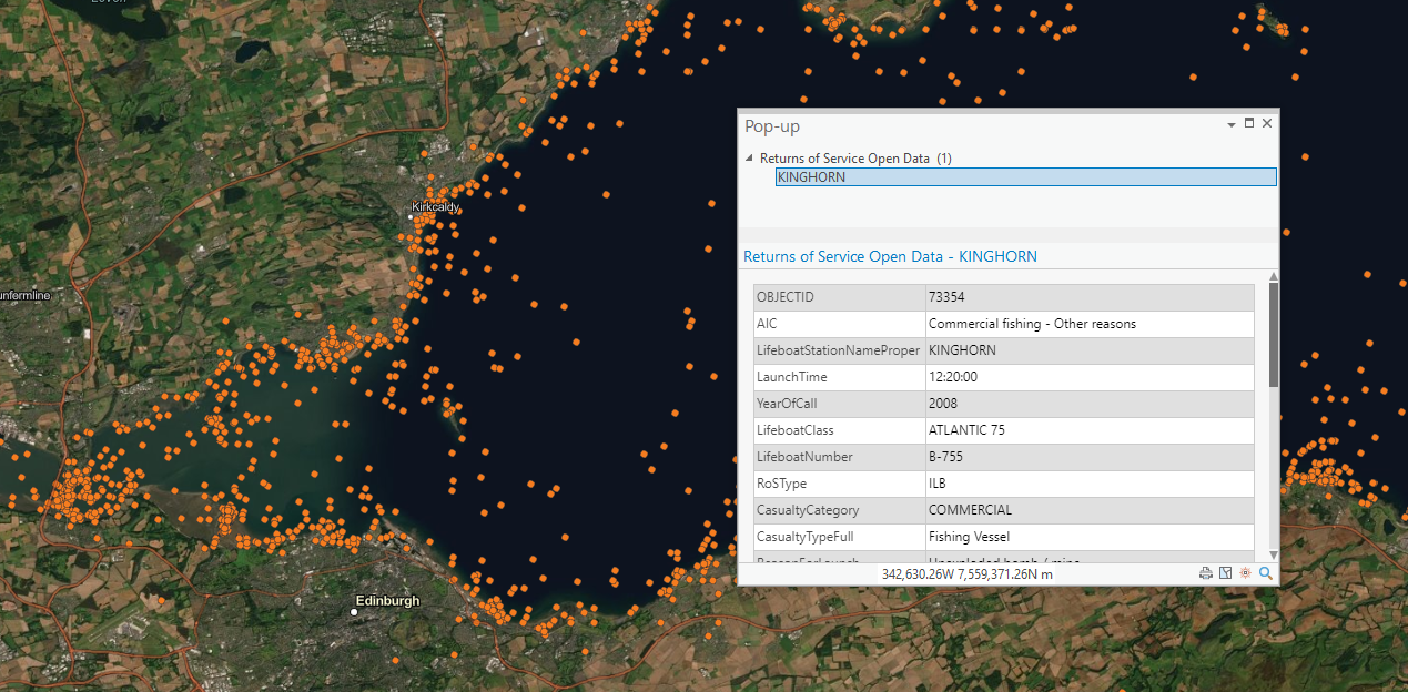
If you aren’t a fan, there’s an option to revert to the classic look. Other new pop-up options include rotating the elements to improve stacking and support for 360 panoramic images.
Taking Pro out and about
Sometimes you need to be able to take the full power of a professional GIS with you when you’re out in the field. With Pro 2.7 you can now connect to a GNSS (GPS) device directly so you know where you are and can create new features directly using your location. The release also introduces a new type of geodatabase. Built on the widely available SQLite, the mobile geodatabase supports data storage and feature collection on the go. This is also the first step towards fully interoperable workflows between ArcGIS Pro and ArcGIS Runtime (the technology our mobile apps are built on).
Linear Referencing
ArcGIS Pro now supports Linear Referencing. This is an important location modelling technique in a number of sectors – recording location as a distance along a route such as a railway track. Routes are created as m-aware polyline features with m-values at each vertex, these store a measure value that is independent of the line geometry.
The little things that make the experience
There’s an Eyedropper tool. When you open the colour pallet dialog there it is all ready for grabbing a colour from a map element: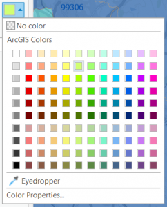
No more rummaging for colour codes. Be glad you can’t see my happy dance…
When you create a new feature class there is now the option to automatically add it to you map and it defaults to on.
There are several enhancements to the editing experience including a new Regular Polygon tool. Specify the number of sides in the template properties and quickly and accurately create triangles, squares, pentagons, hexagons etc. You may need to activate the tool in the template properties for your polygon layer.
There’s a new geoprocessing option – Enable Undo toggled on by default – so you can have Undo automatically on in geoprocessing tools that support it.
If you work with 3D take a look at the new 3D Object Feature Class. These are a bit like multipatches with bling. They represent the outer shell of features in 3D space but have a richer set of properties – like reflection, shadowing, and roughness. File geodatabase 3D Object features can be opened and edited directly in third-party modelling applications like Maya and Blender. Maybe not such a little thing…
Cartography
There are some fantastic new features for enhancing your maps and getting a greater degree of control over how they look. I hadn’t heard of Variable fonts before, now supported in Pro, but they give you control of font characteristics like weight, width and slant. PANTONE® colours I did know about and eight new system styles have been added that use them.
If you are using callouts you can now choose to anchor to the feature outline and then apply an internal offset. Or you can switch to using key numbering to manage labelling of features in a densely packed area. Take a look at the What’s New video to see these and other new features in action.
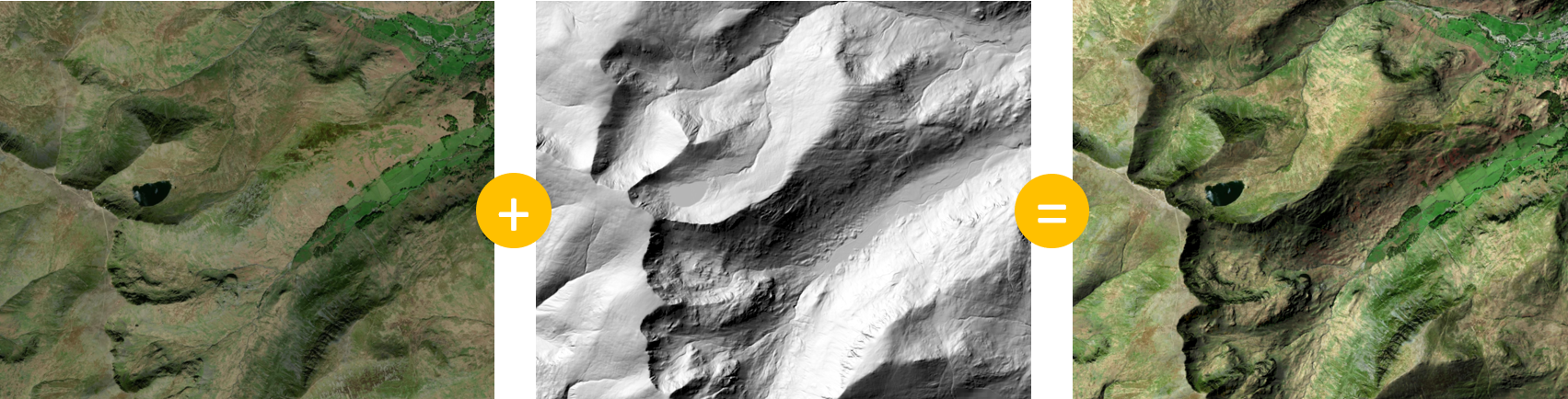
The headline act on the cartography stage is the introduction of layer blending. Commonly used in image editing and graphic design workflows, blending modes can enhance the visualisation of features and change the way you design maps for publication. Are you as excited about this as John Nelson? Here’s that simple example of using hillshade to make imagery look bumpier applied to Helvellyen:
Blending was added to ArcGIS Online earlier this year and this blog is a good intro to using it.
Don’t forget to checkout the new system styles.
Analysis
Did I mention that there are 67 new geoprocessing tools? And updates to lots more. You’ll have to work through the list yourselves, but here are some that caught my attention.
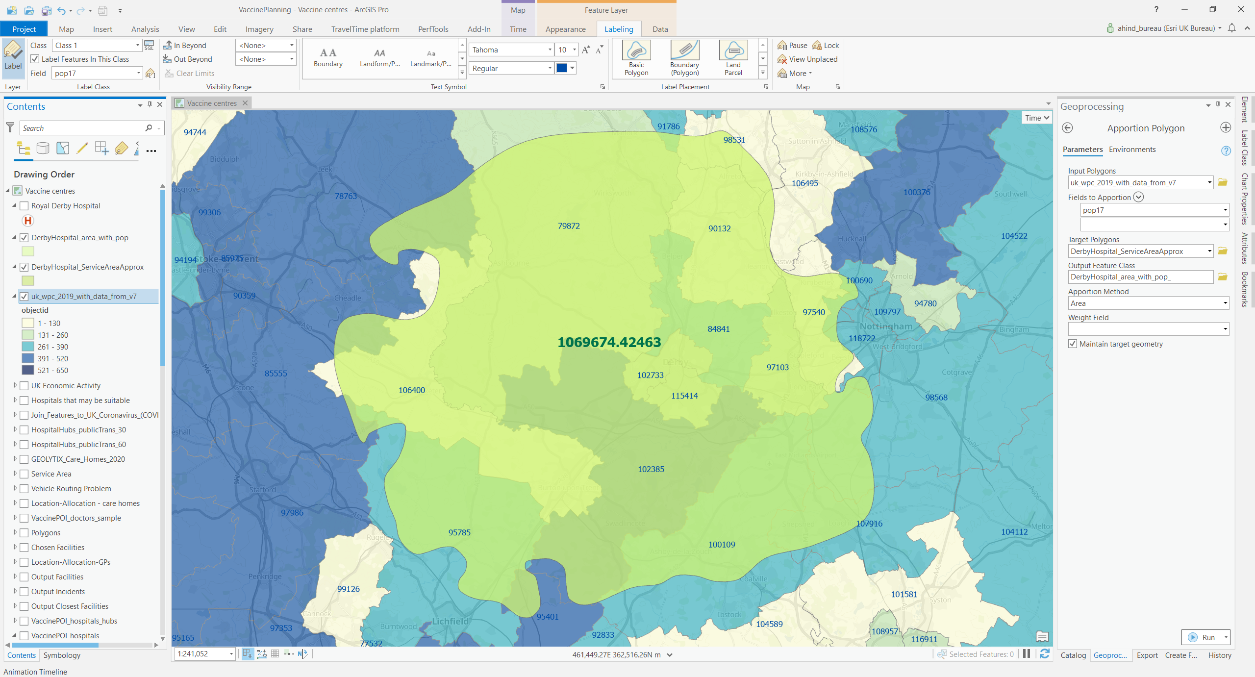
How do you add attributes to a set of polygons based on an existing set of polygons, using the amount of area overlap to calculate the attribute contribution from each overlapped polygon. Before you break out ModelBuilder to try this challenge… it’s now a single tool – Apportion Polygon. In the example below the tool was used to calculate a population value for a simplified Royal Derby Hospital service area, from my blog on GIS in vaccine planning, from Local Authority census data:
Among the new Pairwise Overlay tools the one that caught my eye was Pairwise Integrate. This performs a similar set of geometry changes to the clustering and cracking steps in validating a Topology – vertices are added at features intersections and vertices that are close are snapped together. Useful if you want to be able to structure your data without setting up a Topology.
The Neighborhood Summary Statistics tool makes it easy to calculate statistics like mean, median and standard deviation for points in a processing area.
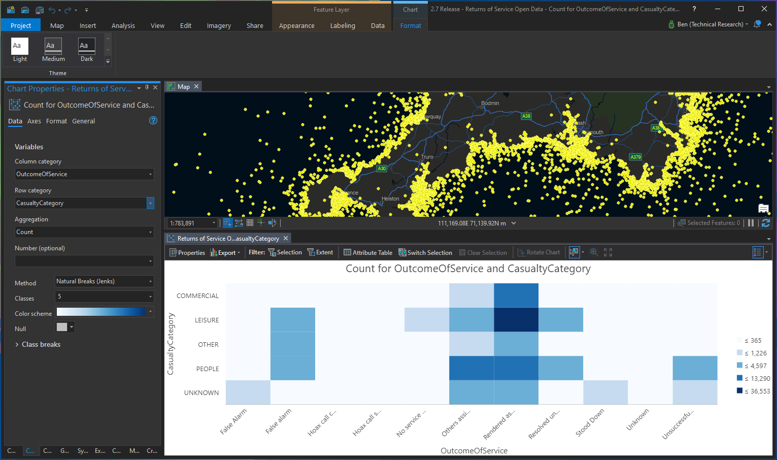
It’s not just new tools, there are also enhancements to Charts. The new Matrix Heat chart shows relationships between categorised data variables. Shown below for RNLI Returns of Service data from the Living Atlas:
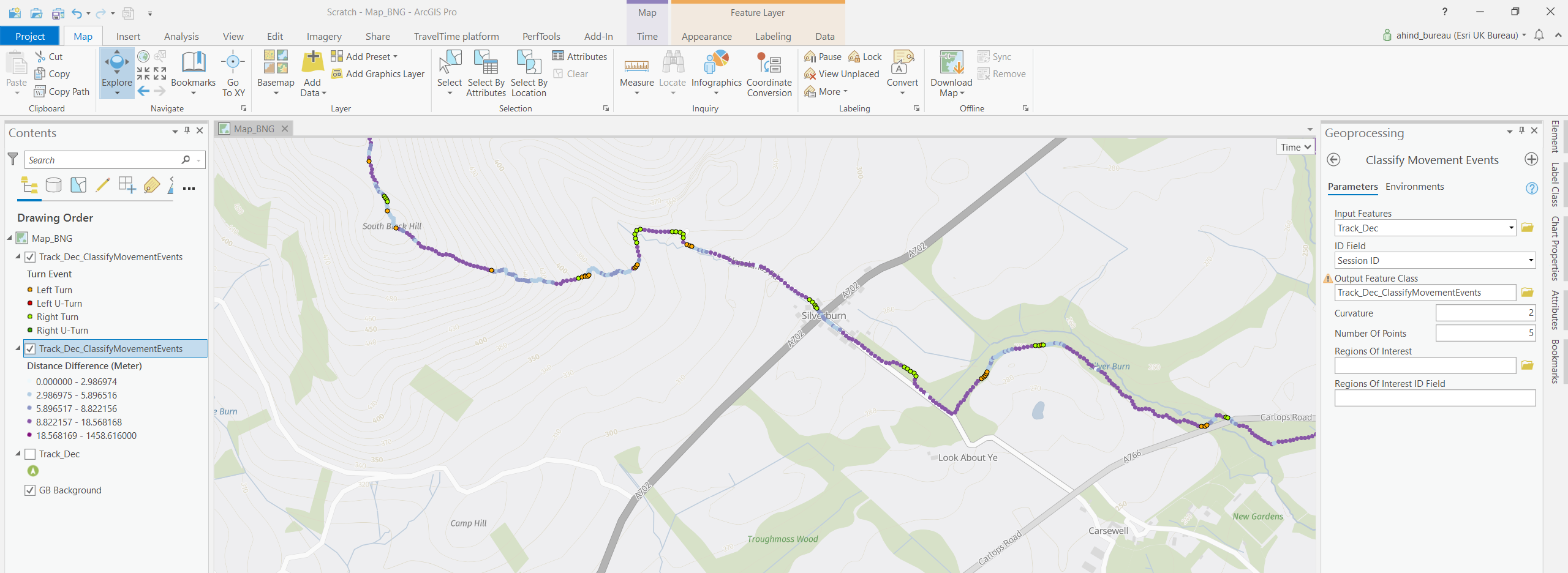
There’s a new addition to the Movement tools which work against point track data. The tools make it much easier to extract useable intelligence from time-sequenced point locations that are grouped by an ID. The new Classify Movement Events (requires Pro Advanced) identifies movement-specific events like turns (red/green dots in the image below), as well as calculating the distance and time between points (shade of blue/purple in the image).
ModelBuilder
Model outputs can now be added to a map with the Add To Display command. The outputs appear under a ModelBuilder group layer and the layer names include the ModelBuilder variable name and the variable value.
The new Iterate Layers tool let’s you iterate the layers in a map and branch your model using the workspace or layer type. You can filter on layer properties, such as visibility, to limit the model processing.
Python
The headline news is that the version of Python in ArcGIS Pro has been upgraded, to Python 3.7.9. Be sure to check out the details for the new functions that have been added to several of the modules too.
So you’ve seen what caught my eye but be sure to take the time to look through the What’s New page to see everything that was in this mighty heap of enhancements. Or grab a brew and jump straight into the What’s New video.