In a previous blog, I explored the range of real-time offerings that are available with ArcGIS. Today, I’ll be taking a closer look at one of those: ArcGIS Velocity. Working with real-time data may seem a daunting prospect, however, this blog will show you how easy it can be to get started with ArcGIS Velocity. By introducing you to some of the publicly available UK data feeds and walking through a worked example, you will soon be ready to analyse real-time data yourself in ArcGIS Velocity.
Let’s start with the basics; ArcGIS Velocity is a software-as-a-service (SaaS) add-on capability for ArcGIS Online. It allows you to ingest, visualise and analyse large volumes of data, sourced from Internet of Things (IoT) sensors. You can connect to data collected from a variety of sensor types by configuring a feed which can be displayed onto a live map layer. From there, you can perform analytics to explore the information and gain insight.
And as with any GIS project, the first thing we need is data…
Open Data Feeds for the UK
Thanks to the ever-expanding world of IoT sensors, there is a wide range of UK specific real-time data feeds for us to get our hands on. Here’s a taster of a few real-time data feeds publicly available:
- Public Road Incidents by Highways England
- CCTV Highways by Highways England
- Indicators of the Planet– a site configured by Esri that monitors our planet using real-time feeds, some of which include their sources for you to explore yourself.
Configuring a feed
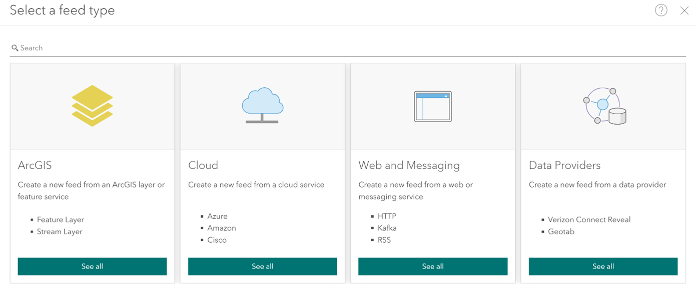
ArcGIS Velocity can ingest and transform live data feeds such as those above, so let’s get started. Firstly, you need to configure a feed. A feed allows you to connect ArcGIS with the IoT system you’ve selected. There is a range of feed types that you can choose from:
- Existing ArcGIS layers or feature services
- Cloud services (such as Azure, Amazon, Cisco)
- Web and messaging services (such as HTTP, Kafka, RSS)
- Data providers (such as Verizon Connect Reveal, Geotab)
Released in Beta with the December 2021 update, you can also use a gRPC feed type to programmatically send real-time data from gRPC clients to Velocity via a hosted endpoint.
As soon as you have set-up your feed, ArcGIS Velocity gets to work by understanding the feed data schema, which you can re-define if necessary. Next, we need to determine our location, date and time data from our feed (presuming the data has these fields). You can also define the field used as the Track ID. The final task is to set how often the feed will run to collect new data from the IoT system, whether that’s periodically or at a recurring time and interval.
And just like that, you’ve completed step one in working with real-time data using ArcGIS Velocity.
Performing Analytics
Once your feed is set up and data is streaming into Velocity, you can design and perform analytics. In ArcGIS Velocity, there are two types of analytics: Real-time and Big data. Real-time analytics deal with data records as they are received. For example, you may only want to retain a record that meets a certain criteria or send an alert when certain conditions are met. Big data analytics work in a different way and allow you to run analysis on an entire dataset to spot patterns, trends or ‘needle in haystack’ type analysis.
Whether it’s detecting an incident or absence of events, calculating distance or filtering by expression, you can transform your data through analysis. Results of this analysis can be stored as a new, or existing feature layer, sent as an email, or written to third-party messaging systems.
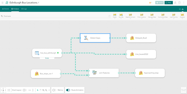
Let’s go into my example and create an analytic for the ingested Edinburgh buses feed. This data feed consists of the live locations of buses in Edinburgh, including details such as speed, heading direction, destination and service name. Firstly, I am going to Create a new real-time analytic from my existing feed and name it ‘Edinburgh Bus Locations’.
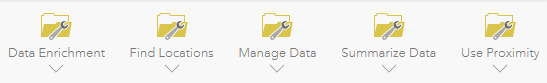
You can view your analytic in Model View. This may be a familiar sight to those who have worked with ModelBuilder in ArcGIS Pro, and it works in a similar way too. You are provided with a range of tools to analyse and explore your real-time data, including an array of geospatial, statistical and data enrichment tools.
Firstly, I want my live bus locations to appear as a feature layer. By adding Outputs > Feature Layer I can connect my feed and visualise it as a feature layer. To connect the tool with the source and receive the data schema, you can link each together by drawing an arrow to their port.
To understand bus services that are delayed, I am using Find Locations > Detect Gaps tool. The Detect Gaps tool monitors all incoming observations and reports whenever any tracks have exceeded the defined Gap Duration. For this configuration, the tool will check each individual bus every 30 seconds to determine whether any have gone more than 4 minutes without moving. I can output this filtered data by adding a feature layer, Outputs > Feature Layer.
Next, I want to visualise which buses are approaching their stop. The Use Summarise Data > Join Features tool transfers attributes from the features in one feed, layer or table to other features in another feed or dataset based on spatial, temporal and attribute relationships. In this case, I will add a new dataset of all bus stop locations in Edinburgh. Configured as a spatial relationship, this tool can calculate when a bus is within 2 meters of its stop and can be visualised in its own feature layer.
Now there’s only one step left for us to do, click start on the feed and analytic. Voila! We have ingested a feed into Velocity, performed analysis and produced an output.
Show it off
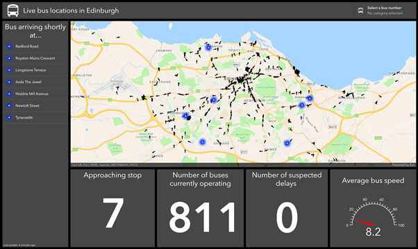
Time for the cherry on top? The ArcGIS system provides a range of products and features to show off your output. Why not enrich the visualisation of your output with a 3D basemap, or perhaps showcase the statistics and live locations of your data in ArcGIS Dashboards.
With a live web map, a few indicators and a list, this dashboard can be used to visualise real-time data as it is being received. It allows individuals to monitor bus operations, including delays, arrivals and the number of buses in operation. All these features can update as the real-time data is received, showing only the most up to date data. But remember, when visualising your feature layers in Map Viewer, make sure to set a refresh interval on the layer, so you have the most up to date data.
I hope this blog has given you a taste of what’s possible with ArcGIS Velocity, leaving you ready to explore its capabilities. What now? Well hopefully you feel ready to have a go yourself. You could use your own real-time data feed or browse those publicly available.
If you don’t yet have access to ArcGIS Velocity and are interested in exploring your real-time requirements, we’d love you to get in touch. You can reach us at sales@esriuk.com