Throughout the year, we’ve seen a handful of compelling visualisations that illustrate the true scale of COVID-19 in 2020. Esri UK recently published a data service that allowed Esri users to access UK COVID-19 data via the Living Atlas and create maps, dashboard and visualisations (read more about the data service here). To highlight the art of the possible with this dataset, I’ve created an animation to view the fluctuating patterns in COVID-19 cases across the UK, over the last 12 months. In this blog, I’ll explore the technical discoveries and cartographic decisions that were made to create the final output (see below).
Animation stuff
I’ve played with Pro’s animation features on a handful of occasions, but my knowledge was pretty limited. Therefore on this project I was definitely learning on the go, which included lots of trial and error (which was actually a great way of exploring).
Keyframes
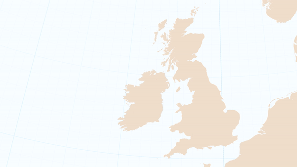
My first discovery was how important keyframes are to the creation of a time enabled animation. I had created a time enabled layer for COVID-19 cases ranging from January to December, symbolised using the dot density technique. When creating the first keyframe, you need to consider the map extent, the active layers on the map and which time period to be in. For my visual, I wanted to start back in January, so I would ensure the date is correct then add my first keyframe. Then, by dragging the time slider to the latest date (December), I would add a second keyframe. The smart element of Pro’s animation toolbox is that with only two keyframes, it will calculate the path between them both and create a journey from January to December – which looks something like this;
With the basics completed, I wanted to create a story that the user could follow without having to consume too much data in a small window. This is where keyframes really come into their own. Navigating to certain key moments on your animation (i.e the first national lockdown), allows you to add a keyframe in at this specific time. It’s then possible to introduce text (i.e. “National Lockdown”) and hold the animation for a few seconds to draw the viewers’ attention to a key event. You can control when items appear and disappear, all based on the keyframes. Definitely worth exploring as the possibilities are limitless!
Side note: the more keyframes I added, the more my computer slowed and struggled to keep up, so maybe retract the ‘limitless’ phrasing.
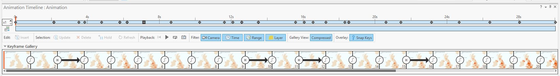
Finally, a nugget of information that would have been helpful for me to know at the beginning of this project; it’s possible to amend the layers and map extent for each keyframe after it’s been created. This saves you from deleting then recreating the keyframes any time you want to edit them… not sure why you would do that though… *sigh*. Lesson learned.
Dynamic text
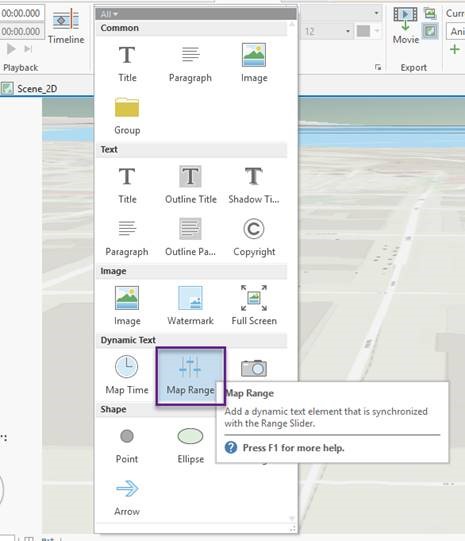
Enter dynamic text! Adding this element to your animation allows you to add text that updates with the map, such as a date field or a ‘Cumulative Cases’ counter. After speaking with the helpful animation experts at Esri, they assisted me in creating this counter using the range sliders.
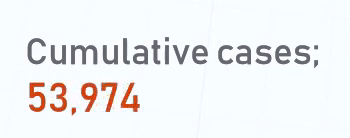
Adding this counter required a bit of behind the scenes stagecraft. I had to create a new (invisible) layer that had the daily UK cumulative case value, then switch on the Range slider (layer properties > range). Each date had a cumulative value associated with it. With the range available, I then added a dynamic text for the Map Range option (see below), which presents the range value at a selected date in the keyframe properties.
Due to the two layers being unrelated and not time enabled, I had to manually enter the range value for each keyframe to improve accuracy. Pro would calculate the path between two keyframes and animate the range value. Unless you create a keyframe for every day, it wasn’t possible to link the datasets given they were in different schemas. In total, I had 28 keyframes which ensured the ‘Cumulative Cases’ value was within reasonable accuracy of the true value on any given date, but not exact. Any time the map paused for highlight a key event, the Cumulative Cases was accurate.
Cartographic choices
As with any public facing map, the cartography is arguably the most important aspect. I might have a beautiful animation but if you can’t understand the data clearly, the map is no good to anyone. For this animation, I was aware of how much data I was throwing at the viewers over 30 seconds, so wanted to adopt the less is more cartography style to give them a fighting chance. This meant saying goodbye to roads, labels, buildings, rivers and pretty much anything that wasn’t land or sea. All achieved with a cartographers best friend, the Vector Basemap Editor. I explored a variety of basemaps, from darker to completely white, but found the sweet spot with the beige/blue combo. This allowed for the small orange dots to clearly be seen above the simple basemap. Note, when mapping something as sensitive as COVID-19 data, it’s worth avoiding using emotive colours such as bright red (connotations of death) or green (which looks like a petri dish). This is an irresponsible way of grabbing attention on such an impactful and health-related topic.
A quick play around with the fonts to keep it slick and smart, then my animation was nearing completion. The addition of the ‘Cumulative Cases’ counter helped me to avoid using a legend, as I ensured the count value text matched the orange dot colour to create a subtle legend without being a legend. Pretty meta stuff.
Blockers
Presumably you’ve picked up on a reoccurring tone throughout the blog, that I definitely hit technical blockers on this project. Blockers are natural when working with technology that’s unfamiliar – it forces you to explore alternatives and workarounds, ultimately learning from the experience. Here’s what I learned…
The dot density technique is great when you have granular data (such as the Lower Tier Local Authority data we used). However, due to the random allocation of dot locations, this can sometimes mislead people into thinking a case has occurred somewhere where it hasn’t. Fortunately, nobody can zoom in on this animation, but if you were to zoom in to rural locations, for example the Scottish Highlands, you’d notice some peculiar dot locations on top of mountains. A solution to this is to use the Dasymetric Dot Density technique, which restricts the dots to only be drawn in urban areas where people actually live. I gave this a shot, using the urban areas data to apply a mask to the dot density symbology, meaning it will only draw in the urban areas (villages, towns, cities).
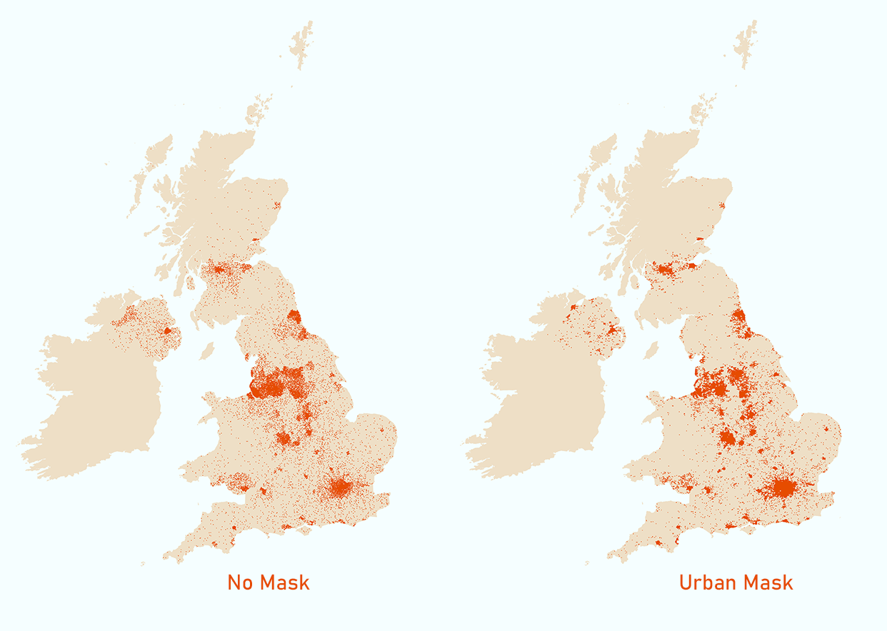
However, asking Pro to draw thousands of dots in fairly complex polygons guarantees some pushback from the machine (it sounded like it was about to take off). Even on a virtual machine, this process was time consuming and didn’t look very promising given the quick turnaround time I had aimed for. So whilst possible, this process needs lot’s of power and even more patience.
I hope that was a useful overview for the ins and outs of how this animation was built. I have nothing but complimentary things to say about Pro’s animation capabilities, so encourage you all to explore the toolset using the newly released COVID-19 service on the Living Atlas. I’ll be intrigued to know which direction you explore with the same dataset and tools…