Mapping your data tells a visual story. But sometimes it feels like you’re only getting a chapter, or perhaps the first book of a semi-successful trilogy. Trying to present lots of data, or data with many relevant attributes, gets cluttered quickly. The information overload might have your viewer losing the plot, so to speak. How can we present everything we’d like to, in a digestible format that guides the end user through the narrative?
Pop-ups.
Available across the ArcGIS system, pop-ups are a key part of your GIS’s information delivery, allowing you to define what and how the information is delivered about point(s) of interest ad hoc. Whether you’re designing pop-ups which pull together specific attributes across multiple features, along with charts to visualise them, or providing a summary table with calculations performed on the fly, there’s a power in pop-ups.
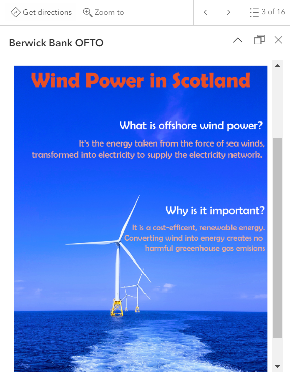
Let’s go through how you can make the most of them. If you’d like to follow along, check out our sample map here. The map visualises wind farm sites and OFTOs in varying stages of development within Scottish waters, using data from Crown Estate Scotland.* Selecting a feature brings up a pop-up with eight options to toggle between. Each option highlights a different capability of pop-ups that we’ll be going over in this blog. To learn more about how each was built, select the appropriate layer and open the Pop-up tab on the right panel of the screen.
*The datasets contain public sector information, licensed under the Open Government Licence v3.0, from Crown Estate Scotland. The terms of this licence are provided more fully here.
Starting up
The default pop-up in ArcGIS Online’s Map Viewer looks like this:
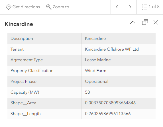
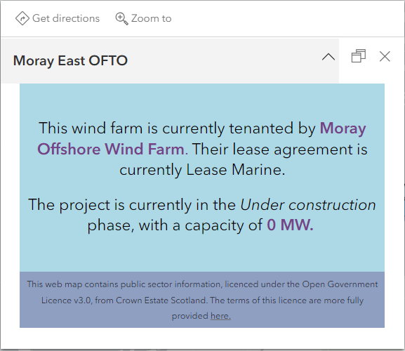
It’s thorough, providing all of the dataset’s attributes. However, you might not want everything all at once, which is where customisation comes in handy. Simple changes make your pop-up much more readable, like this:
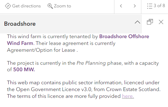
Or, for something more colourful, this:
What can we show with pop-ups?
Using the Pop-up element, you decide what information to show and the best way to do so. It gives you control over both style and content, with options to embed fields, charts, images, text, Arcade and alter their formats.
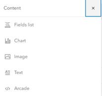
Different pop-up content options in Map Viewer.
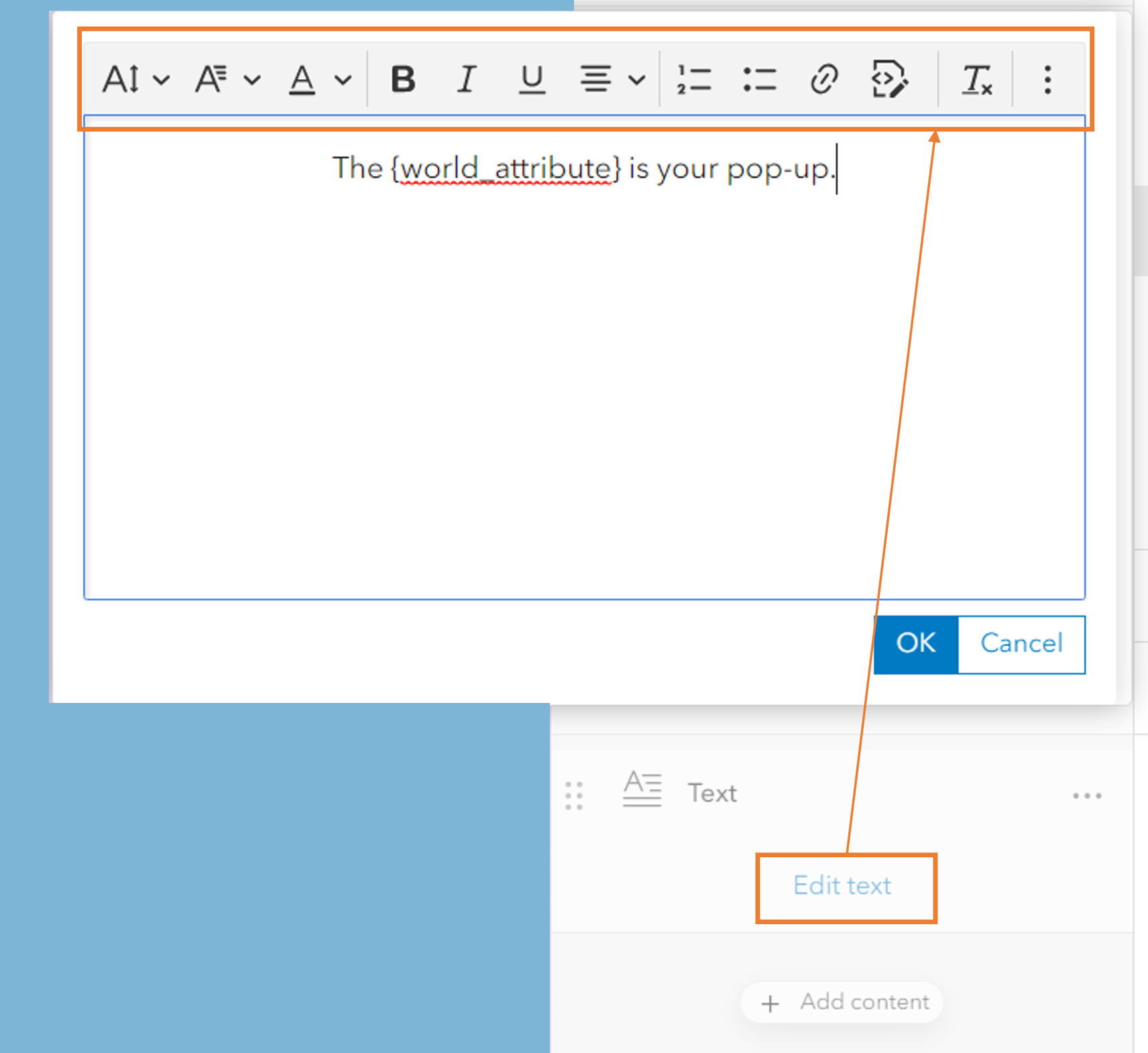
Start building your pop-up by adding an engaging title and introductory text. Insert {curly brackets} around specific field names to bring in dynamic text which auto-populates as the end user selects a feature of interest. Once you’ve added in the relevant information, play with font colour, type, size and more for an easy to read visual.
And if you want the end user to be able to explore further, this is a great opportunity to use hyperlinks referencing your organisation.
Customisation tools available to make the pop-up best suited to your needs.
Level up your pop-up with visuals
Pop-ups aren’t just about formatting information from what’s already there. They also give you the freedom to communicate in new ways, like through images, tables or charts.
Images
Pictures are worth a thousand words, letting users vividly imagine the point of interest or help verify a location. If you have one image to go across all of your pop-ups, like a safety infographic or supplementary map, insert its URL into the Image configuration window. For images that are feature-specific, they’ll have to be stored in an attribute table. You can then pull them through using the {photo_field_name} containing the images.
An educational infographic to go across all of my pop-ups.
Tables
You can display feature data in a table through the Fields content element or build one using HTML. I prefer the latter simply because it provides a more modern appearance but go with what suits you. They will convey identical information, just in different ways.
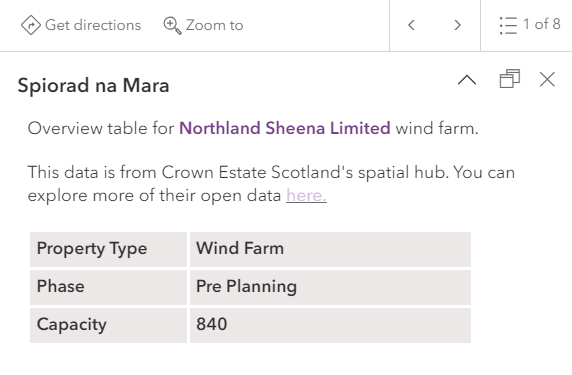
An HTML-made table to display attributes from a feature.
Charts
Charts are another meaningful way to represent your data. This tutorial explains how to configure a Chart content element in detail. My key takeaway from this is that different charts have different purposes, and that you can colour your charts with distinct colour ramps – neat!
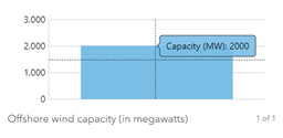
The default display for pop-up bar charts.
While this shows what the megawatt capacity is for the wind farm selected, it doesn’t tell me how this compares to others. If only there were a way to bring in the data from other features… this is where Arcade is particularly useful. Using a few lines of code, we’re able to bring in the entire feature set into our bar chart for a more complete overview of wind power capacity.
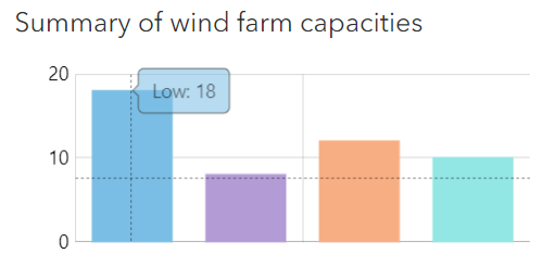
A bar chart sorting and counting the wind farms by capacity range.
Oh the places you’ll go with Arcade
There is simply so much you can do with a little lingo in Arcade! For on-the-fly calculations, consider using Arcade. This lightweight expression language lets you reformat data, perform operations and access data from other layers, along with much more.
Reformatting your data
Sometimes data is uploaded in different formats, such as having feature names in ALL CAPS, or perhaps a number with too many decimal places. These are easy fixes in Arcade, especially if you know where to find them. I’ve listed some common functions that I often use below, but you can find more comprehensive lists here and here too.
- Proper() – redefines how to capitalise text strings. One common use is transforming ALL CAPS titles into normal case.
- Round() – rounds a number value to a specified amount of decimal places.
- Trim() – removes unnecessary spaces specified from the beginning or end of the text.
On-the-fly calculations
Arcade can pull, calculate and relate data from multiple layers. This blog goes over the process, so I’ll let you explore for yourself!
You can use Arcade for on-the-fly graphics too. Along with the bar chart we made earlier, Arcade can build or customise other media elements like pie charts and progression meters. The ArcGIS Developers page is a great resource for sample code to help you get started.
Workflow for creating a progress chart in a pop-up, from the expression, source code and final visual.
Aesthetics with HTML
For the aesthetic side of things, I’ve provided a few of my favourite uses of HTML. HTML, hypertext markup language, is used for structuring web content, including polishing up your pop-ups. Access your pop-up’s source code by selecting this icon:

Background colours
While you can’t change the colour of the white box containing your pop-up information, you can work around the white by creating coloured rectangular buffers to encapsulate your text. You just need to specify the rectangle size and hex code.
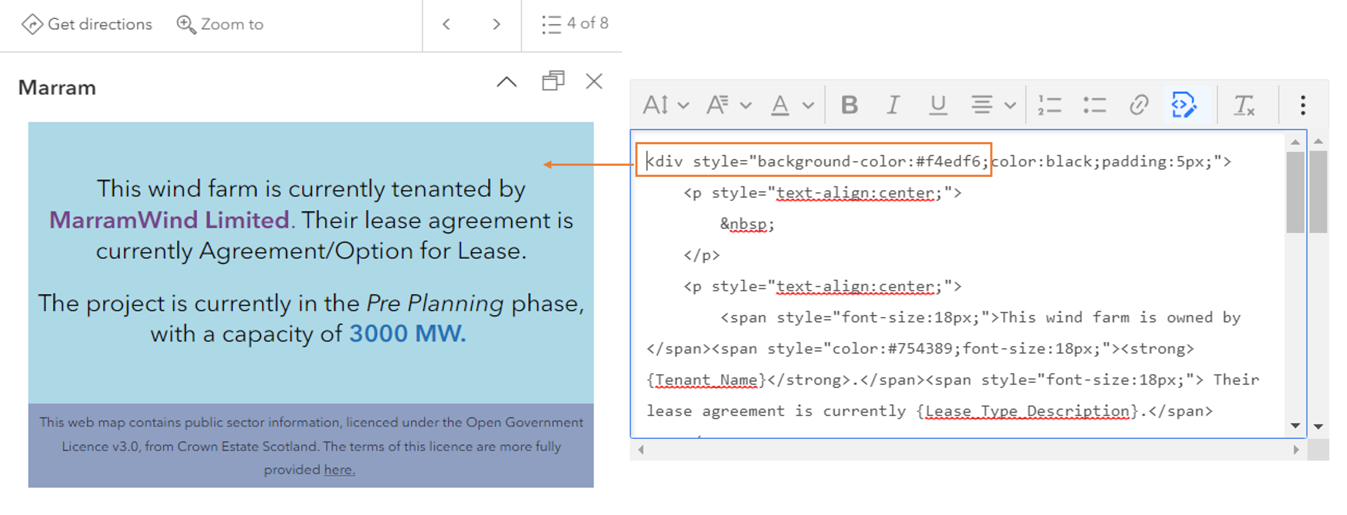
Specifying a hex-code within the source code allows me to have this blue-on-blue display.
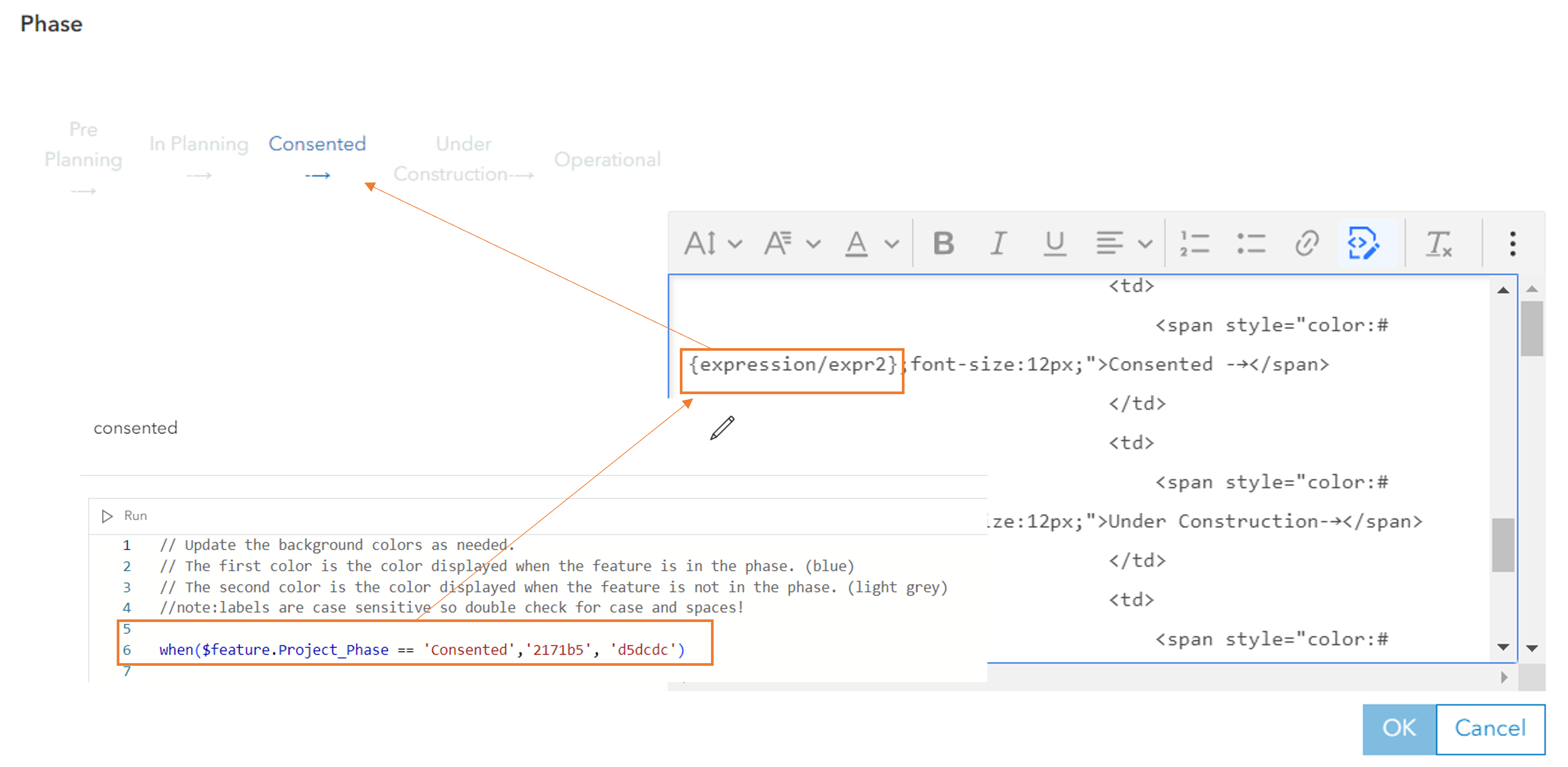
Dynamic coloured text
Convey your text’s meaning immediately through dynamic colours. Matching text to the attribute’s symbology is a quick way for the reader to relate the map and corresponding pop-up. This uses the dual approach of an Arcade expression plugged into the source code. Once you’ve written your expression, it’s a matter of having the pop-up retrieve it from within the underlying HTML. In this case, displaying the megawatt capacity text in the same blue hue as its grade on the colour ramp.
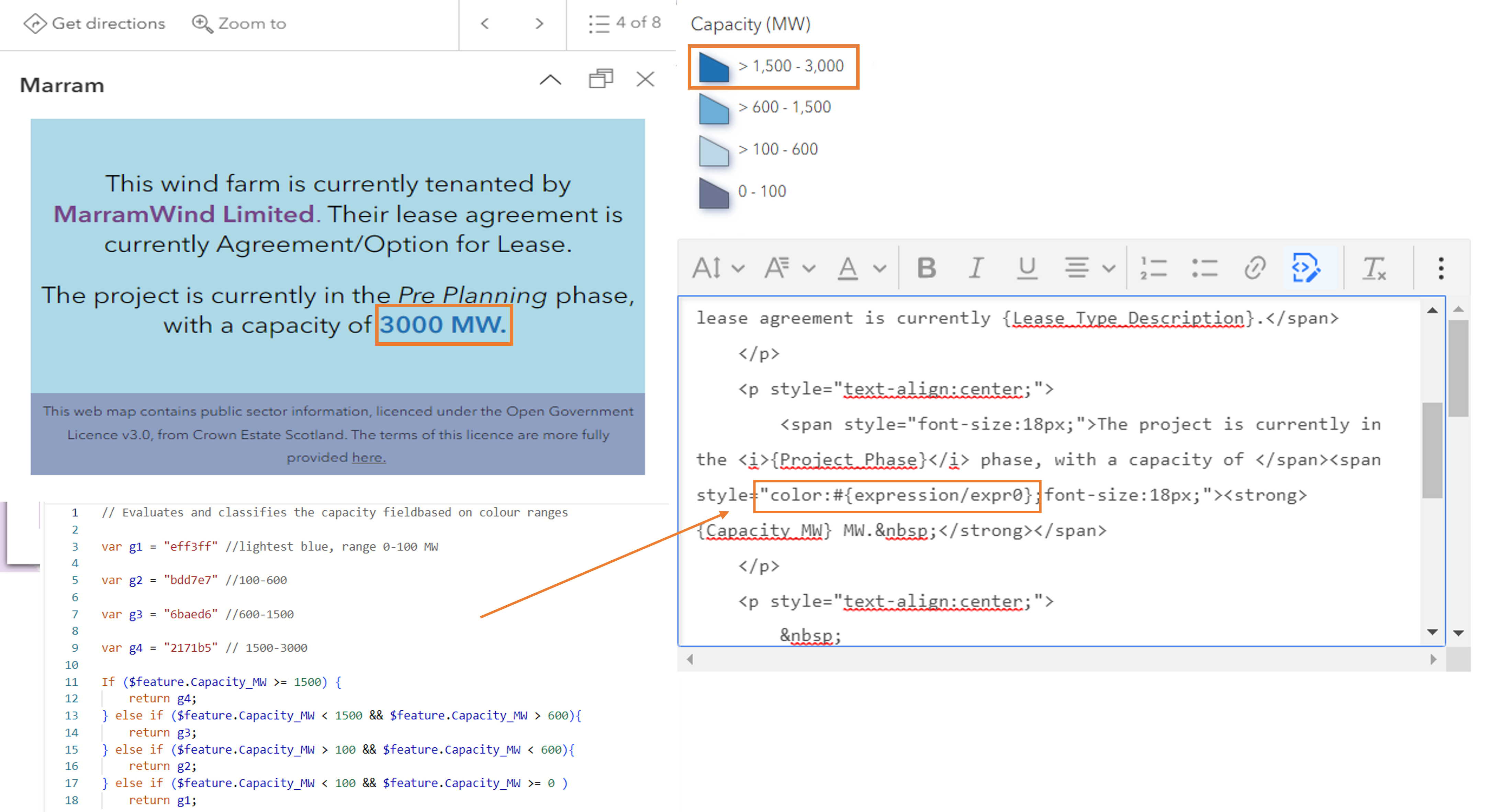
The expression assigning hex codes to megawatt ranges, where it sits within the source code, and how it’s displayed within the pop-up window.
There’s lots more HTML you can use for behind the scenes, like trialling font families. Just keep in mind that it must be supported by the ArcGIS framework. If it isn’t, the code you write will be scrubbed before saving. So, unless it’s spring cleaning, check before your code disappears. Or, try this workaround.
Resources
Hopefully this blog has left you feeling inspired to redesign your pop-ups. Here are some additional resources to help you get started. If you’re looking for even more ways to improve your pop-up, did you know that you can send emails directly from them? I’ll leave you to explore these and any other ideas that… pop-up. Happy mapping.
- Our sample map
- Feel free to make a copy for later reference
- Pop-up basics
- Understanding text elements, and colour text elements
- More on charts