Beautiful cartography, effective labels, elegant styles – a lot of time and effort goes into creating maps. But we shouldn’t stop at the maps we create. A well thought through app design isn’t just about making something ‘pretty’, it’s about capturing your audience’s attention, aligning with branding and considering a design that supports the map you want to share.
In ArcGIS, we have a set of web app builders to ensure you are fully equipped with the necessary tools and capabilities. To understand these different app builders, I recommend watching the Configuring the right kind of app for your map session from our Annual Conference 2023.
In this blog, we are delving into design. Specifically what design choices each app builder offers in being able to add branding into your apps that align with your maps. So, what are we waiting for!
ArcGIS StoryMaps
Take a look at the ArcGIS StoryMaps Gallery and what do you notice? They’re all unique, right! That’s because this app provides you with a variety of tools to make sure you’re creating a story that’s truly your own and is sure to catch the eye.
This is all thanks to a Story’s Theme. These define everything from a Story’s background colour and typography to recommended accent colours and default basemaps. ArcGIS StoryMaps offers 6 pre-built themes for you to apply to your entire story with just one click. The Featured Theme Gallery (Beta) also offers a library of professionally designed themes for you to choose from.
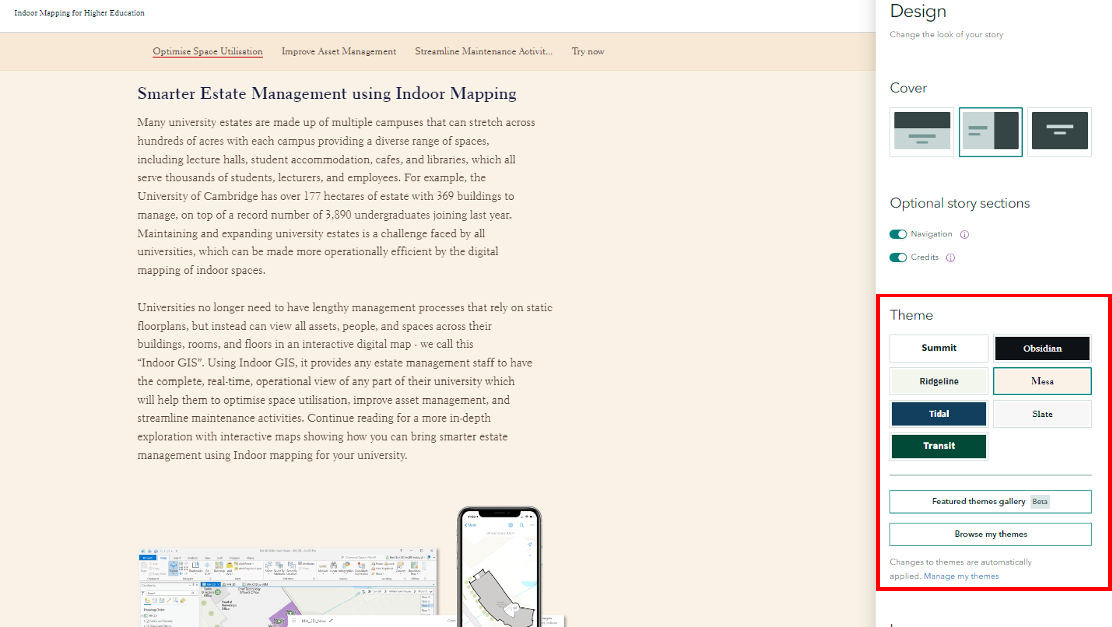
A glance at all the preset Themes ArcGIS StoryMaps has to offer which can be found in the Design tab.
While these are great to kick start your Story creation, the best way to truly put your stamp on your Story is to create your own theme. With the Theme Builder, you can dig into every element of a Story so let’s point out a few of those key elements.
Colours
The Theme Builder offers a colour picker for you to find the perfect hue for your Story’s background, header, font, accents and more. Play around with the colour ramp or if you have a specific colour value in mind (hex colour) to align with branding, you can add it straight into the text box. As you’re choosing your colours, the built-in Contrast Checker tells you whether or not your choices hit the recommended contrast ratio. This leaves you feeling confident they’re not only aesthetic but also meeting accessibility requirements.
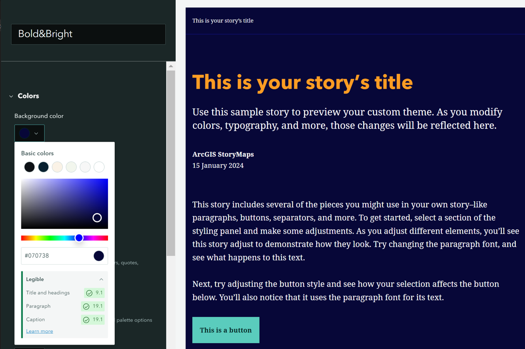
The Contrast Checker in action, assessing contrast ratios at multiple text scales.
Typography
We all have a favourite font, or at least I do. In the Theme Builder, you can choose the default font for your Title, Headings and Paragraph formats. You can even upload Google Fonts into your Story for those like me who can’t resist their favourites.
Not forgetting you can also add your organisation’s logo, play with the design of Story elements, define default basemaps and much more. I really encourage you to dive into the Theme Builder and just have fun creating something that suits you! Don’t forget, you can make as many Themes as you’d like. Themes can be stored in your very own private Theme library, shared with specified groups or shared with your organisation to help keep everyone’s stories on brand. Learn more about sharing Themes here.
ArcGIS Instant Apps
With the name ArcGIS Instant Apps suggesting rapid app creation, people often overlook this app builder in terms of design choice options. Well I’m here to tell you, think again.
In terms of design, with the Express tab turned on, you can choose from preset themes like Forest, Ocean, Soil and Street. However, hidden behind that Express tab is a creative mind’s delight where you can step outside those pre-defined themes. You can access a colour picker for choosing the exact hue for your Background and Text elements, along with a built-in contrast ratio check to ensure it meets contrast guidelines.
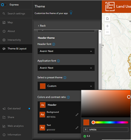
Font customisation options in ArcGIS Instant Apps, again showcasing the handy Colour Picker!
You can also define the font that your app will apply (shown above), as well as adding your own logo, further aligning with your brand.
ArcGIS Dashboards
ArcGIS Dashboards offers a really impressive selection for defining your specific design and colour scheme. Found in the Theme tab of your Dashboard configuration, you can specify the exact colour and hue to be applied to all Text, Dashboard background colour, Element background, Element outline, Tab border colour, should I go on? One thing to note, unlike other app builders, Dashboards doesn’t yet offer a contrast checker, so it’s important to choose highly contrasting colours. This is crucial not just for accessibility but for considering those who may use your app in low-light conditions or field use.
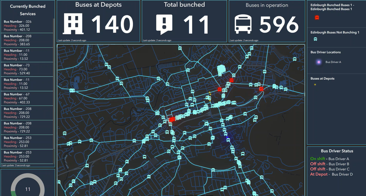
Just one example of customising your app to compliment the design choices of your map.
Not only can you define colours in the Theme tab, you can override the default for specific Dashboard elements. Perhaps you want the text colour of your Indicator to match the colour of its relevant data in your map? By going into individual element settings, you have the opportunity to format your text elements directly within the item template and override the colour of the element itself.
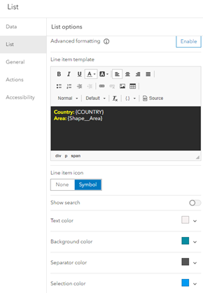
Here’s what it looks like to format your text directly in the app builder.
Here’s a tip for you. While you can’t specify exact hex colours directly in the text elements, in the Advanced Formatting tab, you can add your hex colours directly into the script. You can even take it one step further and define specific colours to specific values. For example, I might want the background colour of my dashboard element to turn red once the value is above a certain threshold.
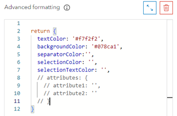
And all you need are your desired hex codes and the knowledge of where to put them!
Check out what’s possible with advanced formatting in Dashboards in this documentation.
ArcGIS Experience Builder
With the extensive configuration options available in ArcGIS Experience Builder, it’s no surprise that there are endless options for adding your own design and identity to the apps you create.
Firstly, it offers five different preset themes for you to easily apply to your apps with one click. This will change the colour and appearance of your widget elements but doesn’t affect the layout and content of your app. As well as this, you can dig into the properties and appearance of individual widgets in the Style tab. Here you can change the widget background, border, box shadow and, for some widgets, you can fully customise text font and colour and other visual elements.
Although, not all widgets let you configure the Style Tab. To combat this, head over to the Theme tab and select Customise. Once you click Advanced Colour Setting, you’ll see eight colour ramps. These are the colour sets defined to your app’s theme. To learn which each of these colour ramps represent, see this documentation. Clicking on the theme colours at the top of each colour ramp opens up a colour picker, allowing you to choose the exact colour and hue and even lets you directly input your brand’s hex colour. Once you start playing with these theme colours, you’ll notice even those pesky widgets that don’t let you edit the style will now align with your colour scheme and branding. Hooray!
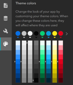
All the colour ramps at your service in ArcGIS Experience Builder.
Get creative with colour and get your apps on brand
Hopefully this blog has shown how you can splash some colour into your creations and add your own organisation’s branding into not just your maps, but your apps too!
Here are some resources you may find useful for digging into the design and getting creative with your apps:
- Create a standout story with ArcGIS StoryMaps’ design panel
- Choosing the right colours for your dashboard
- Mapping with Accessibility: 8 key hacks to map with confidence
- Instant Apps theming tools – It has never been easier to add colour and branding to your apps
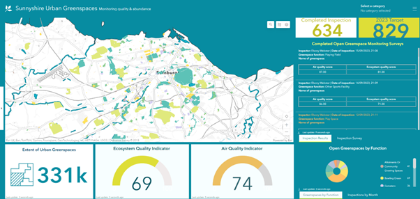
If you’re still after some inspiration, this unique Dashboard shows the many ways you can brighten your apps and add your own unique branding. This was created for our Scottish Conference 2023 and you can catch up on the recording here.