There are an estimated 300 million people globally who suffer with colour vision deficiency (CVD), equating to 8% of the male population and 0.4% of the female population. Easily distinguishable colours such as red, green and blue, can appear extremely similar to those with CVD, making it difficult to interpret a map – something often overlooked by those without CVD!
The bright, multicoloured maps we are so used to creating cause many difficulties for those with CVD as colours merge together, making reading maps much harder. Without considering colour blindness when creating maps in ArcGIS Pro, their accessibility could be greatly limited. It is important that there are tools available to increase the accessibility and use for those with CVD.
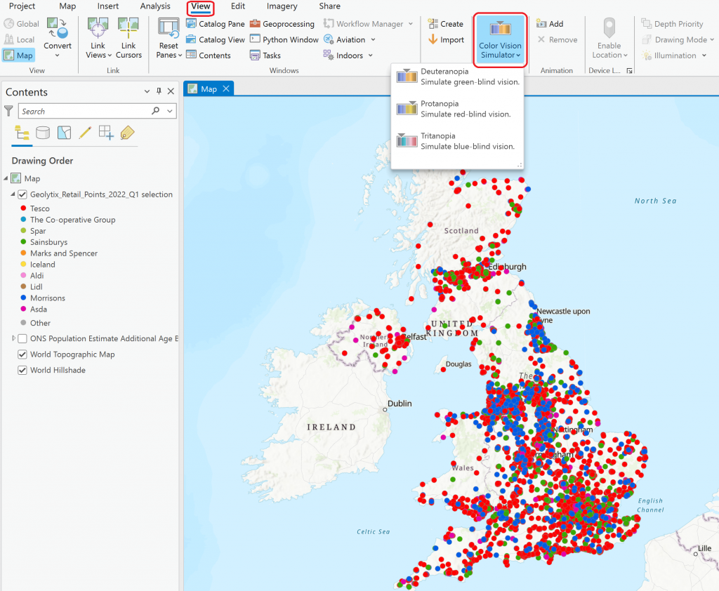
Color Vision Deficiency Simulator tool
In the latest update of ArcGIS Pro, version 3.0, the Color Vision Deficiency Simulator tool was introduced. This tool allows the user to visualise how a map, layout or report would appear to those with CVD. The tool simulates the map in all three CVD forms – Deuteranopia, Protanopia (red-green blindness) and Tritanopia (blue-yellow blindness). By using this tool, we are able to make symbology alterations and symbolise our maps with CVD in mind, changing traditional rainbow styles to colour-schemes suitable for those with CVD.
To use the tool navigate to the View tab and in the Accessibility group, click the Color Vision Deficiency Simulator drop-down list. You can then pick from the three CVD forms to visualise your map.
Creating maps suitable for CVD
To demonstrate how this tool can be used effectively to make your maps and reports more accessible, I will run through an example using data available from the Living Atlas. The dataset is a point dataset, provided by Geolytix, showing the locations of different supermarket chains across the UK. This data is freely available so you can follow along yourself! More information about this dataset can be found here.
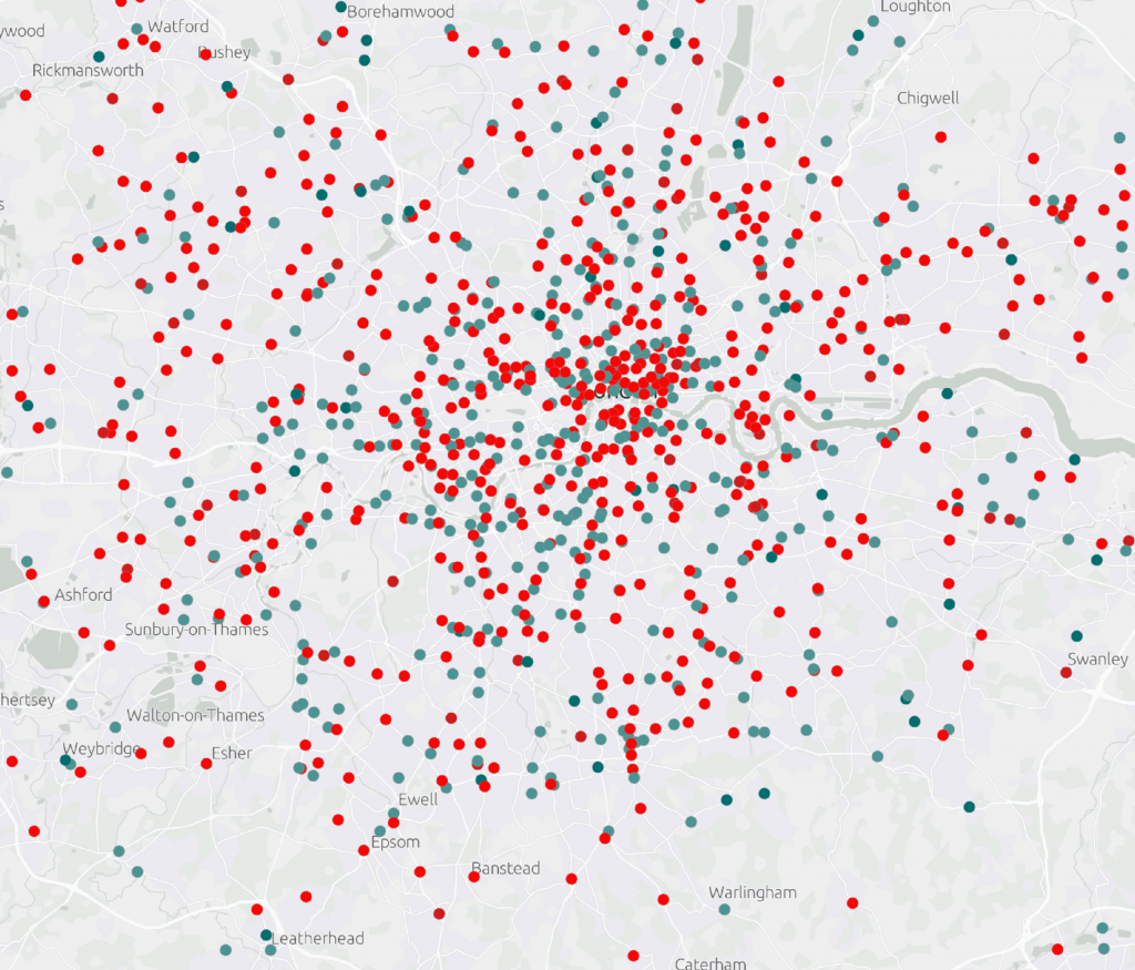
Firstly, I selected four supermarkets to display (Tesco, Sainsburys, Asda and Morrisons) and then focused in on the Greater London area, symbolising the map how I typically would with 4 distinct colours (red, green, blue, and pink).
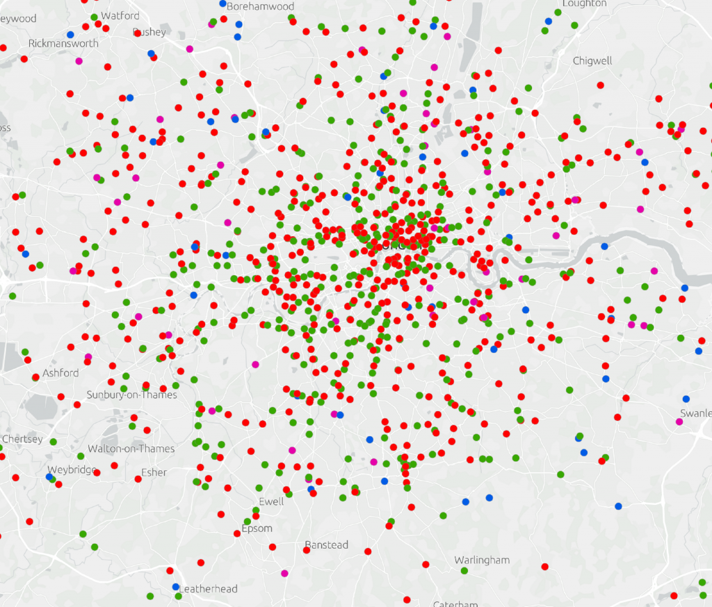
To someone without CVD, this map is very clear and easy to interpret – no troubles there! But now, let’s use the Color Vision Deficiency Simulator tool to look at how this same map would appear to someone with different forms of CVD:
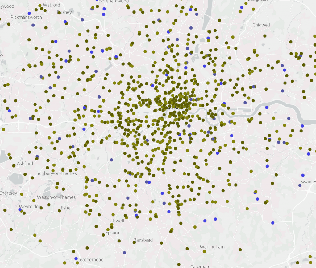
Deuteranopia (red-green blindness)
To someone with Deuteranopia, the map looks very different. The bright and distinct colours are replaced with dull colours of a similar hue. The red and green points become hard to distinguish, both visualised as dark green. The pink and blue points are also a very similar shade of blue. Not easy to interpret…
Protanopia (red-green blindness)
A similar issue is seen when the map is visualised as Protanopia – again, red and green are difficult to tell apart, as are pink and blue.
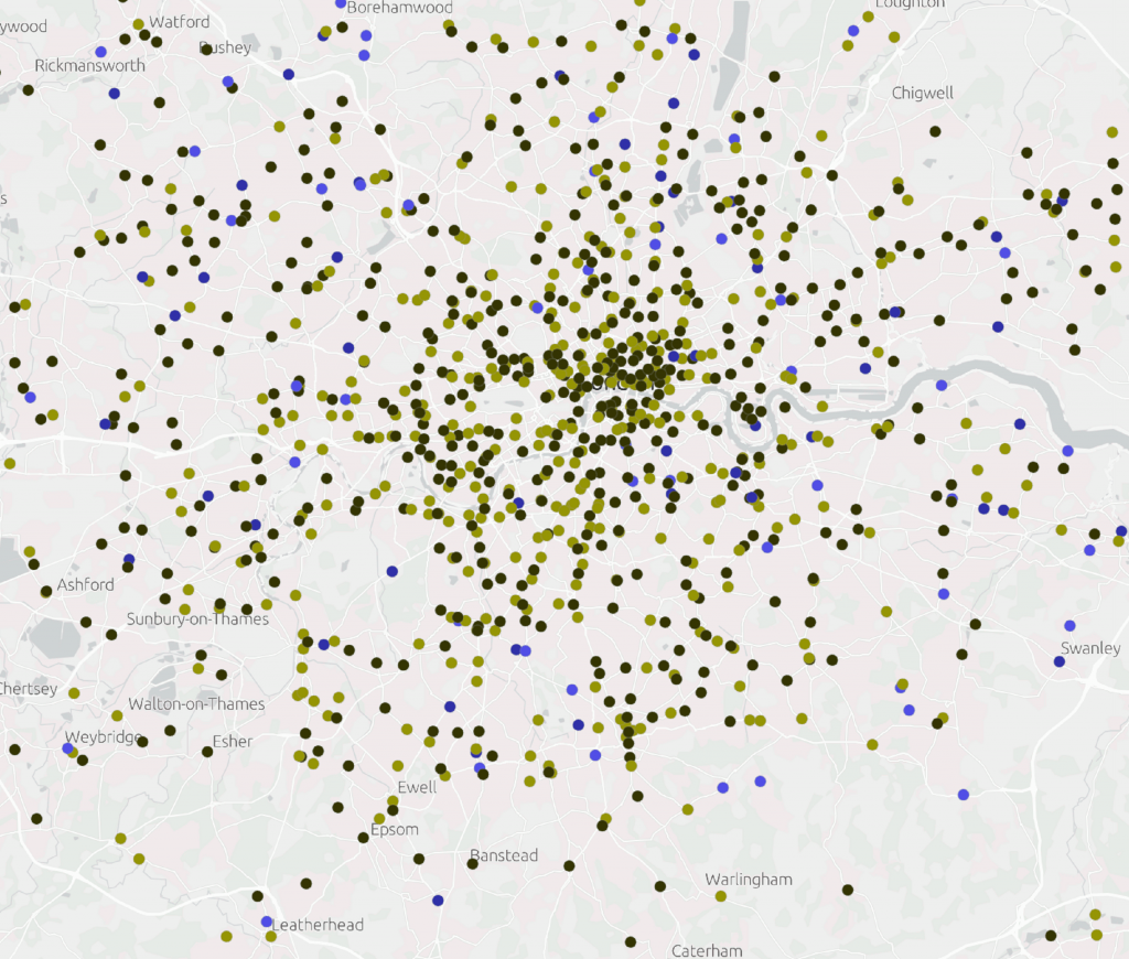
Tritanopia (blue-yellow blindness)
When the Color Vision Simulator tool is set to Tritanopia, we can again see that the original rainbow symbology is not suitable for this form of CVD. With Tritanopia, it is hard to distinguish between red and pink and also between blue and green.
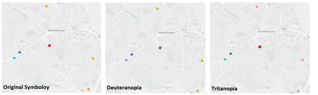
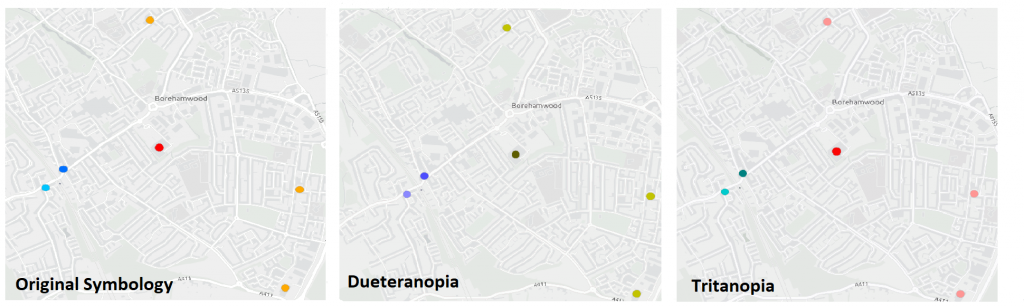
To show this in more detail, I have zoomed into the area of Borehamwood. Using the original symbology, we can see 4 distinct colours. After using the Color Vision Deficiency Simulator to view our maps, the ability to distinguish between the colours is greatly reduced, particularly for those with Deuteranopia and Tritanopia. It’s clear that the original colour scheme is not suitable and so changes need to be made.
Increasing accessibility by altering colours
Following this, I wanted to try out some different colour schemes to find one that can be visualised by all three forms of CVD, being more consious of my colour choices. I knew that avoiding red and green and including different shades of the same colour is better suited for those with CVD. There were also no issues distinguishing between blue and red, so I can safely assume that these colours can be included in the map. As a result, I decided on a map symbolised using two shades of blue, red and orange.
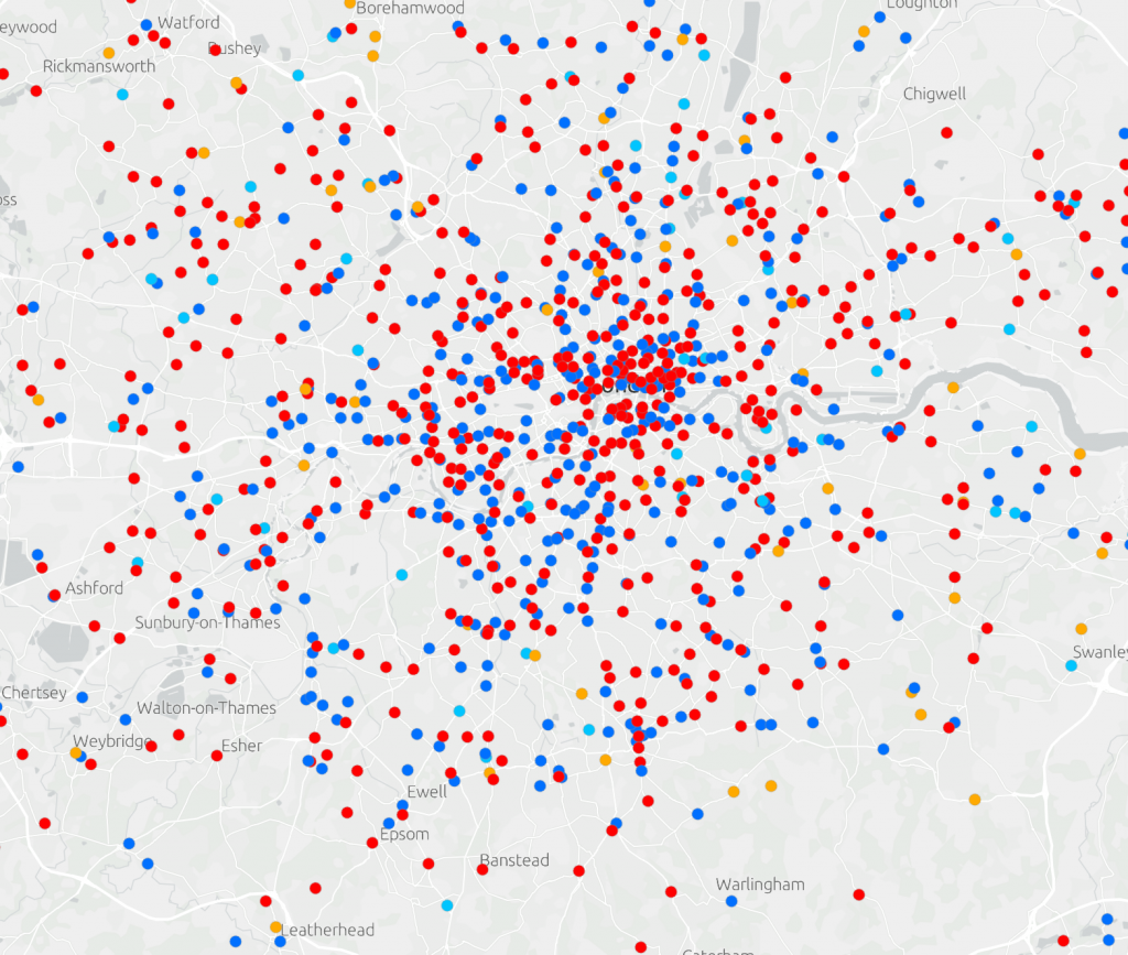
Now for the important part – let’s test it using the Color Vision Deficiency Simulator tool. From the images below, we can see that this colour scheme works for both red-green (Deuteranopia) and blue-yellow (Tritanopia) colour blindness! 4 distinct colours can be identified, all easily distinguishable from each other.
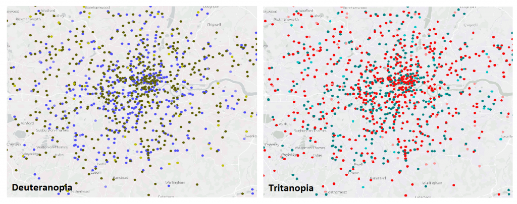
Again, if we zoom into the area of Borehamwood, 4 colours can be easily identified meaning this map can be interpreted by someone with CVD.
From using the Color Vision Deficiency Simulator tool, we were able to change a map that was initially not easily read by those with CVD, to one that could be clearly understood. It became clear that we should avoid reds and greens, and instead focus on including different shades and hues. The Color Vision Deficiency Simulator tool is a real step forward in accessible mapping and means CVD friendly maps can be whipped up in minutes! I encourage you all to try out this tool yourself and we can all be more conscious of the accessibility of our next maps.
Interested to find out more about this topic? Explore our accessibility resources or even check out this handy blog about going further into mapping with accessibility in mind.