We are eagerly awaiting the new Map Viewer coming out of beta – planned for the Spring ArcGIS Online update. I’m sure lots of you have already taken the beta for a spin to see what cool new features you get for your web mapping, but I thought I’d take you on a tour of what’s coming…
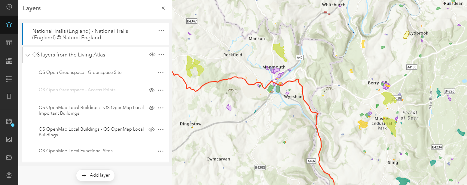
Group layers
This may well be the most asked for feature in web maps, but they are coming. Add a layer to a group, rename it and drag the other layers in… that simple.
More mapping styles
We’re all familiar with using colour ramps to show relative value differences for data attributes in a map. The new Map Viewer gives a much bigger library of colour ramps to use, so we can better fit the symbology of our data to the rest of the map contents. They are categorised by use case and it’s great to see colour blind friendly as a filter for colour ramps in the dialog (see below). I’d have put that one at the top of the list to remind us all to consider it first.
The above and below mapping option is taken to another level with the ability to combine colour and unique symbols to emphasise the values above or below a threshold. For the new Living Atlas UK earthquake data I’ve been looking at I set the threshold to magnitude of 2 – it defaults to the mean value and you can either slide the bar or double click on the value to set your own value.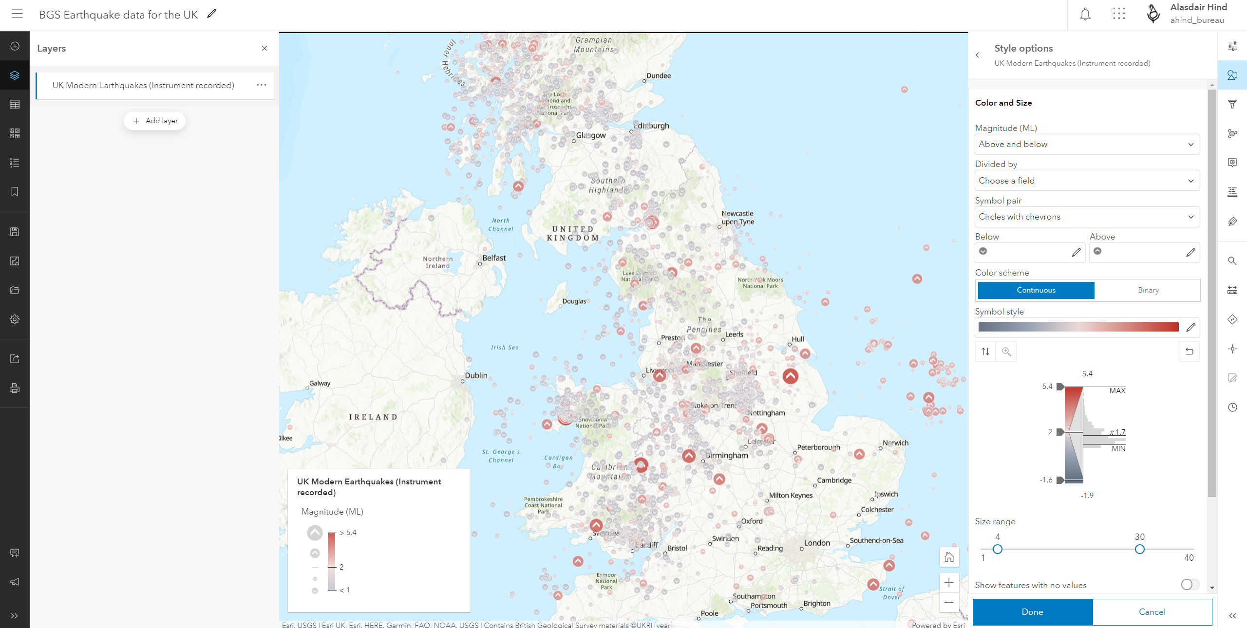
Presenting data sets that have multiple attributes in a map has always been a challenge. For a project looking at employment patterns, I used the predominant category option to highlight regional dominance. But every map style has its drawbacks and this was giving me a first past the post visualisation. Enter dot density mapping. Switching to the new Map Viewer allowed me to create a more nuanced map that visually represented the runners up too: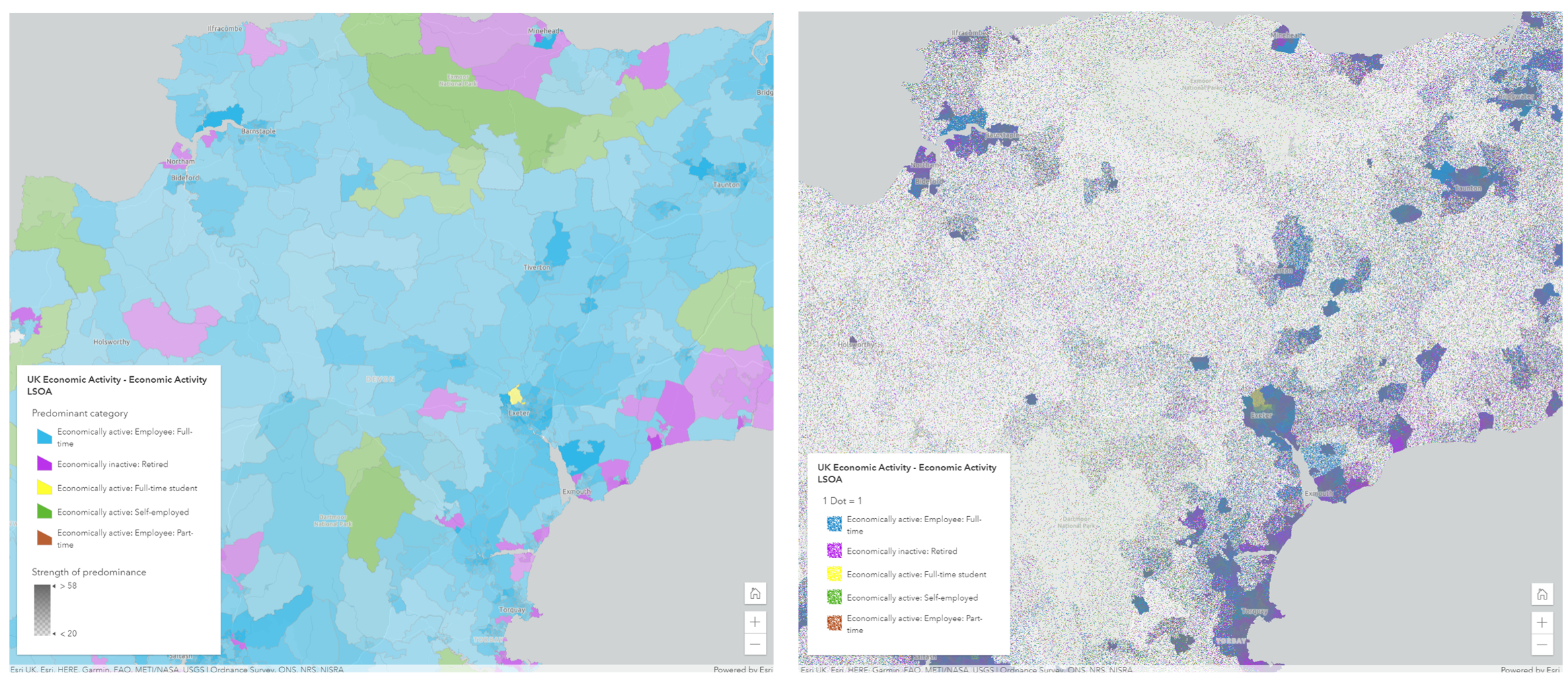
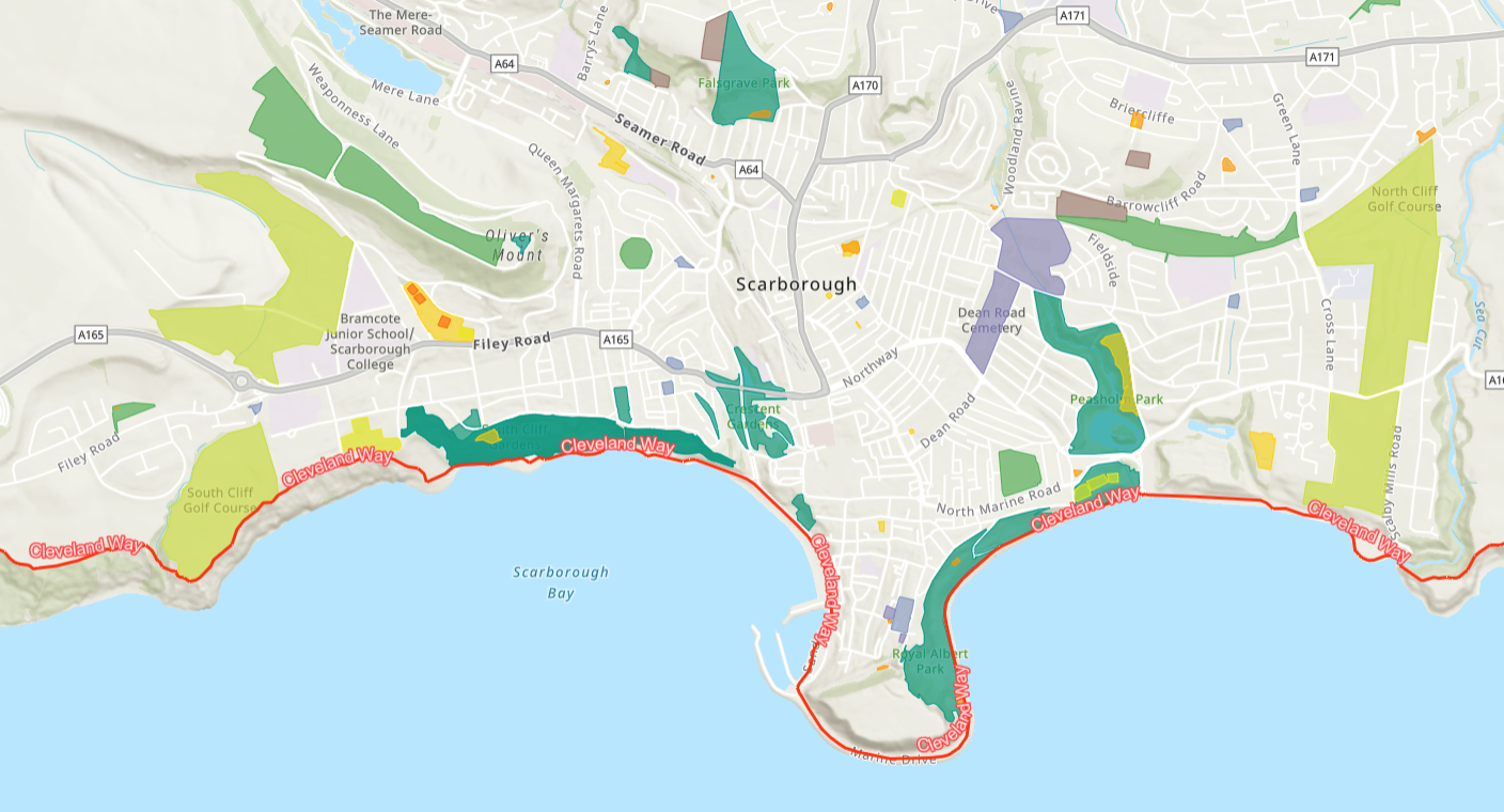
You can explore these maps interactively here, along with more thoughts on the choices.
Lots of label options
The new Map Viewer makes setting up effective labels really straightforward. As well a much bigger library of fonts, you can also set up multiple label classes. Each label class has its own visibility range, its own style, and its own optional filter. In the example below, I used these to add labels that use Arcade to round the target attribute and then show the rounded value at different sizes above and below a threshold value – half the population in full time employment: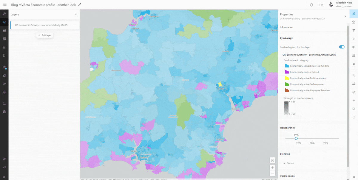
Every change you make instantly updates the labels, so it’s quick to spot that the yellow halos are a bit overkill and revert to something more subtle.
I used the same attribute in my label classes, but you could have different information visible at different zoom scales. So many options and although performance may become a limit the instant feedback makes it easy to spot if you are going too far.
Save at a fixed scale
When you save a web map in the new Map Viewer you get the option to save at a fixed scale. Imagine you carefully set up your layer visibility ranges and your labelling to be nice and clear when you open the map on your monitor. You save it and take it out and about in an app on your mobile. When you open it at the saved extent half the layers are hidden because the scale has changed. Not anymore – or at least it’s now your choice.
If you’re using a rotated map view – yes you can rotate your seaside maps – you can even set it to save the rotation.
Eye popping pop-ups
Pop-ups are an integral part of accessing information in web maps or apps. In the current Map Viewer there are options to customise a pop-up, but it becomes so much easier with the new Map Viewer. It’s really easy to choose what attributes to include and what they are called.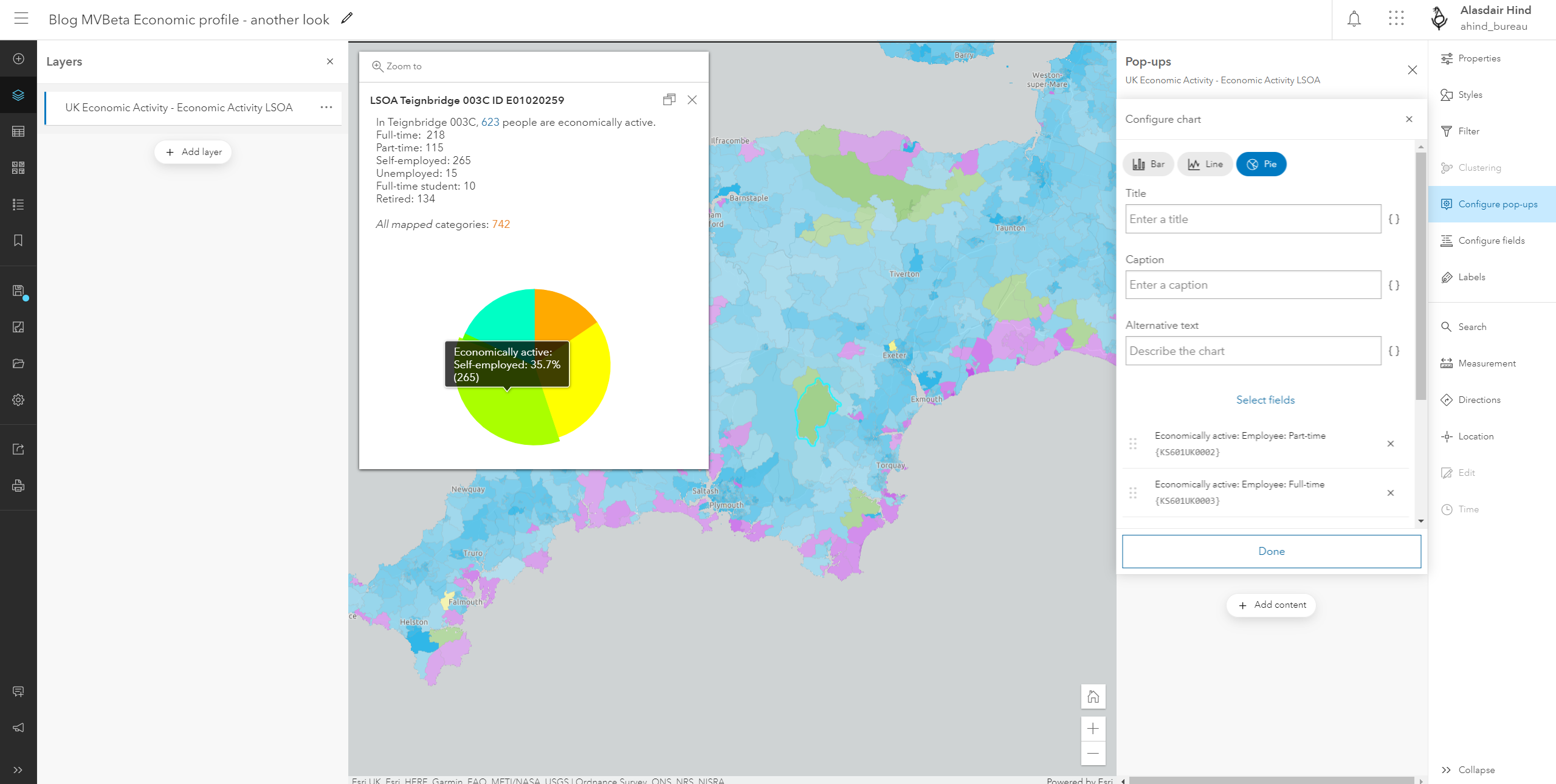
You can of course create Arcade expressions to enhance your pop-ups. In the example above the All mapped value is a simple sum of the fields shown in the pop-up and is used for the predominant colour symbology.
Oh, and if you have a layer with attached images it will default to including an Attachments Gallery, that displays the images in the pop-up and in the right orientation. Ta daaa!
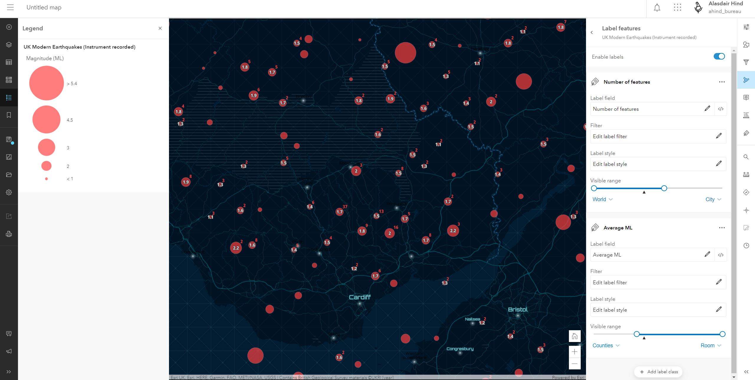
Cooler clusters
Clustering is a great way to dynamically aggregate incident data. The Clustering tool in the new Map Viewer gives us a lot more flexibility and control over the information available for the clusters. If you have an attribute-based symbology set for your layer, this carries through to the clustering. In the map of recent earthquakes below the symbol size is indicating the magnitude of the earthquake. With clustering active, this becomes the average magnitude for the earthquakes in the cluster. The cluster pop-up defaults to showing the number of features and the average for the key value. You can then set up labelling to show the information you need. I’ve got it showing the count for the cluster in red and the average magnitude in white (though I am wary of averages as they can easily mask the true data range).
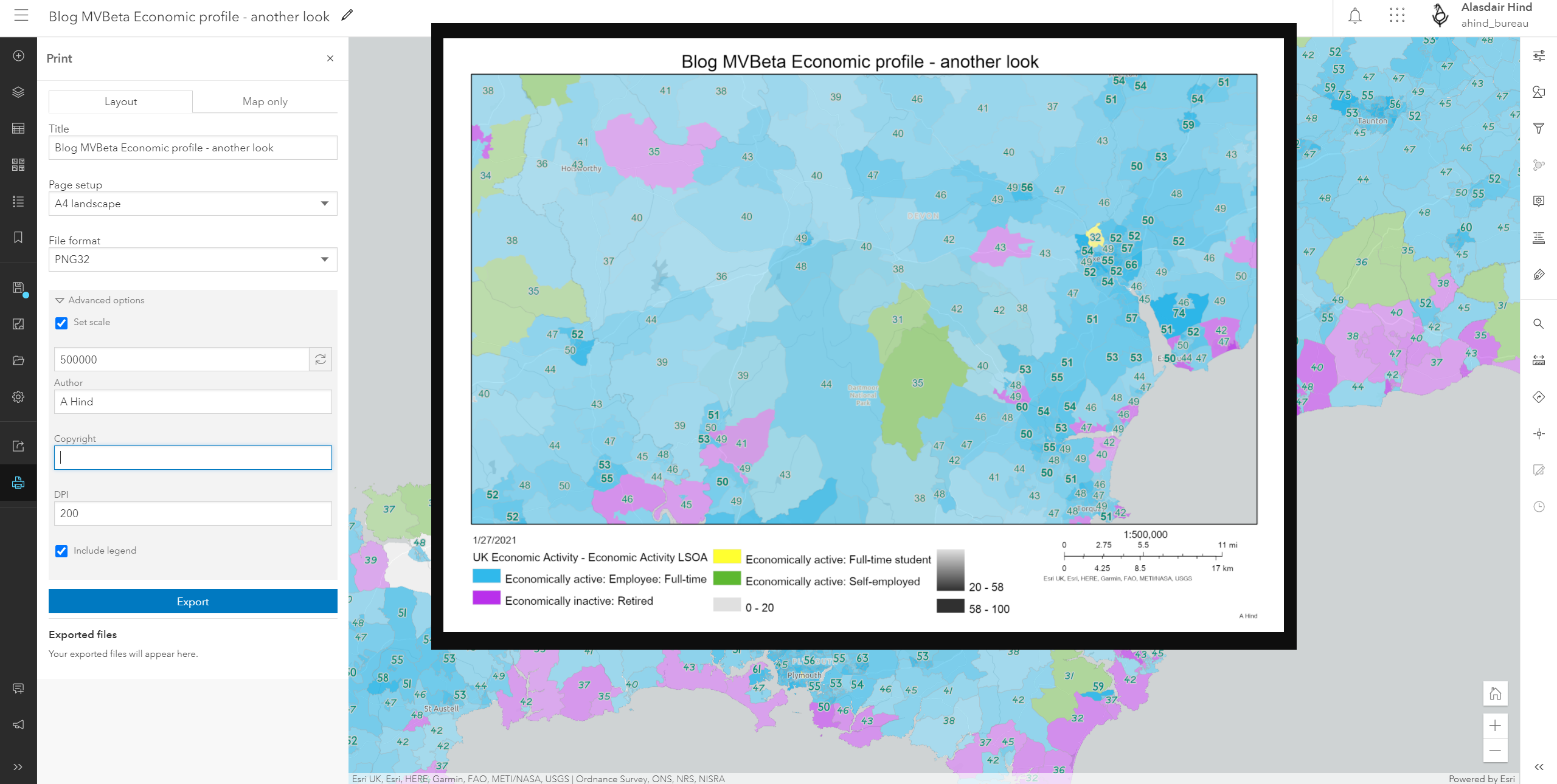
Pretty good printing
Web maps let our users access an up-to-date, interactive view of our data but sometimes we still need to share our maps as images. I’m sure I’m not the only one that’s resorted to cropping a screenshot of a web map. No more… the new Map Viewer gives us a print tool with a choice of a simple Layout and Map only mode. For the map only option choose the format and dimensions – with Advanced options to set the map scale and DPI. If you want to use a layout, there are A3 and A4 options for portrait or landscape. The Advanced options for layouts add Author and Copyright text options and the ability to include a legend. The inset image below is the output from the print options shown:
Step cautiously towards better mapping
I’ve shared lots of the goodies that the new Map Viewer brings but before we all rush off to dot density map the world, there’s a cautionary note. The new Map Viewer is built on the JavaScript 4 framework and some of the new features (like dot density maps) are specific to JavaScript 4. These features are supported by newer parts of the ArcGIS system – also built on JavaScript 4 – but not by all parts. So be mindful of where you want to use your maps. It may be prudent to stick to using the classic JavaScript 3 Map Viewer if you want to add the to something like ArcGIS Web AppBuilder or an older dashboard.
You can map with confidence in the new Map Viewer if you are going to be using the map in:
- ArcGIS Experience Builder
- the new ArcGIS Dashboards – also planned for release next week
- these Configurable Apps – Media Map, Minimalist, Interactive Legend, Zone Lookup, Nearby, and Attachment Viewer.
- ArcGIS Field Maps – which needs the new maps if you want to make use of smart forms
If you haven’t tried it yet, I definitely recommend taking a stroll through the new Map Viewer when it comes out. We’ll also let you know if more new features are added, via our ArcGIS Online update blog post. If you just can’t wait a couple of weeks all of the above is there to try in beta just now.