The latest ArcGIS Online update brought a lot of changes and heralded the beginning of a new era for ArcGIS Dashboards. What does this new era entail, I hear you ask? ArcGIS Dashboards Beta, which was released last year, is now the default dashboard builder and the former Dashboards app is now ArcGIS Dashboards Classic.
When you first open the new Dashboards app, you may not even notice that there’s been any changes but delve a little further and there’s plenty for all to enjoy. The following are some of the new features available:
- Support for the new Map Viewer and its functions
- Support for Arcade expressions
- More choice when displaying statistics
- Standalone tables are now supported
- Business Analyst integration
JavaScript 4
As with other newer ArcGIS System apps, the new Dashboards have been built using the ArcGIS Maps SDK for JavaScript bringing all the new features such as group layers and clustering to your dashboards. A lot of the benefits of this change won’t be noticed when first using the new dashboards but under the hood, a lot has changed. Despite these changes, the vast majority of existing dashboards are going to work right out of the box with users not needing to make any changes themselves.
Arcade
Arcade has arrived in Dashboards! The ability to customise popups using Arcade has been around for a while but it can now be shown within your Dashboards as well. One of most interesting uses of this is the ability to use Arcade to query other feature layers so they show within a single popup. So instead of having to navigate through several popups if you have multiple layers, you can now have the information on one popup.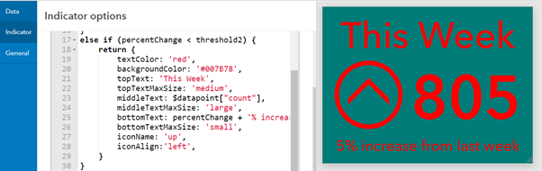
Not only is map authoring customisation using Arcade supported, but you can now also compose Arcade expressions when creating Lists and Indicators, bringing even more customisation potential. Using expressions, lists can now be displayed with more information than ever before and indicators can be tailored to your dashboards look and feel.
Your lists and indicators are getting even more information. After you’ve selected the data you wish to use, you can enable Advanced Formatting mode by clicking the button as shown below in this indicator example.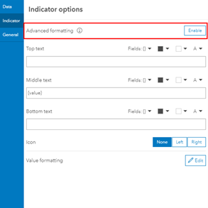
This brings up the Arcade expression which is being used as default but allows you to modify it as you wish. If you want to simply change the background colour, remove the // in front of backgroundColor and type in your colour between the apostrophes. With the new Dashboards, you can now use Hex, RGB and HSL formats here. The indicator will automatically display the change you’ve made so you can experiment to find what works for you.
If you’re feeling a little more adventurous with Arcade, you can begin to conditionally format your indicator to change depending on the data being fed in. This could be very useful for showing live data, making extreme events even more obvious to the viewer. See more in this blog.
Statistics
The percentile statistic is a new addition to the indicator, gauge and serial chart elements bringing a new option for displaying metrics. This option could be great for a dashboard showing stream flow statistics to highlight extreme events or it could be used for other indicators where extreme events may skew the result.
Another cool new feature that’s come to Dashboards is the improvements to the count tool. Firstly, you can now choose to count only non-empty fields. So, if you have a dataset which has empty values in a field the count statistic now only includes the records with data, rather than all of them.
Secondly, distinct values can be counted. When using the indicator or gauge elements, there is now a distinct toggle at the bottom of the data options page. So, if you have multiple reports for a certain location, enabling the Distinct toggle will count this as one as opposed to counting each individual report.
More information on these Count features can be found here.
Standalone tables
Have a standalone table in a web map? Maybe you have a layer which references a table? Do you want to be able to reference it in your dashboard without the fear of something odd happening? Well, the new dashboards are what you’ve been looking for. Standalone tables can now be used with your elements which I am sure will be a popular addition for many.
Business Analyst
With the latest release of Business Analyst, you can easily export Business Analyst infographics directly into new Dashboards. From within Business Analyst, there is now an option to select ArcGIS Dashboards. From there, you will be presented a new workflow which allows you to tailor the infographic to your needs. It can then be shared as it is or edited like any other dashboard. A nice addition for those who use both apps.
Other improvements
You now have tools to improve the design and layout of your dashboards. When resizing an element a percentage indicator automatically appears, giving you the ability to split up your layout with precision.
There are even more date options added to the date filter. Weeks, months, quarters and years can now be used as time units.
With this update, the old Dashboards app becomes Dashboards Classic and will still be available for use. Any dashboards that had been made using the old architecture should be compatible with the new Dashboards app however. The url will also automatically change to <yourURL>.arcgis.com/apps/dashboards/ upon opening but it is recommended you save each one upon opening them in ArcGIS Dashboards.