Blog Archives

London Borough of Hounslow
ArcGIS gives us a better understanding of the growing risks from urban heat, so we can deliver the right council services for vulnerable people.
Extreme heatwaves are on the increase, creating significant health risks for vulnerable groups, particularly in urban areas. Hounslow Council has used Esri’s ArcGIS Online solution to pinpoint the areas of greatest risk within the London Borough of Hounslow and it is now leveraging this fresh insight to keep residents cool and safe.
Dozens of datasets analysed in ArcGIS Online to reveal new insight into heat risks
Urban heat report with interactive map created using Report Builder for ArcGIS
Single source of authoritative urban heat data available to all council staff
The Challenge
Extreme heat of over 40°C is around 10 times more likely today than it was in pre-industrial Britain , posing a tremendous risk to vulnerable groups, such as the elderly, children aged under four and people with underlying health conditions. According to the Office of National Statistics, a heatwave in mid July 2022 contributed to 2,227 excess deaths in the UK .
Heatwaves in urban areas are a particular concern, as heat levels are increased by tall buildings and narrow streets, as well as emissions from air conditioners and vehicles. Hounslow Council wanted to better understand the risks arising from heat at different locations throughout the borough, so that it could put plans in place to support residents during periods of exceptional hot weather.
“ArcGIS helps us to reach people who are most at risk and most likely to need council services, in a cost-effective and timely way.”
Councillor Katherine Dunne, London Borough of Hounslow
The Solution
While Hounslow Council had undertaken heat studies previously, it decided to take a map-centric approach for the first time. It had recently begun to use Esri’s ArcGIS Online solution and realised that it could use this cloud-based geographic information system (GIS) to both deepen its understanding of urban heat risks and make insights more accessible.
In the first instance, the council inputted heat data at LSOA (Lower-layer Super Output Area) level into ArcGIS Online, enabling 150 small areas within the borough to be compared statistically. It then added contextual geospatial data from the Hounslow Data Observatory, a location-specific data hub, managed by Esri UK, that provides easy access to open data on the population, economy, health and social care, housing, crime and safety, deprivation and the environment through the Esri UK National Data Service.
Hounslow Council also sourced some data from third parties, such as air quality readings from the Greater London Authority, and added relevant, internal council data on everything from the addresses of care homes and known locations of rough sleepers to water refill stations. The council analysed all of this data geospatially in ArcGIS Online to produce a detailed heat risk index, which clearly identifies the specific areas within the borough where residents are most at risk from hot weather.
Next, Hounslow Council used Report Builder for ArcGIS, a web app builder for data in ArcGIS Online, to create a Heat Awareness Insights Report which includes an interactive map. Users can turn on and off layers in this web map, search by postcode or area and probe the data themselves to get visual answers to their questions. The report is published on the council’s website, so while primarily intended for internal use, it can be used more widely by businesses, charities and individuals in the borough to understand the potential impacts of heatwaves.
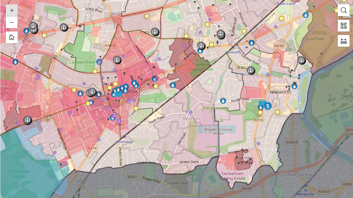
Users can zoom into the ArcGIS Online map to see more detail, including the locations of care homes and rough sleeping sites in a high-risk location.
Benefits
Deeper insight into urban heat risk
Hounslow Council has undoubtedly gained a far deeper understanding of urban heat risks in 150 small areas within the borough. ArcGIS Online has pinpointed specific high-risk groups, in high-risk locations, and delivered new insight into the compound effects of urban heat and deprivation. The ArcGIS-based research has, for instance, revealed that six of the ten areas with the highest vulnerability for heat are also among the most disadvantaged areas in the borough.
Focused delivery of new heat relief services
ArcGIS Online is now used by teams throughout the council to ensure heat relief services are focused on the right areas. In the borough’s Cool Spaces initiative, for instance, the council used the insights from the ArcGIS map to engage with leisure centres and libraries in high risk areas and encourage them to provide accessible, cooler spaces for residents during periods of extreme heat.
Cost efficient allocation of resources
Importantly, Hounslow Council can use the insights from ArcGIS Online to help it allocate its limited resources appropriately and effectively. Recently, it used the urban heat map to pinpoint where to promote its cool spaces and avoided wasting money on advertising in low risk locations. “ArcGIS helps us to reach people who are most at risk and most likely to need council services, in a cost-effective and timely way,” says Councillor Katherine Dunne, London Borough of Hounslow.
Effective planning for climate change resilience
Recognising that heatwaves are becoming more common due to climate change, Hounslow Council is using the urban heat map to help it take heat vulnerability into account as a part of its long term strategic planning. For example, ArcGIS has helped to inform where targeted actions should be delivered as part of the development of the Council’s Climate Change Resilience Plan.
Improved safety for vulnerable people in Hounslow
Hounslow Council can now identify specific care homes and nurseries, in high risk areas, and work with these businesses to ensure the right heat protection measures are introduced. It can also better coordinate homelessness services to give sun cream and hats to homeless people in the highest risk, hottest areas. Led by data-derived evidence, these proactive measures, and others like them, will help to ensure the safety of vulnerable people in future extreme heat events.


believe housing
By taking an organisation-wide approach to the delivery of GIS we are encouraging cross-directorate collaboration and driving better outcomes for staff and customers.
In the two years since adopting a location-centric approach to data management, believe housing has made significant progress in delivering better services. By leveraging the ArcGIS System, believe has unlocked its asset and customer data, enabling a more target-based approach to decision-making and resulting in improved outcomes for its customers.
A digital profile of assets, neighbourhoods and customer is supporting cross directorate collaboration
Mobile surveys are resulting in significantly improved customer feedback collection and satisfaction levels
Enhanced risk management is better supporting at-risk residents and driving more accurate insurance premiums
The Challenge
believe housing is one of the largest housing associations in the North East, providing homes and services to a growing population while striving to exceed customer expectations. Each year, it handles over 80,000 property repairs, answers more than 200,000 customer calls, and responds to over 25,000 emails.
In 2022, believe recognised the need to optimise location data usage to modernise social housing management. Data was scattered across spreadsheets, databases, and a central warehouse, making access difficult and time-consuming. Without data being in one central system, the organisation was potentially missing patterns and insights.
The organisation urgently needed a centralised system to unlock and visualise data and make it accessible to multiple user groups. It identified the need for a data management system that would inform decision-making and support a more target-based approach to social housing management, while empowering users with the tools necessary to perform their roles more efficiently.
“We can now produce more accurate, targeted responses to operational issues driven by data, and not guess estimates, which is resulting in a better outcome for our customers.”
Lynsey Darby, GIS Specialist, believe housing
The Solution
In May 2022 following a competitive tender, Esri UK was selected to build a comprehensive enterprise-wide GIS system from the ground up and supply data including OS AddressBase™, The Bluesky National Tree Map™ and Esri UK TitleInfo, a service which combines Land Registry Title Deed polygons with tenure, ownership and other data. The project involved installing Esri’s full software suite including ArcGIS Pro, ArcGIS Enterprise and ArcGIS Online by September 2022. By the end of the year the foundations of the GIS system were established including an enterprise geodatabase, automated and secure daily data update models and a standardised base map for consistent use across all applications.
A central GIS Hub was developed to organise and manage all maps and apps in one place. Within the Hub the Asset Atlas, an interactive web map app, was deployed. The Asset Atlas allows multi-user access to data while providing bespoke user levels and restricted access to safeguard sensitive content.
believe’s GIS specialist has explored various ways to innovate and effectively utilise core datasets. For example, by collaborating with the Risk & Assurance team and using the Environment Agency’s Flood Map for Planning, they identified 309 properties at risk of flooding out of more than 18,500 reviewed. This data was shared with the organisation’s insurers, enabling more precise risk assessments. Additionally, vulnerable customers in at-risk properties were identified, ensuring the organisation could prioritise providing emergency help and support in the event of a flood.
Another significant operational improvement is impacting customer satisfaction. The Major Works team now has a mobile survey system to collect customer feedback immediately after job completion. This replaced the previous quarterly manual surveys which generated only about 60 responses a year and often took weeks to address issues.
Since launching over 1,124 responses have been received in eight months. The system allows for prompt response to negative feedback, with the goal of addressing customer issues within two hours and, where possible, resolving them the same day.
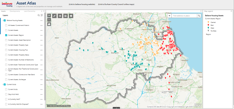
Believe housing's Asset Atlas web mapping application - asset, customer and neighbourhood information viewable in one location.
“Improved customer service is one of the key outcomes of adopting a location-centric data management approach. We can dispatch a contractor to a customer within two hours of receiving a complaint, significantly increasing the likelihood of same-day resolution.”
Samantha Tullock, Assistant Director of Strategic Assets, believe housing
Benefits
Accelerated cross-directorate collaboration
By taking an organisation-wide approach to location data management and creating a digital profile of assets, customers and neighbourhoods, cross-department collaboration has rapidly improved. All users have access to a single truth of the data, viewable from a desk-based environment or mobile device, supporting more accurate, target-based decision-making.
Improved customer service
The new mobile survey process has significantly improved customer feedback collection and satisfaction, enabling faster issue resolution. Customer complaints are responded to within two hours, often resulting in the call-out contractor going back to the property the same day to resolve the complainant’s issues.
Time and cost savings
As customer service levels have improved huge time and cost savings are being made. Users find it easier to access the information they need to gain insights and make target-based decisions and improved contractor management is delivering further cost savings.
Enhanced risk management
The GIS system has enhanced risk management, particularly in assessing and responding to flood risks. This provides residents at risk with greater reassurance in the event of an extreme weather event while the insurance company has a more accurate view of risk, so they can set premiums that reflect the true level of risk.

Associated British Ports
With GIS at its heart we have launched a location-aware, end-to-end digitised solution to onboard our electricity customers using ArcGIS Survey123 and ArcGIS Online.
Associated British Ports (ABP), the UK’s largest port operator, faced significant challenges in standardising and streamlining its electricity service processes across 21 ports. Historic onboarding procedures, inconsistent data from analogue and digital meters, and delayed billing led to issues with customer satisfaction and potential revenue leakage. To address these issues, ABP implemented a spatially intelligent, automated solution using Esri’s ArcGIS Platform, enhancing operational efficiency and customer satisfaction.
Average customer onboarding times have been reduced by 83%
More accurate and timely billing has eliminated the potential for revenue leakage
The consolidation of 23 forms into a 5 linked forms process is driving spatially intelligent business improvement processes
The Challenge
Associated British Ports (ABP) is the UK’s largest port operator with 21 geographically dispersed locations and an estate of over 4,875 hectares supporting 1,800 plus tenants, from independent traders to global corporations.
Each port had operated with different customer onboarding processes and an audit revealed that onboarding and offboarding of electricity services were often delayed; only 2% of new customers were set-up before occupancy and just 28% received their electricity bill on time.
The customer onboarding journey was hindered by fragmented and inconsistent processes across its 21 ports, involving 23 different variants of forms. This complexity, coupled with unreliable data from both analogue and digital meters, created barriers to delivering a seamless and responsive customer experience. Additionally, a significant number of meters had not been captured within ABP’s systems, raising concerns around revenue assurance and operational workflows.
What was needed was a standardised, automated solution that could be used across the business, to expedite and streamline the onboarding and offboarding of electricity services and ensure timely and accurate billing for its tenants.
“We now have a spatially intelligent end-to-end billing process, a major achievement in only six months from concept to delivery.”
Nadine Warken, Data & Analytics Lead, Associated British Ports
The Solution
Working alongside the Business Process Improvement team the Data & Analytics team recognised the spatial nature of electricity meters and, with their experience of working with Esri’s ArcGIS Platform, knew that it could leverage GIS as the foundation for solving its onboarding challenge. In March 2024, the team started working with ArcGIS Survey123, integrated with Microsoft Power Automate, to streamline communication between Property, Engineering, Master Data and Billing teams.
The first release in July 2024 introduced five connected digital forms; a second release in October 2024 added user experience improvements, live meter data integration and the Utility Efficiency Manager Review (UEMR) process. Built entirely in ArcGIS Survey123 web designer, the system enables an end-to-end, location-aware workflow supported by ArcGIS Online, Azure Synapse, Microsoft Power BI and ArcGIS Experience Builder.
The onboarding process now begins with three linked Customer Assessment Forms (CAF). CAF A captures customer requirements; CAF B enables engineers to assess technical feasibility and CAF C allows surveyors to approve or reject proposals based on customer engagement and feedback. For direct engineering works, the Meter Action Request (MAR) form initiates the process
The MAR form collects customer data from the CAF forms to support engineers completing on site - leveraging live data feeds to automatically populate meter details, capture GPS locations and take images of readings. Finally, the UEMR captures utility-specific inputs such as tariff and account details.
All data captured flows into three integrated dashboards: a GIS dashboard built in ArcGIS Online using ArcGIS Experience Builder which hosts and enables viewers to review meter information captured. The second is a Microsoft Power BI In-Progress Tracker used to monitor onboarding status in near real-time and the third is a KPI dashboard measuring turnaround times.
“Innovation in engineering isn’t just about solving today’s problems - it’s about building systems that empower future progress. By transforming our metering portfolio, we’ve turned complexity into clarity, laying the foundation for smarter, more sustainable operations. By implementing the current solution, we have ensured that engineering resource is focussed and prioritised across the wider business through removing unnecessary manual tasks,” said Mark Hennessy, Group Head of Technical Authority (Engineering), Associated British Ports
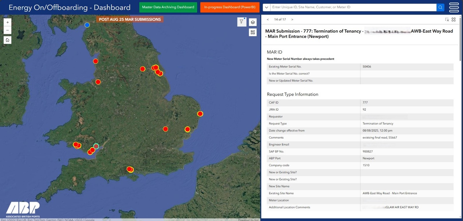
The Energy Onboarding/Offboarding GIS Dashboard.
“In the property sector, the transformation comes from reimagining every customer interaction. By harnessing innovation and placing customers at the heart of our process, we’ve truly elevated their experience for energy, both insight into information and the ‘on-time’ billing process.”
Ian Henderson, Group Head of Property, Associated British Ports
.
Benefits
Better customer service
Streamlining and digitising the onboarding process has reduced the average onboarding time by 83%. This dramatic acceleration is having a major positive impact on the customer experience, they can engage with services faster allowing them to realise their own revenue streams sooner.
Cost savings
The implementation of more accurate field data collection and the digitised inventory of all meters has significantly improved billing accuracy for customers. This enhanced accuracy combined with more timely billing has effectively eliminated the potential for revenue leakage, helping the organisation to realise substantial cost savings.
Business process improvements
The consolidation of 23 forms into a streamlined five linked up form process - standardised across the organisation’s entire estate, supported by in-person training - has empowered the Business Improvement team to identify additional areas where spatially-led solutions can be implemented to enhance business processes.
Spatially intelligent solutions
Timely, up-to-date and mission-critical accurate data is not only supporting better customer service, delivering cost savings and driving business process improvements but is also highlighting the importance of spatially intelligent solutions.

Ocean Conservation Trust
We are using a suite of ArcGIS solutions to help us protect, regenerate and restore the UK’s seagrass meadows.
The charity Ocean Conservation Trust is working to protect and restore the UK’s seagrass beds, in a project called Blue Meadows. It is using a suite of products from Esri’s ArcGIS system to help it plan and deliver activities cost-efficiently, improve the cultivation of seagrass plants and monitor the impact of this vitally important conservation programme.
Activities to protect and restore seagrass meadows are planned with ArcGIS Pro and ArcGIS Online
Data and images for monitoring seagrass health are collected on boats with a configuration of ArcGIS Field Maps
The cultivation of new seagrass plants is carefully managed by volunteers using ArcGIS Survey123 forms
The Challenge
As much as 44% of the UK’s seagrass has been lost since the 1930s, due to human activity, pollution and disease. Yet, these blue meadows are vitally important for both marine biodiversity and carbon storage. Based in Plymouth, Ocean Conservation Trust is working to protect and regenerate existing seagrass and restore what has been lost. In total, it aims to scale seagrass restoration techniques to deliver around 50 hectares annually and is using Esri’s ArcGIS technology to help it achieve this laudable objective.
“ArcGIS gives us an effective, spatial approach to measuring the impact of the Blue Meadows project.”
Andy Cameron, Conservation Project Manager, Ocean Conservation Trust
The Solution
The charity uses ArcGIS Pro and ArcGIS Online in the office to plan where to focus its restoration and protection efforts. It collates and analyses internal and third-party data on ocean habitats, coastal areas and species and uses the insight derived to plan locations for new seagrass surveys, for example. Similarly, it uses the map-based insights delivered by ArcGIS Online to decide where to put marker buoys to highlight the locations of seagrass meadows.
When working out on the ocean, the charity uses a configuration of ArcGIS Field Maps to record its survey locations and capture data in real time. Underwater pictures of quadrats (1 m2 sample areas) and data, such as substrate type and sea kelp detections, are captured in ArcGIS Field Maps on tablets, while on the boat. Estimates of seagrass cover are entered directly into ArcGIS Field Maps, enabling teams to visualise seagrass health in web maps.
Ocean Conservation Trust has also developed several ArcGIS Survey123 surveys for different groups of staff and volunteers. One particularly pivotal ArcGIS Survey123 survey is used in the charity’s seagrass nursery to record everything from leaf length to water chemistry at regular intervals, in a consistent way. Another ArcGIS Survey123 survey enables staff to log their use of the charity’s new van, in a fast and convenient digital process.
The charity is currently developing a series of ArcGIS dashboards, which will help it to share the information that it is collecting via ArcGIS Field Maps and ArcGIS Survey123, in a visual way, more broadly within the charity. “It’s an important next step for us,” explains Miriam Webborn, Habitat Monitoring Officer at Ocean Conservation Trust. “We aim to close the data loop, so the whole team can see the results of what they have been working on.”
Not content to stop here, however, the charity is also currently exploring how to use Sonardyne underwater GPS systems in conjunction with ArcGIS Online to map seagrass in unprecedented detail. Moreover, it is taking its first steps with ArcGIS StoryMaps to build interactive stories called ‘Deep Dives’ to help make people more aware of the importance of restoring seagrass meadows.
“Our new ArcGIS dashboards will also enable volunteers to see the data they collect in the context of the wider project and help them appreciate the value of their contribution.”
Miriam Webborn, Habitat Monitoring Officer, Ocean Conservation Trust
Benefits
Cost effective conservation project planning
Using ArcGIS Online, Ocean Conservation Trust can plan seagrass monitoring or planting projects carefully in the office to enable them to be implemented efficiently when teams of divers, ecologists and boats head out to sea. “ArcGIS provides all the information that project teams need to plan activities, from the locations of reefs to ship wrecks and moorings,” explains Andy Cameron, Conservation Project Manager at Ocean Conservation Trust. “As a result, we do not waste time and money sending teams out to unsuitable locations.”
Improved monitoring of seagrass restoration schemes
Ocean Conservation Trust has improved the monitoring of its restoration schemes by using ArcGIS—both on land and sea. It is particularly notable that staff can view and analyse images and data about the seabed while afloat. “ArcGIS gives us an effective, spatial approach to measuring the impact of the Blue Meadows project,” Cameron says. “We can see precisely where new seagrass beds have been planted and monitor existing seagrass meadows over time to evidence improvements in this vitally important ocean habitat.”
More successful seagrass cultivation
Used in the charity’s seagrass nursery, ArcGIS Survey123 records the important data needed to improve the cultivation of seagrass plants, which are notoriously difficult to grow from seed. By capturing information on growing conditions in a consistent way in the app, staff and volunteers can now more easily determine the best growing conditions and, over time, increase the volume and health of plants available for replanting.
Effective engagement with volunteers
The use of ArcGIS Survey123 helps Ocean Conservation Trust to involve volunteers in its work in an effective and engaging way. For example, volunteers use an ArcGIS Survey123 form on clifftop walks to survey where pleasure boats are moored up in relation to seagrass conservation areas and assess how people interact with seagrass meadows. “Our new ArcGIS dashboards will also enable volunteers to see the data they collect in the context of the wider project and help them appreciate the value of their contribution,” notes Webborn.
Creative approaches to public education
Increasingly, Ocean Conservation Trust is using ArcGIS solutions to deliver more creative and persuasive public education initiatives about seagrass and ocean conservation in general. For instance, it built an ArcGIS Survey123 survey to capture information during an Ocean Literacy workshop that aimed to improve understanding of the ocean. The charity’s ArcGIS StoryMaps stories, when launched, will further support education and public engagement activities like this.
Keep Wales Tidy
Our new ArcGIS-driven litter survey methodology is giving us richer data to help influence and monitor policy and keep Wales tidy.
The environmental charity, Keep Wales Tidy, has transformed its annual litter surveys, saving an estimated 66 days of staff time while enabling 73% more locations to be inspected compared to the old methodology. The new ArcGIS-driven approach also delivers richer data, which is used to monitor and inform environmental policy, as well as clean up public spaces.
80,000+ potential survey locations were identified, analysed and filtered using ArcGIS Pro and ArcGIS Online
Over 5,000 locations are surveyed using a versatile survey form created in-house with ArcGIS Survey123
Survey progress and results are monitored and managed using dashboards built with ArcGIS Dashboards
The Challenge
Driven by its vision for clean, safe public spaces across Wales, Keep Wales Tidy has been collecting data on litter and local environmental quality (LEQ) issues for nearly twenty years. Annual litter survey results are shared with local authorities to help prioritise cleansing and target prevention activities to create cleaner, greener communities. Importantly, the charity also uses this data internally and in collaboration with partners to help influence and inform environmental legislation in an evidence-led approach.
Keep Wales Tidy was challenged to update its well-established litter survey methodology to enable it to collect more granular data on litter. At the same time, it also wanted to broaden the scope of the surveys to include green spaces, parks, beaches, transport hubs and other public areas. As a charity with limited resources, it needed to ensure the efficiency of the new survey approach and consider the practicality of delivery.
“ArcGIS takes the pressure off us and frees up our time to focus on what’s important – collecting data on the ground.”
Joe Marshall-Mills, GIS and Data Officer, Keep Wales Tidy
The Solution
Over the course of a year, Keep Wales Tidy created a new litter survey methodology, named Geospatial Litter Analysis (or GLÂN). Informed by the charity’s vast experience of surveying on the ground, the new system was designed to utilise Esri’s geographic information system (GIS) technology, ArcGIS.
The charity started by using ArcGIS Pro and Ordnance Survey’s National Geographic Database to identify 80,000+ publicly accessible areas where surveys could take place across various land types and uses. Next, it used multiple criteria to filter locations in ArcGIS Online to identify 5,464 sites to survey – a statistically significant sample across Wales. Lower Super Output Areas (LSOAs) were plotted in ArcGIS Pro alongside the sample to aid a spatially targeted approach that was geographically representative across every local authority. Each year, 20% of these LSOAs will be covered, meaning that 100% coverage will be achieved in five years.
Next, the charity overhauled the survey form, redesigning it with ArcGIS Survey123 to allow more data to be collected with more consistency. In addition, ArcGIS Field Maps and ArcGIS Survey123 apps are used to capture detailed information on litter in the field – everything from food and drinks packaging to dog fouling.The form automatically generates litter scores for cleanliness, aligned to statutory guidance, to enable accurate comparisons between areas.
Data collected is instantly uploaded to ArcGIS Online and viewable in an internal operations dashboard, created using ArcGIS Dashboards. This application enables staff to monitor survey progress on their desktops or mobile devices, while sharing survey locations to improve staff safety.
Keep Wales Tidy is currently developing further data visualisation tools using ArcGIS Experience Builder, which will be used to share survey results through publicly accessible platforms. The goal is to provide clear, accessible information about litter trends in Wales, while supporting local authorities, environmental organisations and policymakers with the evidence they need to drive positive change.
“This world-leading process is a fantastic step forward to creating action for a cleaner environment in Wales.”
Angharad James, Policy and Research Officer, Keep Wales Tidy
Benefits
Approximately 66 days of time saved
The new ArcGIS-driven survey approach has removed many time-consuming administration tasks, with an estimated saving of 1-3 days on planning and quality assurance for each of the 22 local authorities in Wales. The more streamlined process has increased efficiency and decreased human error at the desk and in the field.
73% more litter surveys conducted
Thanks to the time savings achieved by the new survey process, Keep Wales Tidy has increased the number of sites surveyed annually from approximately 3,000 to more than 5,000, without additional surveyors. “As with many charities, we work in a small team with limited resources,” says Joe Marshall-Mills, GIS and Data Officer at Keep Wales Tidy. “ArcGIS takes the pressure off us and frees up our time to focus on what’s important – collecting data on the ground.”
Better evidence to drive policy change
With ArcGIS, Keep Wales Tidy is collecting useful and robust litter data that can be used as evidence to influence policy change. For example, the data will prove pivotal in the introduction of Extended Producer Responsibility (EPR) for litter, a proposed initiative whereby producers will pay towards the cleansing of the litter their packaging generates. “ArcGIS is allowing us to efficiently collect and analyse data that we and other organisations need to influence policy and legislation to help keep our environment clean,” says Angharad James, Policy and Research Officer at Keep Wales Tidy.
Granular detail for monitoring policy impacts
The ArcGIS Survey123 form allows surveyors to collect data about specific types of litter in far more detail, which can be used to monitor the impact of environmental policy. For instance, the form distinguishes between various types of vape litter, enabling researchers to monitor the impact of the recent single-use vape ban, while monitoring any unintended consequences from existing or new legislation.
Targeted action to clean up public spaces
When the charity’s new public data visualisation tools go live, local authorities and other stakeholders will be able to access near-live data during the survey period and use it to plan and prioritise cleansing activities in the right places. “Keep Wales Tidy has been fighting for cleaner community and public spaces ever since it was founded over 50 years ago,” says James. “This world-leading process is a fantastic step forward to creating action for a cleaner environment in Wales.”

British Geological Survey
Council teams and contractors use our new ArcGIS tool to assess coal mine gas risks more quickly and precisely.
The British Geological Survey (BGS) has created an innovative ArcGIS app to help local authorities screen for gas emissions from abandoned mine workings, quickly and accurately. As the first decision-support tool of its kind in the world, the solution improves understanding of gas risks, enabling local authorities to expedite planning processes while safeguarding public health.
Initial prototype of decision-support tool built within weeks using ArcGIS Experience Builder
Early-stage coal mine gas risk assessments now completed in minutes rather than hours
Easy-to-use tool expedites planning processes, to accelerate the delivery of new homes
The Challenge
Scotland has a strong coal mining heritage. Few signs of the coal industry remain above ground today, but thousands of kilometres of abandoned underground workings lie beneath what is now prime development land. When considering planning applications, local authorities have to evaluate the risk of gas leaks from these historic mine workings and ensure the correct mitigations are put in place to protect infrastructure and public health.
The vital importance of this planning process was brought into sharp focus in 2014, in the village of Gorebridge near Edinburgh, when around 200 residents of a new housing estate reported health issues including nausea and headaches. High levels of carbon dioxide from disused coal mines were detected, and the entire estate of 64 new-built homes had to be demolished.
“The ArcGIS app lowers the barriers to accessing spatial data on mine gas risks and makes it far easier for users from all backgrounds to make well-informed decisions to improve public safety.”
Svea Rautenberg, GIS Developer, British Geological Survey
The Solution
Following the publication of national industry guidance by CL:AIRE in 2021 on how best to assess mine gas risks, BGS joined forces with the engineering firm WSP and North Lanarkshire Council to develop a decision-support tool using Esri’s geographic information system (GIS) technology. At the time, teams at North Lanarkshire Council were spending a lot of time evaluating mine gas risks on a site-by-site basis and engaging with planning applicants on sites with complex ground conditions.
BGS created the initial prototype of the decision-support tool within just a few weeks. It then built the solution using Esri’s ArcGIS Experience Builder app builder in ArcGIS Online and refined it iteratively over a period of six months in collaboration with WSP and North Lanarkshire Council. During the project, BGS prepared the data for the decision-support tool using ArcGIS Pro, consolidating its own geological data with data under a zero-cost, public sector license from the Mining Remediation Authority. The final solution was then hosted in North Lanarkshire Council’s ArcGIS Online system.
The coal mine gas risk decision-support tool is now being used by the pollution control, planning and building standards teams at North Lanarkshire Council, as well as the council’s appointed contractors, including WSP. Users draw polygons around proposed development sites, and the tool automatically calculates and presents colour-coded risk scores for every 50m2 area within the site. The tool allows users to drill down to get detailed information on risk factors, such as the proximity of mine entries, boreholes and mine workings.
To support the introduction and ongoing use of the coal mine gas risk decision-support tool, BGS created an intuitive and highly visual user guide with the ArcGIS StoryMaps app builder. Easy to follow, the guide includes a worked example, enabling new users and contractors to start taking advantage of the tool very quickly.
“With this ArcGIS project, we are fullfilling our remit by enabling councils to make faster decisions, supporting improved public health and helping to deliver more housing in the UK using data-driven geoscience.”
Dr. Darren Beriro, Principal Geoscientist, British Geological Survey
Benefits
Expedited planning applications for new developments
North Lanarkshire Council is expected to save a significant amount of time, as staff and contractors no longer have to manually search through different datasets to apply the CL:AIRE flow charts to calculate mine gas risks. Consequently, the council can make faster decisions and expedite planning approvals. “Mine gas screening is just one part of the planning process,” explains Dr. Darren Beriro, Principal Geoscientist at BGS. “However, by speeding up this vital stage, councils can use geoscience evidence to help approve new developments more quickly, supporting Government objectives for new housing and investment.”
Greater trust in the mine gas screening process
The new decision-support tool provides North Lanarkshire Council and third parties with accurate data and a standardised approach to assessing mine gas risks, which fosters greater trust in the council’s mine gas screening procedures. “Our new ArcGIS-based tool brings together the most authoritative data sets, giving councils, contractors and developers a shared view of the best available information and confidence in the process,” says Beriro.
Reduced complexity in the mitigation of health risks
Critically, the new decision-support tool reduces the complexity of the process of screening for coal mine gas risks. This makes it easier for councils to ensure that gas risks are correctly and consistently screened at an early stage in the development process, to help prevent a repeat of the infamous Gorebridge incident. As Svea Rautenberg, GIS Developer at BGS points out, “The ArcGIS app lowers the barriers to accessing spatial data on mine gas risks and makes it far easier for users from all backgrounds to make well-informed decisions to improve public safety.”
A template solution for other mining areas
BGS plans to continue to develop its pioneering coal mine gas risk decision-support tool, which is believed to be the first of its kind in the world. It hopes to make similar tools or services available to local authorities in other mining areas in the future. Summing up, Beriro says, “BGS is a non-departmental government body and part of the Department of Science, Innovation and Technology. We are a leading and trusted provider of geological data and knowledge to meet the societal need for a sustainable future. With this ArcGIS project, we are fullfilling our remit by enabling councils to make faster decisions, supporting improved public health and helping to deliver more housing in the UK using data-driven geoscience.”
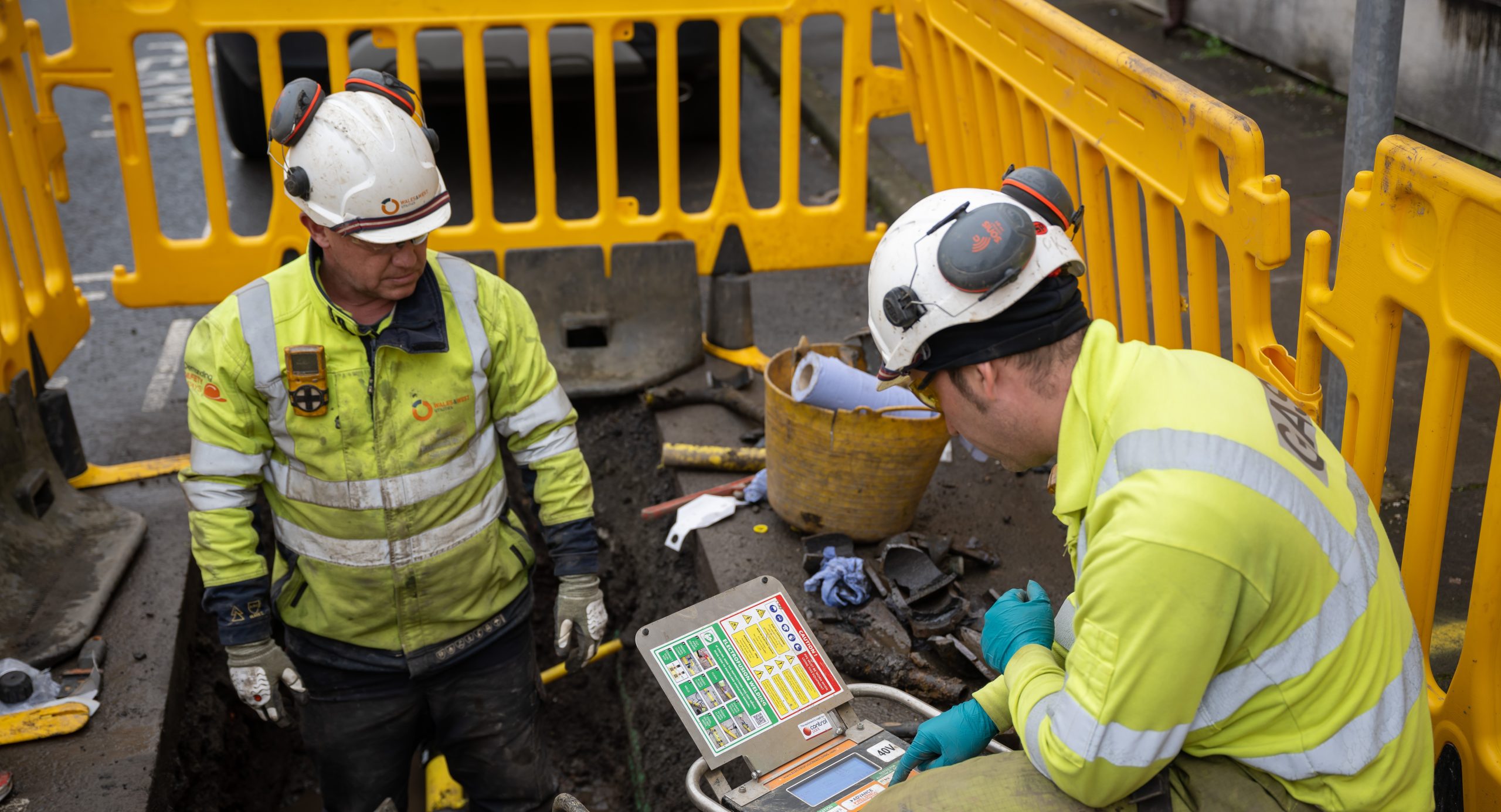
Wales and West Utilities
By updating our corporate GIS platform, we have improved our operational efficiency and gained the ability to build new apps quickly to meet future business needs.
With hundreds of employees using Esri’s geographic information system (GIS) technology every day, Wales & West Utilities took the bold decision to not just upgrade its core GIS platform but fully redesign it. Harnessing the flexibility of Esri’s ArcGIS system, the gas distribution business has delivered new and improved enterprise-wide GIS capabilities that will drive the company’s success long into the future.
20-year-old corporate GIS platform redesigned and enhanced with ArcGIS Enterprise
Core Gas Viewer system improved to deliver new capabilities for 1,800 staff
20+ GIS apps built, providing bespoke capabilities for teams with no need for custom code
The Challenge
When Wales & West Utilities was founded in 2005, GIS was identified as a core business system, and work began straight away to create a bespoke, advanced GIS platform. Built with Esri’s GIS technology, the resulting solution was ground-breaking. It improved the availability of spatial data, led to the creation of new streamlined business processes and contributed to significant improvements in operational efficiency.
Two decades later, the same GIS system was still in constant use but in need of an update. Rather than simply upgrade this custom-built solution, Wales & West Utilities decided to redesign the entire enterprise GIS platform to take full advantage of Esri’s modern, web service based, GIS technology, ArcGIS. The business was particularly keen to use only ArcGIS capabilities in the build process, and no custom code, to simplify future upgrades.
“The implementation of ArcGIS Enterprise has unlocked tremendous value for the business, by making better data available in easy-to-use apps.”
Bernard Murphy, Head of Strategy and Architecture, Wales & West Utilities
The Solution
Wales & West Utilities kicked off the project with a period of business process evaluation, to ascertain if users’ needs were still the same as they had been nearly twenty years before and identify new business requirements. The legacy ArcGIS platform had been highly innovative at the time of development, and it was important to the business that the successor solution be no less ambitious and transformative.
The in-house project team then built a new corporate geodatabase in Esri’s ArcGIS Enterprise solution that enables Wales & West Utilities to process and maintain 33 million records per month. To address complexities and historic inconsistencies in the business’s legacy asset data, the project team created a process in Microsoft SQL to correct errors before inputting the data into ArcGIS Enterprise, which meant that the new GIS platform was powered with more accurate spatial data.
Wales & West Utilities then built and rolled out over twenty process-specific apps using ArcGIS Enterprise—and more are in development. Although precisely designed to meet user requirements, the apps are all built using out-of-the-box app builders and the included widgets, with no custom code, which will make them easy to upgrade and maintain in the future. Several of the apps are integrated with the organisation’s SAP systems to create fully automated processes, such as costing for quotations or operation work order creation; others produce tailored outputs that can be issued directly to the Land Registry.
Chief amongst the new apps is the new-look Gas Viewer, the core mapping system used by all of the organisation’s 1,800 staff. Built using the Portal for ArcGIS component in ArcGIS Enterprise, this pivotal solution provides a single source of accurate, up-to-date data on customers, network assets and plans for new network extensions. Not just a simple new-for-old replacement, the solution delivers new capabilities, such as the ability to see, at a glance, if a property is on or off gas.
“Our new ArcGIS platform enables us to develop new solutions quickly that have no custom code but are very bespoke to our requirements.”
Kieran Bourke, GIS Architect, Wales & West Utilities
Benefits
More efficient business processes
The migration to ArcGIS Enterprise has created more efficient business processes. In Connections Quotations Design, for example, tasks that used to take 45 minutes can now be completed in around 10. Bernard Murphy, Head of Strategy and Architecture at Wales & West Utilities, explains: “The implementation of ArcGIS Enterprise has unlocked tremendous value for the business, by making better data available in easy-to-use apps. Wales & West Utilities now has an advanced, modern and versatile mapping platform that is enabling the business to operate more efficiently.”
Improved collaboration between departments
As ArcGIS Enterprise serves up the same geospatial data to all of the organisation’s GIS apps and the core Gas Viewer solution, Wales & West Utilities can be confident that all staff are working from the same, accurate, up-to-date information, whatever they are doing. This contributes to improved collaboration between departments. The legal team, for instance, now has visibility of all new gas infrastructure planned, as soon as it is designed.
Rapid delivery of new business solutions
Using the many adaptable features of ArcGIS Enterprise, Wales & West Utilities can build new GIS apps, precisely tailored to the needs of users, in just days. For example, it has built an app that automatically notifies staff of changes in Ordnance Survey’s 13 million data attributes, so business data can be updated. “It’s so easy!” says Kieran Bourke, GIS Architect at Wales & West Utilities. “Our new ArcGIS platform enables us to develop new solutions quickly that have no custom code but are very bespoke to our requirements.”
Better informed decision-making
ArcGIS Enterprise enables Wales & West Utilities to use open source, third-party data in its apps and GIS services for the first time, which improves decision-making. For example, network designers can now see contaminated land and easily evaluate its proximity to project areas. Similarly, staff can see instantly if proposed new pipelines cross historical sites and make sure project quotations and schedules take into account the need to liaise with local historical and archaeological groups.
A scalable platform for the future
The new GIS platform will enable Wales & West Utilities to continually adapt and build new apps to meet future business needs. It is currently building mobile apps, using ArcGIS Field Maps and the Premium Feature Data Store in ArcGIS Online, which supports high-volume data workflows. These apps will enable field-based engineers to view network data and capture information on the move, further improving the efficiency of core business operations.

Oxfordshire County Council
Our new ArcGIS-driven survey process helped us divert 96 tonnes of food waste to recycling and save £12,455 in one year.
Oxfordshire County Council is using Esri’s ArcGIS solutions to survey households and encourage them to recycle their food waste. 30% more cost efficient than the council’s previous paper-based survey method, the new ArcGIS-driven process has diverted nearly 96 tonnes of food waste away from general bins, increased participation in food waste recycling by 19.5% and delivered a £12,455 cost saving in one year.
Householder address and recycling data managed in ArcGIS Enterprise
Tasks allocated to surveyors and entire survey process monitored with ArcGIS Workforce
Data collected on mobile devices in smart forms created with ArcGIS Survey123
The Challenge
Oxfordshire County Council has the highest household waste recycling rate of any county council in England at almost 60%. However, it estimates that around 50% of food waste in the county is not put out for collection in food waste bins. This means that not all food waste is disposed of through anaerobic digestion, a process that saves money for councils, reduces environmental impacts, such as methane release, and generates green energy. Just nine recycled banana skins can produce enough energy through anaerobic digestion to fully charge a laptop.
Indirect communications with the general public, such as leaflets and social media, were not having sufficient impact on food recycling rates, so Oxfordshire County Council decided to engage directly with households. Working with four district councils and Oxford City Council, it identified properties that were consistently not setting out food waste bins and then visited these households to encourage them to use the food waste collection service. The initiative was, however, largely paper-based, very complex and incredibly time-consuming to administer, making it unsustainable in this format.
“Now we have an efficient, digital process that is saving a significant amount of money for the council, while also reducing our environmental impacts.”
Mark Watson, Circular Economy Projects Officer, Oxfordshire County Council
The Solution
Taking a fresh look at the whole initiative, the council’s recycling department worked with in-house geographic information system (GIS) specialists to build a more streamlined and efficient approach. The council’s GIS team had previously used Esri’s ArcGIS system to transform other survey processes, in areas including local nature recovery planning, and leveraged this experience to build a new food waste survey solution in just two weeks.
Launched in 2024, the new survey method begins in ArcGIS Enterprise, where an app displays the addresses at which food waste bins are consistently not put out for collection. This data then feeds into ArcGIS Workforce, a mobile app solution that simplifies the process of managing field-based teams and allocating tasks. It enables Oxfordshire County Council to create efficient routes for its five surveyors, with information on which specific properties to visit.
In the field, the surveyors then use a mobile data collection form, created with the ArcGIS Survey123 app builder, to record interactions with householders, including information about any barriers they face to using food waste collection services. Surveyors can also record what resources they supply to householders, ranging from information leaflets to new food waste bins and free compostable bin liners. The survey form is easy to use and can be completed even in areas with no mobile signal.
Staff in the recycling department can monitor the progress of surveys from their desks, in real-time, using ArcGIS Workforce and change assignments on the fly if necessary. Then, when surveys are completed, they can use the charts and maps embedded within the ArcGIS Survey123 app to see graphical representations of the survey responses and identify trends. The data is also exported into Microsoft Excel for further analysis.
“Our use of ArcGIS has led to a substantial reduction in the time required to manage and admister the survey process—so much so that the 2024 project was delivered 30% more cost effectively than the year before.”
Mark Watson, Circular Economy Projects Officer, Oxfordshire County Council
Benefits
30% reduction in project delivery costs
Using ArcGIS, Oxfordshire County Council can now complete its food waste recycling survey much more efficiently and effectively than in previous years. Mark Watson, Circular Economy Projects Officer at Oxfordshire County Council says, “Our use of ArcGIS has led to a substantial reduction in the time required to manage and administer the survey process—so much so that the 2024 project was delivered 30% more cost effectively than the year before.”
Productivity targets achieved in the field
The council’s surveyors are able to work very efficiently in the field as ArcGIS Workforce eliminates duplication of effort and provides clear jobs lists, while the ArcGIS Survey123 app is far easier to use than paper-based forms. In 2024, surveyors succeeded in visiting 9,165 properties and achieved their productivity target of surveying an average of 50 households per day.
19.5% increase in food recycling
The ArcGIS-driven approach is having a measurable impact on the number of households using the food waste recycling service. In a study of 521 households that received survey visits in 2024, Oxfordshire County Council found that participation in food recycling increased by 19.5% from 42% to 50%. Across the project area more widely (and taking into account properties that were already using the food waste service), participation increased to over 70%, which is a significant milestone for the council.
£12K in annual cost savings
In 2024 alone, Oxfordshire County Council successfully diverted 95.8 tonnes of additional food waste from general rubbish to food recycling following the completion of the ArcGIS survey process. Disposing of food waste via anaerobic digestion is currently £130 per tonne cheaper than disposing of mixed waste, so the council saved £12,455 in just one year. By targeting similarly-sized areas elsewhere in the county in future years, it expects to make similar savings annually.
Reduced environmental impacts
Importantly, the new ArcGIS food waste survey process helps the council to reduce its carbon footprint by around four tonnes annually. It also supports the circular economy by ensuring more food waste is used to generate power and fertiliser that can be used for growing new food crops. Watson is clearly proud to assert, “Now we have an efficient, digital process that is saving a significant amount of money for the council, while also reducing our environmental impacts.”
SHINE
Housing associations in North East England are using ArcGIS to share data, collaborate more effectively and deliver cost-effective services for tenants.
In the North East of England, forward-thinking housing associations have joined forces to share and analyse their property and asset data in a web-based app built with ArcGIS. Called OneMap, the solution provides a ground-breaking platform for collaboration, paving the way for all participating organisations to reduce costs, improve the experience of residents and provide more targeted support for vulnerable groups.
First-of-its-kind app built rapidly using the ArcGIS Experience Builder app builder
Open data from multiple sources incorporated easily from the Esri Living Atlas of the World
Geospatial analysis shared with partners including mayor-led North East Combined Authority
The Challenge
Many housing associations operate within North East England, managing and maintaining similar properties, often in the same towns and cities, and dealing with the same community issues, like antisocial behaviour. Recognising the advantages of working together more closely, seventeen housing associations in this region decided to form an informal partnership for sharing expertise, reducing duplication of effort and fostering innovation.
SHINE (Social Housing Innovation North East) was duly launched in 2023, with membership open to all social housing providers in the area. Over time, however, it became clear that the group needed an effective and secure way to share data. Members needed to be able to see the locations of concentrations of properties, from different housing associations, so that they could identify opportunities for sharing resources and planning collaboratively to save money and improve services.
“ArcGIS provides us with a visual picture of where SHINE members have properties and assets, so we can see potential for collaboration that wasn’t obvious before.”
Lynsey Darby, GIS Lead, SHINE
The Solution
From the outset, it was clear that a geographic information system (GIS) would provide the best way of sharing information, so GIS professionals from eight member organisations got together to build a collaboration platform for SHINE. “Geography is absolutely fundamental to the housing sector,” explains Lynsey Darby, who is GIS Lead for SHINE and GIS Specialist at the housing association believe housing. “You can’t really do anything collaboratively without an understanding of where properties are and which communities you are serving, so GIS was the best tool for this.”
Many members of SHINE already used Esri’s ArcGIS technology, so the GIS Group used the ArcGIS Experience Builder app builder in ArcGIS Online to create the new data sharing app. Initially, the app was populated with property data from eight members of SHINE. Then, supplementary contextual information about the region was added from the Esri Living Atlas of the World, including environmental, demographic and boundary data.
Called OneMap, the app was launched to participating organisations with the tagline ‘Location intelligence for data driven solutions’. It was exceptionally well received, not only by members of SHINE but also by the wider housing sector, which recognised the potential value of the ground-breaking collaboration platform. Darby herself received the accolade ‘Innovator of the Year’ for her role in the project, at the National Housing Innovation Awards 2025.
Participating members of SHINE can now use OneMap to not only see which other organisations have assets near theirs, but also undertake geospatial analysis. They can learn which areas are prone to flooding and join forces with other housing associations nearby to jointly plan mitigations; they can find housing blocks of a similar age to their own to share maintenance plans; and they can analyse issues like employment and access to green spaces to better understand the needs of residents.
“Now, we have an ArcGIS app that enables housing associations in the region to pinpoint opportunities to work together, and we expect to see major efficiencies in the future.”
Rebecca Dick, GIS Group Member, SHINE
Benefits
Shared cost efficiencies from reduced duplication
Using OneMap, members of SHINE can more easily identify opportunities to work together to reduce duplication and save money. In Hartlepool, for example, where four housing associations own properties in one estate, members can now plan more cost-effective, joint maintenance schedules. “We are taking a leap, because collaboration like this has never been done before in the housing sector,” says Rebecca Dick, a founding member of SHINE’s GIS Group and GIS Lead at the housing association Thirteen. “Now, we have an ArcGIS app that enables housing associations in the region to pinpoint opportunities to work together, and we expect to see major efficiencies in the future.”
Coordinated enhancements to the resident experience
The OneMap app will also help SHINE members to ensure residents have a positive experience of living in social housing. Members expect to use the ArcGIS-based solution to formulate joint strategies for tackling anti-social behaviour, for example. Members can also use OneMap to spot opportunities to join up and improve open spaces to create larger, more attractive and environmentally friendly areas that residents can enjoy. “ArcGIS provides us with a visual picture of where SHINE members have properties and assets, so we can see potential for collaboration that wasn’t obvious before,” says Darby.
Targeted strategies to support vulnerable residents
Using the analytical tools embedded in OneMap, SHINE can formulate targeted strategies to help improve the lives of specific groups. For example, it recently used OneMap to help HENNE (Housing Employability Network North East) evidence the need for funding to support economically-inactive social housing tenants over the age of 50. SHINE has also located specific schools in areas with a large proportion of social housing and high deprivation. This insight has been shared with the North East Combined Authority to help inform new strategies to relieve child poverty.
High quality housing across the North East
In working together, all members of SHINE can collectively contribute to a higher quality of housing throughout the region. In the future, for instance, a maintenance team from one member organisation could be sent out to fix an urgent issue at another member’s property, if closer, saving time and fixing problems faster. SHINE members can also see the locations of all properties with an energy rating of D or below and apply for government funding to collectively improve the energy efficiency of homes. As Darby says, “It’s early days, but the potential is huge.”

Scottish Wildlife Trust
With more accessible data, available in real-time, we can be more effective in our efforts to save Scotland’s native red squirrels.
The Scottish Wildlife Trust is using Esri’s ArcGIS solutions to help save Scotland’s red squirrels, in a partnership project supported by the Scottish Government’s Nature Restoration Fund which is managed by NatureScot.The charity has improved the collection and accessibility of its monitoring data, which enables it to better identify threats and protect this charismatic and much-loved endangered species.
Browser-based, smart forms built with ArcGIS Survey123 for capturing research data
Interactive dashboard built with ArcGIS Dashboards for visualising data and identifying threats
Entire solution created easily in-house using the charity’s existing ArcGIS Online subscription
The Challenge
The UK’s native red squirrels have been in dramatic decline ever since American grey squirrels reached our shores in the 1800s, bringing disease and competition for food and habitat. To help protect remaining red squirrel populations, the Scottish Wildlife Trust is leading a partnership project called Saving Scotland’s Red Squirrels. Part of its work involves monitoring squirrels using feeder boxes at specific locations. The project team analyses the hairs captured on sticky pads (or images on camera traps) to identify the presence of red squirrels, grey squirrels and pine martens, and then uses this information to inform strategies to safeguard recovering red squirrel populations.
When this important research began, recording the high volume of data in a format compatible with the project’s main database presented a challenge, and the team only had capacity to convert findings from the peak months of May and June into a format that was compatible with mapping software. Consequently, the team didn’t have an easy way of collating and visualising the findings from across its six regions, year-round, which restricted its ability to gain insights from the data.
“ArcGIS has not only made data collection much more straightforward, but also allowed us to collect this in a spatial database year-round, which is operationally much more useful.”
Tom Lewis, Data Officer for Saving Scotland’s Red Squirrels, Scottish Wildlife Trust
The Solution
The Scottish Wildlife Trust already used Esri’s geographic information system (GIS) technology in other important conservation projects. It realised that it could enhance data processes in the Saving Scotland’s Red Squirrels project by using Esri’s ArcGIS solutions to capture, share and analyse the feeder box findings.
The charity used the advanced XLS form function in ArcGIS Survey123 to build a bespoke, browser-based, smart form for recording the survey samples. It then used the ArcGIS Dashboards app builder to create an intuitive and interactive dashboard for displaying the results on maps and in tables. Created quickly in-house, this ArcGIS-based approach captures data in a schema that is compatible with other internal systems.
Today, just over 100 volunteers regularly visit around 880 active feeder boxes and collect samples. Nine regional project officers then study the hairs on the sticky pads under a microscope and upload the findings by accessing the ArcGIS Survey123 form from their Internet browsers. They simply select the species detected, the sample collection date and the box it came from, and additional required information such as the precise location is automatically generated.
All staff involved in this monitoring effort can view the results on the ArcGIS dashboard straight away. They can see colour-coded points on the maps indicating the known locations of squirrels and pine martens, and can filter the view by species, time period, region, staff member and specific feeder boxes. Features embedded in the dashboard enable users to see the numbers of visits and detections. These automatically update based on the selected filters, which makes the crucial grey squirrel detections easy to visualise.
“ArcGIS helps keep everyone on the same page.”
Tom Lewis, Data Officer for Saving Scotland’s Red Squirrels, Scottish Wildlife Trust
Benefits
Easy access to year-round research data
Now, for the first time, the Scottish Wildlife Trust has easy access to the findings from sticky pads, in a spatial format, for the whole year, rather than just two months. “ArcGIS has not only made data collection much more straightforward, but also allowed us to collect this in a spatial database year-round, which is operationally much more useful,” observes Tom Lewis, Data Officer for the Saving Scotland’s Red Squirrels project at Scottish Wildlife Trust.
Real-time information to inform rapid responses
Critically, the new ArcGIS solution makes feeder box detections visible in real-time, enabling the project team to quickly identify the key areas to focus on to safeguard red squirrels. When grey squirrel hairs are detected at feeder boxes around Aberdeen, for example, the team can coordinate rapid responses to set traps in precisely the right locations, preventing grey squirrels from establishing in an area and endangering recovering populations of red squirrels.
Greater insight for intensive long-term monitoring
Using the ArcGIS dashboard, the Scottish Wildlife Trust can closely monitor squirrel detections over the long-term. Staff can, for example, monitor the Highland Boundary Fault, where geography creates a natural barrier, and monitor routes that grey squirrels could use to spread into established red squirrel areas. “Being able to explore our data on a digital map allows us to visualise the relationships between feeder box detections and identify incursion routes more easily,” Lewis explains.
Shared understanding of the bigger picture
Geographically dispersed team members working on the Saving Scotland’s Red Squirrels project now collect and view data in the same way, which supports stronger collaboration and improves what Lewis refers to as ‘team cohesion’. “ArcGIS helps keep everyone on the same page,” he says. “Staff can explore the data from their own feeder boxes but also see samples from across the team, which wouldn’t have been easy before.”
Better evidence to inform funding decisions
With thousands of data samples collected already, the project team is building strong evidence to inform future conservation efforts. It shares its data with third parties, such as the North East Scotland Biological Records Centre (NESBReC), and will use it to show where funding is most needed for specific red squirrel conservation measures. As Lewis says, “The data we collect can help convey the importance of the project to potential funders and inform decision making by us, along with partners.”